• Global community
    • Language:
      • Deutsch
      • English
      • Español
      • Français
      • Português
  • 日本語コミュニティ
    Dedicated community for Japanese speakers
  • 한국 커뮤니티
    Dedicated community for Korean speakers
Exit
0

Something about my colour sucks

Community Beginner ,
Sep 11, 2023 Sep 11, 2023

Copy link to clipboard

Copied

Hi all,


I am fairly new to Premier and video, but I feel like something about my colour is off but I can't quite pinpoint it. What do you think? I've played with Lumetri colour a bit, though pretty amateur. Any tips or insights? Thank you!
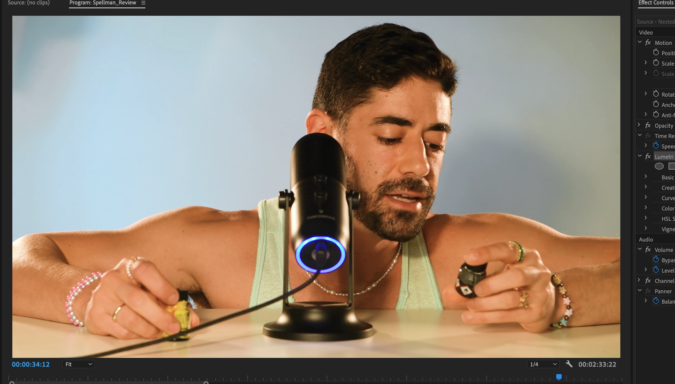
 

Screen Shot 2023-09-12 at 8.52.55 am.png

TOPICS
Editing

Views

96

Translate

Translate

Report

Report
Community guidelines
Be kind and respectful, give credit to the original source of content, and search for duplicates before posting. Learn more
community guidelines
LEGEND ,
Sep 11, 2023 Sep 11, 2023

Copy link to clipboard

Copied

LATEST

First, that isn't that bad, really. And I would highly recommend working from the Lumetri panel rather than the Effects Control Panel, when adjusting things in Lumetri.


Next ... get your scopes panel set. Your eyes are simply not a highly reliable tool for "absolute" color work, especially if you don't have a fully calibrated and profiled Grade 1 Reference monitor. That's full-on colorist kit, and most of us don't have it. Ergo, the scopes tell you when you're off more reliably than the eyeball does.


I recommend the RGB Parade, which gives you a view left to right across the screen, of the image, in three separate channel-specific diplays ... you see the red channel on the left, green in the middle, and blue to the right.


Something of the image that is at the same height in the image will have the same level of red, green, and blue data there. Handy to use to check your highlight and black points across channels for color casts.


Also the Waveform ... I prefere YC no chroma version ... gives you a good clean view of the display of data left to right across the image for brightness.


And finally, the Vectorscope, which shows you both saturation and specific hues around the color wheel.


For instance, there's a line in the Vectorscope that has come to be called the "skin tone line" ... it's a graticle going from upper left through the middle to lower right. If your skin tones are closely grouped around that line at the upper left, between yellow and red, then ... they're going to be pretty accurate.


As one example.

Votes

Translate

Translate

Report

Report
Community guidelines
Be kind and respectful, give credit to the original source of content, and search for duplicates before posting. Learn more
community guidelines