Copy link to clipboard
Copied
Hi,
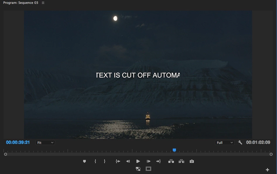
When adding text in the new Adobe Premiere Pro 2017.1 the text gets cut in the program monitor. It is as if there is a hidden safe zone, which cuts off everything outside of the center. If I use the old "legacy title" tool, there is no problem. Any way I can remove those "safety borders" or whatever they are? As you can see on the added frame grab the text is cut on the left and on the right. If I move the text further to the left or right it gets cut off even more.
Thanks, Per
I am on a MacBook Pro 15 " mid 2015
I've got it!
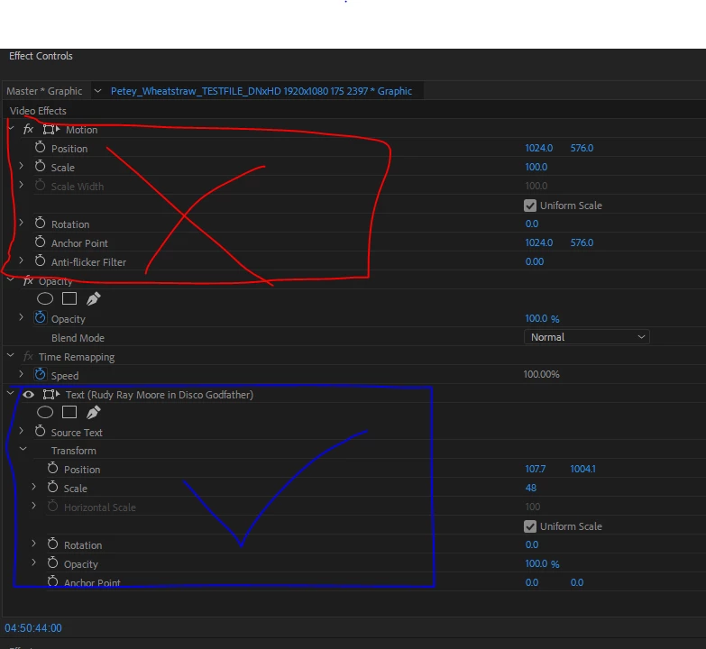
Simple answer: don't use the Video Effects to control what the text does, but the Text Effects, which appear below in the same Effects Control panel.
In more detail:
When the new text clip (an 'fx' clip) is selected,
...the Effect Controls will show not only the default Video Effects and any effects you have added, but also...this is key...a SPECIFIC set of controls for the Text itself. Use THOSE to control position, scale, etc. of the text and there will not be any of this cutting
...Copy link to clipboard
Copied
Post screenshot of title properties in effect controls window.
Copy link to clipboard
Copied
Copy link to clipboard
Copied
my guess is you probably dragged the text off the screen a bit and to move it back you used motion controls and not the text control.
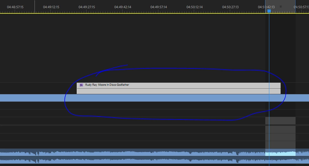
here is moving the text from outside the screen with the text controls
things will be more clear if you click twice in the program monitor (not on the text) and
check see the motion controls on screen.
Copy link to clipboard
Copied
Thank you so much motion controls helped!
Copy link to clipboard
Copied
Seems to be the answer...at least in my case. THANK YOU
Copy link to clipboard
Copied
Thank you so much! This is what fixed it for me
Copy link to clipboard
Copied
I think i found a solution. I've been having this same annoying problem. The text itself is not what is set in the wrong location. If you click on the new text in the timeline and hit the motion frame in the properties effects box (NOT the actual texts motion box), you'll see it's off frame. I don't know why it defaults this way, but this should take care of the framing issue.
As to why my center and right align still seem to be completely off, i have no clue. Hope this solves your problem!
Copy link to clipboard
Copied
That is exactly what was wrong with mine. My titles were getting cut off like they were stuck inside a window same as the OP described.
When I checked 'Video Effects' with the drop down arrow I noticed my 'Scale' was set to '58' and the 'blue box' that appeared on the 'Main Monitor' when I clicked 'Scale' was exactly the size and location of the titles being cut off.
I increased the 'Video Effects' 'Scale' to 100 and then decreased the 'Scale' on the titles and it fit perfectly.
Thanks for the help!
Dan
Copy link to clipboard
Copied
Same thing is happening to me. When text is copied and pasted from one title to another, the resulting image is clipped (see Fig. 1). There's got to be a way to create some kind of distributed user network that aggregates the time and work lost due to half-baked features that DO NOT WORK AS ADVERTISED and dynamically micro-reimburses users that have documentation (probably through subscription discount) << The future. Oh, wait, it's called a lawsuit. Editing for three hours, then opening your project first thing Monday to find your complex titles completely fubar as a result of a dysfunctional program feature is ENRAGING. But I'm good, I'll just go ahead and do these schizophrenic UI acrobatics so that my basic text can display normally, thanks.
Figure 1.
Copy link to clipboard
Copied
I'm having the same issues. I swear it was fine then after I close and open up text is cut off again. I have tried retyping, making new text boxes. Not sure what I'm doing wrong.... See for example the Word Pentra 400 ? The last 0 is cut off also the text on the right and more.
Here are my settings for the word Pentra 400. Any help would be great!!!!
Copy link to clipboard
Copied
I had the same problem. Adjust the anchor point on the Text layer in Effect Controls. Make your Program size 25% and you will see the problem.I had the same problem. Adjust the anchor point on the Text layer in Effect Controls. Make your Program size 25% and you will see the problem.
Copy link to clipboard
Copied
What I realized is that for some reason if you look at “Scale” it's at 400%. I ended up retyping all my text and making sure it was all at 100% and then I adjusted the font size and that seemed to have solved it. I have no idea why it defaults to 400%. I hope this helps other users as well.
Thanks!
Copy link to clipboard
Copied
Chanteb's solution in comment 4 worked for me -- thank you!
Mine was at 87%, and some of you have it at 400% and other random numbers.
I think I figured out how mine got that way. I was first resizing in the Essential Graphics tab to begin with. Then I was repositioning the graphic in regular Effect Controls and ran into the OP issue. When I went back into EG, there was my 87% scale. I can't recreate it or explain how it happened exactly, but I think the new graphics system is best monitored entirely in Essential Graphics (or Effect Controls but not both?)
Copy link to clipboard
Copied
Right click on Text layer and remove attributes. That worked for me.
Copy link to clipboard
Copied
THANK YOU! This worked perfectly for me
Copy link to clipboard
Copied
I've been having this problem for so long. It was in the motion tab like you said. thanks.
Copy link to clipboard
Copied
The same thing happened to me in Adobe Premiere Pro 2018.
Copy link to clipboard
Copied
I had the same problem. I found masks in the text settings that I deleted. Solved the problem. I'm not sure why they got added.
Copy link to clipboard
Copied
I too had that problem today. Tried flush left right and center with no luck.
The easiest fix I found was to draw a text box then type inside it. I made the text box larger than needed and then just tightened up the boundaries so it wasn't too large. So far it has worked well.
Copy link to clipboard
Copied
I've got it!
Simple answer: don't use the Video Effects to control what the text does, but the Text Effects, which appear below in the same Effects Control panel.
In more detail:
When the new text clip (an 'fx' clip) is selected,
...the Effect Controls will show not only the default Video Effects and any effects you have added, but also...this is key...a SPECIFIC set of controls for the Text itself. Use THOSE to control position, scale, etc. of the text and there will not be any of this cutting off at the edges nonsense.
Many Bothans died (or at least got really frustrated) to bring us this information. Use it well.
Copy link to clipboard
Copied
This answer, which I marked as correct, is mostly correct. One clarification though: Everything in the ECP is part of Video or Audio effects. It's the intrinsic Motion effect that you want to avoid. Motion controls the whole Graphic track item. So if you scale the Graphics down to, say 30%, and then you scale or move one or more layer(s) inside that Graphic so that it is no longer inside that Graphics bounding box (which is now just 30% of the frame size) it will get clipped. This is as designed and was necessary for performance reasons. We understand that users want/need a way to affect their whole graphic as one thing without getting clipped layers like this. So we will consider this all a + many for that request.
Copy link to clipboard
Copied
I have been using .SRT files with the CAPTIONS control panel and I am having trouble with the invisible boundary limiting my text size and even though I anchor my text at center, when I change font size, it scales up the font to the left and not evenly to the left and right from center.
It seems the CAPTION control panel is not developed completely yet.
Copy link to clipboard
Copied
Captions are completely separate from Essential Graphics. You should consider starting a separate thread for that Captions problem since I know very little about them.
Copy link to clipboard
Copied
Found the Solution ...
I had the same issues with AE sometimes ...
-From "Effect Controls"
-Go to Text Effects.
-Slide the X axis of the Anchor Point to LEFT (if your text is cropped from RIGHT) and vice-versa ...
Simple trick, probably the software has a default anchor size/position which is causing this issue.
Cheers ...