Copy link to clipboard
Copied
Hey,
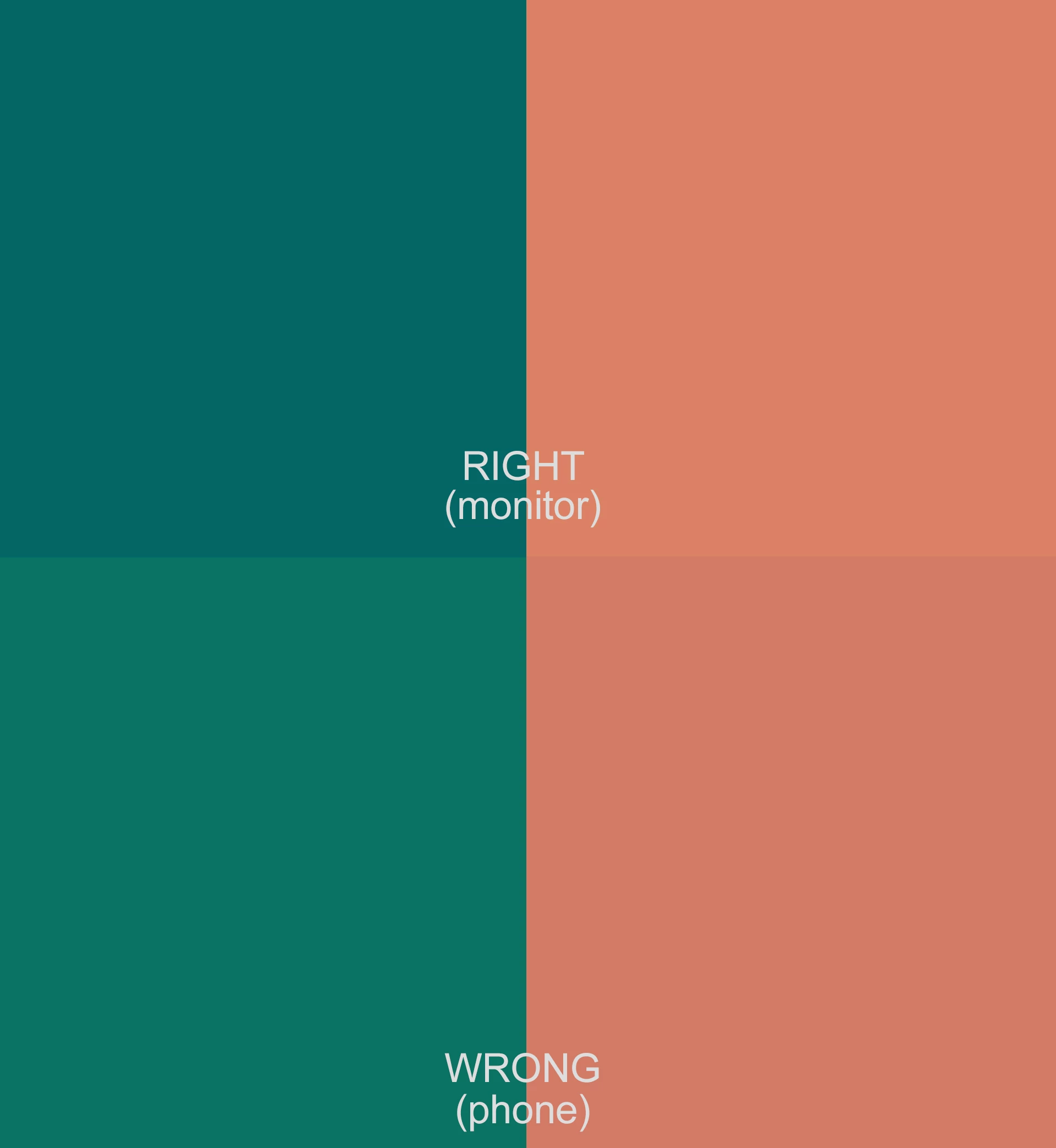
I am trying to make a two-tone poster style video and everything is fine until I look the render on smartphones. The colors are quite off compared to three different monitors. I tested it on two android devices and on one iphone. Problem is same.
The monitors are not calibrated and there is a small difference on every monitor, but not as drastic as on phones.
Oh, one interesting thing. When I upload the video to Google Drive, the thumbnail colors are messed up just like on a phone screen, but video playback is fine. Same thing in Youtube, when I hover over the timeline bar and this little thumbnail pops up showing the frame of a chosen time point, the thumbnail colors are messed up the same way.
Is it a color management problem? Render settings?
I would really appreciate any help. 🙂 Thanks.
Copy link to clipboard
Copied
I am having the same issue. The image colors are correct, but the video colors are not.
On the left is the correct blue. On the right is the blue rendered on mobile devices.
Can someone help us please?
Copy link to clipboard
Copied
If you import the exported file into Premiere Pro, does it look the same on the timeline?
Copy link to clipboard
Copied
One of the first things pro colorists learn is that ... outside of your system, you have no flippin' control whatSOfreaking EVER.
Every screen is different, and take the same phone and a vid on a park bench in noon day sun, in a dark bedroom at night, it will vary visually due to the surround ambient light and the way your eyes react to that.
Which is why pro colorists go nuts setting up a calibrated/profiled dead-accurate viewing system. Knowing that no one, ever, whether viewing by broadcast signal, streaming, or theatrical release, will ever see exactly what they saw on their reference monitor.
You get your system tight to the specs so that, when viewed out in the total mess of a mush that is Real Life, your media looks ... relative to other pro produced media on that device ... like pro produced media.
It won't look like on your system. Hopefully, it's somewhat close. That's all you can do.
Copy link to clipboard
Copied
Yes, I know. But on mobile devices, the exact same color used for my images and for my video is rendering as the two completely different colors as seen in my original post (images render the left side color and video renders the right side color). Thus, the exact same color is rendering as different image versus video colors and it looks quite bad to have the images and video side-by-side. It's my branding, after all. Is there anything that can be done about this? Thanks for your help.
Copy link to clipboard
Copied
On all mobile devices or just Apple devices?
Cheers,
Kevin
Copy link to clipboard
Copied
I only have android phone and tablet. But, shouldn't the images and video render the same color?
Duane
Copy link to clipboard
Copied
Why do you assume so?
Every screen is different. Even with high-end colorists calibration setup, you cannot identically match two "identical" monitors connected to the same computer.
Now go to almost the variances in operating systems, screen designs, settings, viewing conditions, and it's a mess. Colorists are taught that no one will ever see exactly what they saw on their reference monitor.
Whether going to theatrical release, broadcast or streaming, web, whatever. "You can't fix gramma's green TV".
So give us exact specs on your OS, hardware, media and effects. Where and what you deliver to. We'll help you get the most solid color management you can do.
Copy link to clipboard
Copied
Specs:
Pixel 3 (Android) and Samsund tablet (Android)
Images and video produced on Windows 11 using Dell monitor
Images created in Illustrator
Video created in Premiere Pro
The only effect so far is use of the Adobe gamma lut for Premiere Pro
Note: I've fiddled with the color by finding an offset blue for the video that renders fairly close to the image blue on mobile. But, it's now different on desktop (of course). Here is an image of the correct blue (left), the problem video blue-green (right), and the corrective blue (center). Apparently, mobile video players want to change the color by moving the hue more towards green (also, making it lighter and less saturated).
Copy link to clipboard
Copied
What Adobe gamma LUT? The one that was used to adapt Rec.709 (with expected gamma 2.4) to the odd Mac Rec.709 display gamma of 1.96?
If so ... um ... why?
Copy link to clipboard
Copied
Hi @R Neil Haugen,
You mentioned that some PC users are adding the LUT that was expressly made for Mac P3 screens as an attempt to address their specific color issue. I am seeing a rise lately in the amount of page views for the post that contains a link to the LUT, as well. Why?
Since v. 22, color issues and confusion around color are dominating the top issues for Premiere Pro. Unfortunately, it's not getting much better yet, when it comes to understanding how to deal with such vexing problems.
I think that a lot of people are just adding it out of desperation that it will somehow fix their specific color issue when the real issue might be the variance of the way colors are interpreted across multiple browsers, player apps, and devices. This problem is not widely understood and is frustrating a lot of people.
Thanks,
Kevin
Copy link to clipboard
Copied
Unfortunately I think your comments are quite accurate. Most users assume they should be able to get pretty nearly identical color across devices and screens.
Sadly, reality is far messier than we would all like.