NITs are the measure of screen brightness. This used to be called IRE, but now ... it's nits. Typically not capitalized, just ... nits. The numbers are the same. I'll give the short answer to which to use down at the bottom. And explain the full details of Premiere's two main HDR options along the way. Which are color space and graphics white.
Rec.709 (now often called SDR) is expected to be "graded" on a screen with 100 nits brightness. It used to be called 100IRE brightness. Clear so far, right? Nits again is just a terminology change from an engineering type name to a video post user name. Same thing being measured though.
HDR can have varying brightness ... for 'beginning' HDR in consumer TVs the minimum brightness across the screen 'needed' by the TV is 400 nits. They have different sub-standards for 600, 800, and up. The "standard" or Rec.2020 allows for up to 10,000 nits ... which no current screen can do.
And yea, for the colorists trying to deliver for various services right now, it can be quite complicated prepping for delivery.
Netflix for example requires basically a 1,000 nits capability and setting for all their DolbyVision HDR media they accept. It must be monitored on an accepted 1,000 nits minimum monitor. At this point, very few monitors can do that ... they're all above $20,000 ... so very few of us can work at "full" 1,000 nits levels.
Thankfully, for most of us it's a lot simpler. Especially within Premiere at the moment.
There are only two questions "we" general users need to be aware of within Premiere. Which of the two color space options we're working in, and which of the two graphics white brightness options to use.
The color space question is whether or not we're working in HLG or PQ ... the latter is considered a higher-quality version, but isn't nearly as widely used in consumer TVs as HLG. So for now, probably go with HLG.
But always remember: the biggest thing of HDR isn't actually that it's brighter, it's that the volume of the color space is several orders of magnitudes more massive.
You have a TON of more shades of colors in HDR than in SDR ... and the colors go more up into the mids/highs and deeper shadows than SDR media does. I've have colorists note it's like going from a crayola box with 16 colors to the big 128 color box. Highly addictive if you've got a screen than can accurately show the color space/volume!
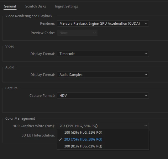
The second option for HDR we have to decide in Premiere is "graphics white" ... which is a concept needed in HDR, not existent in SDR. Think of a white piece of paper in sunlight ... that will be about the brightest thing your image will show with texture and detail. That ... is the "graphic white" point.
Above that point, image data will be expected to be primarily over-bright light reflections, speculars, and light sources themselves. Bits of light & color without detail or texture.
Premiere allows us two options ... the 203 one, and the brighter one. Because HDR is still quite new, they are allowing people to make a choice between two settings. Rather than giving us actual control of that per timeline say. (Probably easier on an engineering level.)
I teach color to pro colorists. My "bosses" at MixingLight.com are the guys that Dolby Labs had in to do the tutorial training that Dolby provides to all colorists working in Resolve or Baselight ... they're some of the more experienced people in HDR out there, delivering for all the "big" services.
And they say simply set that graphics white setting for the 203 and forget about. One told me "No one but a noob in HDR goes to 300+ for grapics white. Blows your conusmer's eyes out ... NOT a good thing to do."
So ... I take his advice.
Basically, in HDR, you move the old "max brightness" point for your brighter things to that 203 level, essentially doubling the brightness of your SDR grade. And allow brightnesses from light sources, reflections, and speculars to soar well above that.
And you've got a lot more subtlety to play with in shadow details/tonalities, and in hues from darks to speculars. Those are the two things most colorists say you learn to work with anew: subtle shadow tonalitiies, and the gorgeous range of hues to play with. Using both to shape the image, the feelings, the perceptions.
The recommended settings for now, for most HDR you can do in Premier:
- use HLG timelines (because consumer hardware is FAR more likely to be able to display HLG)
- and set the graphics white to 203.
Neil