
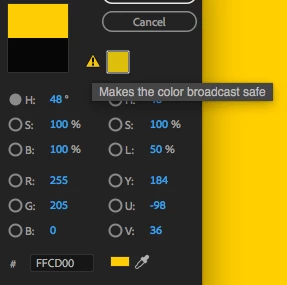
What does "Makes the color broadcast safe" mean specifically
When making a Color Matte, I've noticed that if you try to pick certain colors, Premiere Pro will throw up a little warning exclamation mark with a suggestion to use a different color. When you hover your mouse over it you get the info "Makes the color broadcast safe". Below is a picture of that.
As a bit of an explanation of how I got here, the organization I work for has specific brand guidelines for which colors to use and my department has noticed that when we use their suggested colors for graphics/ text, some of those colors shift after exporting. I looked further into those colors and in the vectorscope some of those color appear outside of the rec709 color space hexagon thing. And of course with those colors Premiere Pro throws up that warning about changing the colors to be "broadcast safe".
So, on to my question. When Premiere Pro is suggesting "broadcast safe" colors, how is it coming to the conclusion that the color it's suggesting is the closest broadcast safe color? Like, is it picking a value that the closest color within rec709 and with luminance values between 0 and 255, or perhaps it's suggesting a color that is the closest color within rec709 and also clamps luminance values between 20 and 235?
Also, for the orange color with hex code #FC8900, which is one of our branding colors and is outside of the rec709 color space according to the lumetri vector scope (image below)
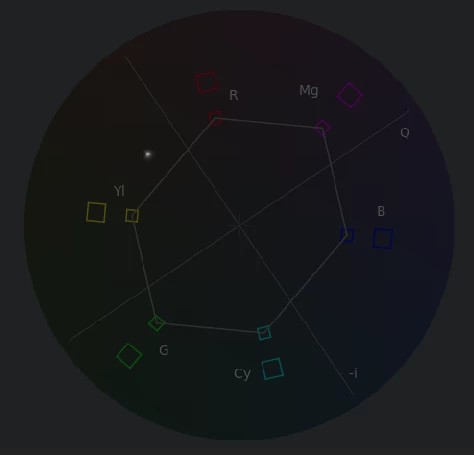
Premiere Pro recommends the hex code E58601 instead (both of which have the same RGB values of 252, 137, 0 oddly enough). But when you look at the vectorscope for this orange color that Premiere Pro says is "broadcast safe" you can see that the color is outside of the rec709 hexagon pictured below).
So is this orange actually broadcast safe? Is that hexagon merely a suggestion to keep your colors close to it instead of being a rule to not pass it?
Thanks for reading this!