Participating Frequently
April 30, 2019
Question

Export without Color Management turned on

  • April 30, 2019
  • 2 replies
  • 929 views

Hey guys!

I am facing a huge problem.

I recently edited and graded a video that took me a ton of work. Created my own lut on Davinci and applied it to premiere. Now the Problem:

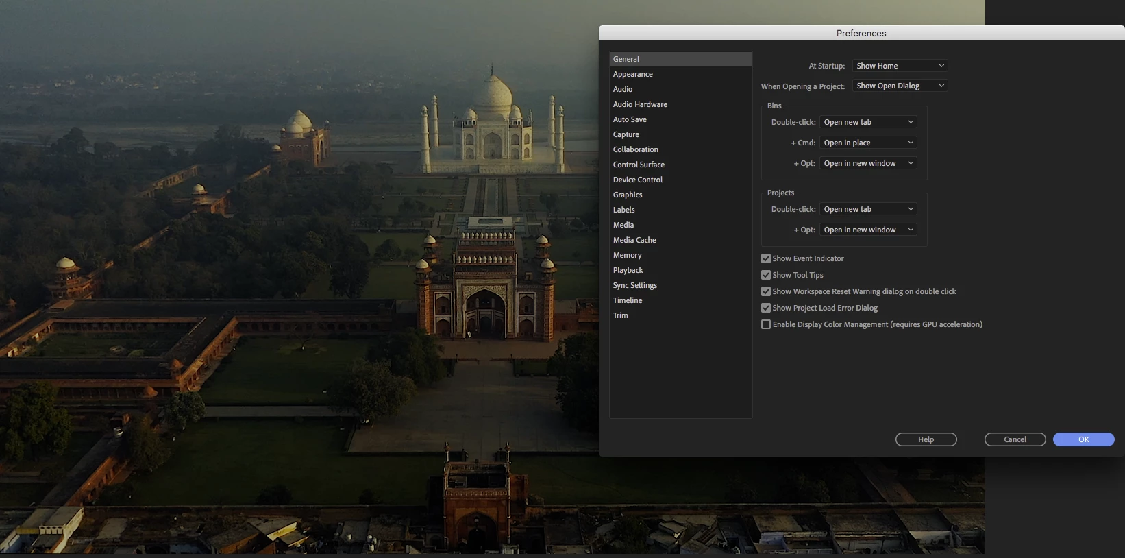
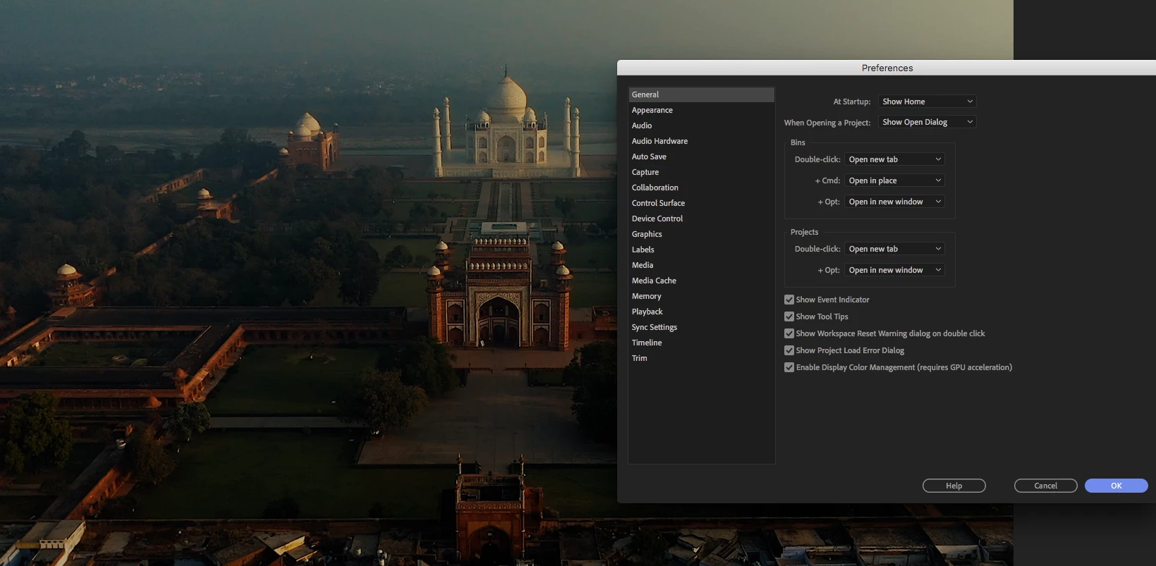
The final EXPORT is always oversaturated and not like I've seen it on the monitor. After some searching I found out there is a setting called "Enable Display Color Management" and it was unchecked (never touched that before tho)

The final export looks like that - when I check this setting. But now some sequences are extremely weird, colors bugging, ugly color noise.

What is that? And how can I just export it without this "enabled display color management".??

Thanks a lot in advance!

This topic has been closed for replies.

2 replies

Participating Frequently
May 1, 2019

UPDATE:

Now on the VLC player I see it exactly as I see it in Premiere when the Color Management is UNCHECKED.

This is very confusing.. Meaning, if I grade now with the Color Management checked, it will be always washed out as soon as it's on a non-mac system?

Participating Frequently
May 1, 2019

UPDATE 2:

Just realized that my monitors are actually showing it oversaturated. On my mac, it looks better - I don't know how that happened tho, since I calibrated them. Maybe something went wrong during the calibration process - So I will do it again, but I'm still very confused

R Neil Haugen
Legend
May 1, 2019

Premiere is designed for very tight color management by "historic broadcast standards". It is designed to be used on a system with a monitor set for sRGB, Rec.709, 100 IRE (now called "nits", D6500 white point, and gamma 2.4. These are what one has to meet for instance to get material through the Quality Control machines for broadcast use.

The program and transmit monitors will show very accurate views when displayed on such a system/monitor.

The Macs that use a P3 monitor display a very different view of the same pixel/RGB values. The P3 color space is a bit bigger than the sRGB color space. The colors farther out to the saturated edge of the sRGB space will end up out a fair amount farther in P3. Hence appearing "over-saturated".

Premiere will internally display tonality darker than the same media outside Pr in a Mac P3 environment. So when you lighten it to look better, then export ... it's suddenly light and washed out looking. Hence all the complaints that "my videos look darker/too dark on import into Premiere". And the complaints that when making it look 'good' in Premiere, then exporting, and they see it in QuickTime Player or Chrome or Safari, it's again ... light and de-saturated.

So the "enable color management" is designed to remap values to the Mac "Display P3" space. The idea is that colors are moved 'in' a bit, and the shadows are lightened in the display so that when displayed on the P3 color space in gamma 1.96, the values are representing about where they would if you were seeing it on a Rec.709/2.4 broadcast display.

But note ... this doesn't mean that the export will look the same after export in say QuickTime on that P3 Mac ... just that the export will hopefully look correct on a system with proper Rec.709/broadcast standards.

Most people start out thinking there is some overall right/wrong that everything is set to ... and that isn't the case. TV's are expected to be sRGB/Rec.709 all right, but ... the colors and tones are almost always way wrong out of the factory. Especially if it's been on a showroom floor, where they want VIBRANT colors ... too saturated, too bright, and normally way off 'center' for color balance.

And different screen technologies display the "same" thing a bit differently. Then throw in all the phones, devices, types of computer monitors, and ... viewing environments. With all sorts of settings including many things "designed to enhance the viewing experience" that jack shadows up and down, highlights out around the barn, and does odd things to color.

Colorists deal with this all the time, and well ... I spend much of my time with colorists. I even am a contributing author on the professional colorist teaching subscription site, mixinglight.com. Yea, I teach how to work with color correction in Premiere.

The only thing one can do is pick the most important, widest use standard for what you will be delivering content. Build a system that is tightly controlled and set for that. Do your diligence on setup and production ... and kiss it good bye when it goes out Into The Wild.

Because ... out There ... ain't no one ever gonna see your pixels like you saw them.

That's all anyone can do. So ... what standards do the people that produce the 'professional media' your viewers will be watching also on their screens use? The only thing you can do is produce material that looks like other professionally produced material. Then yours will look professional also. Colorists have monitors that range from $5,000 to $30,000. They may have spent more money on their calibration gear than probably your entire computer system cost. They make their content look dead-on by using external signal scopes and checking everything on the scopes and those expensive, calibrated, and profiled monitors. The vast majority ... work at video sRGB, Rec.709, 100 nits, D6500, gamma 2.4.

Some corporate web work is processed as above, but destined for a brighter viewing possibility, produced with a gamma of 2.2.

The theatrical release "major films" work will be finished for one of the two P3 variants that are designed for such, and with a gamma even darker ... 2.6. With perhaps a "trimmed" version at gamma 2.4 for later non-theater release.

Now of course, there are some programs in High Dynamic Range or HDR. That is primarily capable of highlights far brighter than 'standard' or SDR content. And ... with the added brightness, there is added color intensity also. Neither you nor I are set up for that work ... ti's very expensive at the moment, with relatively few places to deliver.

I would add ... though Mac users may think otherwise, only about what, 10% of the screens out there? ... are driven by a Mac OS.

So, what are you calibrating your monitors with? What monitors are you using?

And again, curious about the LUT from Resolve ... the point was ... ?

Neil

Everyone's mileage always varies ...
R Neil Haugen
Legend
May 1, 2019

You are on a Mac, with their P3 ... environment. Not that it's "wrong" ... but it is a very different beast than anything else.

There have been two P3 standards for professional use, both assuming theatrical release. One uses a D6300 white point, one a co-efficient something or other roughly around D600. And they use a gamma of 2.6.

Premiere is built to "historic broadcast standards" of the last 20 years ... video sRGB for color space, with Rec.709/D6500/100 IRE (now nits) ... and with the commonly required gamma of 2.4 for broadcast use. The app is tightly color-managed internally to be shown on monitors with the proper broadcast setup calibration/profiling specs.

The new Mac P3 ecosystem takes the P3 color space, a little bit bigger than sRGB, just enough to make a notable difference; keeps the sRGB white point of D6500; and applies a scene-referred gamma of 1.96. It ain't nothin' like nothin' out there.

And the OS, the monitor, and the internal or "house" apps are designed to work with that intriguing and unique color ... space.

The reason it looks over-saturated is the way the colors/hues that Pr assumes will be mapped to video sRGB are instead being mapped to the wider P3, making them over-saturated.

The "Enable display color management" option is an attempt by the Premiere engineers to mod their hardwired internal monitors to work ... generically ... on Macs with the Mac-P3 setup.

To use it, you would ideally have applied that before you did your grade.

Now ... there may be a way to make this work. Engineer Francis Crossman, who did the sleuthing to puzzle this out (and I wish Apple had been a bit more public about this!) has a pair of LUTs, one designed to take Pr-produced material and make it look more as expected on a Mac-P3, and one to take Mac-P3 produced material and re-route that for a standard broadcast/Premiere "space".

Here's a link to an article with links to the LUTs and all:

"Why does my footage look darker in Premiere?" Color Q&A

I'm curious about the LUT you created in Resolve ... as to what it was designed to do ... and ... how did you set the color management in Resolve?

Neil

Everyone's mileage always varies ...
Participating Frequently
May 1, 2019

Hello Neil

Thank you very much for your message, that already helps a lot.

So in order to understand this right, cause I am still a little bit confused.

When the color management is "Unchecked" and what I see in the program Monitor - those are the "real" colors or not?

My videos are 99% of the time for online use - Youtube, Website, Instagram

What do the people on the other end see? What I see, with the color management unchecked or if it's checked?

What confuses me is, that on my Huawei Phone, the Video doesn't look that much saturated tho. It's very confusing and I got a little misunderstanding right now in my mind with which colors are real which not..

For in the future, do you suggest, to always turn this on? It won't effect it anymore, if I upload the Videos to Youtube for example?