Participant
February 10, 2020
Answered

Super Yellow Footage Disaster. H.E.L.P.

  • February 10, 2020
  • 5 replies
  • 5665 views

Hello Community!

It is my first-time post to the community because usually, I find answers to what I am looking for, however this time I got a huge problem. 


To Premiere and Color Correction geeks out there, this is for you!


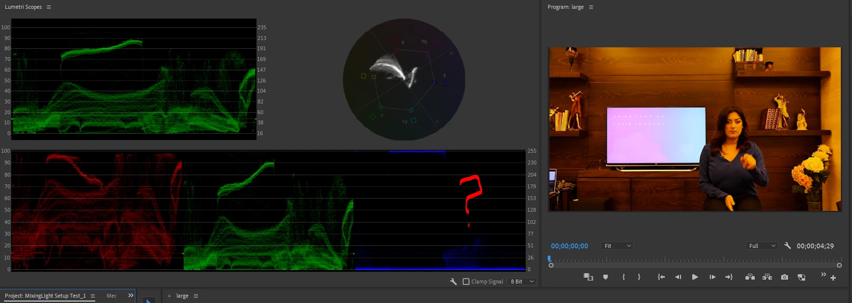
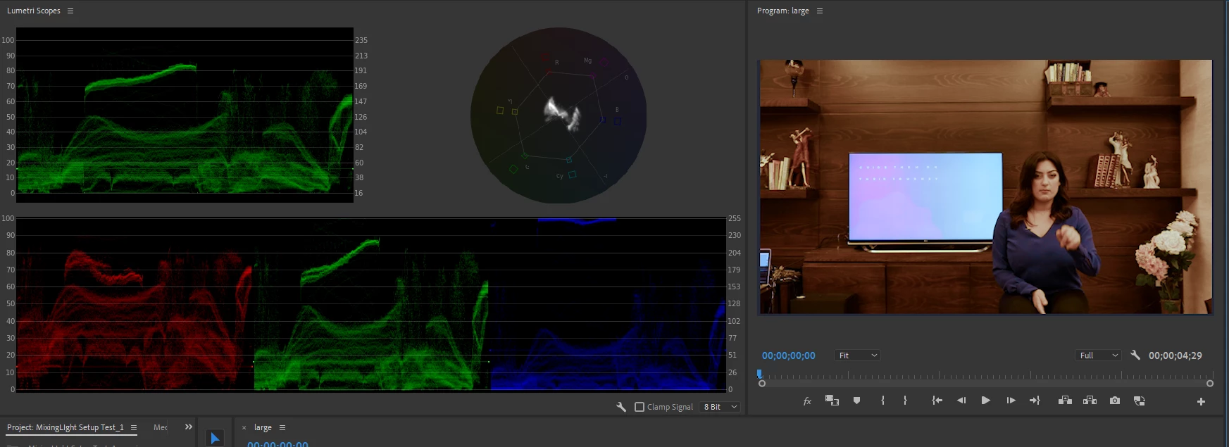
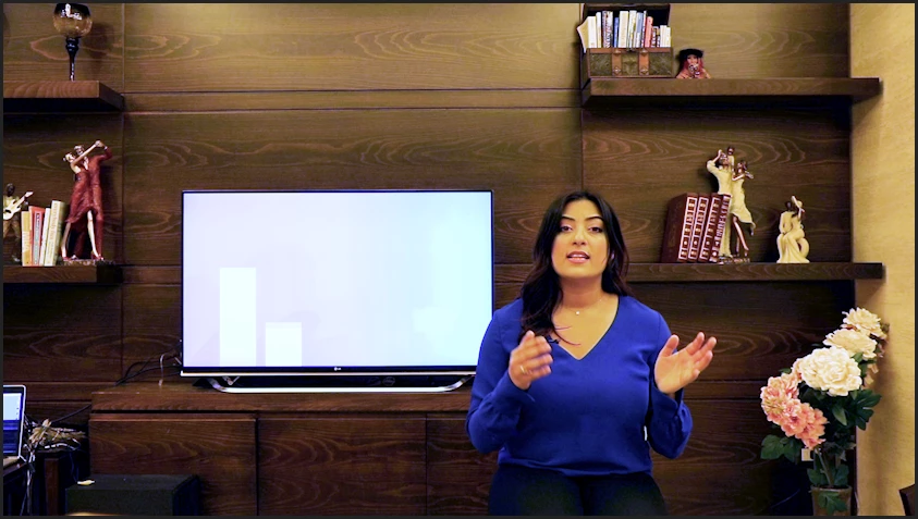
I shot a 30 min footage, and the lighting was terrible (YELLOW YELLOW YELLOW). I did a small test first and color corrected in Premiere and it was fine. However, the lighting turned out much more yellow than I thought and I can't get to fix it! 


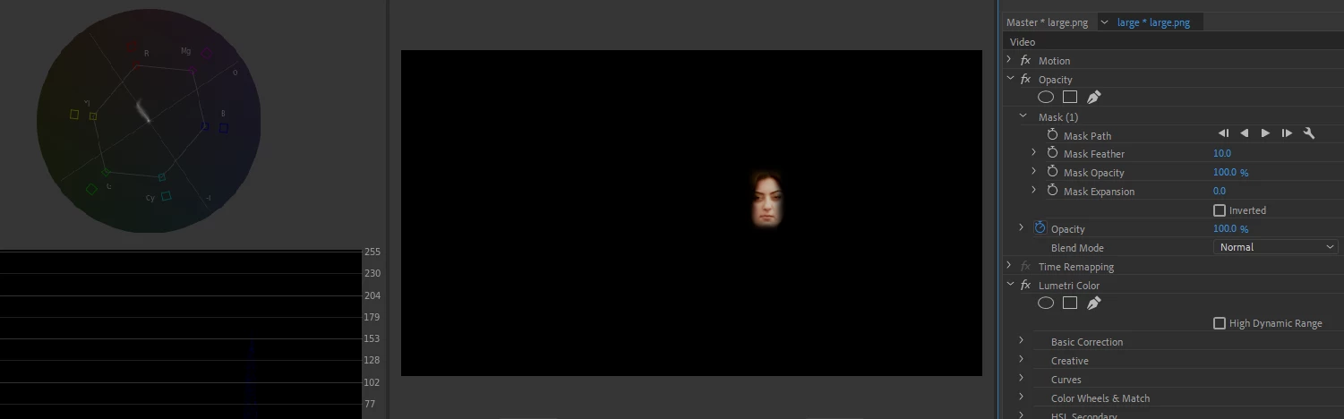
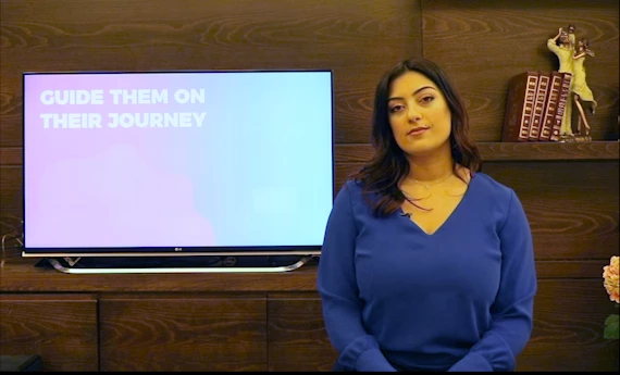
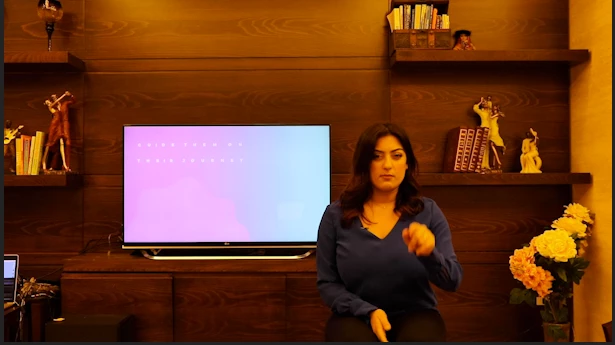
I included screenshots of the original footage, plus my failed attempts at fixing it. But I still can't get the right white balance, the right exposure, and the film turns grainy. I watched everything available about this, however, no one had footage that is as yellow and dark as mine.


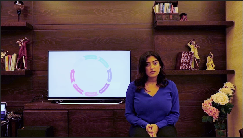
Another problem is the screen behind me, but I think (hope) I can fix that with chroma key...


Is there a way to save my footage?


Thank you so much ❤️ ❤️ ❤️

I

This topic has been closed for replies.
Correct answer R Neil Haugen

The first thing to do to analyze an image for tone/hue is to bring up the scopes ... and wow, the Vectorscope YUV shows saturation way out of bounds between Yellow and Red and next to no blue values.

The RGB parade confirmed ... you've got blue at both ends, but nothing in the middle.


So the first thing was to back off the over-saturated tones, which I did with the Curves tab Sat v Sat control, at first just putting a control point on both ends then dropping the right-end, the high saturated tones, way down ... then making a few minor adjustments.


Then worked a few other color and tonal controls. I also used a quick opacity mask to check skin tone ...

I don't know the rest of the tones, but this looks like it is at least close to something neutral.


I'm also including a .Look file, that can be loaded via the Creative Tab's "Look" input dropdown slot then adjusted via the strength and other controls, and of course, the rest of the Lumetri controls will help you trim that in.


I'm also including a preset file, which when dragged onto the clip, you could go into Lumetri and see exactly what's been done and modify anything you wish.


Neil

ClientTest Look file

ClientTest Lumetri Preset 


5 replies

R Neil Haugen
Legend
February 11, 2020

You got a much better image than you started with, and ... did it yourself. Which is always the best way to learn!


The Look (a .cube LUT file) and the Preset should be usable across Mac/Pc. In case you're not quite sure, the Look file could be stored anywhere on a drive on your computer (though they do have a normally preferred location that Premiere will look for user-installed LUTs in).


From the Creative Tab's drop-down slot at the top, choose Browse ... navigate to and select. Make sure you don't have any other Lumetri effect applied to the clip when you do, which looks like that may have been an issue.


For the Preset, you park it on your computer ... then in the Effects panel, click on the 3-bar menu, 'Import Preset' ... and then after it does its thing, you can drag/drop that onto the clip on a sequence or onto the Effects Control Panel (ECP) ... and again, make sure you don't have any other Lumetri on as it's a rather strong set of control changes.


Now ... another question ... you're on a Mac? Retina monitor I presume? It's good if you are to make sure that in the Preferences for Premiere, you have "Display Color Management" enabled. Premiere is designed to work within a viewing environment of pro standards, video sRGB, Rec.709 (both camera and display transform functions applied), gamma 2.4, 100 nits. This option tells Premiere to look at the operating system's controls set for that monitor, and adapt the image within Premiere in an attempt to match how it would look on a proper color system.


But ... nice job on the color corrections you applied!


Neil

Everyone's mileage always varies ...
Inspiring
February 11, 2020

That was weird. Someone marked this post as correctly answered, which usually means " end of story".

It's not true.

To the original poster:

If you added Neil's Look to an already 'semi corrected' clip (clips ) it would be all screwed up.

He was using your 'original' screen capture ( sRGB) as a starting point. NOT WHAT YOU DID with hue v sat.

So if you added the look to the already adjusted stuff it would be way off. Nothin to do with mac or PC.


The fact he spent so much time doing what he suggested to you is really fantastic and shared that freely here on the forum.


I will thank him for that. Thank you, Neil.


I have no clue why some policeman took the liberty of marking this post thread as " correctly answered".


Inspiring
February 11, 2020

Good going ! It looks more pretty to me now, but I have 2 problems visually.

a) blue of sweater looks weird a little 

b) TV monitor is overexposed and blown out and very blue


As you can see already, things start to get kinda complicated the more you dive into fixing stuff. What Neil did is really good and if you can learn what he is showing you it would benefit you in the long term.

For down and dirty quick partial fix, what you did with the skin tone hue v sat is usually a good starting point to get close to what stuff should look like to start basic editing. Later on the color correction is sorta a more complex and subjective ( with scopes it's your choice between what is considered normal and what your mood is regarding the scene ) discipline.


It's best to shoot with the WB and exposure as close as you can get it so you don't have to fix nothin much.


Your light was around 32K color temp and the TV is around 65K color temp. Very warm and cool in comparison ( not matched WB ). To try and fix the TV to match what you got now would mean masking, tracking, correcting just the masked area ( TV ) and then a final tweak for the sweater IMO. That is a lot to learn and do. I use Resolve and CS6, and Neil uses the new Adobe stuff and Resolve, so he knows what I'm talking about when I say....the following.... and he might be able to help you tweak stuff cause I don't have Lumetri.


First, in resolve, I would mask the TV on the frame that has the LEAST amount of the talent blocking the TV. Then track it and adjust if necessary. Then select that for all value adjustments ( YRGB) first ( lift gain gamma Y values )) in LOG ( less overlap and will end up more contrasty ). Then pull down the blue value and mess with the color that way... try to match the 32K ....


I think in adobe you have to go to after effects for some of this ??? Neil will know.


🙂


P.S. Neil has tutorials he does professionally to teach people about stuff, so maybe he can turn you on to where that stuff is located behind a paywall...   I don't think the cost is very high to join the thing but I don't honestly know what's up with that. We tend to try not to promote private business on the forums.


R Neil Haugen
R Neil HaugenCorrect answer
Legend
February 10, 2020

The first thing to do to analyze an image for tone/hue is to bring up the scopes ... and wow, the Vectorscope YUV shows saturation way out of bounds between Yellow and Red and next to no blue values.

The RGB parade confirmed ... you've got blue at both ends, but nothing in the middle.


So the first thing was to back off the over-saturated tones, which I did with the Curves tab Sat v Sat control, at first just putting a control point on both ends then dropping the right-end, the high saturated tones, way down ... then making a few minor adjustments.


Then worked a few other color and tonal controls. I also used a quick opacity mask to check skin tone ...

I don't know the rest of the tones, but this looks like it is at least close to something neutral.


I'm also including a .Look file, that can be loaded via the Creative Tab's "Look" input dropdown slot then adjusted via the strength and other controls, and of course, the rest of the Lumetri controls will help you trim that in.


I'm also including a preset file, which when dragged onto the clip, you could go into Lumetri and see exactly what's been done and modify anything you wish.


Neil

ClientTest Look file

ClientTest Lumetri Preset 


Everyone's mileage always varies ...
Participant
February 11, 2020

Hello Neil!

Thank you so much for the time you took to help me out, I appreciate it.


The Look file didn't give the right output, I include an image here:

And I was not able to load the Preset on my Premiere (I have a mac... not sure if that's the problem).


However, I did follow your instructions and played around with saturation. I got a much better result (below), do you recommend to do anything further than this?


Thank you so much!

Inspiring
February 10, 2020

might try hue v sat... select skin tone, adjust... see what it does ??


Inspiring
February 10, 2020

p.s.

that would ( lowering saturation of that color or range you selected ) adjut levels, not color... so I don't think your problem is color, but levels


🙂


Participant
February 11, 2020

Hi Salvo,

This was a great tip! I was able to get a much better image, and it still needs tweaking.


Thanks!