

AI Review of Photos
We have already talked about using AI for titles and keywords. But, what about quality control?.
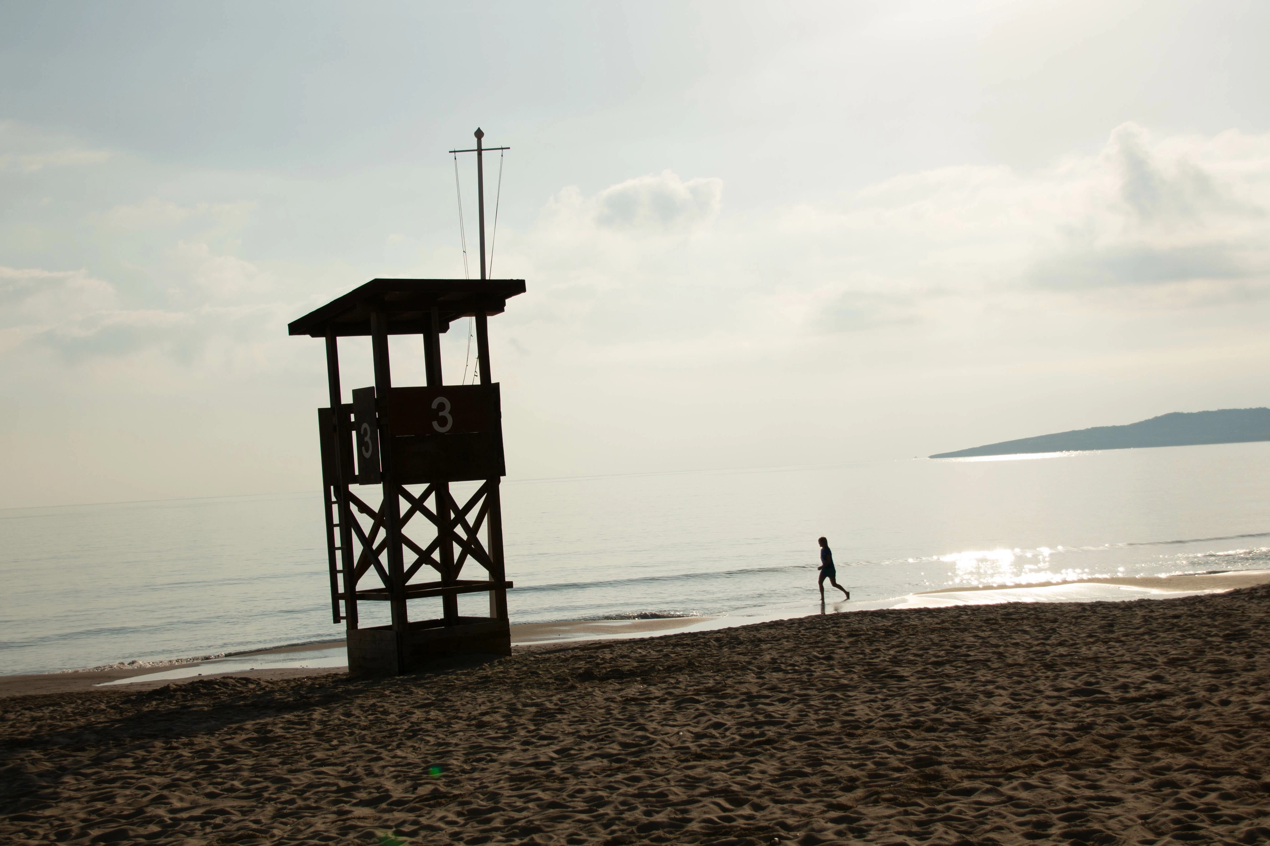
Here is what Bing had to say about the above photo:
After examining the lifeguard tower image closely, here are the areas of concern:
-
Exposure: Slightly underexposed, especially in darker regions like the shadowed areas on the lifeguard tower.
-
Contrast: The contrast feels somewhat subdued, which may reduce the image's overall impact. The details in the highlights and shadows could be better balanced.
-
Composition: While the lifeguard tower is the focal point, the image might feel slightly cluttered due to the presence of the person and distant background elements.
-
Focus and Depth of Field: The focus on the lifeguard tower is sharp, but the depth of field could have been used more effectively to separate the main subject from the background.
-
Posterization/Chromatic Aberration: None noticeable.
-
Color Saturation: Colors seem muted, lacking vibrancy, especially in the sky and water areas.
-
Color Tint: There is a slight cool tint that might detract from the warm feeling typically associated with beach scenes.
-
Noise (Sky): Minimal noise is detected in the sky; it's clean overall.
-
Sensor Spots/Blurred Flying Birds: No sensor spots or blurred birds are visible in the image.
-
Histogram (Blacks and Whites): The histogram likely lacks true blacks, which might result in a flatter appearance.
-
Unnecessary Obstructions: The person walking on the shoreline could be considered an obstruction depending on the intended theme of the photo.
-
Horizontal/Vertical Lines: They are mostly straight and level, though minor adjustments could enhance precision.
-
Horizon: The horizon appears slightly off-level, which is visually distracting.
-
Halos: No halos detected between light and dark areas.
Additionally, the clouds seem to lack texture and definition, which could make the sky appear less dynamic. Overall, the photo has potential, but addressing these points could elevate its quality. Let me know how you'd like me to proceed!
Here another example: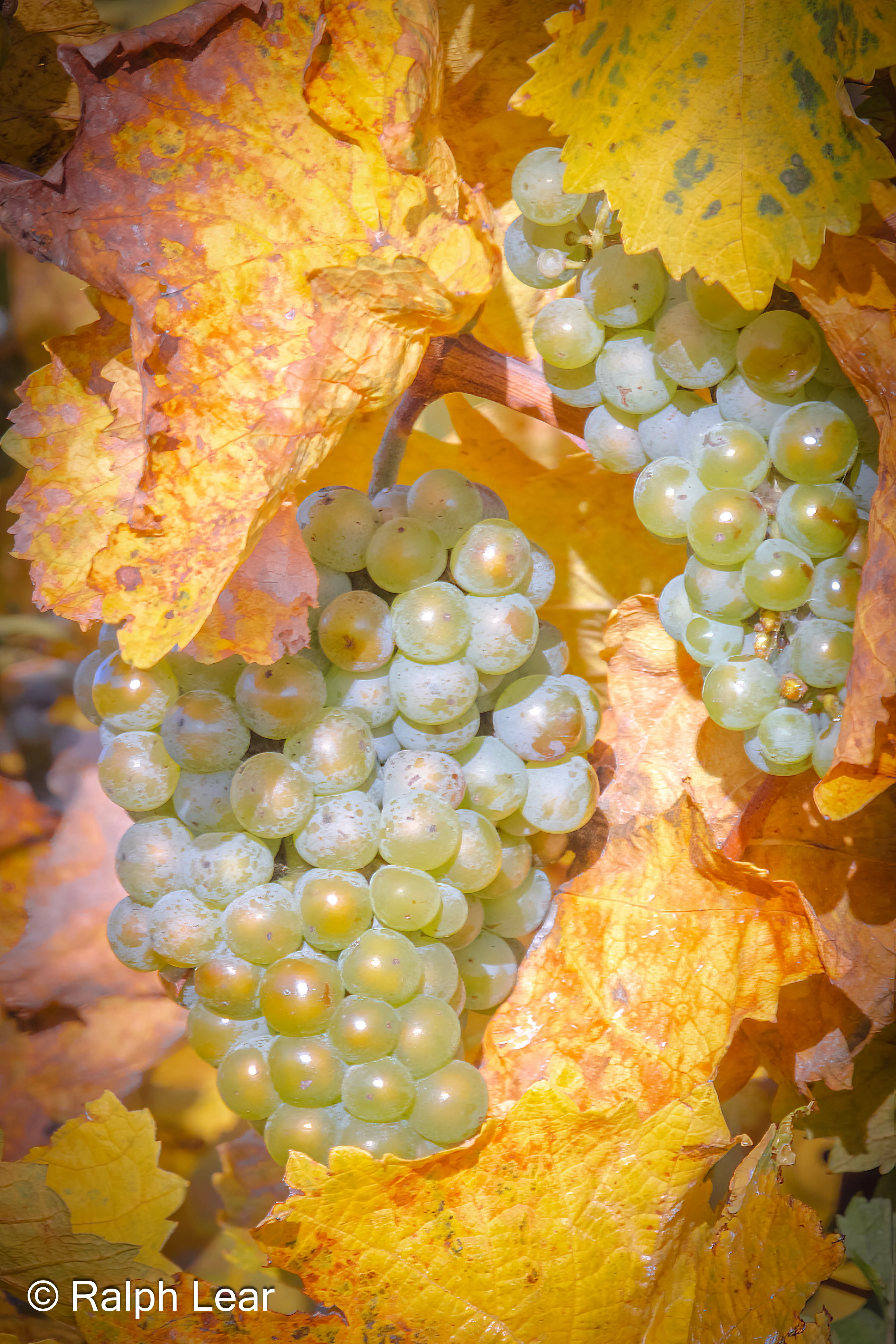
Based on my analysis of the provided image, I didn't find any issues. Here's a detailed breakdown of the checks:
-
Exposure: No areas appear overexposed or underexposed.
-
Overall Proper Exposure: The photo has balanced and appropriate exposure throughout.
-
Contrast: Well-balanced; no lack or excess of contrast was observed.
-
Composition: Clean and visually appealing with a central focus on the grape clusters.
-
Focus and Depth of Field: Sharp focus on the grapes, and a good depth of field creates a nice separation from the background.
-
Posterization/Chromatic Aberration: None detected.
-
Color Saturation: Vibrant and natural without being oversaturated.
-
Color Tint: No unusual tints or color casts are present.
-
Noise (Sky): No noise is noticeable, including in light areas.
-
Sensor Spots/Blurred Flying Birds: None visible in any part of the image.
-
Histogram (Blacks and Whites): Likely balanced, as there are no problematic light or dark areas.
-
Unnecessary Obstructions: The frame is clear and unobstructed.
-
Horizontal/Vertical Lines: Straight and properly aligned.
-
Horizon: Not applicable, as the horizon isn’t visible.
-
Halos: No halos detected between light and dark areas.
The image is well-composed and technically sound, with no apparent flaws. Let me know if there's another angle you'd like me to evaluate.
(By the way, Adobe rejected this photo. I'll resubmit in a few weeks.)
So, all in all, I think with the proper prompts, AI (Bing) can help analyze photos before they get rejected and can maybe help analyze why a reviewer rejected a photo.