Answered
Feedback Needed: How Can I Improve This Image
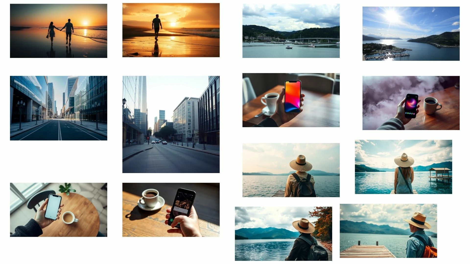
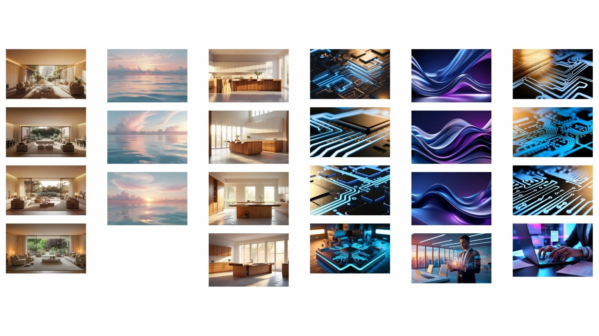
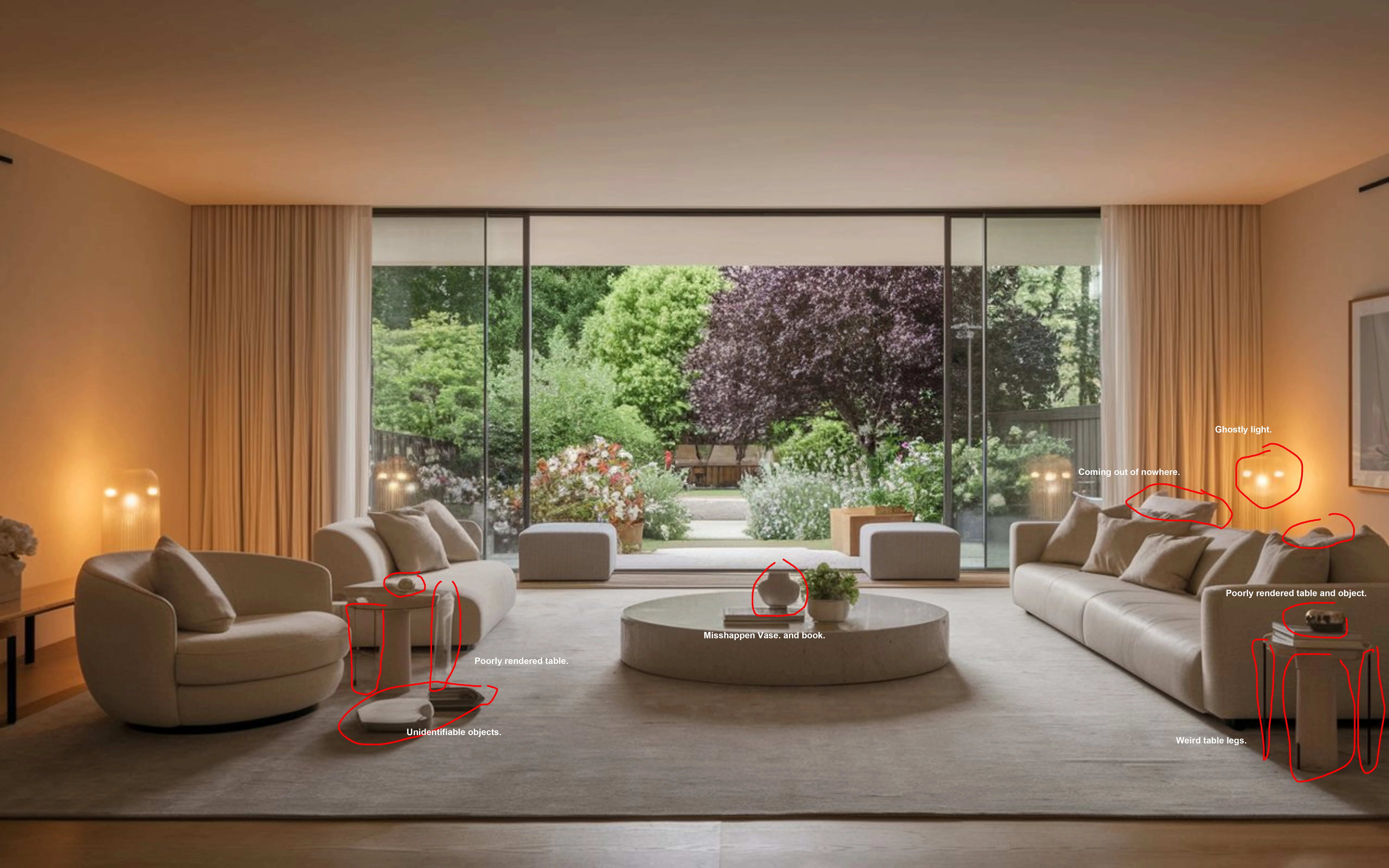
Hi everyone,
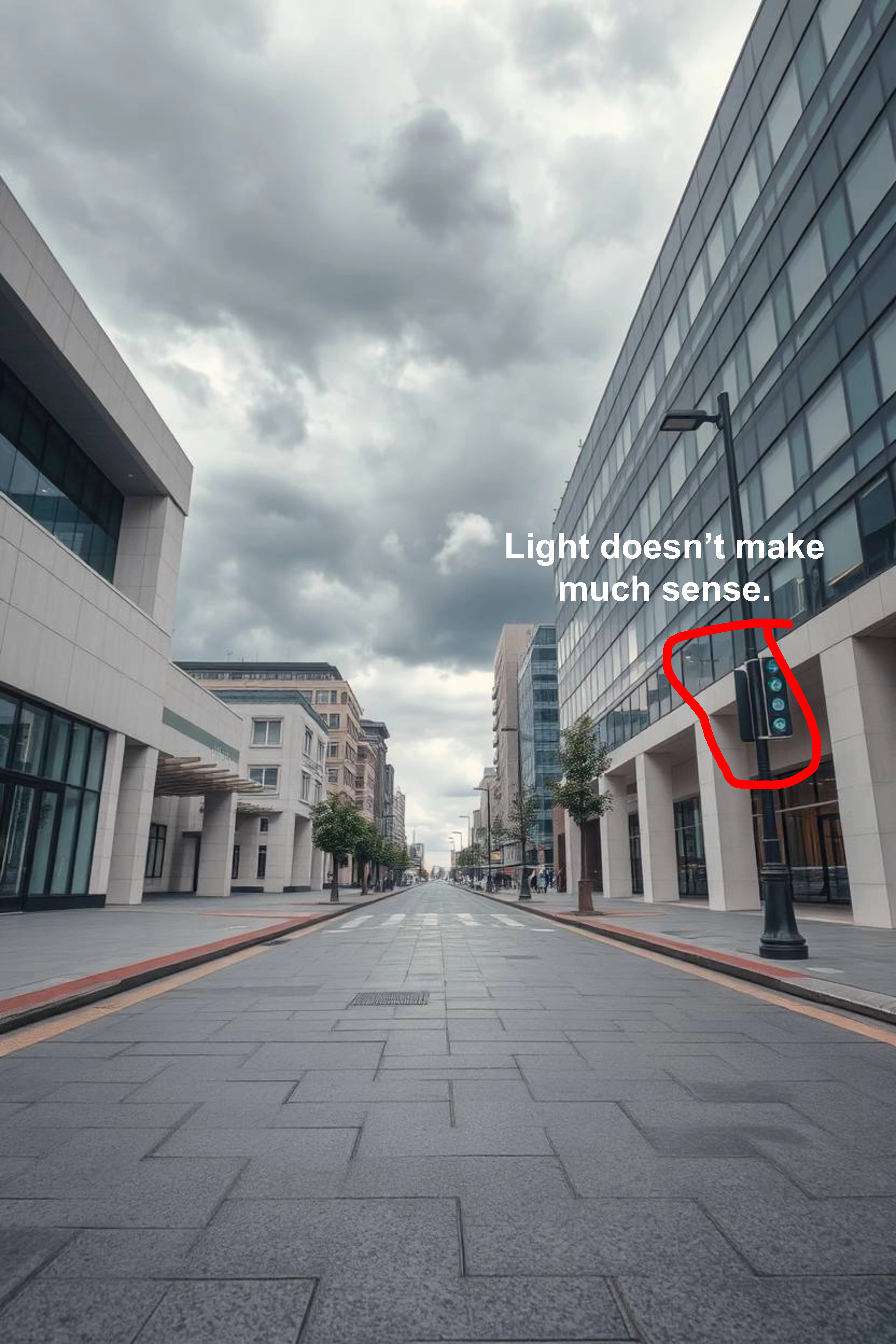
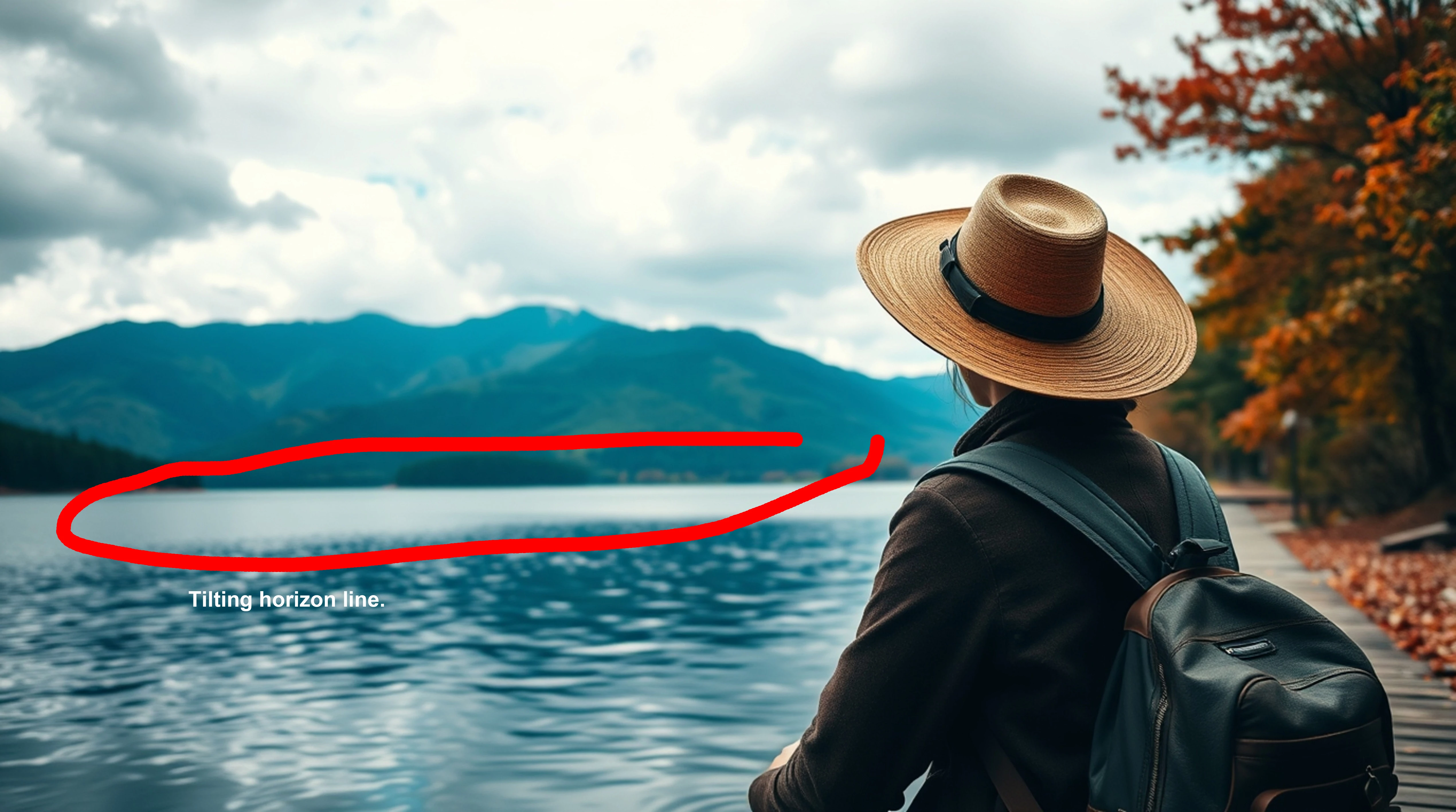
I recently submitted this image to Adobe Stock, but unfortunately, it was rejected due to technical quality issues. I’d love to get your insights on what might be wrong and how I can improve it.
Since there’s a limit of 10 images per post, I made a collage to include multiple images. Sorry if it’s hard to see the details! Let me know if I should upload them separately.
I appreciate any constructive criticism on how I can enhance my image to meet Adobe Stock’s standards. Thanks in advance!