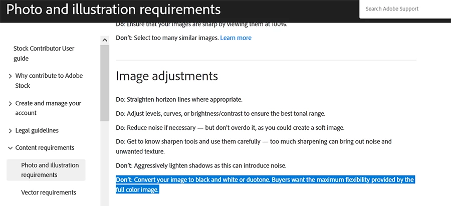
daniellei4510
Community Expert
Community Expert
July 1, 2023
Answered

OK, I'll put myself out there...

  • July 1, 2023
  • 4 replies
  • 1059 views

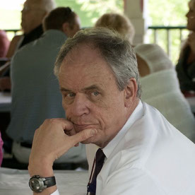
I'm fairly eclectic when it comes to the images I submit to Adobe Stock. This includes a fair share of surrealistic AI images. The majority have been approved but this one didn't pass muster. While I spent a good hour photoshoping improved roman numerals on the clock, is it the other symbols and numbers depicted that might have resulted in its rejection? Or the hat covering a part of the clock? The strands of hair I left on the back of her neck?

Normally, when I get images rejected, I simply shrug my shoulders and move on. But this one kind of perplexes me. Thanks for your input!

This topic has been closed for replies.
Correct answer Nancy OShea

I will only add that Adobe Stock frowns on duotone images.


Dos & Don'ts

https://helpx.adobe.com/stock/contributor/help/photography-illustrations.html


4 replies

Nancy OShea
Community Expert
Nancy OSheaCommunity ExpertCorrect answer
Community Expert
July 2, 2023

I will only add that Adobe Stock frowns on duotone images.


Dos & Don'ts

https://helpx.adobe.com/stock/contributor/help/photography-illustrations.html


Nancy O'Shea— Product User & Community Expert
daniellei4510
Community Expert
Community Expert
July 3, 2023

I was aware of this, but the AI itself resulted in the sepia toning. I considered converting it to black and white, since I've had 4 or 5 B&W images accepted previously (which is not to say the image would otherwise have been accepted in light of the other issues pointed out). But then, weirdly enough, I was watching a recent Adobe Livestream about submitting AI images (what to do, what not to do, etc.). At one point, if I heard the presenter correctly, he suggested using Lightroom presets to give submissions a little boost to set them apart from other submissions. But this seemed entirely against Adobe Stock standards so I was a bit surprised. Ultimately, I think the subject will dictate what to do or what not to do with an image, particularly AI images, and I would rarely if ever take such advice. To me, the suffix "pre" means, "it's already been done--if not overdone--and should only be used for personal requirements and not stock photography.

Adobe Community Expert | If you can't fix it, hide it; if you can't hide it, delete it.
Jill_C
Community Expert
Community Expert
July 3, 2023

Have you used any Lightroom presets? They are simply a memorized set of image adjustments. 

Jill C., Forum Volunteer
Abambo
Community Expert
Community Expert
July 1, 2023

It's a nice picture and surly merits some thoughts.

The “exposure” is not correct, whites are missing:


The first thing that I look at, with portraits, is if the eyes are sharp, in focus.


They aren't. What is in focus, however, are elements in front and behind, with out-of-focus elements in between.

You also have artefacts, looking like bad cutouts:

Incidentally, there are sharp and blurred areas everywhere in your picture.

These artefacts are also quality issues:

The blur in the pointer is not of natural (optical) origin. Artefacts on the pointer:

If you edited this, you did not blend the last number correctly with the background.

I'll stop now, the list is incomplete, but any of these errors would trigger a quality issue refusal.


(all screenshots are at 100%!)

ABAMBO | Hard- and Software Engineer | Photographer
daniellei4510
Community Expert
Community Expert
July 1, 2023

Thanks, ABAMBO...I think you're right. Maybe they would have a couple issues slide, but collectivly I can see all of your points. I think I was relying on the strength of the concept itself rather than focusing enough on the technical issues.

And yes, with regard to a comment from another contributor elsewhere, I did provide the proper release. 

Adobe Community Expert | If you can't fix it, hide it; if you can't hide it, delete it.
Abambo
Community Expert
Community Expert
July 1, 2023

Well, from all the errors I showed, one error will be enough to trigger the refusal. If there is a tiny error, it may pass, but if there are a couple of them, one will catch the moderator's attention.


I would guess it was this one, as it is effortlessly to see:


ABAMBO | Hard- and Software Engineer | Photographer
Participating Frequently
July 1, 2023

Você olhou os motivos da devolução? Não me espataria se eles tivessem rejeitado por motivos de direitos autorais da modelo que compõe a imagem.

daniellei4510
Community Expert
Community Expert
July 1, 2023

It was "Quality Issues." But I'm at the point where I think quality issues is the go-to selection when nothing else works as their reason for a rejection. Kind of like me selecting "Graphic Resource" when none of the other categories fit the subject. I probably went with "People" in this case, but is it really about people? Not really. The category could be "Time," Clocks, "Surrealism," but of course we don't have the luxury of chooseing from a list of very specific categories. Which is probably good if the overall scheme of things.

Adobe Community Expert | If you can't fix it, hide it; if you can't hide it, delete it.
Jill_C
Community Expert
Community Expert
July 1, 2023

The Category is meaningless, and appears to be a holdover from the Fotolia days; it would not have been a reason for rejection. The hat, particularly in the front, does look odd and could be a quality problem. The noisy background is also an issue. The nonsensical letters/figures around the edge are another issue. Of course, you would also have needed a model release for the woman.

Jill C., Forum Volunteer
EzyRider_II
Inspiring
July 1, 2023
Perplexed : ). I like your phrasing things. Must be the seconds hand : ).
Falls right onto the Roman I and seems it's an extension of the clock hand
: ). I dunno. I think get the concept of your composition, the "Dali-like"
(?) clock deforming theme, but who would be your buying (!) audience for
it? Other than visually it's intriguing. I personally would probably remove
the one curling strain of hair on her neck that is sticking out a bit too
much. Not sure if I helped or further increased your perplexity (is that
even a word?). Good luck with it though.