Question
Photos Rejected
Hi there! Any tip to improve this to don't be rejected for technical issues? Thanks in advance
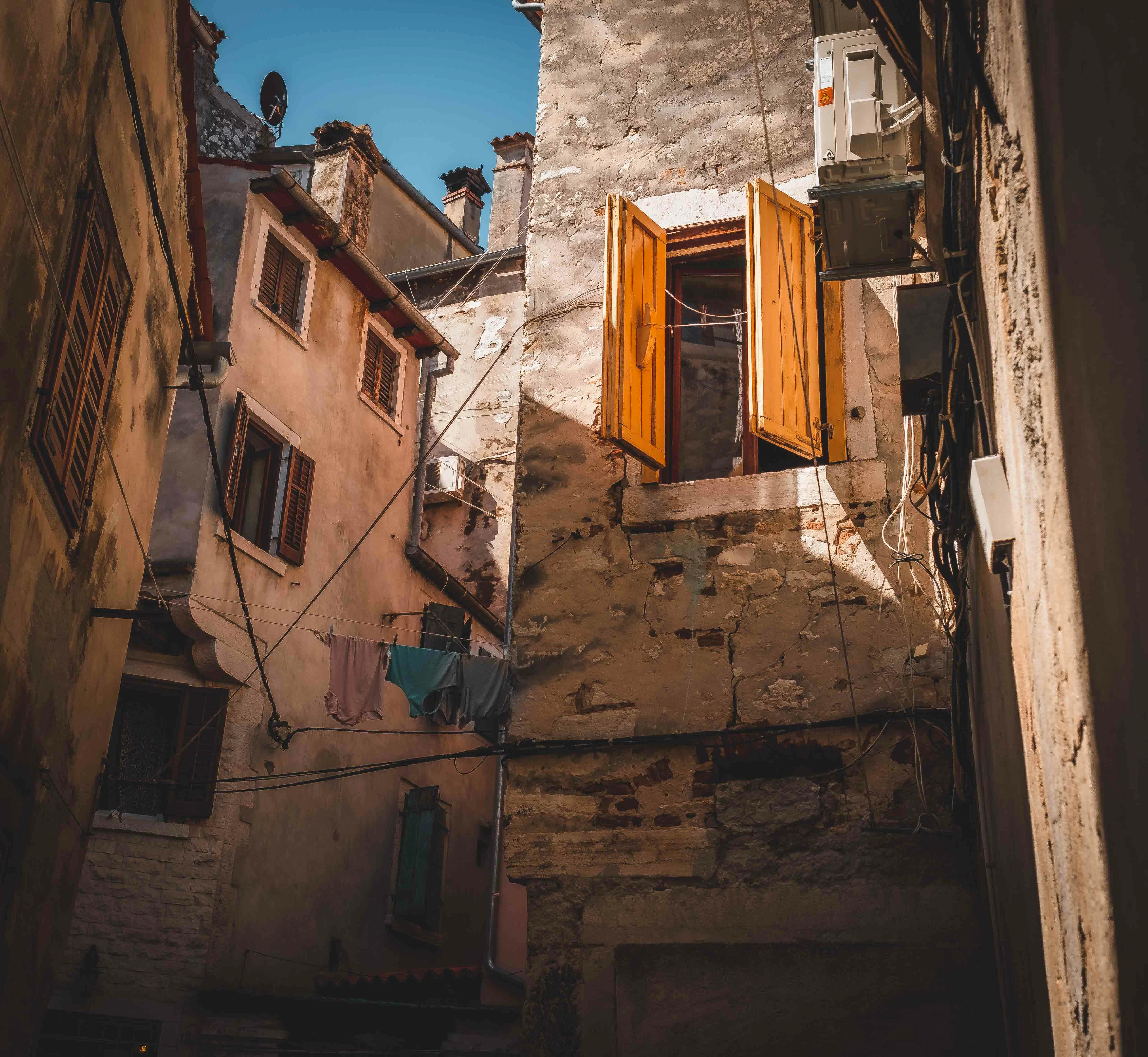

Hi there! Any tip to improve this to don't be rejected for technical issues? Thanks in advance
Already have an account? Login
Enter your E-mail address. We'll send you an e-mail with instructions to reset your password.