

Refus / problèmes techniques
Copy link to clipboard
Copied


 7
Replies
7
7
Replies
7

Copy link to clipboard
Copied
The pictures are to small for an analyzis. Some are out of focus, some seam to be overprocessed, some others over or underexposed.
If you are new to stock, you should consider these resources: https://helpx.adobe.com/stock/contributor/tutorials.html
Please read the contributor user manual for more information on Adobe stock contributions: https://helpx.adobe.com/stock/contributor/user-guide.html
See here for rejection reasons: https://helpx.adobe.com/stock/contributor/help/reasons-for-content-rejection.html
and especially quality and technical issues: https://helpx.adobe.com/stock/contributor/help/quality-and-technical-issues.html

Copy link to clipboard
Copied
I agree with @Abambo about out of focus and over/under exposed.
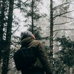
Photo 476 is underexposed, out of focus and to red.
Photo 4C5 is out of focus, has to much dead space (the sky) and the fence at the bottom must be removed.
Photo 4A4 is out of focus, has to much dead space and the foreground is under exposed. Also the branches on the left should be removed.is
Basically, all of the photos are out of focus.
I think you get the point.
By the way. Dead space is different from empty space. Empty space can be usefull in stock photos. It allows the buyer to add text. It should however, not be patches of burned out white spots due to over exposed areas. Some details should be seeable. That is why a photoagrapher exposes for these areas.
Photography is more than just pressing a button!
========================================
Copy link to clipboard
Copied
Copy link to clipboard
Copied
Filters are never a great idea, when they modify the picture in an artistic way. Filters are OK to enhance the quality of the picture. Sharpening, denoise, dodge, burn...whatever makes a good picture great. But you should avoid filters that that saturate colours more than is natural, that change the white balance into something warmer or cooler, etc. My final pictures often include some vignetting, but for stock, I do lens correction and avoid such embellishments. The buyer can then use the picture as he needs. Filters are quite fast to be added but can mostly never be removed from the final jpeg.
Copy link to clipboard
Copied
i take this precious advice ! thank's
I use a presets on lightroom but isn't the best idea in your words ^^. how can improve my photography colors please ?
Copy link to clipboard
Copied
There are presets and presets. Sometimes adding contrast helps and there is a preset for that. Sometimes you really need to edit carefully to get the picture equilibrated. Look at the tutorials, they will help you to produce for stock.
What I generally do is:
- Applying lens correction
- Applying white balance correction
- Straightening the picture, correcting the horizon if necessary.
- Applying the auto-edit feature. Very often then, I return to manual and adjust myself, but as the auto-edit is fast and convenient, it gives ideas on how the picture could look.
- Adding local contrast.
Copy link to clipboard
Copied

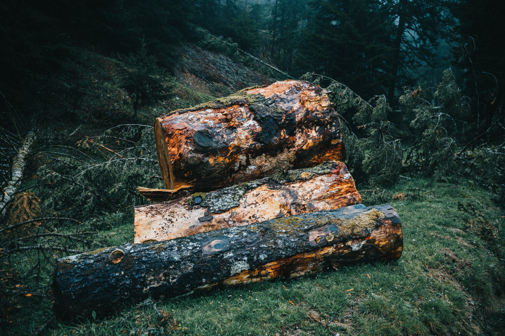
I think your presets are also making your images to soft and out of focus. Here is your file. Notice the image has a more natural color and appears to be sharper. I reduced the saturation of red and orange and increased the details. This is actually nothing more than adding contrast (as @Abambo said) on boundary edges.
Photography is more than just pressing a button!
========================================
Find more inspiration, events, and resources on the new Adobe Community
Explore Now
 AdChoices