Copy link to clipboard
Copied
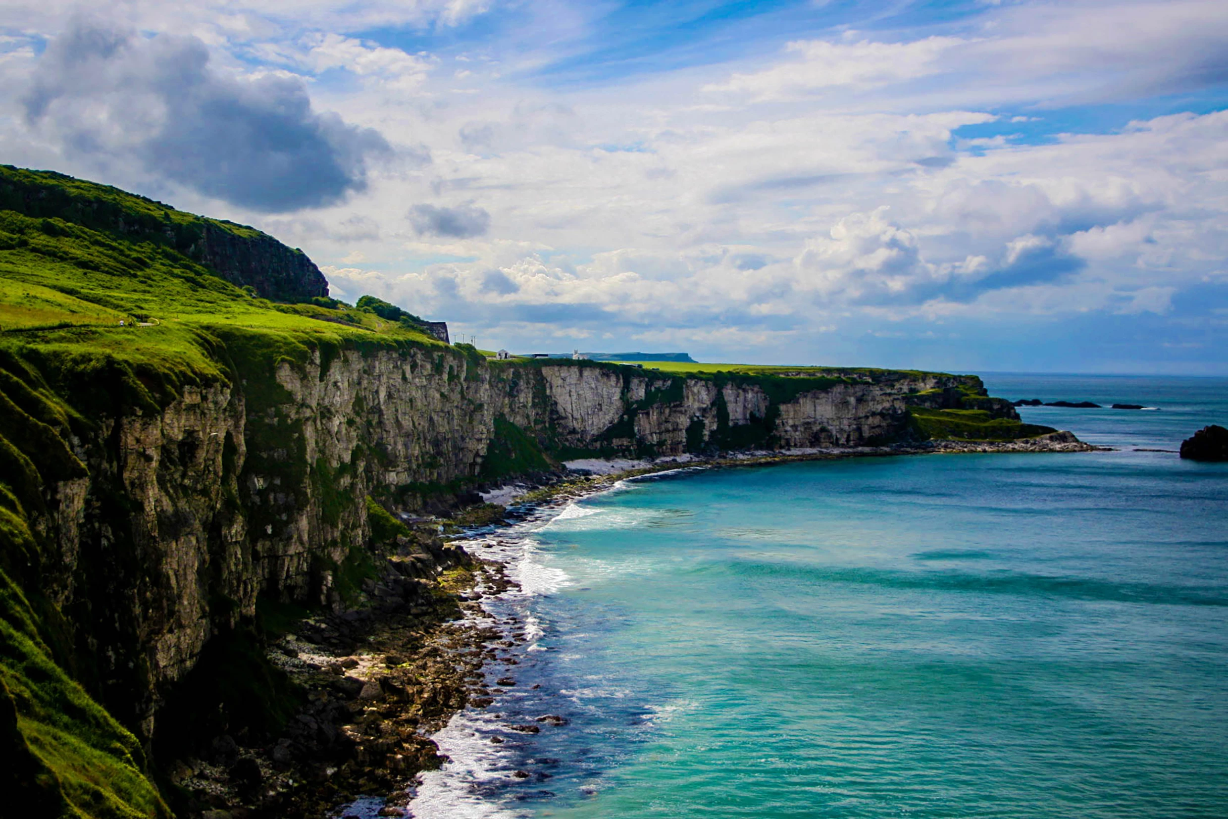
Hello! I am an amateur photographer and I love travel photography. I took this picture in Ireland and enhanced it. It was unfortunately rejected for aesthetic purposes, and I was wondering if I could have some feedback as to what I could do to improve the picture. Thank you!
Thanks for writing. In my opinion this image is way over-processed. The contrast is too intense, the image appears to be over-sharpened. If you are doing a duplicate overlay to get the colors to pop I recommend you lower the opacity quite a bit. It looks a bit oversaturated in an unnatural way. I like to use the vibrance tool in Lightroom to push the color a bit further but it's a fine line between being an eye catching photo and being over done.
Generally designers prefer to add their own post p
...Copy link to clipboard
Copied
There is absolutely nothing wrong with the image. It is very good and very commercial. Adobe seems to use computer algorithms for "artifacts" that do not function very well. The "humanoid" reviewers apparently flip through things at an incredible rate. Many mistakes are made and there seems no appeal process. If they don't get their act together, I am not going to waste time uploading. Anybody have more information?
Copy link to clipboard
Copied
Definitely doesnt seem like people are viewing these at all. Like in mine that was rejected for out of focus, I guess every macro shot using 2.8 or less should be rejected
Copy link to clipboard
Copied
I'm going to stop uploading. The acceptance rate of about 1 in 10 for really good, commercial images makes it totally not worth the effort. The worst part is total lack of support and no appeal process.
Copy link to clipboard
Copied
Thanks for writing. In my opinion this image is way over-processed. The contrast is too intense, the image appears to be over-sharpened. If you are doing a duplicate overlay to get the colors to pop I recommend you lower the opacity quite a bit. It looks a bit oversaturated in an unnatural way. I like to use the vibrance tool in Lightroom to push the color a bit further but it's a fine line between being an eye catching photo and being over done.
Generally designers prefer to add their own post processing and special effects to match their project exactly. You will find better results submitting the clean, color version of the file with minimal post.
Better luck next time,
Mat Hayward