Copy link to clipboard
Copied
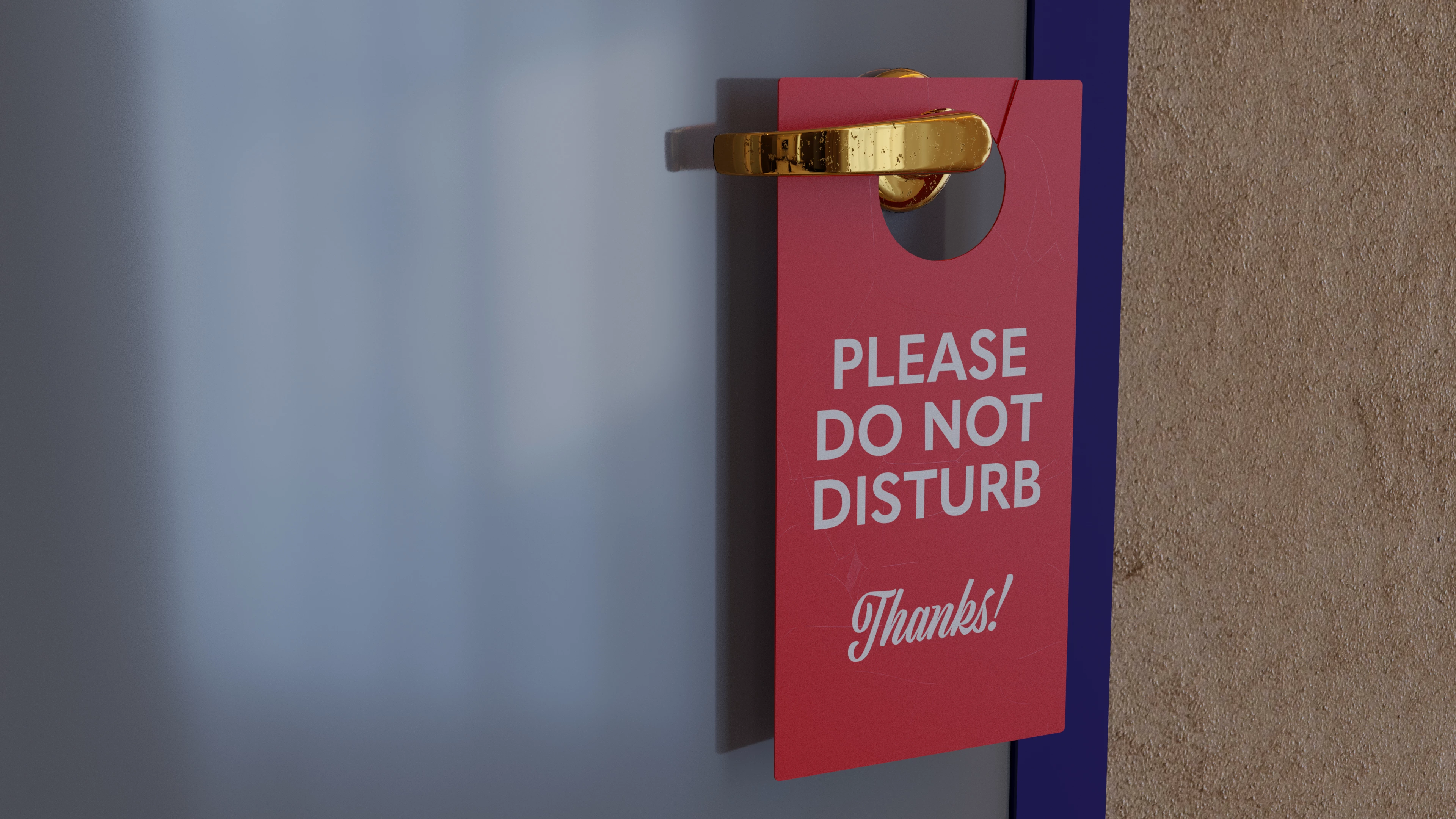
Hoping for some feedback on this one. I have successfully sumbitted images created digitally (3D-rendered). This one was created using Blender. Is there too much technically wrong it? Too much negative space? Thanks for any advice or insight anyone can provide.
I think I can have some improvement ideas as a fellow 3d-artist. These are just an opinions, so nothing too critical.
Even when it is a render, it's still being compared to real photos. As a "photo", its slightly boring, but that can easily be changed!
First: If you were a hotel owner, trying to have customers with your website, would you buy a photo of a scatched old looking "do not disturb" sign photographed on a cloudy day hanging from door hadle that's seen better days? Or would you find a pho
It's not subject related. The exposure together with the noise would be a good hint to correct. The noise is introduced by the renderer to make the image look more realistic, may be there is a parameter or more than one to influence that. The exposure could be influenced with more light in the scene.
If you can't reduce the noise by increasing the render accuracy, it may help to render a huge image, do noise reduction in Photoshop and downsample and sharpen carefully.
Copy link to clipboard
Copied
Hello, What was the rejection reason that was sent with your rejection? The title of the rejection?
This information is important.
Copy link to clipboard
Copied
Thanks for the reply, @ricky336.
Title was "Technical Issues" and "Thanks for giving us the chance to consider your image. Unfortunately, during our review we found that it contains one or more technical issues, so we can't accept it into our collection."
Rather ambiguous. š
Image was rendered at 4K. This preview image is the JPEG version, of course, so what I've shared isn't the highest quality version.
Copy link to clipboard
Copied
The title is enough, the rest is a standard sentence we all here read multiple times with our own failures. š
Copy link to clipboard
Copied
Nice rendering. It looks quite real. You have even some nice subtle noise. That may be a cause... but I would really like to read the refusal reason as asked by @ricky336. All the rest would be guesswork.
Copy link to clipboard
Copied
Thanks, @Abambo.
Their reason for rejection went like this:
"Thanks for giving us the chance to consider your image. Unfortunately, during our review we found that it contains one or more technical issues, so we can't accept it into our collection."
I've taken a couple things into consideration, based on the replies of others, too. The "noise" factor will probably be helped by increasing the exposure in the program's settings, so we'll see what happens when I re-submit. As you say, "all the rest would be guesswork". I successfully submitted a vector image of just the "Please Do Not Disturb" door sign, so we know the issue is not simply subject-matter. š
Copy link to clipboard
Copied
It's not subject related. The exposure together with the noise would be a good hint to correct. The noise is introduced by the renderer to make the image look more realistic, may be there is a parameter or more than one to influence that. The exposure could be influenced with more light in the scene.
If you can't reduce the noise by increasing the render accuracy, it may help to render a huge image, do noise reduction in Photoshop and downsample and sharpen carefully.
Copy link to clipboard
Copied
@Abambo Thanks!
I've already passed it through the "de-noiser" feature, so that can't be helped inside the program itself. Already I've increased to "light" from the strength of the HDRI I'm using for lighting, so that should help. If it still fails royally to reduce the "noise", I'll run with your second suggestion.
Copy link to clipboard
Copied
Copy link to clipboard
Copied
Good call on the exposure issue. After increasing the exposure in the final render (among a couple other things) the image that resulted was accepted. Fortunately, the exposure issue cleared up any excessive "noise" that might have contributed to the first rejection. Thanks so much for the help. š
Copy link to clipboard
Copied
Copy link to clipboard
Copied
Thanks for the response, @jacquelingphoto2017. You're correct it was rejected for "Technical Issues" (The full reason given: "Thanks for giving us the chance to consider your image. Unfortunately, during our review we found that it contains one or more technical issues, so we can't accept it into our collection.") This newb appreciates the feedback 100%!
I'll tweak the exposure settings in the render and see if that makes a difference in solving the "technical issue".
Copy link to clipboard
Copied
My thanks to you for your insight! I did tweak the exposure settings (among other things), but I'm sure that was one key piece to the puzzle. My second attempt at submitting the image was successful. š Cheers.
Copy link to clipboard
Copied
You are welcome @KarlaTS . I wish you all the best of sales.
Copy link to clipboard
Copied
I think I can have some improvement ideas as a fellow 3d-artist. These are just an opinions, so nothing too critical.
Even when it is a render, it's still being compared to real photos. As a "photo", its slightly boring, but that can easily be changed!
First: If you were a hotel owner, trying to have customers with your website, would you buy a photo of a scatched old looking "do not disturb" sign photographed on a cloudy day hanging from door hadle that's seen better days? Or would you find a photo that is little less scratched, photographed on a nice day?
- The lighting atm. looks like a cloudy day, giving quite sad mood to the image. So some better HDRI can help with that, or additional light sources.
- The blue frame seems to be lacking textures. At least add bevel modifier to it
- The background wall texture seem to be quite low resolution. I would find some completely other texture for that. Mabe some little more expensive looking material, such wood?
- Reflections are always cool, so if you change that sign to be some sort of a plastic, it would really make it look better imho.
- I would also turn the sign angle slightly to something ittle more dynamic looking. Perfection rarely exists- .
- You also said there about the "negative space". The composition easily could be changed to have little less of that door, which is not giving much additional "story" to this image.
Copy link to clipboard
Copied
Thanks, @aartturi!
Those are all excellent considerations.
With the HDRI, I made the error of not using it at full strength, so that's one thing I've improved in the second time around. Truth be told, I was considering adding some bump to the blue door frame prior to the final render, and have done so procedurally on the second pass. Background wall texture is another procedurally added bump (node set-up and all that would be too much to get into right now) as opposed to a UV texture, so I may have to work with the camera settings to get that to look more hi-res.
As for the sign, I will give it a shot making it look more "clean" as opposed to scratchy and used, though as you rightly pointed out, there's no "perfect" item in the real world, so it's a fine balance between making it look super neat and polished as opposed to gently uesd.
All super suggestions! Thank you. I'll see if the second rendering yields better results from the mods.
Copy link to clipboard
Copied
@aartturi I have to amend my reply, as I did indeed use a UV texture for the wall. (Sheesh, can't even keep track of my own node tree.) Yeah, I may have to tweak that, for sure.
Copy link to clipboard
Copied
Good to hear you found my comment useful! What comes to node trees, that happens to me typically also. Especially when opening some old files.
Hope your render will do well! š
Copy link to clipboard
Copied
Thanks so much for all your helpful suggestions. I addressed all of them when I worked the latest render, and the submission has been accepted. š In this case, the negative space was not one of the issues, but I'm pretty sure everything else contributed to the first rejection. Helpful advice, indeed.