Copy link to clipboard
Copied
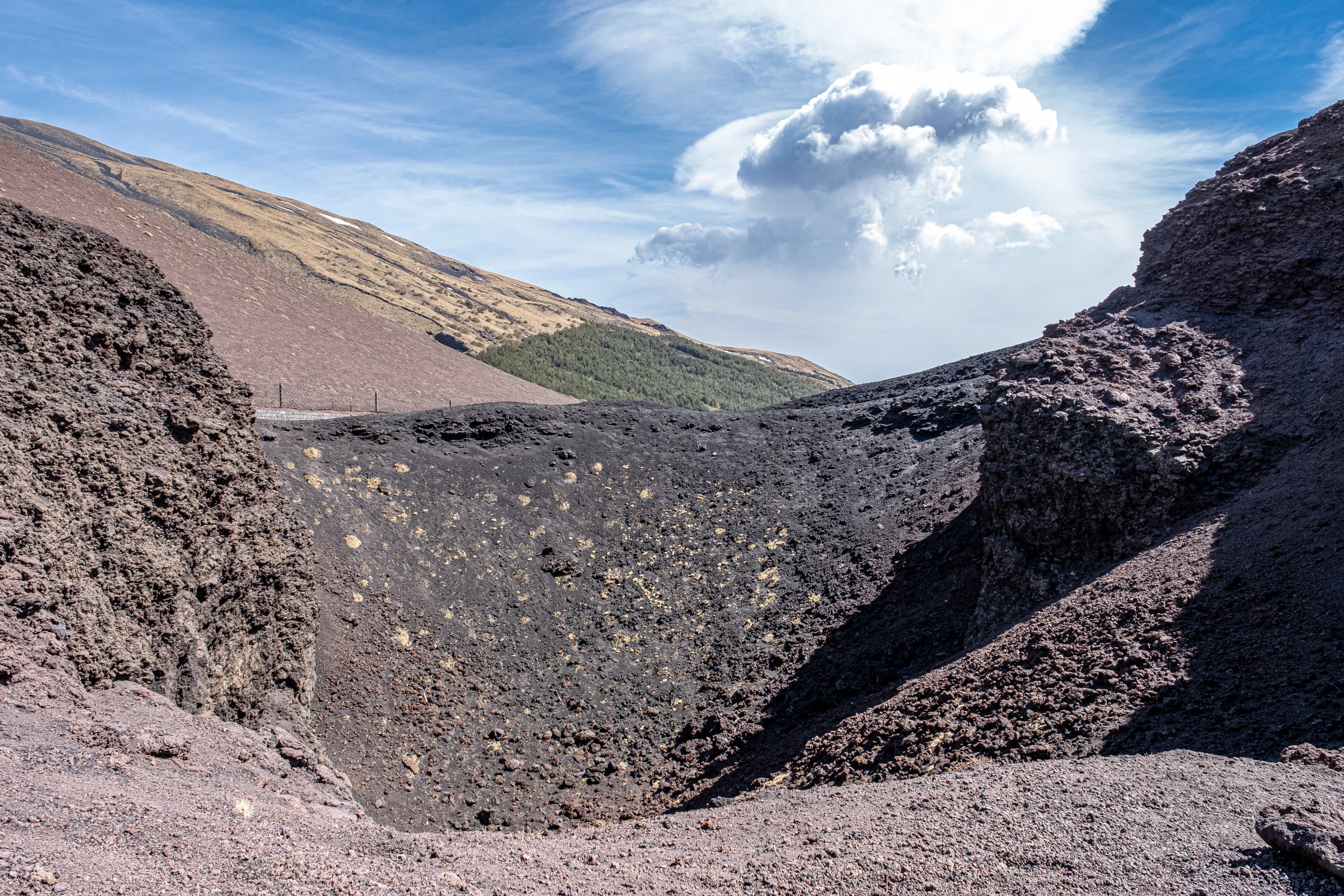
This image was rejected due to Quality Issues, Please review and advise why was it rejected.
Copy link to clipboard
Copied
What about the other image you uploaded? Looks like you don't want feedback on that one?
This one has underexposed shadows and slightly overexposed cloud areas. White Balance is too blue. The foreground rocks and hills are lacking detail when zoomed in - they have a "crushed" appearance with indistinct edges; looks like this is from a cell phone camera?
Copy link to clipboard
Copied
This image is not from a cell phone camera, it is from Fuji XT-3. I left the shadows on purpose, slightly overexposed
clouds don't harm the image in my opinion. What do you mean by "crushed" appearance?
I really want the feedback on the first image, but the various feedbacks seem to be inconclusive.
Copy link to clipboard
Copied
Zoom in and examine the details carefully. Fill the screen with this crop, and you'll see that the edges of objects are indistinct.
Copy link to clipboard
Copied
Your comment is a mistake that alot of contributors make.
"I left the shadows on purpose, slightly overexposed clouds don't harm the image in my opinion"
Adobe sets the guidelines and we must meet them or our images may not be accepted.
Our opinion does not matter and nobody at Adobe is listening to it. At the most, they listen to selected buyers.
The "Community Experts" here in this forum have been chosen from Adobe because we give "conclusive" feedback. If we are not sure, we will tell you that we are uncertain. Many other users also are quite expierenced and give valid feedback. If @Jill_C or @Nancy OShea give you a tip, try resubmitting following their suggestions. They have a good idea of what Adobe is looking for.
Here an example:
(foreground reduced, shadows lightened, clouds filled in, blue color reduced, light and shadows added, fence removed and eye catcher added. Naturaly, the seagulls should be replaced with another bird)
Copy link to clipboard
Copied
Hi Ralph,
Thanks for your constructive tip. I'll certainly keep it in mind.
Copy link to clipboard
Copied
IMO, it needs some WOW factor.
Start by straghtening and cropping out distracting elements from the foreground.
Add some saturation and levels adjustments to boost color vibrance and reduce harsh foreground shadows. See screenshot.
Copy link to clipboard
Copied
Hello,
I think the clouds are fine, exposure, etc., BUT it does need some WOW to it as @Nancy OShea said. Currently, the image is too flat; it needs to 'pop' more!
Copy link to clipboard
Copied
Excuse me for my ignorance, but what WOW stands for? Thanks for your reply.
Copy link to clipboard
Copied
Another question, what does it mean the image "needes to 'pop' more"? Please advise. Thanks.
Copy link to clipboard
Copied
Hi Ricky, one more question. When you say that the image is too flat, do you mean it is not contrasty enough? Please advice. Thanks.
Copy link to clipboard
Copied
Hi Ricky, one more question. When you say that the image is too flat, do you mean it is not contrasty enough? Please advice. Thanks.
By @MoRavid
Yes, needs more contrast!
Copy link to clipboard
Copied
Needs to pop more is just more vibrant in colour! Images should stand out.
Copy link to clipboard
Copied
'WOW', is just wow, - amazing, cool - awesome, take my breath away, knock me over with a feather, blow my socks off, the best thing since sliced bread, and so on. Often the 'wow factor' is used in English to describe something that is more than ordinary!
"Wow, that's an amazing view, photo..."