Hi @adamb232280 ,
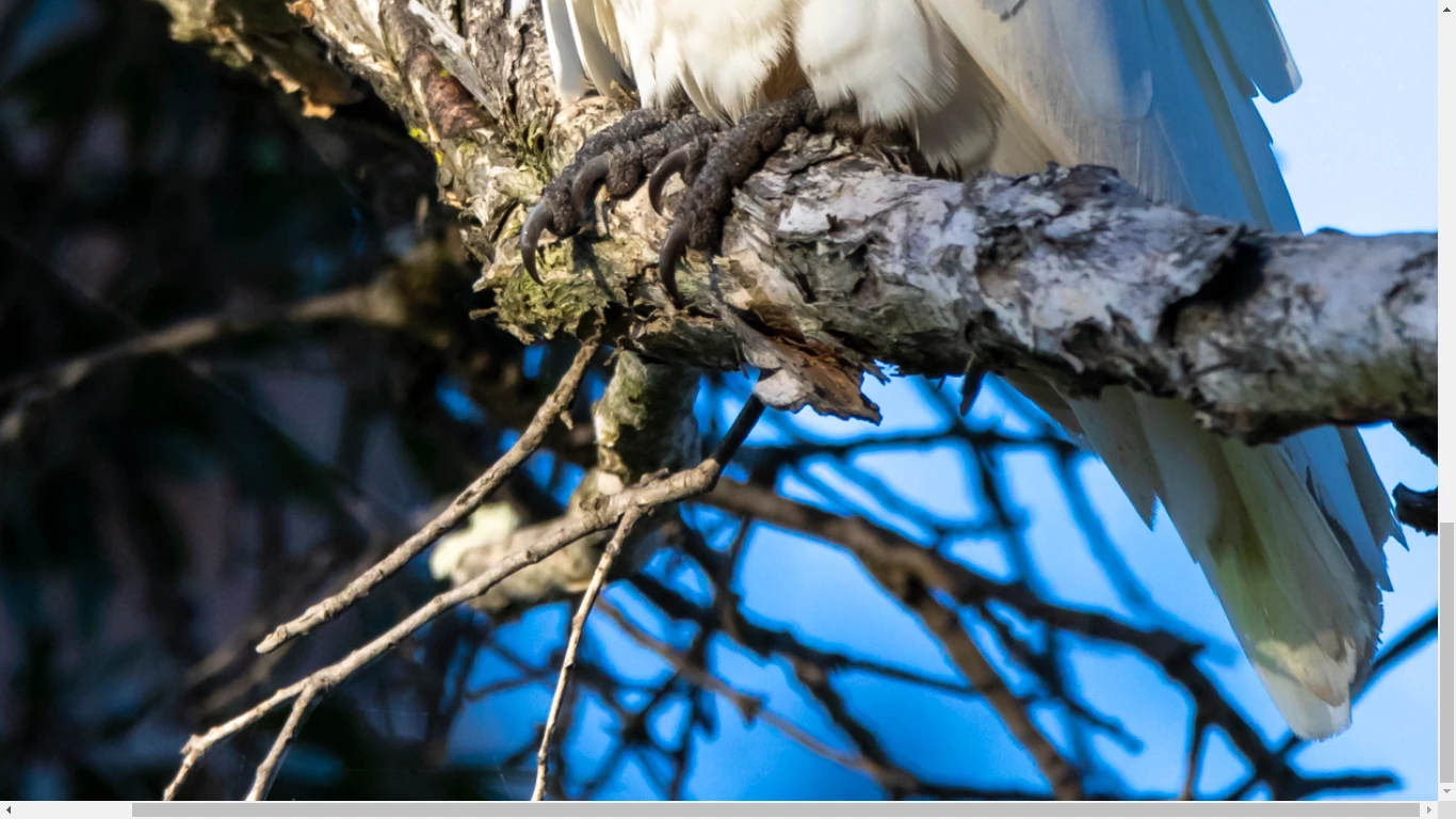
Blue color fringing and white balance issue. I generally never like anything in the forefront to be out of focus. I am not sure what the moderators would say about the bit of branch in the forefront that is out of focus seeing that the main subject seem to be in focus.
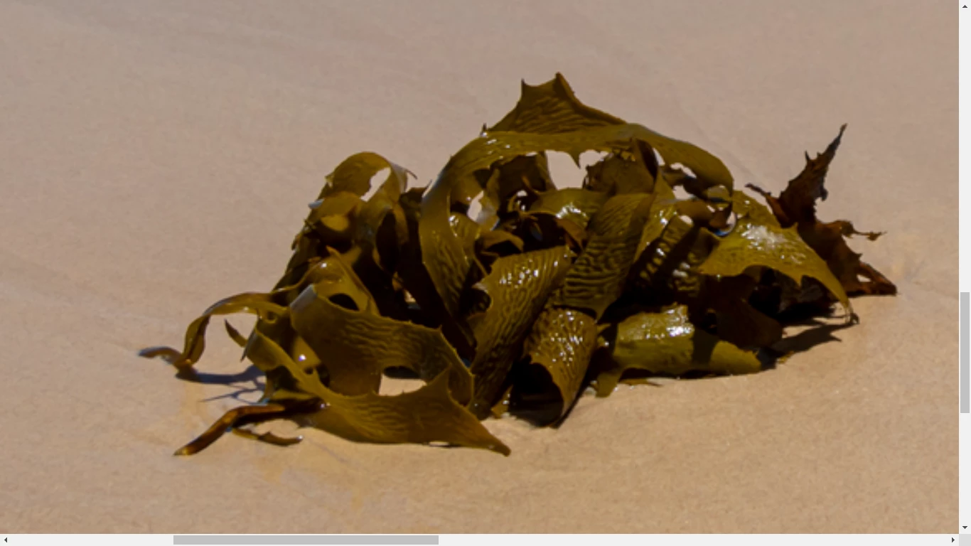
Too much of this framing is out of focus. If the seaweed was the focus then you should zoom in more on it. If the landscape was the subject then you needed to set depth of field to capture the whole scene in focus. Also there is a white balance issue as re the blue areas on the seaweed.
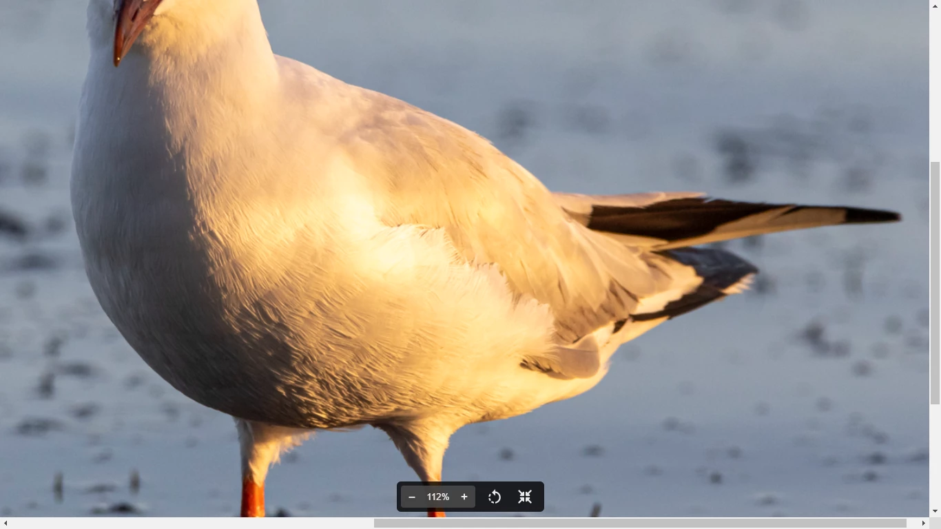
Too much blurry negative space. Needed more depth to include the bird tail within focus. Highlights destroys some details on the side of the bird. It might be slightly under exposed and there is a blue cast over the bird, meaning there is a white balance issue.
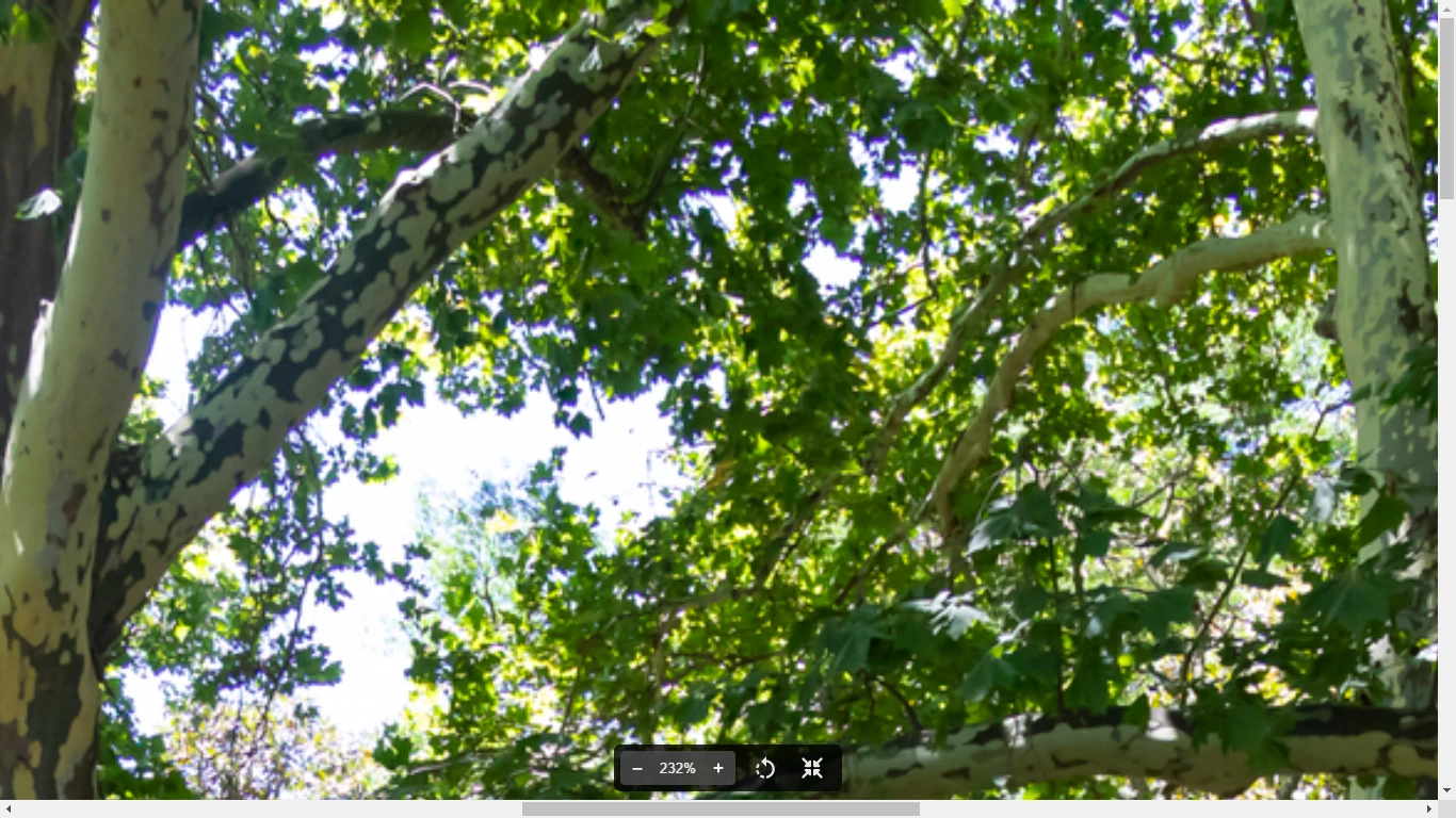
Your focus got lost in the woods. There is a specific technique for landscape photography that you did not implement hence focusing wildly. While I do understand what you wanted to capture, I do agree that the composition is not good. You should either include both whole benches, or only one. This image also have color fringing.
Best wishes
JG
Photographer and Nutrition Author
