This topic has been closed for replies.
Correct answer Abambo

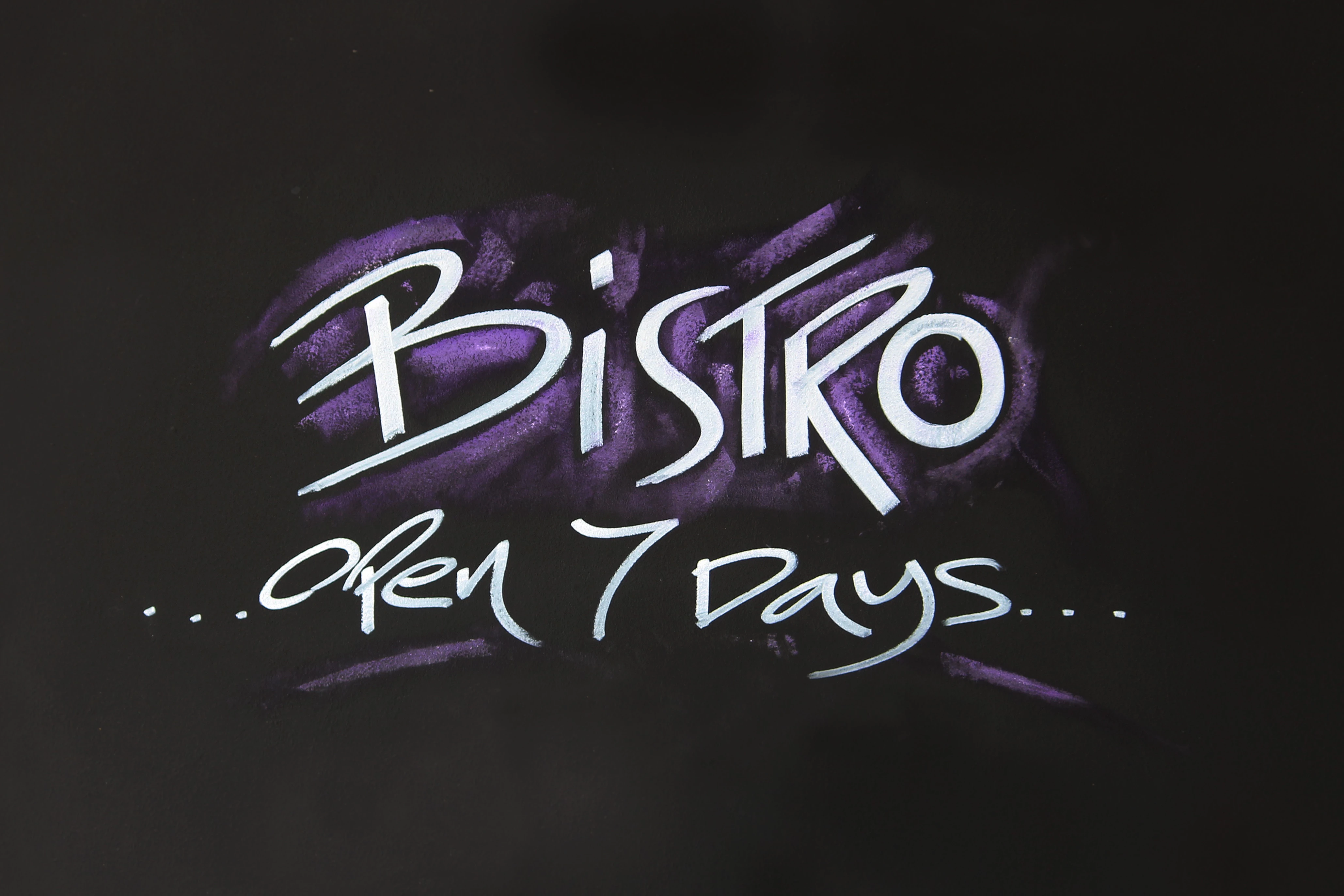
The technical reason is probably the cropping. I would expect to have a bit of the surrounding universe in the picture.


As for other problems:

A little  sharpening and a bit of texture (clarity) together with colour noise reduction may help. However, it may also get an ultimate refusal because of IP violations.


As for the commercial value for the image, I would guess that it won't be a bestseller.

2 replies

Nancy OShea
Community Expert
Community Expert
June 21, 2021

Was this submitted as a JPG bitmap?  If yes, it has no commercial appeal.  I would not buy it.


Or was it submitted as a vector Illustrator file that the customer can edit to change the message?  Obviously, that would have more commercial appeal to potential customers.


Before you submit images, ask yourself who will buy this and how will they use it?


Nancy O'Shea— Product User & Community Expert
rose 6060Author
Known Participant
June 21, 2021

Hello Nancy, It was a jpg not a bitmmap image. My question was not about the commercial appeal of the image - it was about the technical issues. 

Nancy OShea
Community Expert
Community Expert
June 22, 2021

Pixel-based raster images = bitmaps, jpgs and pngs.  You can't have commercial appeal without good technical quality. 


If you want to create signs as JPGs that nobody can edit, you won't get many sales.  On the other hand, if you create signs as vectors that people CAN edit, your quality will be 100% better and you'll make more sales. 


Nancy O'Shea— Product User & Community Expert
J E L
Community Expert
Community Expert
June 21, 2021

@rose 6060 Is this a photograph of someone else's sign or graffiti design or your own graphic? I can't immediately think of any stock applications for it. If a designer needed an image of a sign with this generic message they most likely would create it with their own tools, fonts, and colors. Also, it doesn't appear in focus to me and there is some sort of black shadow that's overlapping the white letters.

rose 6060Author
Known Participant
June 21, 2021

Hello Jain

So what are the technical issues? - is it the focus? and I am not sure what you mean about a black shadow? 

rose 6060Author
Known Participant
June 21, 2021

Yes, technically it is out of focus and by the black shadow I mean that you've applied some type of blackish stroke or brush wash over the white letters and maybe you were going for a grunge or textured look or something but it hasn't been applied well in some letters and looks like bad shadowing. This would be better submitted as a vector file to get the crispy look that text requires.


Its a photo of chalk on a black board nothing was done to the lettering?