• Global community
    • Language:
      • Deutsch
      • English
      • Español
      • Français
      • Português
  • 日本語コミュニティ
    Dedicated community for Japanese speakers
  • 한국 커뮤니티
    Dedicated community for Korean speakers
Exit
0

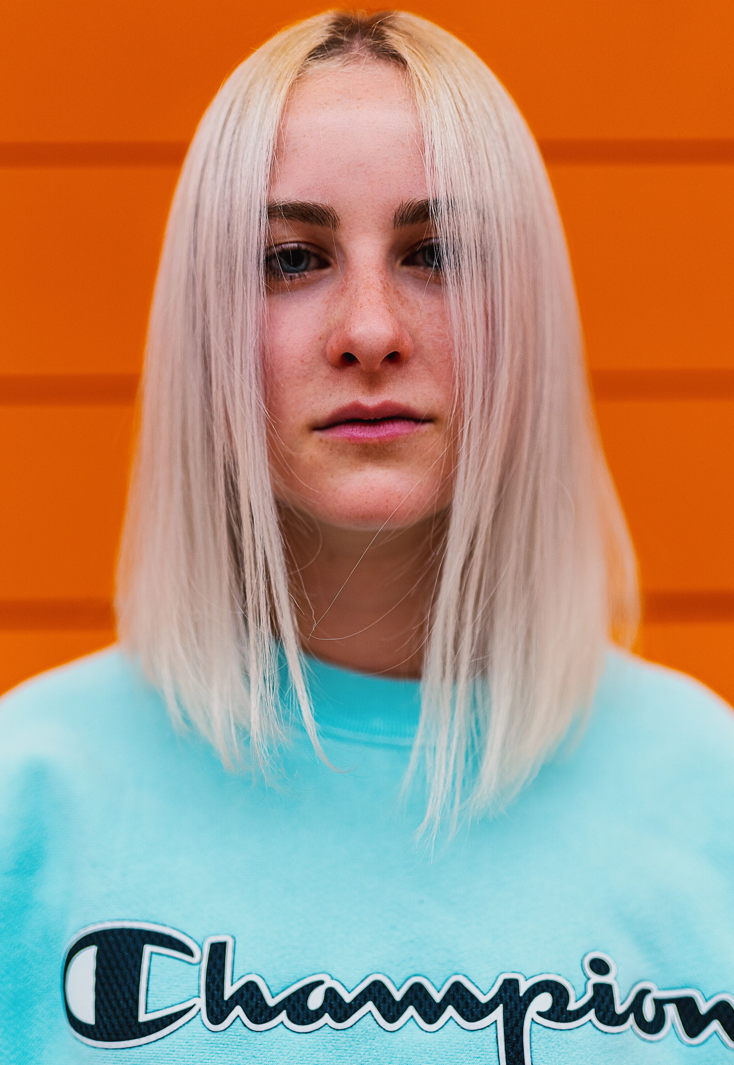
What do you think about the Picture?

New Here ,
Jul 02, 2019 Jul 02, 2019

Copy link to clipboard

Copied

Hey i was wondering if some of you have some suggestions for improvements in both Technical Part and Post Processing (Look and Retouching).

Thank you in advance guys.
_DSC4793_srgb_medium.jpg

TOPICS
Contributor critique

Views

299

Translate

Translate

Report

Report
Community guidelines
Be kind and respectful, give credit to the original source of content, and search for duplicates before posting. Learn more
community guidelines
Advisor ,
Jul 02, 2019 Jul 02, 2019

Copy link to clipboard

Copied

Hello leonw84507179 , This is a good photograph of a delightful model. There appears to be a bleed of the background orange into the light hair.  Needs to be cleaned up. The Orange dominates the photograph so soften or change the background. Check your white balance. Look at the Histogram and bring the colors down for a more useable shot. The word Champions also has a halo around it. Did you send a model release? Is the Word Champions trademarked or owned by a company? Check your white balance. Here is a link to more information for Adobe Stock Contributors. Regards, JH

https://helpx.adobe.com/stock/contributor/help/quality-and-technical-issues.html

Select an article:

ON THIS PAGE

Applies to: Stock Contributor

For content to have commercial value, it must be of high quality. Learn about the quality and technical issues and how to avoid content rejection.

TIP S ON: ARTIFACTS, NOISE, BLURRS:


Property release and protection guidelines for Adobe Stock should give you a clearer understanding of what is required. Known image restrictions will give you a more comprehensive knowledge of what is not accepted, and with other's, what composition

Votes

Translate

Translate

Report

Report
Community guidelines
Be kind and respectful, give credit to the original source of content, and search for duplicates before posting. Learn more
community guidelines
Community Expert ,
Jul 03, 2019 Jul 03, 2019

Copy link to clipboard

Copied

Well, it's too orange, the skin tone is orange etc. Secondly, the background is not good, apart from the orange, which makes everything orange, the lines cut through the person's head! It is also cropped too closely - I think.

I think the focus isn't good either.

To improve - take it again and think about the type of background more about how the colours work together.

Votes

Translate

Translate

Report

Report
Community guidelines
Be kind and respectful, give credit to the original source of content, and search for duplicates before posting. Learn more
community guidelines
Community Expert ,
Jul 03, 2019 Jul 03, 2019

Copy link to clipboard

Copied

LATEST

The first refusal reason would be the Champion logo!

The second is the colour balance. A red (orange) background like this one fools the automatic white balance.

My third is that the shadowy eyes region makes you picture less attractive. But may be you wanted to create a kind of sad mood.

ABAMBO | Hard- and Software Engineer | Photographer

Votes

Translate

Translate

Report

Report
Community guidelines
Be kind and respectful, give credit to the original source of content, and search for duplicates before posting. Learn more
community guidelines