New Participant
August 30, 2018
Answered

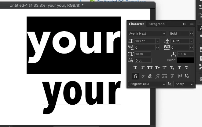
Avenir Next Font – Letter U

  • August 30, 2018
  • 5 replies
  • 18164 views

The letter U in the Avenir Next bold font (which installs with the Mac OS) has a problem that is showing up only when used in Adobe applications. Look at the letter U in this screenshot. It appears larger than it should All characters are the same size, no stroke, no scaling applied. This does not occur in any non-Adobe application. Is there a bug that needs to be fixed?

Correct answer Daniel E Lane

It's absolutely true, and quite bizarre. The problem with the lowercase u is most severe for me in Avenir Next Condensed. The font works as expected in MS Word, but is way too big in Adobe CC -- PS, Ill, and ID. I'm being forced to switch to something like Proxima Nova for a versatile condensed font.


Make sure you have the latest version of Photoshop installed as well as the latest updates to you Mac OS, because it seems the issue is fixed with the latest updates.

Top row is Anenir Next. Bottom is the condensed version

5 replies

hadleyk78468788
Known Participant
April 22, 2024

I am writing from 2024 and having this problem too!

I am on iMac Sonoma latest version, using the latest version of licensed Adobe products. Avenir Next Condensed.ttc is a Mac system font and cannot be deactivated, therefore I can't download a different .ttf or .otf version and try that. The system font is always the one used.

The lower case "u" in Avenir Next Condensed used in InDesign when saved to PDF has a higher X height than the other letters. When zoomed in to about 200% it looks normal.

I need to save the documents to PDF and they will be used as PDFs online most likely at 100%, they will not be printed and workarounds like saving to another program and then writing the PDF from there aren't an option. Adobe has told me the font is a restricted font in Adobe, therefore they can't offer any solutions.

Is there any feasible solution to this? This is my client's brand font and they are not happy about the way it looks.

Abambo
Community Expert
April 22, 2024

How is the font when you use it in Word or similar?

ABAMBO | Hard- and Software Engineer | Photographer
hadleyk78468788
Known Participant
April 22, 2024

Thanks for your reply! In Word it looks fine, but when exported to PDF from Word and viewed in Acrobat it is bad.  So the problem is with Acrobat. This is what Monotype told me as well.


Adobe has said that it is a restricted font and therefore, I guess, they aren't doing anything to alter this artefact.


Adobe suggested that I get a different version of the font (.ttf or .otf) and use that, but since Avenir Next Condensed is a Mac system font, I don't think I can override it or deactivate it. At least I don't know how....

Known Participant
February 18, 2020

This has been going on for quite a while through many versions of indesign. My printers, working from my PDFs, have no problem when they rip the PDF for printing.


Clients are a bit offput, but they calm down when you ask them to zoom in on the 'u'.  The problem disappears oddly enough.

New Participant
August 12, 2020

thank you for sharing. we are having the same issue.

New Participant
October 2, 2019

Hi There! I'm experiencing this issue also, and the suggested solution unfortunately didn't do the trick for me. My mac is up to date, my indesign is up to date. I've attempted to uninstall and reinstall the fonts. But my 'u' character continues to look this this: 


Any other suggestions would be super appreciated.


kellip16335071
Participating Frequently
October 14, 2019

I'm having the same issue. My Mac and InDesign are all up to date. I have the TrueType version of Avenir Next. I'm working on an email image for a client and the "U"s are all jacked up throughout. This won't be printed since it's an email image, so it has to look good.
Part of the image below. The "Y"s look off too! Frustrating! If anyone has a solution that would be great. Thanks!

Daniel E Lane
Inspiring
January 24, 2019

Glad to help!

CJS1953
New Participant
January 24, 2019

I’d gladly click correct, but see no place to do that.

Lukas Engqvist
Community Expert
August 30, 2018

It could be the size you are viewing the font that affects it. Please confirm that the text is not converted to outlines in the case you are showing. If you convert a font to outlines you lose the font hinting which is the detailed instructions that tell the font to nudge an anchor point  to round up or to round down. It looks like the problem is both ways, the O seems to be rounded down and the height of the u too tall. What application is this? If the font Truetype or OTF ?

New Participant
August 30, 2018

It is not the viewing size. It is not outlined. App is PhotoShop but it occurs in all Adobe CC. I'm aware sometimes fonts render on screen oddly in Acrobat. That is normal. They will print fine. What's happening here will not print fine. Font is the TrueType version that is installed with the Mac OS. I have obtained the OpenType version for testing purposes and it works perfectly fine. Workaround in place; problem solved you may think? Nope. A partner prefers to avoid use of any version of this font anymore because of this issue. I'm in this field for about 30 years. I've seen most everything. This is a problem with Adobe software conflicting with the font. I'd like to see a reply from an Adobe engineer. While I appreciate it, rank-and-file responses likely will not help here.

CJS1953
New Participant
January 23, 2019

It's absolutely true, and quite bizarre. The problem with the lowercase u is most severe for me in Avenir Next Condensed. The font works as expected in MS Word, but is way too big in Adobe CC -- PS, Ill, and ID. I'm being forced to switch to something like Proxima Nova for a versatile condensed font.