- Inicio
- Using the Community
- Hilos de conversación
- Re: New red logo is ugly and jarring to the eye.
- Re: New red logo is ugly and jarring to the eye.
New red logo is ugly and jarring to the eye.

Copiar vínculo al Portapapeles
Copiado
For a design company Adobe sure has some ugly and bad looks. the new red A is one of them.

Copiar vínculo al Portapapeles
Copiado
looks orange here...

Copiar vínculo al Portapapeles
Copiado
looks orange-ish on my screen too
Copiar vínculo al Portapapeles
Copiado
Adjust your screen color. It bright red for me.
Copiar vínculo al Portapapeles
Copiado
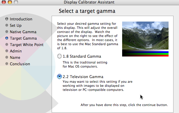
No way am I going to adjust the "screen" color of my calibrated and profiled monitor! I hope you are just joking.

Copiar vínculo al Portapapeles
Copiado
PjonesCET wrote:
Adjust your screen color. It bright red for me.
No.
My laptop is likely quite typical of the "average" user's screen. I'm not going to make adjustments for Adobe's logo! and furthermore it IS orange-ish! Look at the logo and then further down for Adobe Air's logo. Definite difference. Even on my lowly, uncalibrated monitor.

Copiar vínculo al Portapapeles
Copiado
You mean you have no way to save Multiple profiles?

I have two settings one for the internet This one. And one using choice 1) for Work on Mac Files I use for myself.
Copiar vínculo al Portapapeles
Copiado
You mean you have no way to save Multiple profiles?

I have two settings one for the internet This one. And one using choice 1) for Work on Mac Files I use for myself.
Also the item you say for are is more of a burandy red or deep red.
Copiar vínculo al Portapapeles
Copiado
Pardon me for asking this, Phillip: Do you have the slightest idea how to calibrate and profile a monitor?
Copiar vínculo al Portapapeles
Copiado
PjonesCET wrote:
You mean you have no way to save Multiple profiles?
I have two settings one for the internet This one. And one using choice 1) for Work on Mac Files I use for myself.
Also the item you say for are is more of a burandy red or deep red.
Phillip,
Please refer to my post here:
http://forums.adobe.com/message/2053935#2053935
![]()
Copiar vínculo al Portapapeles
Copiado
"The beginning of the end, my friend..."
Copiar vínculo al Portapapeles
Copiado
So, that's what it is? I thought it was a squashed pyramid... you know, all about being a monolithic institution.
Copiar vínculo al Portapapeles
Copiado
it does look squished, doesn't it? like it's height is set to 95% or something?
Copiar vínculo al Portapapeles
Copiado
Click on HOME at the top of the forum main page to see the logo displayed correctly:


Copiar vínculo al Portapapeles
Copiado
No matter how its displayed its still ugly and jarring.
Copiar vínculo al Portapapeles
Copiado
Buko. wrote:
No matter how its displayed its still ugly and jarring.
"Macromedia's revenge"?

Copiar vínculo al Portapapeles
Copiado
Buko. wrote:
For a design company Adobe sure has some ugly and bad looks. the new red A is one of them.
I agree completely.
The odd part is that this is the inverse of the Adobe logo that is present in the Admin icons. That is much more pleasing, with a white background and red triangles. Almost like someone does not know how to use PhotoShop and hit the inverse button by mistake.
Copiar vínculo al Portapapeles
Copiado
They don't know how to use dreamweaver either!
here:

adobe.com:


Copiar vínculo al Portapapeles
Copiado
I agree, it's squished and it's orange-ish
Copiar vínculo al Portapapeles
Copiado
They could have sampled red from my dahlia - I don't charge much ![]()
Copiar vínculo al Portapapeles
Copiado
... if they asked nicely I could probably have helped them not distort it too ![]()

Copiar vínculo al Portapapeles
Copiado
New red logo is ugly and jarring to the eye.
greenjumpyone wrote:
I agree, it's squished and it's orange-ish
I think buko needs to calibrate his monitor! ![]()


Copiar vínculo al Portapapeles
Copiado
PETA will be on your butt for baby harp seal abuse.
Copiar vínculo al Portapapeles
Copiado
It's unsquished.

Copiar vínculo al Portapapeles
Copiado
A stretched Jack O'Lantern?
-
- 1
- 2
Encuentra más inspiración, eventos y recursos en la nueva comunidad de Adobe
Explorar ahora