



Alexis Van Hurkman
Community Manager
Community Manager
April 15, 2026
StickyNews

Now in Beta: Introducing Color Mode
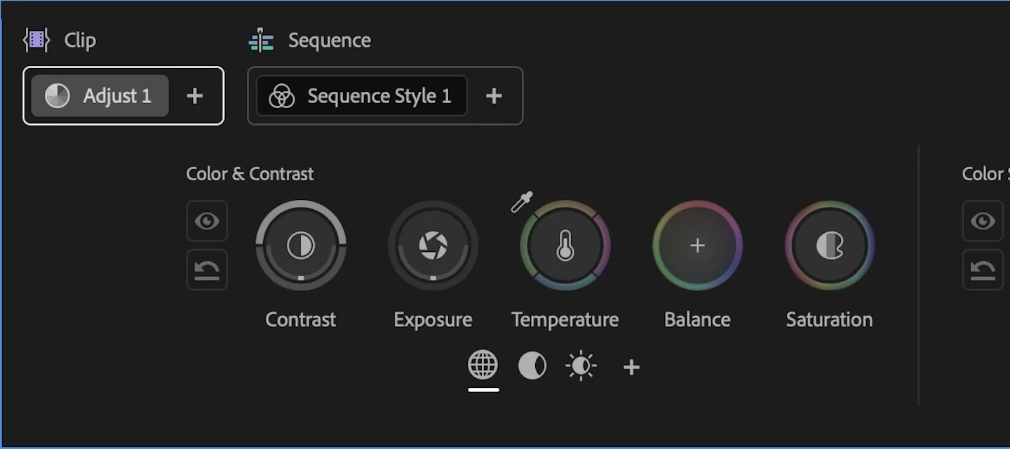
Welcome to the public beta of our brand new Color Mode! This is a colossal release that's been years in the making, months in private beta, and now we're excited to share it with you. Here's all the most important information to get you started.

Resources for Learning About Color Mode

Given how new this is, we've prepared the following videos and articles to get you up to speed on Color Mode as quickly as possible. 

About Color Mode

Color Mode is a brand new approach to color grading created specifically for the needs of editors. It's been designed to be an accessible, fast to learn, and efficient environment for making every clip in your sequence look its best right inside of Premiere. However, Color Mode has also been built to provide the full functionality necessary for users at every level to make highly detailed improvements as well as the broad stylistic enhancements necessary to prepare any edited sequence for delivery to the audience in its best form.

Whatever your level of color knowhow, Color Mode gives you a streamlined and uncluttered color adjustment experience. Learning how to examine and evaluate the image is the most important skill necessary for successful color, and Color Mode has been carefully designed is to keep your eye on the picture as you work. The default layout deliberately maximizes the size of the Color monitor (depending on your computer’s display size), minimizes other onscreen distractions to only what’s essential to guide you through the process, and provides color-specific panels that aren’t available in Edit mode to accelerate your color workflows.
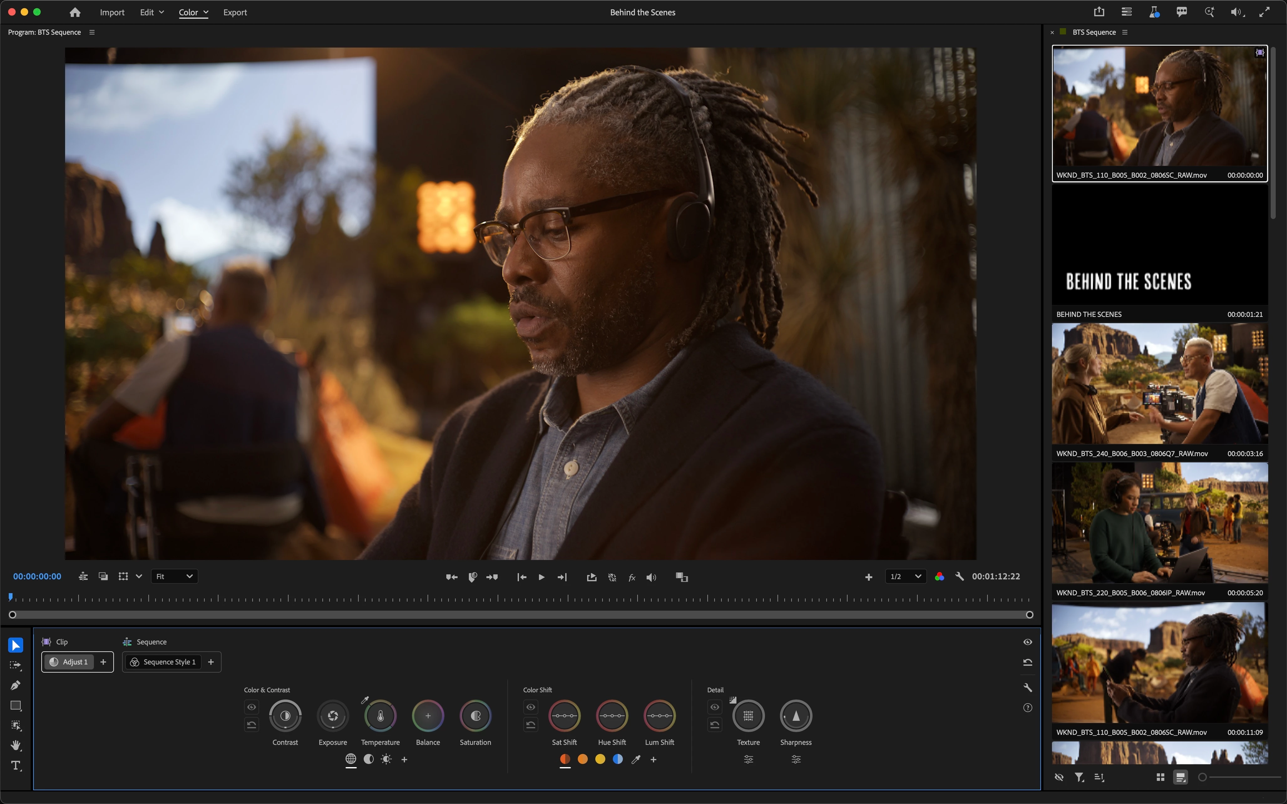
The default Color Mode workspace

The Clip Grid, available only in Color Mode, makes it fast to select any clip for sequence navigation and immediate adjustment. It can be positioned vertically or horizontally, and has many functions that help you organize your work via filter and sort, manage color operations via copy and paste, and make complex selections quickly in order to create groups for grade management.

The Clip Grid positioned horizontally

The Color Controls panel has been designed to expose maximum color adjustment functionality within minimum space, so you spend more time grading and less time opening collapsed groups and scrolling around to find what you need. Adjust operations give you surgical control over the image, while Style operations let you use saved Style presets or build-your-own combinations of modules designed to make artistic adjustments fast and fun. Two dimensional color controls let you simultaneously adjust related parameters for maximum creative control, while a heads-up-display gives you contextual analysis and guidance when you need it, disappearing when you don't. 
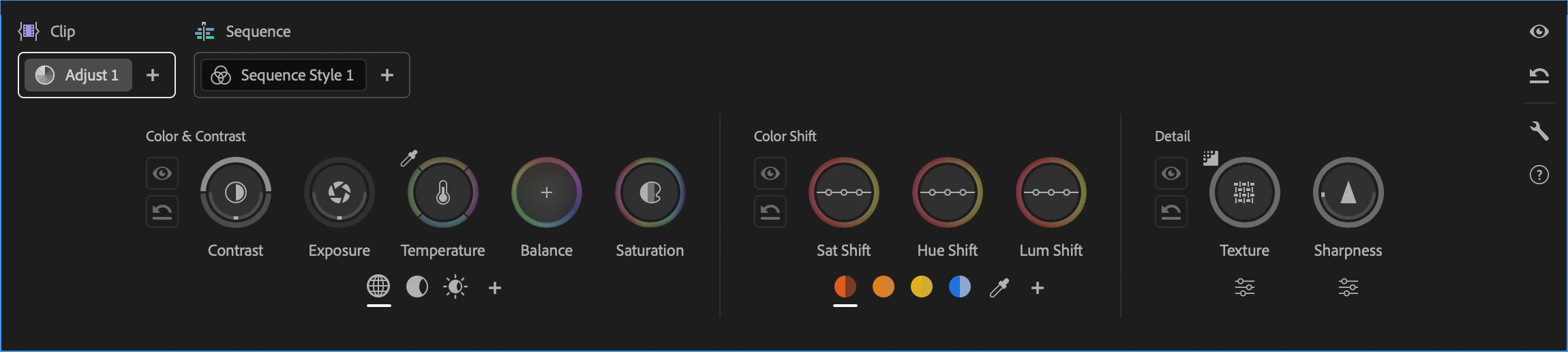
Color controls for the selected Adjust operation

Color Mode also makes it easy to apply operations at every level of your grade, to adjust the entire sequence at once, specific custom groups of clips, or individual clips as your needs require. When applied to the sequence or a group, an operation automatically ripples changes to all connected clips, making alterations fast and simple. Every clip starts with an Adjust operation you can use to make surgical corrections to images, while a default sequence Style operation lets you apply a Style Preset to the entire sequence to give it a show look, or create your own look by mixing and matching Style Modules, which are customizable color effects.
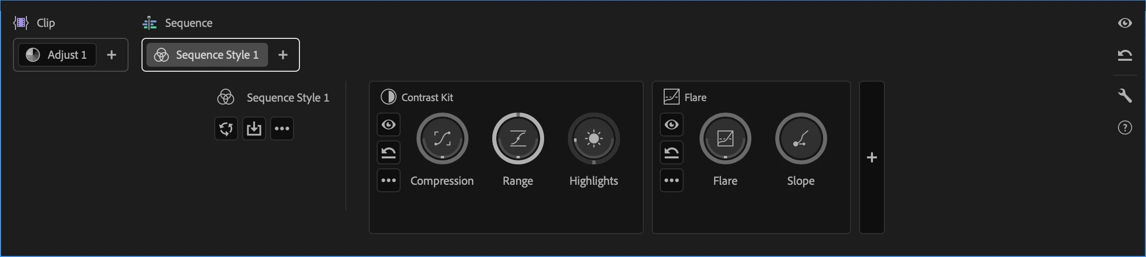
Style modules within the selected Style operation

Lastly, the Color monitor has specific features to facilitate color workflows. For example, you can switch between sequence and clip playback modes in the time ruler to either navigate the entire sequence quickly (in sequence mode) or focus deeply on the clip at hand without accidentally navigating to another clip (in clip mode). A new Solo mode lets you suspend compositing effects and superimpositions so you can specifically monitor a single clip you’re adjusting, without the distraction of superimposed graphics or clips getting in the way.

About the Public Beta

While Color Mode is nearly complete, it’s still a work in progress. However, the end-to-end workflow we wanted to give in this first version of Color Mode is fully operational, so we invite you to give it a try, kick the tires, and give us your feedback. Tell us what you like, because it’s important for us to hear what’s working. Tell us what you think could be improved. Above all, feel free to reach out on the public beta forums.

How Should I Test This?

Color Mode is a massive update, and the public beta is an ongoing work in progress. While we’ve taken pains to provide the best experience possible, you should expect issues to arise from time to time. When these happen, we’d appreciate it if you would use the Adobe bug reporting mechanism and let us know what you were doing in the provided dialog.

We’re confident that we’ve given you new workflows you’ll love, and we’d be very happy for you to test with real-world edited sequences of various lengths and sizes. However, changes are anticipated over the course of the public beta  as we make improvements and respond to user feedback, so we don’t recommend doing client work just yet.

Ongoing refinements to Color Mode at this stage may impact the project format, so consider every project you create that uses Color mode to be potentially disposable. For the best experience, import duplicates of projects with sequences you want to test using, or import new media into a fresh project. 

Note: There are no limitations over what kind of media you are encouraged to test with, although 8K media is known to have performance issues when used at an 8K sequence resolution.

Premiere (beta) Project Compatibility

While it's possible to take a project created in Premiere (beta) with Color Mode and open it in Premiere 26, this isn’t recommended as you won’t be able to access any of the beta features in the shipping version, including the new color effects in each clip, group, and sequence operation. Given the magnitude of the changes in this particular beta of Premiere, we do not recommend moving projects freely between versions.

To avoid inconvenience, we recommend you use duplicate projects with sequences that you'd like to work with for learning and testing Color Mode, and we strongly advise against using this public beta for mission critical client work.

If you do open a Premiere (beta) project in Premiere 26, you’ll be warned about missing color effect and sequence color effect video filters. If you continue, you’ll notice that graded clips contain an offline filter corresponding to the color effect. The safest thing you can do in this instance is to quit without saving and reopen this project in Premiere (beta).

Color Management

Color Mode is designed to work on sequences using Color Management. This is meant to give you the best starting point for grading clips in all supported color spaces, log-encoded, or raw. Using Color Management, you’ll get great results using the Direct Rec. 709 (SDR) color setup that’s the default for most new sequences.

Important: You should always double-check that sequences are using the correct color setup before you start grading. Using the wrong color setup could give you unexpected results and changing the color setup you’re using after you’ve made color adjustments is not recommended as it will likely change the appearance of your clips.

As you experiment, you may also want to try the newly improved Wide Gamut (Tone Mapped) color setup to see the differences in workflow. The default Tone Mapping and Gamut Compression settings have been improved to work correctly with graphics and SDR media using the new Apply Inverse Tone Mapping checkbox in the Advanced settings. This new option is a work in progress during public beta, so your feedback is critical to making sure we’re giving you the results you need.

No matter which color setup you use, every feature in Color Mode has been designed to make grading and delivering HDR output a pleasure, so try choosing either the Rec. 2100 HLG or PQ output color spaces and using all the available Adjust and Style tools to grade HDR highlights if you have an HDR display you can use.

After Effects Interoperability

Because of the extensive changes being made to how color grades are managed, After Effects interoperability for clips that have been graded using Color Mode remains a work in progress, and should be avoided until further notice. We remain committed to robust After Effects interoperability so making this a great experience is a priority for us.

Color Mode Replaces the Lumetri Panel

While the Lumetri Color effect remains available in the Color Correction bin of the Effects browser, the Lumetri panel has been replaced by the Color Management panel to support the new Color Mode. Previous projects using Lumetri will import correctly and appear as before, with total color fidelity. If you want to continue making Lumetri color adjustments or adding more Lumetri Color effects, you can do so using the Effects Control panel.

Avoid Using Lumetri Color and Color Mode Together

If you’re beginning a new project, we encourage you to use Color Mode without also using Lumetri Color effects. The Lumetri Color effect has several disadvantages compared to Color mode, including:

  • Some controls in Lumetri Color clip out-of-range color values so they’re not retrievable in subsequent adjustments. Color Mode does not.
  • Lumetri Color controls have a more limited range of adjustment. Color Mode gives you greater range to make bigger changes.
  • Lumetri Color does image processing differently than the significantly more color space-aware tools that have been newly created for Color Mode. 
  • Lumetri Color controls were primarily designed for SDR grading. Color Mode tools have been built to make both SDR and HDR grading easier and faster.

Avoid mixing Lumetri Color with the Color workspace; using Lumetri often restricts your grading options in Color Mode.

There Are New Fast Color Features in Edit Mode

If you want to make fast color adjustments in Edit mode, the Properties Panel has a new Color section with a set of basic correction controls that you can use. These adjustments work in conjunction with Color Mode to provide you a seamless experience. You can make simple and fast adjustments to fix issues with individual clips in Edit Mode, while using the streamlined workflows in Color Mode to quickly grade your overall sequence with more creative controls. 
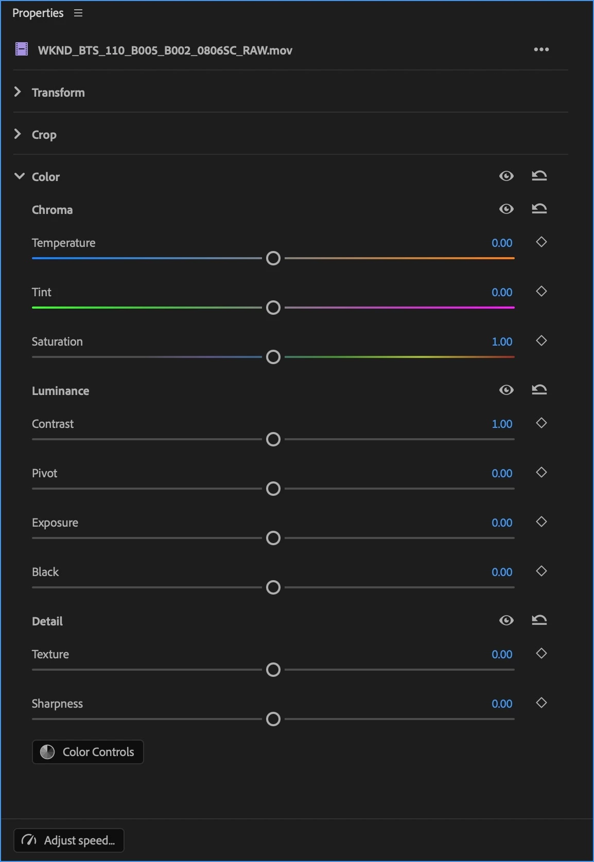
New Color controls in the Properties panel

Clip Match Has Been Removed

Changes to Premiere required the Clip Match feature of Lumetri be removed, as well as the clip comparison mode of the Monitor in Edit mode (clip comparison is available in Color Mode).

Finish Critical Projects in Version 26

If you want to continue using Lumetri as it was to finish a work in progress, we encourage you to continue using the shipping version of Premiere version 26 until you’ve finished.

One Last Note From the Architect

On a personal note, back when I wrote the Color Correction Handbook, I had no idea that I’d someday have the opportunity to bring everything I’ve learned to a re-imagination of color workflow this ambitious. Color Mode is the product of a career's worth of work as a colorist, of research, of talking with countless colorists and post production artists, and lessons learned building all kinds of other color tools and workflows. With the help of my close collaborators in Design, Engineering, Project Management, and Product Marketing here at Adobe, we would all like to introduce this new color experience.

While we've worked hard to provide as complete a color workflow as we could on day one, Rome wasn't built in a day and this is only the beginning; we have an ambitious roadmap and there's much more to come, so I invite you to give it a try and have fun exploring what we’ve created!

269 replies

Participant
October 8, 2026

Good Job.

Of course, we need to let go of our old habits.

Perfect with a trackball.

Translate
Participant
October 7, 2026

This new color correction panel is a good idea, but in practice it’s not what I expected.


What I like:


This new “node” mode, organized like layers, that encapsulates one adjustment chained after another. It’s an organized way to work with color.


These new adjustment wheels are designed to be clearer than a drop-down menu.


What I don’t like:


The color wheels have a very small fixed size, and on high-resolution screens, they look too small compared to the rest of the interface.


When you click on one of the controls, the adjustment is made by moving the mouse, without any visible cursor or adjustment bars. The adjustment simply changes as you move the mouse—intended to be intuitive but ultimately unpredictable and awkward.


It seems like an attempt to implement Davinci Resolve’s color panel, but poorly executed.

Translate
R Neil Haugen
Legend
October 8, 2026

It is not intended to be like unto any other color manipulation system … note how so many of the ‘base’ controls do two different things simultaneously … via horizontal versus vertical movement?


And the math under it ain’t like anything before. This is really where most new to this system struggle, as they are trying to think in terms of using other colot tools. It’s certainly where I struggled as one of the first private beta testers! Alexis laughs at my initial reaction which was nowhere near as genteel as yours.


The underlying concept is built on first reducing the differences between groups of clips fast, then trimming difficult clips, and also is done as easily by starting with an overall ‘look’ applied or as by applying that anywhere in your grading process.


The size of the HUD displays is set by user choice …. my ultrawide can show them pretty large, so I’m wondering if you’ve gone into the context menus and set your HUD to your taste?


As is movement of the corrections … you may need to set your mouse/cursor movement differently to use this smoothly.


I really found this a pain until I got the intent and worked within how it’s designed to work. As was needed with SpeedGrade and of course is needed with Resolve or Baselight. And found I could get ‘colorfulness’ … greater apparent saturation … in the upper mids in this past what I can get anywhere else, without breaking any data level requirements of Rec.709. 

Translate
Everyone's mileage always varies ...
DJP2014
Inspiring
October 1, 2026

Would love to see a ramp overlay feature added. Kinda like this.

Really helps me visualise what the new curve controls do.


Translate
Inspiring
September 24, 2026

Is there a way to keep adjustments in sync between several clips and sequences now?

In the early beta there hasn’t been such a feature yet. Similar to a shared node in DaVinci and how groups work within a sequence. But I need to share some grading for multiple sequences - so this would be super useful - without going into copy and paste hell or having to version my clip styles.

Translate
R Neil Haugen
Legend
September 24, 2026

Have you saved looks and grades in Color Mode yet? As then, you can apply saved things to groups.

Translate
Everyone's mileage always varies ...
Inspiring
September 24, 2026

I assumed that they don’t stay in sync then, by the wording of it. Basically you can save it as a group - and when you click it it create a local copy of the saved preset - just how all the effect presets always worked. Is this not the case?

If I have to drag the updated group back into every sequence every time, this seems like huge unnecessary pain.

Translate
Inspiring
September 19, 2026

Hello!

I started using Premiere in 2013 and edited and graded two feature films along with countless other projects on it. I finally switched to Resolve in 2023 due to stability issues and the lack of proper color tools. When I saw videos on YouTube about the new Color Mode, I got excited to see if Premiere was finally catching up to Resolve and decided to test it out. I wanted to pitch in with some feedback here because I see great potential in what you're building.

First off, I was really happy to see that the contrast and exposure controls work a lot like the HDR tools in Resolve. It feels very filmic, and it's hard to accidentally clip the image. Very nice work—the underlying color science is clearly getting a massive upgrade over the old Lumetri.

However there is one major area I want to give strong critique on: the tactile feel and usability of the controls.

Right now, it feels like a continuation of the issues with Lumetri (like how clunky and imprecise Lumetri curves felt compared to Resolve’s smooth, precise curves). That uneasy feeling has made its way into the new Color controls. It’s a bit like driving in a video game simulation instead of a real car—you just can’t "feel" the changes as you make them. I feel blind when tweaking adjustments.

The control graphics are so small I have to squint to see if I’ve actually changed anything. The numeral values in the tool scopes look like font size 4 or 5—way too small.

The tiny indicator showing that a tool has been adjusted is only about one pixel in size. The revolving indicators actually make it harder to tell at a glance if a setting has been tweaked. I get that the goal is to keep eyes on the preview image, but people without perfect eyesight will really struggle with this.

The color heads-up display scopes lag noticeably behind the main Video Scopes and the numeral values are very hard to see, I kept on trying to go to the numbers and to try to punch it in with my keyboard.

With settings like Sharpness, Temperature, or basic primary tweaks, you often just want to type in an exact numerical value to match across clips. Trying to match settings between two clips using just the visual controls felt like trying to move a glass on a table with a sledgehammer—far too much fiddling required.

A few other quick notes:

Tools like "Extract Hues" are very cool, but they need much more fine-tuning like proper feathering and softening control to be usable in production. I’d also really miss having proper, smooth adjustable curves.

Still no native BRAW support after all these years?

The workspace feels heavily designed for single screens. A lot of people work with a dedicated external reference monitor and don't need a huge video preview taking up GUI space. It would be great to have a layout mode that stacks multiple tool tabs visibly all at once on screen or gives you greater in depth numerical and visual representation of the changes you are making. 

I tried all the tools on my laptop and I still found there seemed to be a feeling that things are small, but yet there’s a lot of empty space and the Color UI doesn't feel very balanced compared to the rest of the UI. For example the preview monitor controls take up almost as much space as the Color tools themselves.

All in all, the core idea and underlying color science seem to work great—it just needs a much more precise, readable, and responsive tactile interface.

Sami

Translate
Alexis Van Hurkman
Community Manager
Community Manager
September 30, 2026

Here are a few tips that will hopefully make your experience better.

The animation of the controls themselves are not meant to be the sole method of seeing what your adjustments are, this system relies heavily on the HUDs to give you the means of fine-tuning your adjustments. Latching into each control, the HUDs are meant to be the larger control surface being provided for precision work, which is why we hide the the mouse cursor so you essentially have unlimited range for adjustment with customizable sensitivity that’s divorce from the pointer position. The size of the controls has no impact on the sensitivity of adjustment.

For this reason, the HUDs can be customized to be larger or smaller, and to occupy different parts of the screen as you prefer. Go into the wrench menu of the Color Control panel and choose Color Heads Up Display (HUD) Options to get into the dialog for customizing the HUDs, there’s a lot you can do. I personally like having the HUDs appear directly above each control being adjusted, but there are several options depending on your preference.

The sensitivity of the controls can also be customized in a lot of different ways as well. Go into the wrench menu of the Color Control panel and choose Color Control Options to open up that dialog that lets you alter control sensitivity so they can move more slowly or quickly with the same amount of mouse movement, dead-zone intensity, modifiers for speeding up or slowing down the controls, and the sensitivity of the arrow keys for making control adjustments. While latched into any control, the up/down/left/right keys give you keyboard driven adjustment similar to printer point controls but for every control you can latch into, and you can customize how coarse or fine this is, along with modifiers for making these coarser or finer.

There are similarly pre-mapped keyboard shortcuts for latching into the different controls, so there’s a lot you can do right from the keyboard in addition to what you can do with your mouse. We have some folks using the keyboard shortcuts alongside a trackball to latch into different controls and do trackball editing at whatever sensitivity they choose in the control options.

We are also working on support for color control surfaces such as those made by Tangent, we demoed this at IBC and support will ship along with the new version of Premiere later this year.

Regarding matching control values to other controls, the best way to do this is to right-click any control to copy that control’s parameters, and then right click the same kind of control in another operation or another zone to paste either or both of those parameters to quickly match parameters precisely. There’s a lot you can do with copy and paste, at the control, operation or operations, and clip level. If you’re in a situation where you need a bunch of clips to mirror the same value or values, this is a great time to use the new grouping functionality where you can group multiple clips together so they share the same adjustments in a way where changes automatically ripple across all clips in the group.

You’re absolutely right that our default workspaces are designed for single monitors. However, these workspaces use the same rearrangeable panel system that Edit mode uses, so you can pull the Monitor, Color Control panel, Clip Grid, Video Scopes, and other panels apart and rearrange them across multiple displays in any way you like. You can even put the HUD into freeform mode and put it anywhere you want, including another display. And some panels like the Clip Grid and Color Control panel have vertical as well as horizontal modes, depending on how you want to arrange them.

To be clear, however, the goal of our layouts is to keep folks eyes on the image as they adjust, and to be able to provide the biggest view of your program monitor for work on the new generation of color critical and HDR capable computer displays hitting the market, for users that don’t want an external broadcast display in their workflow. Additionally, this gives you a lot of room for the use of the new masking controls that are integrated with clip operations to give you isolated secondaries capabilities, which include multi-masking using object selection, vector masks, or the new HSL mask we just released to public beta.

Regarding how controls and text look on large displays, we’ve gotten other feedback on this and this is an area where we can definitely improve, so we appreciate the specifics you’ve provided and we’re looking into how to evolve the system from here. This is an ongoing project and we have lots more plans in the works.

In the meantime I hope this information helps, and I appreciate the kind words about our imaging math; it’s something we have put a lot of work into. 

Translate
Participant
September 18, 2026

i was 90% through a project when the beta version was forced on me. the comparison and colour matching tool is gone. and i cant find an equivalent. HELP. its frustrating having the change when im almost done. lumetri in the effects panel no longer has the comparison view. doing it manually is a no go for me, inprecise. please bring back comparison view and match 


Translate
Alexis Van Hurkman
Community Manager
Community Manager
October 1, 2026

Full use of the Lumetri panel remains available in the shipping version of Premiere, so the recommendation remains to complete client work in the current version and reserve Beta for testing new features.

That said, an updated version of the clip comparison monitor mode is available in Color mode, and it can be used with Lumetri color effects (available in the Video Effects browser) that are applied within the Properties Panel’s new FX tab (if you’re in the latest Beta) or the Effects Controls panel. You can open the properties or effects control panels in Color mode and use them with the clip grid (to navigate your program and select multiple clips for comparison) and the Comparison View button/key shortcut in the Monitor.

Unfortunately, given the age of the Match Color algorithm, it was necessary for a variety of reasons to remove it in the process of building the new color system and accelerating our image processing pipeline. A better replacement is on the road map, but the date is not announced.

In the meantime, if you remain in the Beta you might try experimenting with the new Assistant panel to match specific clips with one another; depending on your media it can give good results. A prompt such as “Match the color and exposure of clip x to clip y” will get you started.

We appreciate that releases with such large changes are challenging, and as always our advice is to wrap up projects in flight in the previous version of Premiere. But once you’ve finished, I hope you give our new color mode a look; we worked hard to make it easy to learn for non-specialists and specialists alike, enjoyable to use, and to provide more powerful workflows with grouping, sequence grading, more powerful masking integration, and even more easy-to-use creative tools for shaping your images. Some short videos to get you started can be found at this link.


Translate
jakew39230329
Known Participant
September 16, 2026

Can we please leave the original Lumetri panel as it is, rather than moving it to the properties?
I know for a fact I will never use the new color mode, I’ve tried it multiple times ad hate it. The day it’s forced on us is the day I’ll switch to Resolve full time.

Translate
Participant
September 16, 2026

I agree! the original Lumetri is much better than this new panel. I hated it also! 
 

Translate
Participating Frequently
September 16, 2026

I’m not an Adobe employee 😅 I’m just a regular editor who uses Premiere Pro, just like you.


Honestly, I was sad too when I first learned that Lumetri would remain as an effect. But I’ve done a lot of research into the new Color mode and its founder, and the more I learn about it, the more I believe this new color pipeline has the potential to be much better, not only for professional colorists, but also much easier and more accessible for regular editors.


The new pipeline is really promising. I agree that, in its current state, it’s still missing many advanced features. But after learning more about the person behind it and the direction of the project, I believe a lot of those features are coming, and I honestly can’t wait to see them introduced.


I’d recommend doing some research into the differences between the old Lumetri pipeline and the new Color mode. There’s actually a lot more going on under the hood than it might seem at first.

Translate
Alexis Van Hurkman
Community Manager
Community Manager
September 7, 2026

More New Features in Beta

We’re happy to announce three more new features in beta, along with various performance and stability improvements. These are available in build 40 and onwards, so update Premiere (Beta) to see them.

Film Color Now Supports Wide Gamut

At long last, we’ve done the super-science required to make the Film Color style module work correctly in Wide Gamut color setups. There’s nothing new to learn, it works the same way it does in Direct Rec. 709 (SDR), but the film color effect is scaled correctly to work in the ACEScct working color space of the Wide Gamut color setups, so that the color and contrast that’s applied appear correctly in both Rec 709 and PQ/HLG output.

Variable Vibrance Style Module

A new Variable Vibrance style module adds the popular Vibrance adjustment to Color mode via Style operations. Dragging vertically with the horizontal control in its default position increases or decreases vibrance in the image. Meanwhile, a new horizontal control lets you customize how vibrance works, via the Skin Tone Protection parameter: 

  • The default position of the Skin Tone parameter (50%) applies vibrance as implemented in Lightroom, applying a moderate amount of skin tone protection that prevents exaggeration of these hues.
  • Dragging this control to the left (0-49%) morphs the effect from vibrance to a full saturation increase in all hues at 0%. This saturation algorithm is different from the saturation algorithm used by Color & Contrast, so you now have two methods of altering image saturation at your disposal.
  • Dragging this control to the right (51-100%) allows you to exaggerate skin tone protection to the point where you can actively de-saturate protected hues. This makes it possible to simultaneously boost the saturation of all other hues while attenuating the saturation of hues corresponding to skin tones.

Add and Remove Clips to/from Groups in the Clip Grid

Group management has been made easier by providing commands for adding clips to or removing clips from groups right in the contextual menu of the Clip Grid.

To add one or more clips to a selected group:

  1. Click to select a clip that belongs to the group you want to add clips to, and then right-click the icon to the left of the group label and choose Select Group Operations (or click to select the operations within that group).
  2. Ctrl-click (Windows) or Command-click (macOS) to select the clip or clips you want to add to the selected group.
  3. Right-click one of the selected clips and choose Add to Selected Groups from the contextual menu. The selected clips will be added to the current group.

To remove one or more clips from a group:

  1. Select one or more clips in the Clip Grid that belong to a group you want to remove them from.
  2. Right-click one of the selected clips and choose that group from the Remove From Group submenu that appears in the contextual menu. If the selected clips collectively belong to the same groups, each group will appear in this menu.
Translate
A3user
Inspiring
September 7, 2026

Thanks! The new method to manage clips in groups is great and was really needed! 

Translate
Tom Shiny
Participating Frequently
September 3, 2026

First - thanks for the overhaul! It’s clearly been a lot of work and it’s a pretty bold new direction. It’s cool to see how much thought has already gone into this.

Suggestions for Color Mode

In the Clips Grid:

  • It would be great to be able to stack clips by groups, or filter by groups
  • In addition to clip name, to toggle on for each clip, which adjustments are on that clip
    • Interview Shot 1
      • (Sequence Adjustment LUT or Overall Style)
      • (Group Adjustment for Color Correction)
      • (Clip Adjustment for a mask or something)
  • To drag adjustments in the Clip Grid from one to another would be helpful - especially if you think they all have the right adjustments and you missed one clip and don’t really need to “look” at it again.
  • Groups (optionally) as folders or bins or some kind of visual organization?

Color Adjustment Windows

  • For those that like numbers, it would be great to have an option for numbers under the dials so you can look quickly and see if the numbers match between things. Grouping kind of fixes this because if the client says “make Jane less contrasty” you can move the group she’s in, but if you know contrast is set to +10, it’s easier to just move it down to +5 and then to double check each clip and see that they’re each +5.
  • Keep Groups up all of the time like Sequence, even if they’re not being used so things don’t jump around as much.
  • More intuitive way to grab skin tones for adjustments - it seems like in Color Shift there’s kind of a way to do that maybe, but to take either the Global / shadows / highlights / CUSTOM, or the Color pics / CUSTOM would be great. So you can add them in as you like easily.


I’m using Premiere Pro Beta 27.0 Build 29.


Translate
Participant
September 2, 2026

Please, an effects finder

Translate