Alexis Van Hurkman
Community Manager
Community Manager
April 15, 2026
StickyNews

Now in Beta: Introducing Color Mode

  • April 15, 2026
  • 25 replies
  • 2260 views

Welcome to the public beta of our brand new Color Mode! This is a colossal release that's been years in the making, months in private beta, and now we're excited to share it with you. Here's all the most important information to get you started.

Resources for Learning About Color Mode

Given how new this is, we've prepared the following videos and articles to get you up to speed on Color Mode as quickly as possible. 

About Color Mode

Color Mode is a brand new approach to color grading created specifically for the needs of editors. It's been designed to be an accessible, fast to learn, and efficient environment for making every clip in your sequence look its best right inside of Premiere. However, Color Mode has also been built to provide the full functionality necessary for users at every level to make highly detailed improvements as well as the broad stylistic enhancements necessary to prepare any edited sequence for delivery to the audience in its best form.

Whatever your level of color knowhow, Color Mode gives you a streamlined and uncluttered color adjustment experience. Learning how to examine and evaluate the image is the most important skill necessary for successful color, and Color Mode has been carefully designed is to keep your eye on the picture as you work. The default layout deliberately maximizes the size of the Color monitor (depending on your computer’s display size), minimizes other onscreen distractions to only what’s essential to guide you through the process, and provides color-specific panels that aren’t available in Edit mode to accelerate your color workflows.

The default Color Mode workspace

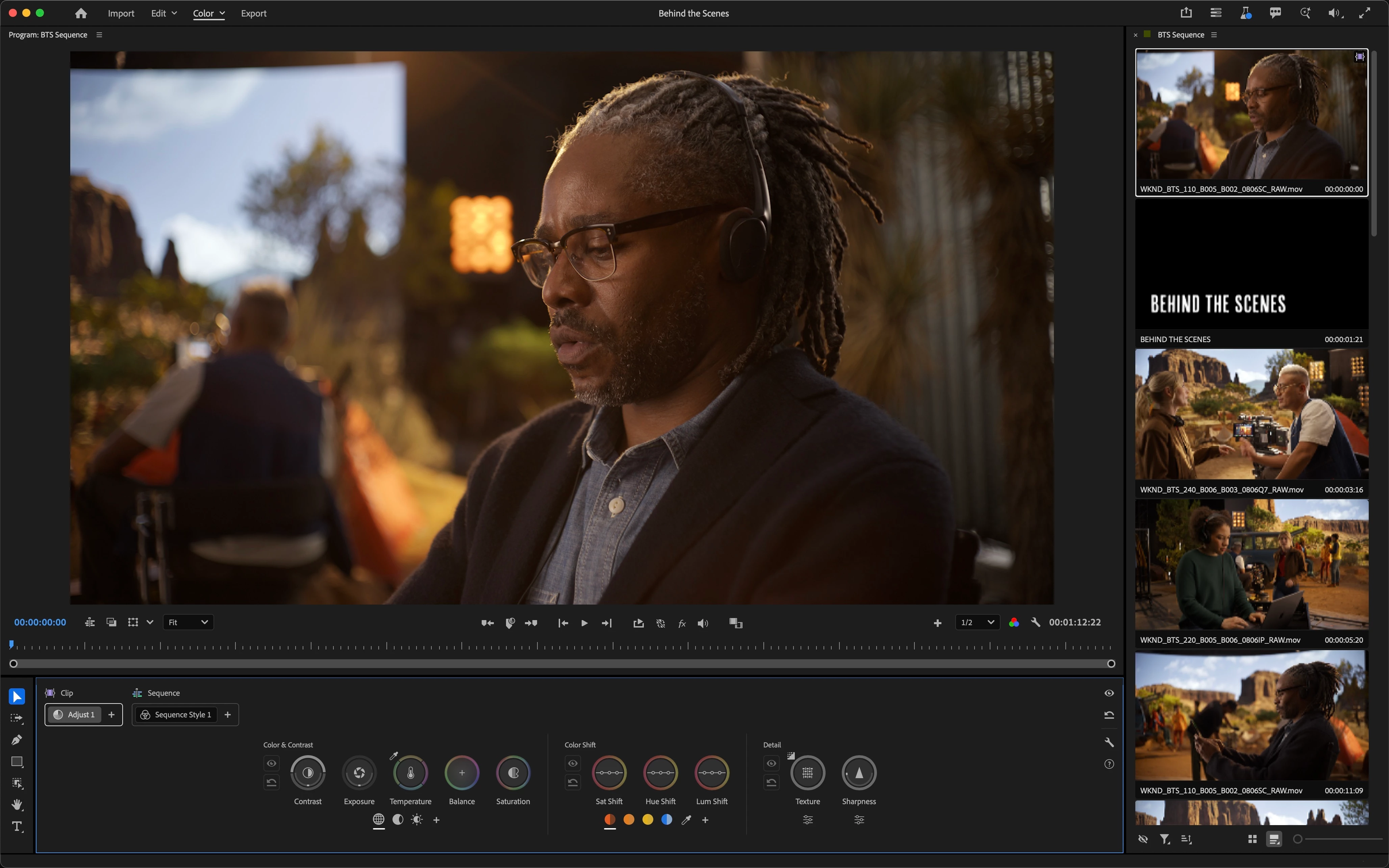
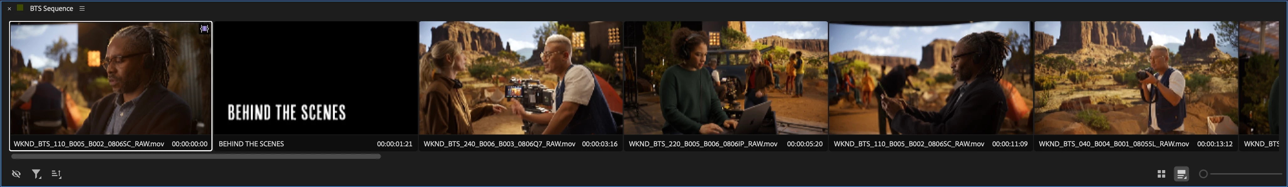
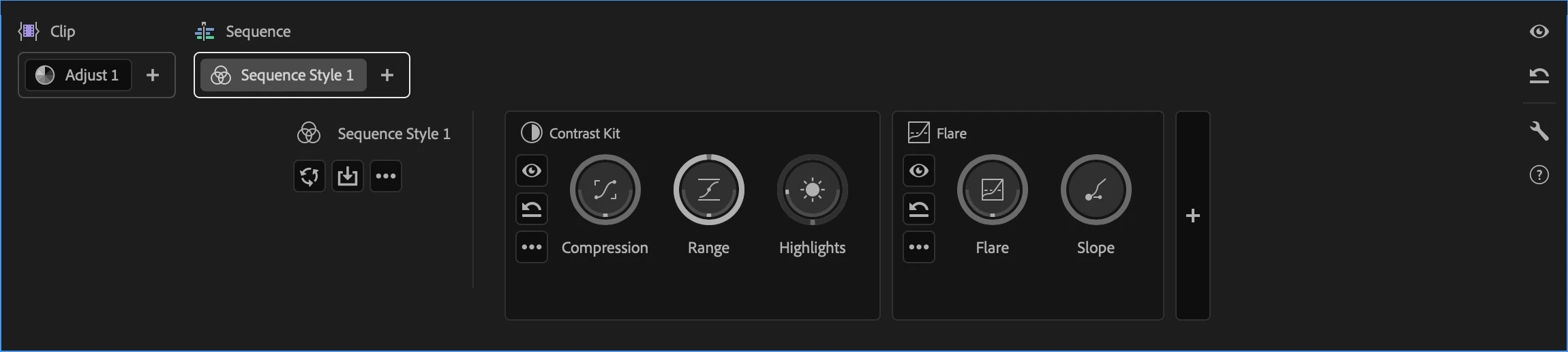
The Clip Grid, available only in Color Mode, makes it fast to select any clip for sequence navigation and immediate adjustment. It can be positioned vertically or horizontally, and has many functions that help you organize your work via filter and sort, manage color operations via copy and paste, and make complex selections quickly in order to create groups for grade management.

The Clip Grid positioned horizontally

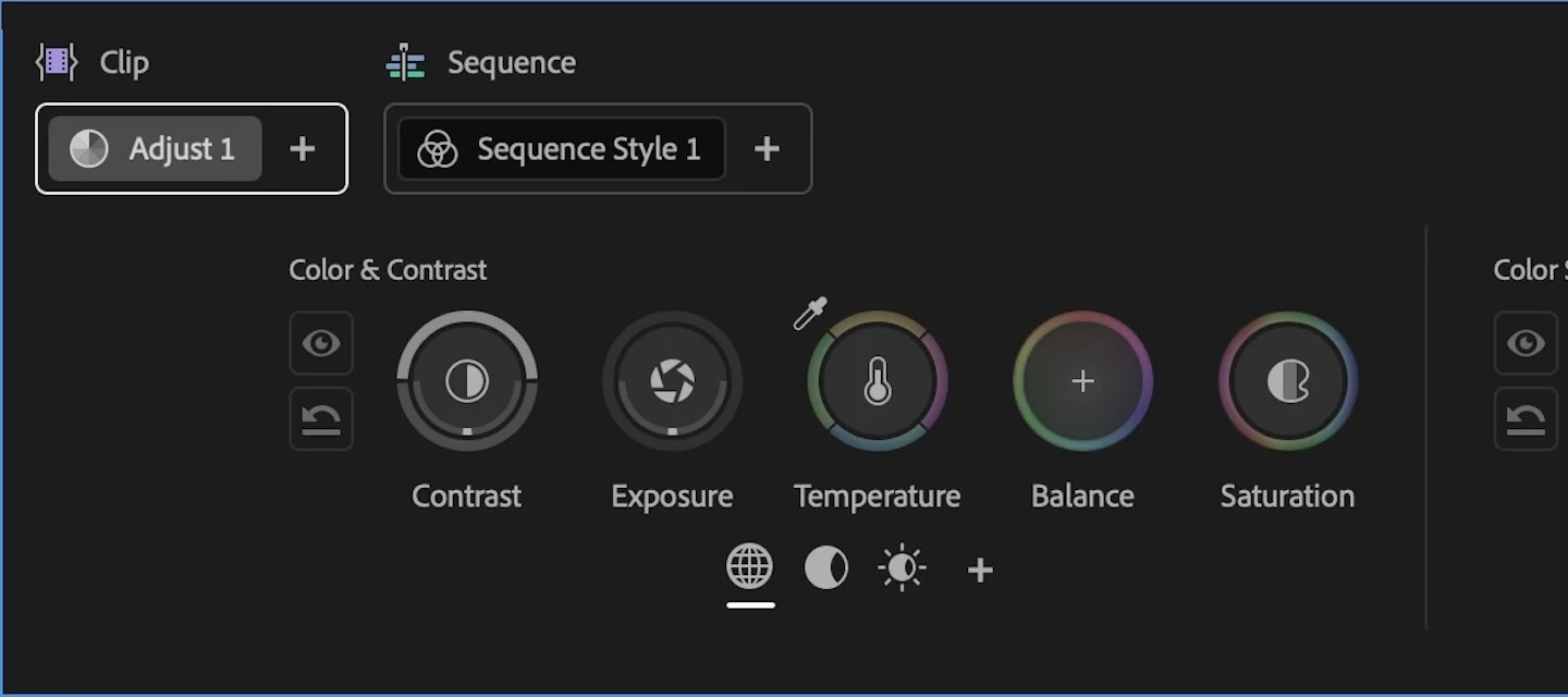
The Color Controls panel has been designed to expose maximum color adjustment functionality within minimum space, so you spend more time grading and less time opening collapsed groups and scrolling around to find what you need. Adjust operations give you surgical control over the image, while Style operations let you use saved Style presets or build-your-own combinations of modules designed to make artistic adjustments fast and fun. Two dimensional color controls let you simultaneously adjust related parameters for maximum creative control, while a heads-up-display gives you contextual analysis and guidance when you need it, disappearing when you don't. 

Color controls for the selected Adjust operation

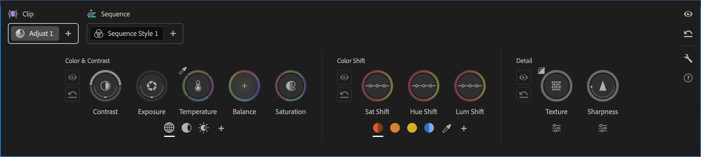
Color Mode also makes it easy to apply operations at every level of your grade, to adjust the entire sequence at once, specific custom groups of clips, or individual clips as your needs require. When applied to the sequence or a group, an operation automatically ripples changes to all connected clips, making alterations fast and simple. Every clip starts with an Adjust operation you can use to make surgical corrections to images, while a default sequence Style operation lets you apply a Style Preset to the entire sequence to give it a show look, or create your own look by mixing and matching Style Modules, which are customizable color effects.

Style modules within the selected Style operation

Lastly, the Color monitor has specific features to facilitate color workflows. For example, you can switch between sequence and clip playback modes in the time ruler to either navigate the entire sequence quickly (in sequence mode) or focus deeply on the clip at hand without accidentally navigating to another clip (in clip mode). A new Solo mode lets you suspend compositing effects and superimpositions so you can specifically monitor a single clip you’re adjusting, without the distraction of superimposed graphics or clips getting in the way.

About the Public Beta

While Color Mode is nearly feature complete, it’s still a work in progress. There are a few new features and refinements yet to come, such as HSL keying for masked operations, additional Style modules, and various other targeted enhancements that will appear throughout the public beta as they become available.

However, the complete end-to-end workflow we wanted to give you in this first version of Color Mode is fully operational, so we invite you to give it a try, kick the tires, and give us your feedback. Tell us what you like, because it’s important for us to hear what’s working. Tell us what you think could be improved. Above all, feel free to reach out on the public beta forums.

How Should I Test This?

Color Mode is a massive update, and the public beta is an ongoing work in progress. While we’ve taken pains to provide the best experience possible, you should expect issues to arise from time to time. When these happen, we’d appreciate it if you would use the Adobe bug reporting mechanism and let us know what you were doing in the provided dialog.

We’re confident that we’ve given you new workflows you’ll love, and we’d be very happy for you to test with real-world edited sequences of various lengths and sizes. However, changes are anticipated over the course of the public beta  as we make improvements and respond to user feedback, so we don’t recommend doing client work just yet.

Ongoing refinements to Color Mode at this stage may impact the project format, so consider every project you create that uses Color mode to be potentially disposable. For the best experience, import duplicates of projects with sequences you want to test using, or import new media into a fresh project. 

Note: There are no limitations over what kind of media you are encouraged to test with, although 8K media is known to have performance issues when used at an 8K sequence resolution.

Premiere (beta) Project Compatibility

While it's possible to take a project created in Premiere (beta) with Color Mode and open it in Premiere 26, this isn’t recommended as you won’t be able to access any of the beta features in the shipping version, including the new color effects in each clip, group, and sequence operation. Given the magnitude of the changes in this particular beta of Premiere, we do not recommend moving projects freely between versions.

To avoid inconvenience, we recommend you use duplicate projects with sequences that you'd like to work with for learning and testing Color Mode, and we strongly advise against using this public beta for mission critical client work.

If you do open a Premiere (beta) project in Premiere 26, you’ll be warned about missing color effect and sequence color effect video filters. If you continue, you’ll notice that graded clips contain an offline filter corresponding to the color effect. The safest thing you can do in this instance is to quit without saving and reopen this project in Premiere (beta).

Color Management

Color Mode is designed to work on sequences using Color Management. This is meant to give you the best starting point for grading clips in all supported color spaces, log-encoded, or raw. Using Color Management, you’ll get great results using the Direct Rec. 709 (SDR) color setup that’s the default for most new sequences.

Important: You should always double-check that sequences are using the correct color setup before you start grading. Using the wrong color setup could give you unexpected results and changing the color setup you’re using after you’ve made color adjustments is not recommended as it will likely change the appearance of your clips.

As you experiment, you may also want to try the newly improved Wide Gamut (Tone Mapped) color setup to see the differences in workflow. The default Tone Mapping and Gamut Compression settings have been improved to work correctly with graphics and SDR media using the new Apply Inverse Tone Mapping checkbox in the Advanced settings. This new option is a work in progress during public beta, so your feedback is critical to making sure we’re giving you the results you need.

No matter which color setup you use, every feature in Color Mode has been designed to make grading and delivering HDR output a pleasure, so try choosing either the Rec. 2100 HLG or PQ output color spaces and using all the available Adjust and Style tools to grade HDR highlights if you have an HDR display you can use.

After Effects Interoperability

Because of the extensive changes being made to how color grades are managed, After Effects interoperability for clips that have been graded using Color Mode remains a work in progress, and should be avoided until further notice. We remain committed to robust After Effects interoperability so making this a great experience is a priority for us.

Color Mode Replaces the Lumetri Panel

While the Lumetri Color effect remains available in the Color Correction bin of the Effects browser, the Lumetri panel has been replaced by the Color Management panel to support the new Color Mode. Previous projects using Lumetri will import correctly and appear as before, with total color fidelity. If you want to continue making Lumetri color adjustments or adding more Lumetri Color effects, you can do so using the Effects Control panel.

Avoid Using Lumetri Color and Color Mode Together

If you’re beginning a new project, we encourage you to use Color Mode without also using Lumetri Color effects. The Lumetri Color effect has several disadvantages compared to Color mode, including:

  • Some controls in Lumetri Color clip out-of-range color values so they’re not retrievable in subsequent adjustments. Color Mode does not.
  • Lumetri Color controls have a more limited range of adjustment. Color Mode gives you greater range to make bigger changes.
  • Lumetri Color does image processing differently than the significantly more color space-aware tools that have been newly created for Color Mode. 
  • Lumetri Color controls were primarily designed for SDR grading. Color Mode tools have been built to make both SDR and HDR grading easier and faster.

Avoid mixing Lumetri Color with the Color workspace; using Lumetri often restricts your grading options in Color Mode.

There Are New Fast Color Features in Edit Mode

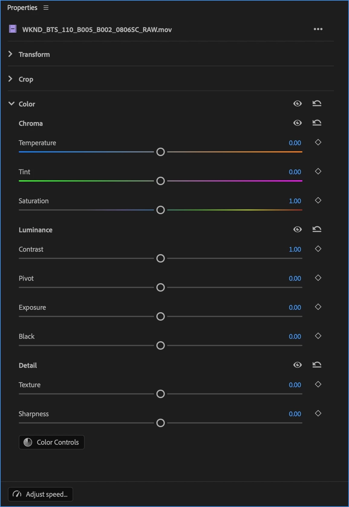
If you want to make fast color adjustments in Edit mode, the Properties Panel has a new Color section with a set of basic correction controls that you can use. These adjustments work in conjunction with Color Mode to provide you a seamless experience. You can make simple and fast adjustments to fix issues with individual clips in Edit Mode, while using the streamlined workflows in Color Mode to quickly grade your overall sequence with more creative controls. 

New Color controls in the Properties panel

Clip Match Has Been Removed

Changes to Premiere required the Clip Match feature of Lumetri be removed, as well as the clip comparison mode of the Monitor in Edit mode (clip comparison is available in Color Mode).

Finish Critical Projects in Version 26

If you want to continue using Lumetri as it was to finish a work in progress, we encourage you to continue using the shipping version of Premiere version 26 until you’ve finished.

One Last Note From the Architect

On a personal note, back when I wrote the Color Correction Handbook, I had no idea that I’d someday have the opportunity to bring everything I’ve learned to a re-imagination of color workflow this ambitious. Color Mode is the product of a career's worth of work as a colorist, of research, of talking with countless colorists and post production artists, and lessons learned building all kinds of other color tools and workflows. With the help of my close collaborators in Design, Engineering, Project Management, and Product Marketing here at Adobe, we would all like to introduce this new color experience.

While we've worked hard to provide as complete a color workflow as we could on day one, Rome wasn't built in a day and this is only the beginning; we have an ambitious roadmap and there's much more to come, so I invite you to give it a try and have fun exploring what we’ve created!

25 replies

Inspiring
April 19, 2026

First impressions are that this is a very neat and tidy implementation of some quite sophisticated tools. 

Love the way the mouse is used to be able to manipulate adjustments though vertical and horizontal movement. It does feel quite intuitive, especially when balancing shots using temperature and balance.

I would say though, overall, the circular icons for each adjustment needs to be bigger, smaller icons perceptually feel that bigger movements are required to affect a change. If icons are bigger, we’ll be able to get a better sense of the directions of where our adjustments are going.


Colour and contrast: I do like the way different zones are hidden, and that you can add more as you go. However, this does involve a lot of clicking and I think it can be hard to keep track of what adjustments have been made, as you have to keep switching zones. How about one click that will reveal all six zones simultaneously?


Exposure: Are these photometric adjustments? Could we dial in stops?


Temperature and Balance: Am I right in thinking that the balance tool is effectively printer lights? How should temperature be approached, do we use balance and temp in conjunction with each other or is it one or the other?


Saturation: Will there be different saturation models?  Would love to see a subtractive saturation option and also density controls.


Colour shift: Really like the way these have been implemented, only having the dominant colours show up is great. Could there be another adjustment where we can introduce an analogous colour in a given hue? So say we have a blue sky, it would be great if we add green into it to give a nice teal look.


Comparison view: The ability to be able to adjust the position of each half of the screen so that we can see our main area of focus properly. Also, having a split view with the full frame would be advantageous too, as well as having the ability to compare more than two shots together.


Skin tone: Definitely need a skin tone line on the vectorscope. Also, an on-screen indicator/meter/gauge of where the skin tones lie would be really handy. This would be invaluable for matching shots.


Split toning: Do love the film colour module and how to adjust the various tonal ranges once negatives and prints are set. However, it would also be great if we could adjust these parameters without having to choose the print and neg stocks first. So we begin from zero and create our own looks. Also, the ability to target each tonal range in each RGB channel would be great too.


Contrast kit and flare: These are great!


Halation, grain and noise reduction tools would be welcome.

Will there be any literature on where to set the pivot point for working in a wide gamut colour space?

Could there be a way where we can export our looks and provide them to other editors? They import and the exact same colour modules would show up in the GUI.

Overall, I think this is a very exciting development and can’t wait to see more.

Shebbe
Community Expert
Community Expert
April 19, 2026

Hey there. I'm not speaking for Adobe but I can answer a few of your questions.


Exposure: Yes they are normalized to stops similar to how the Exposure effect in AE is built. Under the hood it is gain in linear space.


Temperature and Balance: Both knobs have the exact same math. The difference is that Temperature uses ‘implied’ locked axes for Temp and Tint and are reflected as two sliders in the Properties Panel which can be accessed when in Edit too. Balance is a freeform wheel that mathematically does the same but isn’t represented as separated x/y values, also not in the Effect Controls Panel. I personally do not like this redundant principle but I think this is what they’re sticking with currently so you can pick whichever you prefer or use both.

They are not similar to how you use printer lights. Their math is also gain in linear space rather than offset. This is more desirable though because large shifts would otherwise tint your shadows/blacks due to the log working space having a toe.


Will there be any literature on where to set the pivot point for working in a wide gamut colour space?

Do you mean the pivot of contrast? I noticed that it was slightly off middle grey when using ACEScct in my test and I hope the default will be aligned in the future so any deviation from it is only ever an artist creative choice and you don’t need to think about it’s value in the case you do not intend to move it away from mid-grey.

Inspiring
April 19, 2026

Hey Shebbe,

Thanks for your response.

Good to know that exposure, temp and balance are in linear gain space. It did feel as though bigger changes were being made with the balance tool compared to the temp, hence why I thought balance may have been printer lights, Temp/tint felt more subtle to me. 

Yes pivot of the contrast exactly. That would be great if they locked the in mid-grey point in by default. Out of interest, how were you testing for middle grey in Premiere? 

cana_6748
Participant
April 19, 2026

from color panel to edit panel shifting is very lag ( take 1 minute)

deepak dhyani
Participating Frequently
April 19, 2026

using Mac Mini M4 Pro with macOS Tahoe...still no results

dsignedits
deepak dhyani
Participating Frequently
April 20, 2026

For now, nobody has an answer for this, I think.

dsignedits
NamrataAgrawal
Adobe Employee
Adobe Employee
April 21, 2026

Hi ​@deepak dhyani ,
What were your steps to reach to this situation, where Clip Grid thumbnails are coming distorted? Also, If possible, would you like to share the media with us (if this issue is coming to you only with particular media). This is not a known issue at our end, so we’d like to debug more around this.

Thanks.

geoffreyc4468750
Participant
April 18, 2026

Not a fan of the new Colour interface. I have given it a test run and hate it. If anything it should be getting more detailed and offer more options like Davinic. I have been editing in Premiere for nearly 8 years and love it. If the colour interface changes like it has, I will be grading my work in Davinci or not upgrading. You can’t change what colour science is. Give us an option to use the new one or old one. When you do eventally up grade the colour panel. 

Shebbe
Community Expert
Community Expert
April 18, 2026

Could you be more specific? What aspects do not work well in your opinion? The “old  one” was just the Lumetri Color effect displayed on a larger panel. You can still use the ‘legacy’ Lumetri  Color effect on your clips and grade via the ECP if that is what you prefer for now. I personally do not see any harm in keeping the Lumetri panel but at the same time it creates confusion between intended color workflow and a legacy mechanism, especially for new users wanting to learn.

geoffreyc4468750
Participant
April 19, 2026

Hey, thanks for the reply. You should aim to keep the basic correction panel which is sometimes all you need to do once you add the adjustment lut from Log to rec709. I don’t see any curves maybe I missed it but it wasn’t there. Also the colour wheels and the HSL are gone, maybe the HSL you can add as a mask but it is so much easier to do that in the current HSL as it is. I am not sure why Adobe want to change something that is easy to use. 

If someone wants to become better at something research it and then learn some soft skills. I did. 

I also know that it needs a lot of work and I hope Adobe listen to the people who use it all the time for there job. And that they are not just introducing a new colour panel to get new costumers.

Participant
April 17, 2026

Hi everyone,


I took the color mode for a test drive, after watching most of your YouTube channel content on it. A great way to introduce something new of this scale by the way, really good job on the marketing launch. Overall I like the direction this is going and the new function it provides. Some of the stuff I am already very excited about:

  • Access to color features Lumetri did not have: pivot of contrast, texture/detail, better hue shifting / HSL control. All this is great.
  • The ability to grade groups of clips at the same time + easy access to timeline operation. The clip grid feels modern and very image-centric. Which is good.
  • The sorting and filter menu! Especially graded/ungraded and the ability to order clips by source timecode to group the same shots/takes in the timeline. Very functional and useful.

As I understand, you are trying to keep things as simple as possible where the UI is concerned, but I do feel it needs a bit of work still. So here is some feedback from my first sessions playing around with this. Call it my first impression of the new mode. I added some screenshots below as well to illustrate some of my feedback.


Overall the UI and controls felt really small on a 4K display. Lots of blank and wasted space, which could be used for more information or just larger tools. Possibly this has to do with the 4K resolution, since what I saw on the YouTube demos felt not as empty as what I saw on mine. Might be a scaling issue.

Overall I feel there is too much clicking and mouse work involved in operating the current UI. I understand the core concept is to use the mouse axis to manipulate what would normally be a slider. This is probably fine in the long run, and just requires retraining some muscle memory. That being said… there are a few things that are quite mouse intensive and probably could do without:

  • For toggling on/off an operation (to do before/after compare) or to reset you now need to select the specific operation, mouse over to the tools in the display, or even all the way to the other side of the panel to toggle on/off or reset this operation. (see screenshot below) You can also right click and choose to do so in the menu, but hiding a function behind a right click menu slows me down as a user. Having an ‘eye’ button right next to each operation in the list (and a reset?) would solve having to mouse around quite a bit.
  • Clicking to cycle through global/shadow/highlight manipulation felt like a step backwards in speed of use. A traditional three-way color corrector actually is faster for balancing shots, since all three color wheels are directly available. Right now I have to balance the global/mids, click to switch to shadows for instance, balance lows/blacks and then click back again to global to continue the work. Thats a lot more clicks and mousing around the interface than a traditional three-way corrector would ask. I am not claiming you should go back to the old tradition of the three-way if you actually want to create something new. But the new does not feel more functional or faster than the old in this case.

There are a lot of icons in the UI now that are unclear or seem a little hidden. The cycle global/shadow/high is one such example. Also it took me a while to figure out I could switch from timeline to clip playback right under the program monitor. The icons are small, unclear and feel hidden.

I very much miss a more elaborate way to compare shots and do some shot matching. Right now you can only toggle the comparison viewer into a sliding split screen view. For matching I find being able to compare two full screen frames of two clips a lot more useful. I think the comparison viewer should be expanded with this, as well as take up a more prominent space in the interface. Shot matching is very much at the center of color correction and comparison mode should be readily available. Being able to compare more than just two shots to each other would be also be an awesome additional function.

Finally: I miss having a permanent waveform/scope in the UI. I found the preferences to change the display of the scope while manipulating the adjustments, but this does not replace a full scope in the display for my purpose. I also use scopes a lot while matching for instance. I also add my upvote to displaying values on the scope and numerical values in the UI. Surprising how often I refer to values for comparing adjustments between shots.


Thanks a lot for the hard work and good luck in the coming development!


Merlin


Shebbe
Community Expert
Community Expert
April 18, 2026

Hey Merlin, that’s great feedback.
 

I totally agree that users with a 4K  display have tons of empty space that could be optimized to some extent. The note about the color tools width empty space makes more sense when you start to play with the Style grade rather than Clip Adjustment. There you can add many modules in sequence making it span much further horizontally.


I do share your sentiment on the program monitor icons. They’re a bit hard to understand and the discoverability and readability of the clip vs timeline play range toggle is not very good. Hope to see some improvement there.


For disabling the grade you can use “\” on the keyboard which works well. Not sure if there is something for individual modules though since they do not really have a selected state the shortcut could focus to.

I also agree with that the current operators require too much knob tweaking for ‘typical’ shadow/midtone/highlight adjustments especially if you're grading in standard SDR where you don't get the partial benefits of a tone mapper. I believe they aren’t too keen on the ‘traditional’ lift/gamma/gain style 3way wheels but I hope other shaping modules will become available that are set up in such a way that you do not need a lot of extra clicks and setups.

The permanent scopes as panel is still available via the Window menu. Currently you can even switch them to the legacy scopes via the panel menu if you have reasons to but I assume those will be removed on release. If you go to the Color Controls’ wrench icon you can disable the HUD version of it if you  prefer. The current issue however is that that's the only place you can see your code values without resorting to the ECP which isn't ideal. I’ve seen others mention the importance for seeing values too so I hope Adobe will take note and come up with a solution.

bmanley349
Participant
April 17, 2026

How do you export all of your color mode sequence adjustments as a .cube?

Shebbe
Community Expert
Community Expert
April 18, 2026

I don't believe you can but it's a good feature request!
If you’re familiar with HALDs you can create them with a few extra steps.

You can use this site for example:

https://sirserch.github.io/lut-creator-js/

Participating Frequently
April 17, 2026

We need clear visibility of all adjustment values within the color panel. When modifying parameters such as highlights, temperature, or other controls, the corresponding numerical values should be displayed alongside each setting for precise monitoring.

Additionally, we would like to have a dedicated Skin Tone feature. This should include tools to refine the selection such as blur and denoise options to allow for smoother and more natural adjustments.

A Skin Tone indicator or visual guide would also be highly valuable, providing greater precision and consistency when working on skin tones.

Finally, we need a vignette control, allowing us to subtly shape the image by darkening or lightening the edges, with adjustable parameters such as intensity, feathering, and radius for better creative control.

R Neil Haugen
Legend
April 18, 2026

I generally agree … though I would add, the second-in Hue segment option (going left to right) is the Skin tone tool … specifically. So there’s the Reds option, the Skin tone option, the Yellows option … 


And if you click on that skin tone segment control, then the Hue shift, you get an outline on the pop-up scope that shows the width and ‘outlying’ depth of the current hue selection. So you can see what hues are going to be changed by working the control.

Everyone's mileage always varies ...
Nadj09
Participant
April 19, 2026

The current approach of using Hue segmentation to adjust skin tones feels more like a workaround than a proper solution. It is similar to the recently introduced numerical values in the vectorscope, which, instead of simplifying the workflow, have introduced additional complexity and made precise adjustments more difficult.


More broadly, several of the methods being suggested at the moment come across as workarounds rather than thoughtfully designed features. This highlights a larger issue: the absence of dedicated, intuitive tools for essential tasks within the new Color Mode. As a result, the workflow feels unnecessarily complicated.


At this stage, it appears that effort is being directed toward compensating for missing functionality rather than simplifying and strengthening the core toolset. This creates the impression that users are expected to adapt to the limitations of the tool, instead of the tool being designed around professional user needs.


We understand that this update is still in development and not yet fully refined. However, in its current state, the Color Mode lacks several key features and does not yet meet the level of polish expected for professional color grading work.


It also raises questions about the timing of its release, as it feels premature given its current limitations—especially in a landscape where competing tools are delivering more mature and comprehensive updates.


In its present form, working in this Color Mode feels closer to the experience of using a simplified mobile application rather than a professional-grade color grading environment.

Daniel Gheorghe
Participating Frequently
April 17, 2026

Loved playing with it, I like the UI. What I’d love to see added in the future is the option to do subtractive saturation and something like Resolve’s Film Look Creator, plus a way to lock the pivot to a specific value when adjusting contrast.

R Neil Haugen
Legend
April 17, 2026

Have you looked through the full section of looks they have? Quite a range of starting options there. Some quite “filmic”, which of course all depends on everyone’s internal view of “filmic” ... which always varies.


And as I’ve noted working with colorists so much, that often what’s called “filmic” doesn’t necessarily have specifically to do with the actual look of a shooting/printing combination, but more “what I felt like when looking at it ...” ... which is fine, and quite human of course.


Personally, as someone who actually fought film (professionally, as in full-time living), and its massive image limitations, for over 25 years ... I am so past living in the ancient restricted/limited past. We can do so much more with an image these days, thank Heavens!

Everyone's mileage always varies ...
Daniel Gheorghe
Participating Frequently
April 17, 2026

Yes, I tried the film modules and I liked what I saw there, however the Film Look Creator in Resolve has a lot more options that would be nice to have in Premiere as well. Or at least some of them.

Neatgirl
Participant
April 17, 2026

Will the “auto” button be integrated to this new workflow?  I looked for it in both the Color Page and the Properties window in the Edit page and couldn’t find it anywhere.  Sometimes when I’m on a tight deadline, I use the auto button to get a grade that that 80% there.  It’s a real time saver and one of the main reasons I edit in Premiere rather than other applications.

Alexis Van Hurkman
Community Manager
Community Manager
April 17, 2026

I’m happy to say that Auto color is on the roadmap, definitely something we want folks to have.

Participating Frequently
April 16, 2026

I really love where this is heading, it’s a nice marriage of the ease of use of Lumtri and the power of Resolves node based color. 

Two big pieces of feedback, that are hopefully easy to implement:

We need IRE values on the scopes (other than 0 and 100) that automatically pop up when making an adjustment. It’s amazing how easy it is to adjust specific color and luminance values in this new mode (like a subjects skin), but not having IRE values to line up something like skin with leaves you stuck with relying solely on your monitor which is never perfect.

We need ways to type in numerical values for adjustment settings like exposure, saturation, etc. The wheels are awesome for quickly adjusting values, but very hard to dial in fine detail with. 

Currently “undo” doesn’t seem to do anything after you make a change, so you have to try and manually backtrack if you don’t like the change you made to an adjustment value.

Really excited about where this is going, nice work Adobe team!

NamrataAgrawal
Adobe Employee
Adobe Employee
April 16, 2026

Thanks for the detailed feedback, really glad to hear you’re enjoying the direction this is going!

IRE values in the HUD scopes: Noted.

Undo not working: We’d like to understand this better. Could you share a bit more about the workflow where undo isn’t responding as expected? We’ll also try to reproduce this on our end.

Participating Frequently
April 16, 2026

Sure, whenever I make any adjustment, command+z does not work to undo the adjustment on my mac (running the latest version of OSX). I’m realizing now that did not try going through the pulldown menus, so it may just be a hot key issue.