Francis-Crossman17221443
Community Manager
Principal Product Manager
August 23, 2024
Question

Now in Beta: Rounded corners in the timeline

  • August 23, 2024
  • 56 replies
  • 19351 views

Starting with Premiere Pro (Beta) version 25.0, build 32, all clips in the timeline have rounded corners!
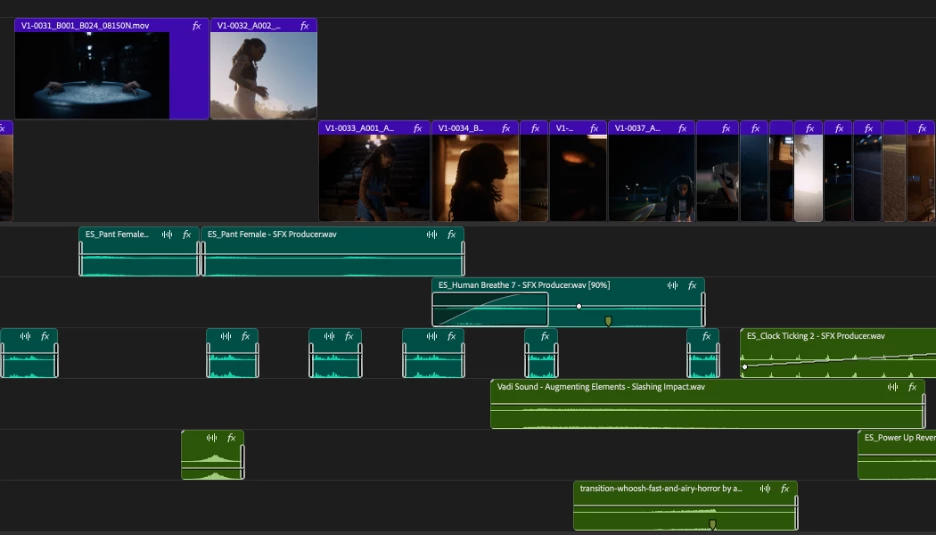


As part of the New Spectrum UI updates, we are now adding rounded corners to all of the clips in the timeline UI. Rounded corners are easier to look at all day long, require less cognitive load to parse and understand, make it easier to see the boundaries between clips, and are just plain friendlier! There is a lot of psychology behind rounded corners. Just look at any object within sight right now, and you will start to see rounded corners everywhere.


Here are a few interesting reads on Medium that explain the concept rather well.


Rounded edges are “friendlier”

The human brain is conditioned to process sharp objects as potentially harmful and dangerous. A human neuroimaging study has shown that it is natural behaviour to lean towards objects with curved contours compared to sharper objects.

(Benjamin Tey, The current obsession with rounded edges in user interfaces)


The Effect

A complete lack of sharp edges and sudden transitions eradicates the manufactured feel that we’re so used to in mass-produced goods. Instead of reminding us of industrial supply chains, automobile production, and chemical laboratories, these softer shapes evoke succulents, pine trees, and rocks that have tumbled through mountain streams. There’s an organic quality that just feels healthy and warm.

(Arthur Van Siclen, Rounded corners in the Apple Ecosystem)


The radius will reduce as the clip gets very small to avoid the timeline looking too “bubbly” and there is a threshold width below which clips will revert to 90° angles entirely. We have tested with very large timelines and we are confident in our settings, but we want to know what you think.  We encourage you to post screenshots of your timeline if you wish.


We want to know what you think.  Please join the conversation below.

56 replies

hellopaul4
Inspiring
September 20, 2024

Has the radius of the rounded corners become much smaller in the latest release (Beta 25.1.0x18)?

Continuing on from the complaints about precise editing that some people are airing, what I find REALLY annoying is this:

I'm dragging the dark pink clip back to snap to the end of the blue clip, and the highlighing of the dark pink clip creates a dark line between the blue clip and the selected dark pink clip. This looks exactly the same as a single-frame gap if the timeline is zoomed out. Please get rid of this outline! I do not need a line around a clip I have selected; its darker colour already shows that it's selected (maybe not if you're using the weird and silly VERY dark labels theme that was introduced a few months ago - if this theme is enabled, then highlighting the selected clip by making it lighter would be far better than drawing a line around it).


Participant
September 11, 2024

PLEASE, DO NOT DO THIS! The one and only reason my colleagues and I haven't fully embraced Resolve is because their timeline has rounded corners exactly like this, which makes it feel imprecise and confusing, especially when doing fine adjustments to specific frames. Professionalls just want a timeline that performs well and does exactly what we tell it. We don't care about the clips in the timeline looking "frendlier", we are here to make films. 

Participant
September 11, 2024

Sorry guys, but this is a game breaker for me. I truly appreciate the thought behind it but as someone that deals with massive localization projects on the regular these visual gaps will lose us so much double-check time. We're dealing with hunderds of timelines that despite heavy automization pass through so many hands and have many moving parts that are very dependend on being placed exactly right/on top of another clip. With these rounded corners, when quickly flipping trough many timelines its impossible to visually check if everything is aligned, which is so easy to be more certain of with these current sharp edges. Really hoping this gets rolled back at some point, until then no updates for us...

jono2729905
Participant
September 7, 2024

HOW do i turn it back to rectangular edges? This round edging is way too busy for someone who edits with lots of tracks. 

Participant
August 31, 2024

NOOOO!!!

Please make this optional!

I don't want my editing software to be "friendly," I want it to be PRECISE. I need to be able to tell, easily, at a glance, if clips are aligned properly across multiple layers. Rounded corners only make that harder.
Seriously, "rounding the corners" is a joke analogy I've used before to describe updates that make software less usable, in the service of making it "more beginner friendly," "nicer to look at," "de-cluttered," etc.

Rounding the corners because you think it looks more friendly is like dulling the blade of an axe so that the user "won't hurt themself." No, the user needs a precise, sharp edge. Premiere Pro is a TOOL, not a game.

My philosophy has always been FUNCTION BEFORE FORM, and it is absolutely bizarre to me that Adobe constantly prioritizes form before function.

Participant
August 30, 2024

Having the red and yellow trimming tools wrap around the curvature of the clips would be a nice touch. 

Participant
August 29, 2024

This is what I was afraid would happen. If we liked round clips, we would have gone for Final Cut and Davinci. Adobe come to your senses! Don't do this! If you cut a real film with scissors, then no one will cut the corners. And you cut it off.

yanga18281014
Participant
August 29, 2024

The new UI looks like a Final Cut timeline. Too many rounded corners make materials look shifted and create gaps everywhere. This makes it hard to see if things line up. Try less rounded corners to reduce visual gaps. Or, as others suggest, only use rounded corners where there are real gaps between materials

Participating Frequently
August 29, 2024

😂 You WISH it looked more like the FC timeline. It has no such ridiculous "make materials look shifted and create gaps everywhere" issues. Because Apple actually understands GUI and UX design. So maybe know what you're talking about first. 

In reality, the 90s called and they want their GUI back, along with the ancient underlying code, which is why PPro is such an unstable sloth. Maybe that's why they have to change it. To have "Pro" in the name is pure irony either way.


phill3709376
Participating Frequently
August 28, 2024

PLEASE MAKE IT AN OPTION - It might be better for the brain but it's awful to cut with - Editing is all about precision and frame accuracy, adding this rounded edge makes it slower to line up elements precisely, and takes me longer to double check for black holes and synch - it's totally antithetical to the craft of editing. PLEASE PLEASE PLEASE DON'T DO THIS! If you look at these two images - believe it or not, that close up actually is showing two shots that are perfectly aligned, meanwhile on the zoomed out screen shot of the timeline it's impossible to see what's touching. It's a professional piece of software I'm using to cut as fast as humanly possible, there are enough soft edges in this business without these! Thank you. 

Participating Frequently
August 28, 2024
quote

Instead of reminding us of industrial supply chains, automobile production, and chemical laboratories, these softer shapes evoke succulents, pine trees, and rocks that have tumbled through mountain streams. 


For me, it evokes the feeling that Adobe wants to copy a UI thing they saw the competition doing but also wanting to pretend its for our well-being.


I do not like the rounded corners on timeline clips, it makes it very hard to tell if there is a gap or not, making timeline legibility way harder than it needs to be. It might look sleek, but its not a good user experience when you actually use it, which is really what UI is all about, no?

If you must do it, at least follow MisterAdvent's brilliant compromise:

if they could be rounded only where there is no abutting clip, and square when there is an abutting clip. That way we could see at a glance where those pesky 1-frame gaps between clips are regardless of timeline zoom. If you see a round corner, there's a gap. If no round corners, no problems.