Inspiring
June 13, 2024

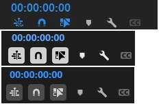
Contrast icons are WORSE than color icons in 24.6 Beta

  • June 13, 2024
  • 5 replies
  • 790 views

Color icons are objectively better than contrast icons for seeing quickly if something's turned on or not. Even the high contrast one I'd argue is harder to identfity than the color one at a glance.

Please give us the option to choose between color icons or contrast icons, not be forced into only using contrast.


Current color icons (top) vs the 2 new contrast icons (bottom):

Additionally, even if I wanted the high contrast one because it's easier to see, the rest of Premiere is so hard on my eyes with that really bright text so I wouldn't be able to use it long term.


I do appreciate you've managed to slim up that part of the UI however, so thank you for that.

5 replies

MyerPj
Community Expert
Community Expert
July 31, 2024
Inspiring
July 31, 2024

@MyerPj  Yep have upvoted that one previously. It's talking about a different issue though regarding the fx badges, but yep still an important thing for them to fix

MyerPj
Community Expert
Community Expert
July 30, 2024
MyerPj
Community Expert
Community Expert
July 30, 2024

I upvoted your thread (up to, left side) Those new on/off icons are not nearly as pleasing and easy to understand as the previous ones. Though I like the new timeline colors. There's a thread around here that has many upvotes, users saying the same thing. See if you can find it, to upvote. If I find it I'll post a link.

hellopaul4
Inspiring
July 30, 2024

I absolutely agree. Also, I hate any use of contrast to show if something's on or off; how am I supposed to know if "light-on-dark" is on and "dark-on-light" is off? Or is it the other way round? Who knows!? Whereas "dull grey" is off, and "bright cyan" is on, in any context, always.