Copy link to clipboard
Copied
Been mucking about with this, but
I do miss the color code (gray, green yellow, purple)
I used them to see in a glance if an effect was applied or not.
Now I have to mouse over the FX badge as they all have the same color
Or make sure the ECP is open and clip is selected.
Or am I missing something here............
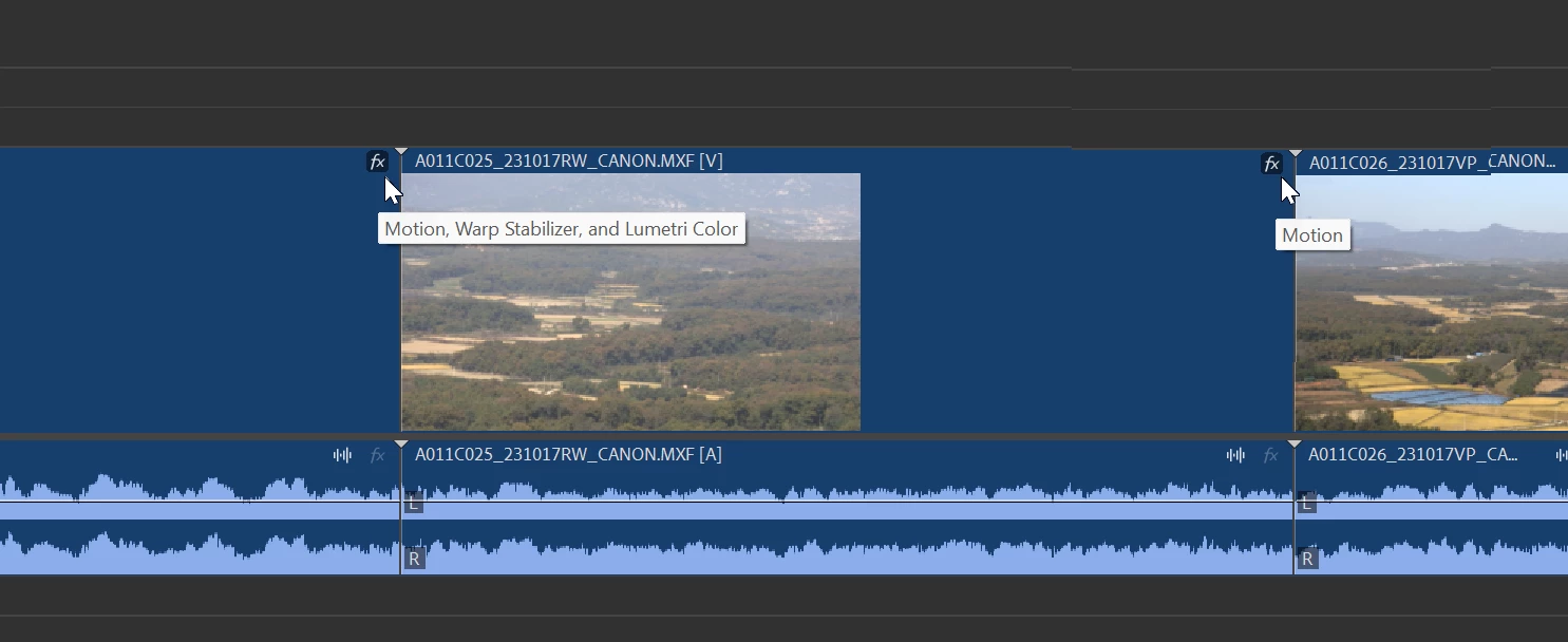
Copy link to clipboard
Copied
This is a huge step back in my workflow.
Please bring back the color code.
Copy link to clipboard
Copied
Definetly, it's a huge step back to me too, I was going to ask for those and saw your post.
Copy link to clipboard
Copied
Haven't look at this beta yet (= big caveat) but this change does seem a backward step. The current (non beta) info could be improved for sure (personally I'd like to know clips that have key frames (e.g. motion & speed ramp) and tracks that have track effects easily visible in the timeline).
Copy link to clipboard
Copied
The color code is a huge part of my workflow too. Please bring it back and please allow for both the waveform and FX badges at smallest track size.
Copy link to clipboard
Copied
I agree, this is perhaps too much UI streamlining. Cleaner UI =/= less information.
Copy link to clipboard
Copied
Been using this feature for some time now and it s.cks
Takes about 1 or 2 second to appear and then disappears again.
Need to hover over the little icon for it to work.
With the color code I could overlook the timeline in one glance now I have to do each clip.
Please Bring back the color code, but guessing, knowing a bit on how Adobe operates. Once taken out it's gone forever............
Copy link to clipboard
Copied
Be aware PPro team, by removing this feature in the official release, you will have a huge number of angry users! So, be aware (and prepared).
Copy link to clipboard
Copied
I agree with the experts on this one. I much prefer the earlier design as it provided more info at a glance.
Copy link to clipboard
Copied
I'm getting used to them after using them a bit more. I heard that the colors were confusing to some, and another reason is that some people can't see specific colors well.
Copy link to clipboard
Copied
I'm getting used to them after using them a bit more. I heard that the colors were confusing to some, and another reason is that some people can't see specific colors well.
By @Kevin-Monahan
Well, find that hard to believe as there is an option to turn it off (instead of deleting the entire feature for some of those people!!)
Copy link to clipboard
Copied
I heard that the colors were confusing to some, and another reason is that some people can't see specific colors well.
I find it concerning that both points are allegedly used as arguments in favor of the change.
1. Confusion is often sprouted out of laziness, lack of knowledge, low curiosity. If you don't know why something is a certain way, but aren't taking the effort to look it up, you shouldn't complain about it either.
2. While general readability should be regarded highly, I can't agree that the default of design should favor few individuals with certain handicaps. If Adobe wants to aid users with various degrees of visual impairment the best way would be to provide additional options. Color blind themes for the whole UI could be one of them.
To circle back at my own initial comment on this. The reduction of information in efforts to make it more simple/clean is having negative effects imo. I would hope there is a way we can have this returned to us in a way that works well with the new design.
Copy link to clipboard
Copied
Fx badge color is one of those unique productivity features that let me prefere to use Pr and avoid the think of switching to any other software.
Copy link to clipboard
Copied
I'm with Ann and the others here.
We NEED the Fx color badges ... not just back, but PERIOD.
This was one of those things that took me a little bit of time to learn how to use, but was so freaking useful. Especially when working the larger or more intense projects I've done. But even the many short little things, it was USEFUL.
The new improved ... ain't improved. Takes longer to figure out whazzup, which is NEVER an improvement!
I don't mind the color changes, I can get used to that no problem.
The Fx badges ... no.
Respectfully, please give us the information back in our sequences.
Copy link to clipboard
Copied
1. Easier to view clips? It's one by one and exactly hovering over the badge opposite all the color badges in one timeline view. No clicking or hovering whatsoever.
2. right click to add effects will open the Effects window, but still need to double-click to actually add an effect.
3. another c;ick to open the Effect controls to actually edit the effect.
I am guessing hardly any editor edits video effects on the timeline apart from opacity and timeremapping. Audio is a different. (smart move just to show the audio section.)
Copy link to clipboard
Copied
Excellent post Ann.
Copy link to clipboard
Copied
Continuing this discussion I had a look at proxies. This readability is equally diminished. You can barely distinguish active connected proxy from offline proxy in the new design.
Please ask yourselves; is it really neccesary to not show any color information? The same disagreements have been expressed by users on After Effects' side where active buttons also have been changed to solely tones of grey rather than blue. We don't need this 'dumbed down' clean minimalistic stuff. We need fast access to information. Something color differentiation can achieve multiple times faster than shapes.
Copy link to clipboard
Copied
Agreed, Shebbe!
Copy link to clipboard
Copied
I like the new button background when on, however, I think the color should be there along with it.
I'd also like to see the FX badge reflect in the colors as noted here and the proxy badge more like the old one.
I do really like the new clip colors.
Copy link to clipboard
Copied
Thinking the same. Something like this is already better to me at least. I do like the boxes over the previous version only having the icons itself.
Copy link to clipboard
Copied
That's really nice, better than I was thinking! 🙂
Copy link to clipboard
Copied
this is how it is now in build 12
but still no colors on the fx badges.
Copy link to clipboard
Copied
I saw that, I was thinking of the blue inside / ie: the tool, but then I saw the background shaded by @Shebbe and I like that even better. I'd like a little color there to make it even more obvious.
Copy link to clipboard
Copied
Is this where we're still discussing this? it's in the main version of Premiere now. Please bring back the badge colors.
Copy link to clipboard
Copied
THIS!! I came here hoping someone had a fix for this issue but annoyingly it seems Adobe has stuck to their guns on this one. Would love for them to revert back to the old system of color coding, so much easier to tell at a glance what is going on with each clip