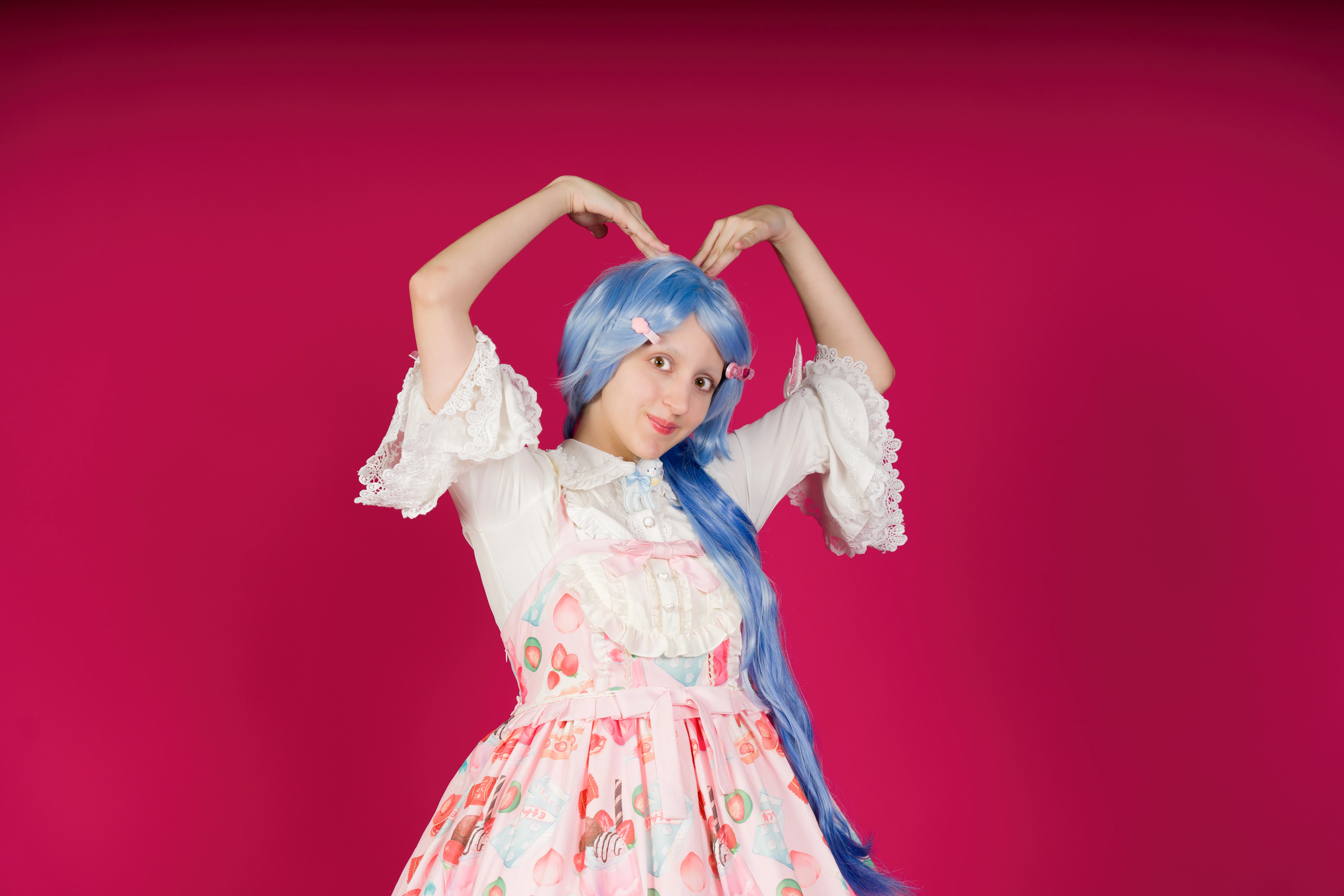
What I would do would be to mask the model. You can then reduce the highlights - you will get more detail in the dress - and increase the contrast, so she stands out more from the background.
It's overexposed. The subject is sharp in focus, but the overexposure takes out all the contrasts. I fear that you have poured full light on the model, as I see two reflection points in the eyes. Looking at the eyes, the black of the eyes need to be black, not grey and the brown should be contrasted with the natural eye structure visible. The white of the eyes can be white, but can still contain some small structure.
The red background, even that it contrasts with the blue hair, is disturbing. it would be better to use a more neutral background. The red will cause issues, if someone wants to cutout the model for their use. If you need a neutral background, you can't use this picture.
ABAMBO | Hard- and Software Engineer | Photographer
There are only two small points of overexposure on the heart-shaped button below the ribbon; the rest is not overexposed at all. The red background is a matter of taste, but many of that series have been accepted, all being equal. What is clear is that Adobe does not accept random photos. Pongo una foto aceptada de esa misma serie.
Sorry, but the subject is overexposed. And no, the red background is not a matter of preference. It adds a difficult to handle colour cast on your subject and fools the white balance. Your asset is worthless, when I need to cutout the girl:
You always will have a redish colour cast.
ABAMBO | Hard- and Software Engineer | Photographer