So sorry for my delayed response, I've been working hard at my day job all week and haven't had time to come back to this yet.
First off, thank you for such a detailed description/guide! However, I think I am just too much a novice with compound paths to even begin to accomplish what you're describing; from your photos I have no idea how to do any of that 😞 The A is connected to one of the Gs, the E, and the D if that wasn't apparent in my original screenshots.
You are welcome, Kyndra.
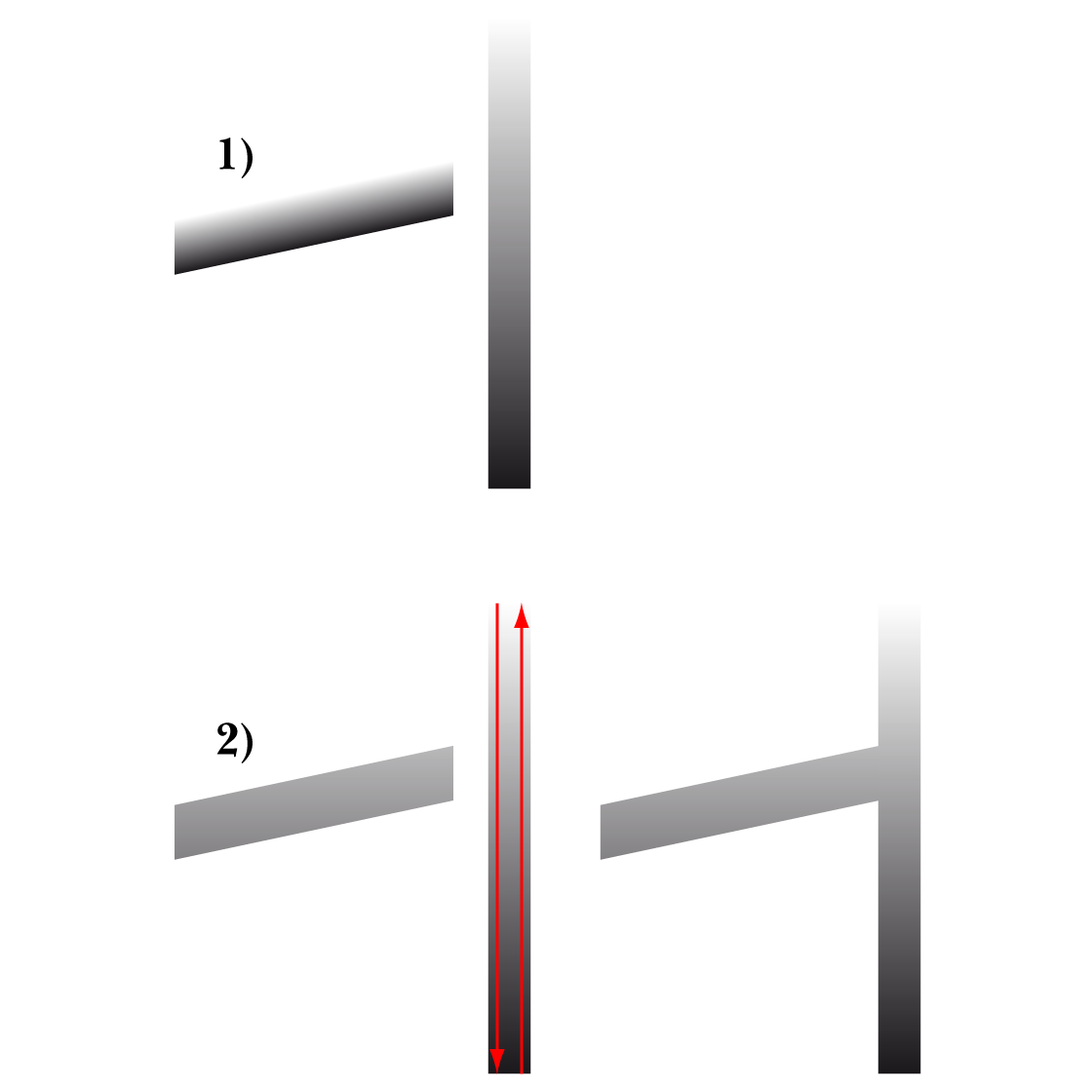
Here is a much simpler way, with no cheat, only a gradient adaptation, again shown with a simple sample as a representation, Amardt Guides being your friends:
1) This is the initial set shown beside each other corresponding to what you have, with the same vertical gradient applied to both;
2) This is what you get when you select the bar part and then ShiftClickDrag vertically with the Gradient Tool, either from top to bottom or from bottom to top of the multiple letter path containing the A as shown with the red arrows; beside 2) is shown the match with the bar abutted to the letter path.
Whether to ShiftClickDrag from top to bottom or from bottom to top depends on the direction of the gradient; you can try either and use the other instead if needed.
In this way the right portion of the full gradient is applied to the bar.
Click to get closer, Click again to get closer still
In the actual artwork, in order to ShiftClickDrag vertically, you need to establish the the height between the top of the full gradient.
For the multiple letter path containing the A, this is between the top of the G and the bottom of the dripping under the D (highest and lowest).
You can do this by ShiftClickDragging with the Line Segment Tool or Clicking twice with the Pen Tool, in both cases starting with the top of the G going right past the dripping under the D, and with the dripping under the D going left past the top of the G.
This corresponds to ShiftClickDragging between top and bottom of the Bounding Box in your latest screenshot.
Smart Guides will guide you, you can Set Smart Guides preferences here,
https://helpx.adobe.com/illustrator/using/rulers-grids-guides-crop-marks.html
I regularly post under the assumption that it is more preferable/convenient/managable for the asker to continue using the artwork as it is including its structure, especially if it is complex and/or is one of the early works.
I agree with Bobby about drop shadows for logos, with the addition that your artwork in its entirety is far more complex than usual and maybe best suited for limited use, as on websites/screens and in normal print context.
In my first post there was no actual description/guide, only a few screenshots to show the (main) steps from 1) to 6), which show the sample bar before and after.
It was clear from your screenshots that the letters you mentioned were all part of one path.