Participant
February 21, 2017
Answered

Anchoring content from multiple text frames on the same line / y-axis

  • February 21, 2017
  • 4 replies
  • 737 views

Hi friends,

I'm in the process of redesigning our staff newsletter, but have hit a snag.

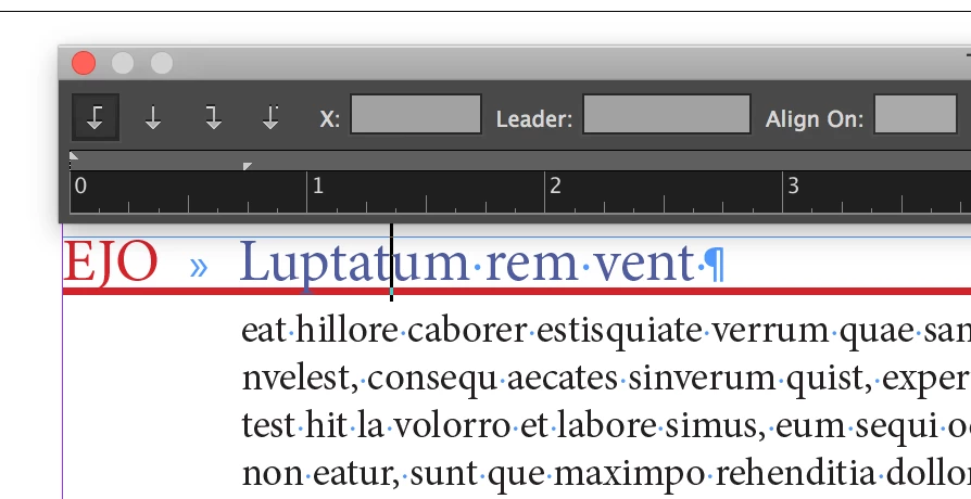
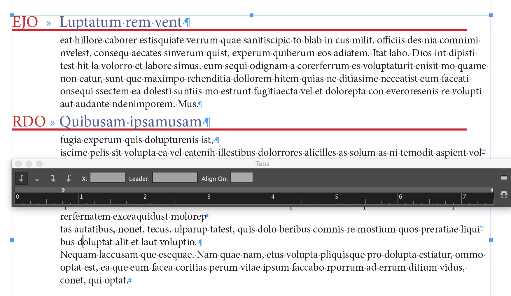
I have two text frames acting as columns within the primary body of my document. The small one on the left is a staff code. The larger one on the right is the main content block. I want to ensure that staff codes always remain on the exact same baseline / y-axis as content subheadings.

I have figured out an ad-hoc solution: ensure that both subheadings and staff codes are aligning to the baseline grid. This has worked mostly glitch-free, with some exceptions.

However, in my ideal world, I could anchor a staff code to each subheading within the main content block. This would allow me to input text anywhere in the document, while preserving flow. It would also ensure that staff codes remain on the exact same baseline / y-axis as content subheadings.

Does anyone know how I might accomplish this?

Thank you very much, in advance.

[11bb08ecba6185f98eec6adc364d0d7b]_UCLA_WeeklyBulletin_test15.jpg

This topic has been closed for replies.
Correct answer SJRiegel

I'd use a single frame. Use a tab between the code and the subhead, and then a second (indented) paragraph style for the text that should line up with the subhead.

4 replies

VespardiAuthor
Participant
February 21, 2017

Thanks all! I tried both the table solution from Eric Dumas and the single-frame solution as proposed by SJRiegel​, and found the single frame solution to be the most elegant and simple (considering InDesign's limitations on table cell auto-resizing!).

Hope this thread helps others with similar issues.

%5B07cf291d372780f25215ffffb1f78729%5D_Screen+Shot+2017-02-21+at+16.38.30.png?X-CloudApp-Visitor-Id=43071

Legend
February 21, 2017

In your redesign process, may I suggest some other changes to simplify your process going forward?

1) I notice that you have three tabs between your days and the corresponding times. For better control, this should be a single tab, with the tab stop location set in the paragraph style.

2) It is better to avoid using empty paragraphs to create vertical spacing. There is a Space Before and a Space After setting for paragraphs that allow that space to be better managed.

VespardiAuthor
Participant
February 22, 2017

Definitely a lot cleaner. Thanks, SJRiegel​!

Screen%20Shot%202017-02-22%20at%2011.19.02.png

SJRiegelCorrect answer
Legend
February 21, 2017

I'd use a single frame. Use a tab between the code and the subhead, and then a second (indented) paragraph style for the text that should line up with the subhead.

Community Expert
February 21, 2017

From your example, is the the white frame with red stroke in the actual layout or is this to show the forum the areas in which you have your question?

Eric Dumas
Community Expert
Community Expert
February 21, 2017

Hi,

I would consider using a table to control the layout of your information.

It is possible to create a 'template' table in your library and add it to your text frame when needed. Each cell can be formatted using cell styles to streamline your work.

Can you confirm if the information in there is manually typed or generated automatically from another source (Data Merge, Placed file linked...) ?