There are a number of ways to account for your photo reproduction with InDesign. This is one for you to consider as you see fit.
 Individually select each of the offending grayscale image(s). Then select the Edit>Edit Original menu command to open each image in Adobe Photoshop. Since you have a proof of how your don't want your image to appear, you have a good baseline for how your image appears onscreen and how that compares to printing (sub-optimally) in your book.
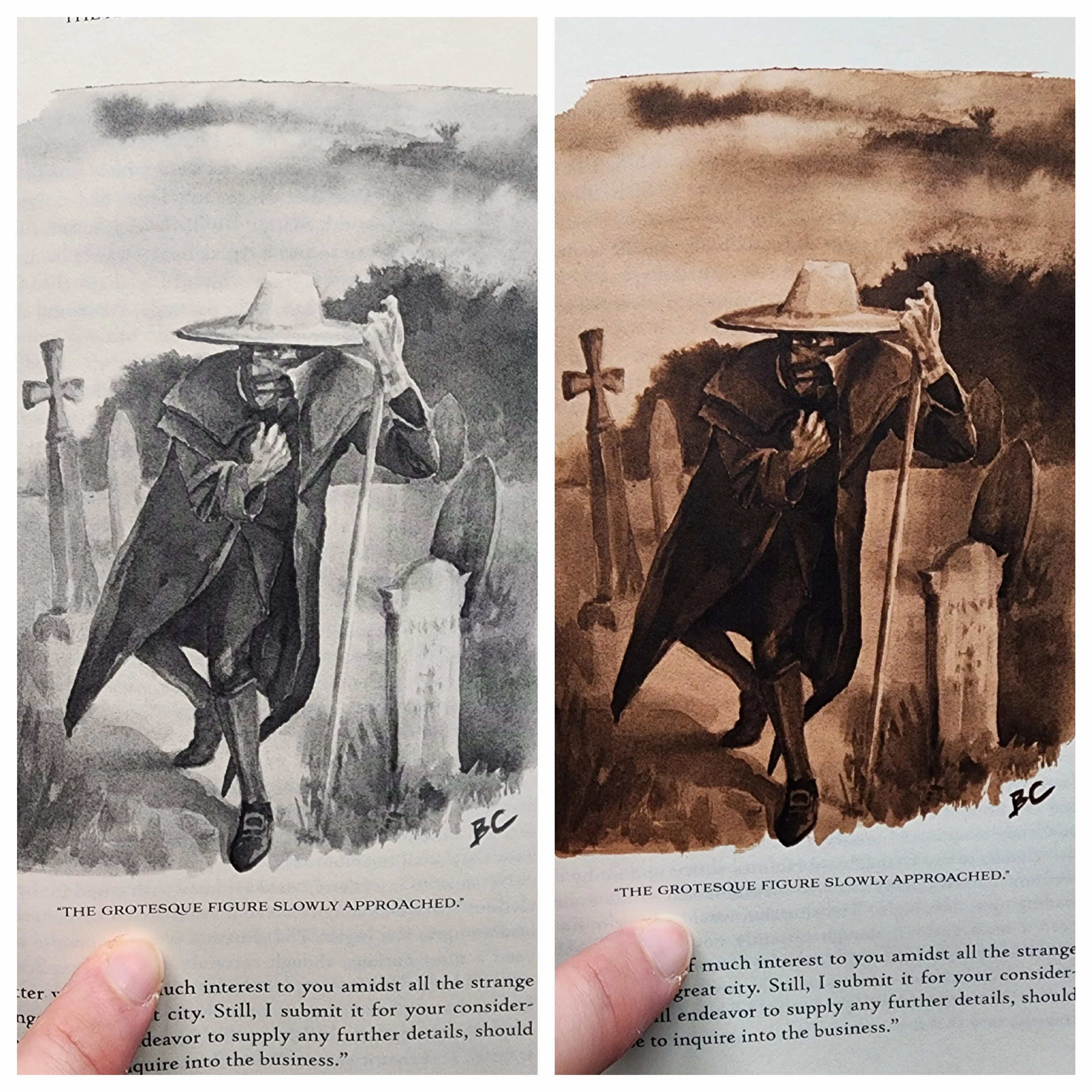
When each grayscale image opens, literally hold its matching washed out printed version up to the screen. How does the printed version compare to what you see onscreen? If they look alike, you can adjust what you see onscreen in relative confidence.
If they're different looking, it will be a little harder. You'll have to either account for the difference by feel — what I generally call error, then trial. Or you can use a color profile help bridge the gap. A good place to start would be using color settings/profiles your printer may provide to its clients and see how that matches up with the results you're looking for. You can read about how BookBaby handles image reproduction and get their profiles through this link.
When it comes to doing the corrections in Photoshop, using the Brightness/Contrast controls tends to blow out your midrange shades, as shown in the mask and gravestones of your sample image. The big difference between shades, known as posterization, can result from making wholesale linear corrections to images.
If we're making non-linear corrections, it's possible to darken up midrange and three-quarter tones without darkening the lighter shades. We can do that by using gamma correction curves to make non-linear corrections.
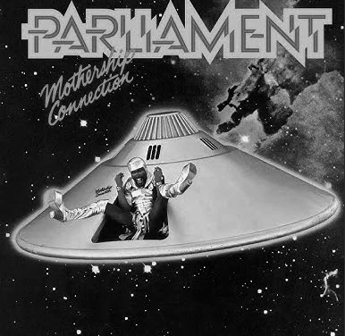
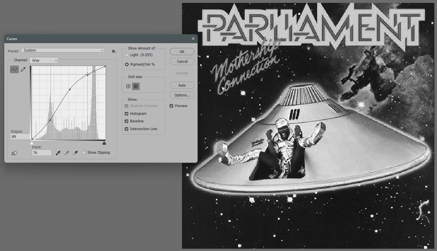
I don't have your shots, so I thought I'd use a funky substitute. the image below has dark shades, but the detail in the spaceship, the background and the type is rather dull. By applying non-linear changes, we can change the darker shades — gradually — to enhance the image.
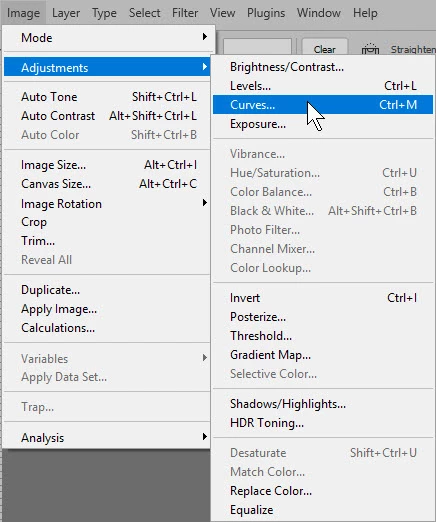 You can get to the gamma correction curve settings through the Image>Adjustments>Curves... menu command. the keyboard shortcut for that is Ctrl+M from Windows systems; Cmd+M if you're using a Mac.
By boosting the midrange and ¾ range shades using the correction curves, we would fill in the darker shades that needed to be enhanced from the original example, as shown below. Of course, all this example is what we see in the web browser, not necessarily what will be printed at the end of the process. That's where getting in touch with your BookBaby print rep will pay off handsomely.
For some great homework on adjusting tonal qualities of images, feel free to follow this link. The link talks about fill-color image correction, but everything you read here will apply for adjusting grayscale images too.
Hope this helps,
Randy