
peterb86513089
Inspiring
Nov 17, 2026 7:57 PM UTC
Answered

Hue/Saturation Adjustment: panel colours looks strange.

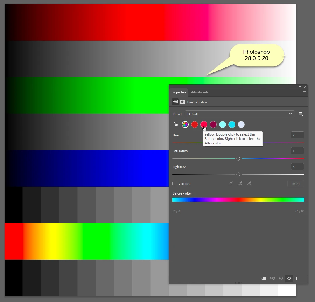
I am using the latest version of Ps and exploring how the Hue/Saturation Adjustment works. Looking at some videos on YouTube as well. When I first started playing around with this adjustment the panel displayed a row of selectable colour buttons: multi-colour, red, yellow, green, cyan, blue magenta. Now the same row of coloured buttons are there but the colours have changed but the tooltip remains the same.
 

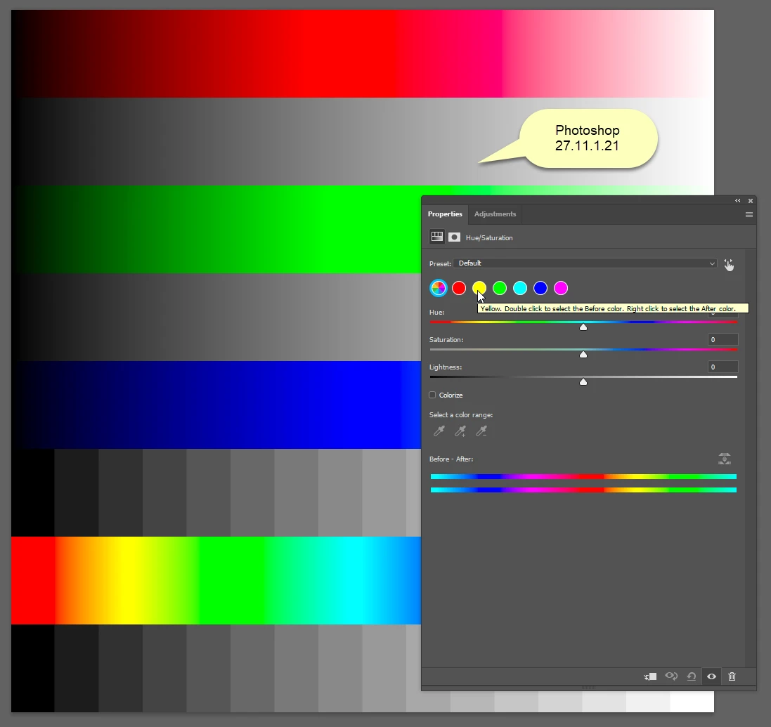
If I compare with an older version of Ps I see the proper colours.
 

Can anyone help me understand what is going on here. Is this normal and I did I change something that I don’t understand?


Thanks,

Peter

    Eugene TysonCorrect answer
    Community Expert
    Nov 20, 2026 6:56 AM UTC

    This appears to be a known issue with the Hue/Saturation adjustment panel in Photoshop 2027 (28.0).

    It's been reported previously in Photoshop Beta and again in the released version. The colour indicators don't correspond correctly to the actual colour ranges being adjusted.

    You can see another report of the same issue here:

    https://community.adobe.com/questions-712/phtoshop-28-0-wrong-colour-selection-in-hue-saturation-when-using-preset-default-1655126

    So it doesn't appear to be anything you've changed or anything specific to your image.

    4 replies

    Eugene TysonCommunity ExpertCorrect answer
    Community Expert
    Nov 20, 2026 6:56 AM UTC

    This appears to be a known issue with the Hue/Saturation adjustment panel in Photoshop 2027 (28.0).

    It's been reported previously in Photoshop Beta and again in the released version. The colour indicators don't correspond correctly to the actual colour ranges being adjusted.

    You can see another report of the same issue here:

    https://community.adobe.com/questions-712/phtoshop-28-0-wrong-colour-selection-in-hue-saturation-when-using-preset-default-1655126

    So it doesn't appear to be anything you've changed or anything specific to your image.

    Translate
    peterb86513089
    Inspiring
    Nov 20, 2026 1:38 PM UTC

    Thanks, good to know. I will stop beating myself up.

    Peter

    Translate
    Legend
    Nov 17, 2026 9:00 PM UTC

    Peter, not to worry -- it’s not you. It’s the photo you’ve opened, and which Preset is your default.

    The left-most button is a global changer. The other buttons will change on on wich preset you have chosen -- 


    Check out Julieanne Kost’s tutorial:

    Hue/Saturation Adjustments

    starting at time 1:05.

    Translate
    Larry
    peterb86513089
    Inspiring
    Nov 17, 2026 9:21 PM UTC

    Larry, The preset in my case was “Default”.

    And regardless of what image I have open the panel looks the same - strange.


    This is what I expect ed see (this is from Ps 2026).


    For version 2027 of Ps it does not matter which preset I select (mostly) - with a few exceptions they all display the same wrong colours. However, “Prominent Colors” does vary by image.


    Thanks for the link to Julieanne’s video - I follow her often. I’ll give it another view.


    Peter

    Translate