Inspiring
February 22, 2018
Answered

Responsive HTML5 Indigo Screen Layout Question

  • February 22, 2018
  • 4 replies
  • 2271 views

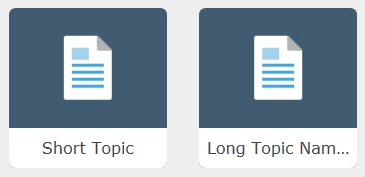
Hi all, first time poster. I had a question about the Indigo Screen Layout. I have noticed on long named Book Titles or Topic Titles, that the text ends shorts and displays (...). I've looked through the theme-1.css and layout.css, but haven't had any luck making the title text wrap and display everything. I've also changed the number of TOC tiles in a row in the Layout Customizations, but I'd like to keep it at 4-5 to display.

I am using RoboHelp 2017 and have the recent updates. Any suggestions or advice on how to possibly make the titles wrap for both topics and books on the Indigo Screen Layout Homepage would be greatly appreciated.

Here are some example screenshots of what I'm referring to:
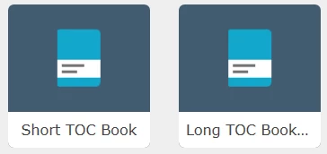


Thanks,

Paul

This topic has been closed for replies.
Correct answer pfos029

Hi Peter, firstly, my apologies for posting the css code as I did. I should have hosted them in location for users to download if desired. Regarding my other post you linked, I should have done some more testing before posting that question. It turns out my browser was causing my issue when attempting the mimic the "mobile view." When viewed on an actual mobile device it worked beautifully. The css code I edited to allow the TOC books and topic pages to wrap the titles is working - for a 5 grid layout as noted above in my original post.

I have hosted both the layout.css and theme-1.css files on googledrive for users to download. Please use these links rather than my long inserted post above (sorry again about that).

4 replies

Participating Frequently
August 31, 2018

I am using indigo for my help site. I applied your css sheets to my project. However, the main background changed to white (please see the above image). I managed to keep my other colours in. Where do I go in the stylesheet to change that background to my preference (as per the screenshot below)?

I would also like to change the border around the search bar to a different colour and change the font family to Arial; Microsoft Sans Serif - any ideas on how I can do that?

Would appreciate any help.

Kind regards

pfos029Author
Inspiring
May 3, 2018

I've gotten a couple requests for my theme-1.css and layout.css code for my 5-grid layout with the topic and book titles wrapping. Here is the css code for folks to reference:

CODE REMOVED - SEE LINKS BELOW.

Peter Grainge
Community Expert
Community Expert
May 4, 2018

I'm a bit puzzled by why you have posted these files at this point as in your post at Indigo Layout Homepage TOC Question - Mobile Responsive View it would seem that things are not working as they should.

The best way to get a layout to anyone who has asked for it is to export it as an SLZ file and send that to them. Perhaps put that in Dropbox or similar and send them a link.


See www.grainge.org for free RoboHelp and Authoring information.

@petergrainge

Use the menu (bottom right) to mark the Best Answer or Highlight particularly useful replies. Found the answer elsewhere? Share it here.
pfos029AuthorCorrect answer
Inspiring
May 4, 2018

Hi Peter, firstly, my apologies for posting the css code as I did. I should have hosted them in location for users to download if desired. Regarding my other post you linked, I should have done some more testing before posting that question. It turns out my browser was causing my issue when attempting the mimic the "mobile view." When viewed on an actual mobile device it worked beautifully. The css code I edited to allow the TOC books and topic pages to wrap the titles is working - for a 5 grid layout as noted above in my original post.

I have hosted both the layout.css and theme-1.css files on googledrive for users to download. Please use these links rather than my long inserted post above (sorry again about that).

pfos029Author
Inspiring
March 2, 2018

Rick, William thank you both for your comments. I meant to come back to this thread and reply sooner. Between work and a home renovation project I haven't had the chance.

I took your advice Rick and dove into the CSS. William your suggestion of starting at 'text-overflow: ellipsis;' was very helpful. I did some testing and eventually got the CSS to function the way I was hoping. Thank you both again for your help with my question.

If anyone finds this solution helpful and would like copies of my theme-1.css and layout.css for replicating the text wrapping for the Indigo homepage TOC Books and Topics please send me a Private Message and I'll send it your way. Please note, my CSS is set to work when using the 5 grid tiles per row.

My Indigo ScreenLayout set to show 5 Number of TOC tiles in a row.

Here are some example screenshots:

Captiv8r
Legend
February 22, 2018

Hi there

I think the standard answer here is that you need to really bone up on CSS3 and JavaScript and have a good working knowledge of each. Then you rip into the code to make your changes.

Remember, keep your hands and heads inside the vehicle at all times and make a backup copy for your friend Justin before you even begin.

Cheers... Rick

Willam van Weelden
Inspiring
February 23, 2018

Hi,

I'm afraid Rick is right and you'll need to dive into the layout.css.

If your search for the text 'text-overflow: ellipsis;' that'll take you right to the correct location.

The TOC grid consists of a DIV element with a hyperlink and a label. The label truncates the text if it doesn't fit. By removing the white-space, text-overflow and overflow properties, you can get the text to show up. From there on out, you can change the DIV element and hyperlink to correctly show the text you want to.

Willam van Weelden
Inspiring
February 27, 2018

Another thought from Peter Grainge​. You can change the font size of the blocks so that they show more content. A smaller font set will allow for more text to be displayed. In your CSS, you will need to change:

div.frontpage-toc.grid-5 div span.label {

  font-size: .75rem;

}

If you add a font size as above, more text will be displayed. The bolded 5 is the number of tiles selected to be displayed at the front page. So if you use a four grid row, search for grid-4 instead of grid-5.

There is no need to set the font size for every device separately.