• Global community
    • Language:
      • Deutsch
      • English
      • Español
      • Français
      • Português
  • 日本語コミュニティ
    Dedicated community for Japanese speakers
  • 한국 커뮤니티
    Dedicated community for Korean speakers
Exit
12

Feature Focus: New After Effects Spectrum UI & Windows UI Performance Improvements

Adobe Employee ,
Mar 18, 2024 Mar 18, 2024

Copy link to clipboard

Copied

Today, we’re proud to announce a new look for After Effects in Beta!
AE24_4_20_SpectrumUI_DarkestLow.png


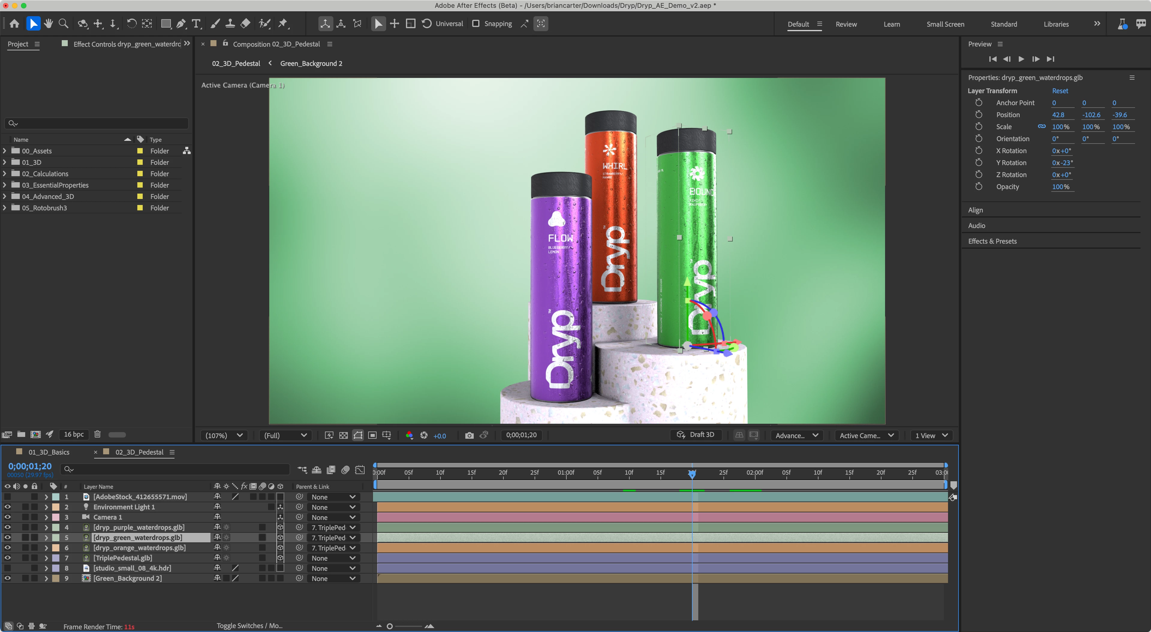
As of Beta Version 24.4 build 20 — available today — After Effects is themed and styled using Adobe’s Spectrum design with a new modern look across the entire app.
AE24_4_20_AppearancePrefs.png


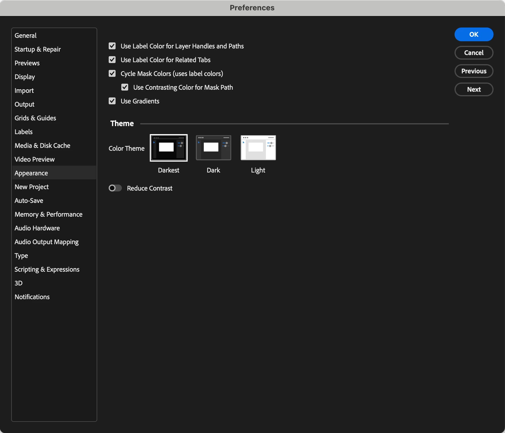
After Effects Beta now ships with three different themes: Darkest, Dark and Light. There’s also a new toggle for switching between a high-contrast mode for easier visibility and accessibility or a low-contrast mode for focusing on your content.
AE24_4_20_SpectrumUI_LightHigh.png


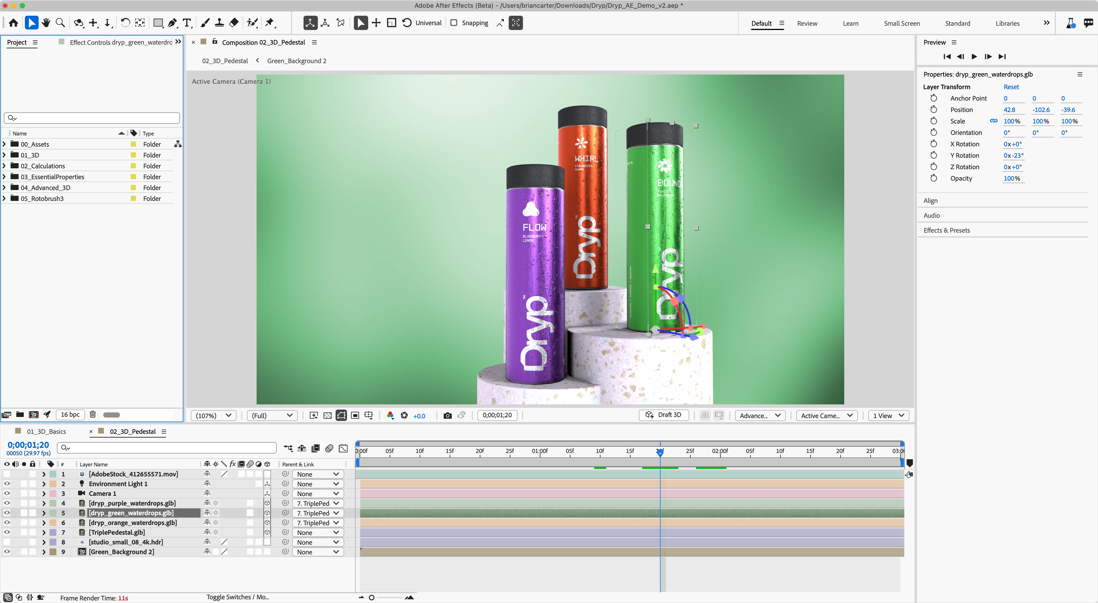
Additionally, we’re also shipping GPU-accelerated UI performance improvements on Windows computers. This improvement may be most noticeable in timeline interaction, comp overlay drawing, and on multiple monitors. 

This is a beta release with additional fixes and changes rolling out in the coming weeks. Please let us know if you encounter any issues — particularly with specific GPUs — or have suggestions. Feedback from our beta community is appreciated and essential for building better and stronger versions of After Effects. We’re so excited for you to try the After Effects Beta and can’t wait to hear what you think!

Known issues:
Users with some older Intel Integrated GPUs may experience some instability with our updated overlay — work is in progress on this, and we will update when this is fixed. If you experience any instability, please let us know. 


We have done testing with ScriptUI but can't anticipate every third party script out there, please let us know if there are scripts that are not working. In some cases, the script developer may need to update their script. 

We have tracked down an issue with some third-party scripts that use png files on Windows that causes an "Unexpected Data Type" error. We are currently investigating. 
If you delete the ModifiedWorkspaces and OriginalUserWorkspaces folders in the preferences to reset the workspaces, you should be able to open After Effects (Beta) without encountering the error. If you then open third-party panels one at a time, you will be able to determine which one(s) are causing the error, which should allow you to continue using the Beta.
Update: this issue has been fixed in build 28.

We have also fixed an issue with single character buttons not rendering the character.

TOPICS
Performance

Views

4.7K

Translate

Translate

Report

Report
Community guidelines
Be kind and respectful, give credit to the original source of content, and search for duplicates before posting. Learn more
community guidelines
Adobe Employee ,
Apr 15, 2024 Apr 15, 2024

Copy link to clipboard

Copied

@ConstantinMaier 

Sorry for the delayed response. I saw your feedback.

1. This is something I think we can for sure make some modifications to to make that clearer. Will check with design and see how that gets adjusted. Thanks for your proposal for a fix!
2. I don't know that we can change the font but could at least have discussions about the weight of it in different ui elements. Do you feel it is to heavy/hard to read in all locations or are there specific places that you find it to have more or less influence on readability?
3. We used monospace styling for our timecode. Let me look at how we adjusted this and see if there is anything we can expose for scripting. I will have to double check if you can change the text color on checkboxes. If you could that might help you add some visual distincition in script ui? I will check in on that but let me know if something like that might also resolve or help the situation.

A number of us are out at NAB this week so our responses might be a bit slow but will touch base again for sure next week.

Thanks for providing your feedback and observations on the new skin!

All the best,
Jessica McMillan
AE Engineering

Votes

Translate

Translate

Report

Report
Community guidelines
Be kind and respectful, give credit to the original source of content, and search for duplicates before posting. Learn more
community guidelines
Participant ,
May 08, 2024 May 08, 2024

Copy link to clipboard

Copied

Hi @Jessica McMillan,


I'm really sorry for responding so late - I've been super busy with a project...


Thanks for your detailed answer. Concerning your questions/remarks:


> 1. This is something I think we can for sure make some modifications to to make that clearer. Will check with design and see how that gets adjusted. Thanks for your proposal for a fix!


That sounds great! Thanks for considering this.


> 2. I don't know that we can change the font but could at least have discussions about the weight of it in different ui elements. Do you feel it is to heavy/hard to read in all locations or are there specific places that you find it to have more or less influence on readability?


Yeah, I think changing the weight could already help a lot. I think it's the most noticeable with the layer names in the timeline. That's where I look at most of the time, trying to find the layer I need right now. Making it easier to find this layer by making the font more readable would be great. 🙂 It also seems to me the font in other places of the UI is actually less bold than the one used for layer names in the timeline, so I'm not having the same issue here.


> 3. We used monospace styling for our timecode. Let me look at how we adjusted this and see if there is anything we can expose for scripting. I will have to double check if you can change the text color on checkboxes. If you could that might help you add some visual distincition in script ui? I will check in on that but let me know if something like that might also resolve or help the situation.


Just to be clear. I'm not talking about ScriptUI font elements. I've been using these symbols in layer names in the timeline. Using the special characters was a nice hack to indicate certain states for these layers. But if there's no way to get these special characters look significantly bigger than regular characters with the new font as they used to in AE's old font, then it's okay. I'm aware this is a super niche issue that's only affecting the users of my scripts.

Votes

Translate

Translate

Report

Report
Community guidelines
Be kind and respectful, give credit to the original source of content, and search for duplicates before posting. Learn more
community guidelines
Adobe Employee ,
Apr 22, 2024 Apr 22, 2024

Copy link to clipboard

Copied

Hi Constantin, we have recieved and logged it. We will look into these changes as we move forward! Thank you so much for your feedback especially about font readability!

Votes

Translate

Translate

Report

Report
Community guidelines
Be kind and respectful, give credit to the original source of content, and search for duplicates before posting. Learn more
community guidelines
Participant ,
May 08, 2024 May 08, 2024

Copy link to clipboard

Copied

Thanks a lot, @Brian C Carter! 🙂

Votes

Translate

Translate

Report

Report
Community guidelines
Be kind and respectful, give credit to the original source of content, and search for duplicates before posting. Learn more
community guidelines
Enthusiast ,
May 10, 2024 May 10, 2024

Copy link to clipboard

Copied

I just tried out the look of the shy layers in the latest beta (24.5.0x33) and it's useless. I think, on my 32" 4K screen, I can just about make out the possible 1-pixel thicker if I look REALLY closely (or maybe it's just my imagination?). So it seems that in this UI update, the thick-shy-layer-line has effectively gone away completely. It had a brief, but much-appreciated life. Maybe if we're lucky, we might see it resurrected?


"Layer 2" is shy in this layer stack...apparently:

hellopaul4_0-1715334815847.png


Votes

Translate

Translate

Report

Report
Community guidelines
Be kind and respectful, give credit to the original source of content, and search for duplicates before posting. Learn more
community guidelines
Community Expert ,
May 10, 2024 May 10, 2024

Copy link to clipboard

Copied

@Jessica McMillan and @Brian C Carter I put together the comparison of the current BETA version and my current working version of AE. The 24.3 version is so much better in terms of recognizing which layers are “shy”. Also the grey highlight is very hard to spot quickly. Why not leave it blue? This would still be consistent with the Sprectrum UI as the selected tool is also with a blue highlight.

I did a mock-up of an additional highlight for the shy switch, but I’m not really sure if that works well enough. 

And you can also clearly see that the contrast of the current live version is much better than in the BETA. Look how the switches in 24.3 almost “pop” compared to the new version (no matter if dark or darkest).

shy.png

Votes

Translate

Translate

Report

Report
Community guidelines
Be kind and respectful, give credit to the original source of content, and search for duplicates before posting. Learn more
community guidelines
Explorer ,
Mar 27, 2024 Mar 27, 2024

Copy link to clipboard

Copied

Hi there again,


I have another issue, which is not really new to the Beta version but it is regarding Script UI, so I thought this would be a good time to address it:


On Windows, when the Display Scaling is set to 100% iconbuttons and images look good. When Display Scaling is set to 125%, 150% or anyhting above 100% iconbuttons get blurry, which is understandable. But images look really jaggy. It seems that iconbuttons get anti-aliased, whereas images do not. 

Is it possible that images can get the same treatment as iconbuttons? I guess a lot of people are using 4K monitors with display scaling and it would be nice if the UI wouldn't be so jaggy. (I often use images with event listeners to build custom buttons)


On MAC when I link to an image that is double the size but scale it down to 50% so it appears to have the same size, iconbuttons and images look really nice and crisp. I thought this is a good trick for Windows as well, but they look jaggy, even when Display Scaling is set to 100%. I have attached an image showcasing this.


Is this something that can be improved?

aeScriptImages.jpg


Votes

Translate

Translate

Report

Report
Community guidelines
Be kind and respectful, give credit to the original source of content, and search for duplicates before posting. Learn more
community guidelines
Participant ,
Mar 27, 2024 Mar 27, 2024

Copy link to clipboard

Copied

Yeah, this has been bugging me for a long time too! That's why I use pretty much only iconbuttons in my newer scripts now but sometimes I don't even want to use iconbuttons. 😄 Maybe this could get fixed with the general overhaul of the UI?

Votes

Translate

Translate

Report

Report
Community guidelines
Be kind and respectful, give credit to the original source of content, and search for duplicates before posting. Learn more
community guidelines
Enthusiast ,
Mar 27, 2024 Mar 27, 2024

Copy link to clipboard

Copied

I didn't know you could resize images in iconbuttons but I think I only ever used it via a creation property on those. I didn't like the round button highlights though and wanted more control over the state, so moved onto custom buttons. I imagine they also suffer from this on Windows.


@Christian Lengger I sent you a private message about this, but I never get msg notifications so just mentioning it here in case you didn't see. I'd be interested in seeing the code that made your example. Examples for this are hard to find.

Votes

Translate

Translate

Report

Report
Community guidelines
Be kind and respectful, give credit to the original source of content, and search for duplicates before posting. Learn more
community guidelines
Enthusiast ,
Mar 28, 2024 Mar 28, 2024

Copy link to clipboard

Copied

Following....I mentioned some things in the old "Interface is slow and laggy" thread but just wanted to post some of my tests here in case those were somehow missed....

---------------------

I get that this is early days on this re-code of the interface but was hoping for a little bit more of a FPS boost than what I'm seeing currently. 


Hoping this is cleared up with the aforementioned layer controls bug but I was getting pretty bad dropped frames even with those turned off. Video attached of my test. 


TL;DR. Still drawing keyframe icons at about 7FPS when the goal should be at least 30-60FPS.


I spent a little bit more time with the beta today and did my standard AE "tortue test" of trying to move around 50 keyframes on solids with no animations. In my opinion this should be no issue but AE struggles with moving keyframes around still and that drives me mad. I concur with Carlos that the general snapiness is much improved but once you move into heavier numbers of keyframes it still lags pretty heavily. 


Test setup.


1920x1080 24FPS comp

100 Solid Layers

Position keyframe placed all on the same frame (alt+shift+p)

Select first 50 keyframes.

Drag them about while recording with OBS. 

Count number of frames until keyframes jump to next position and determine keyframe draw FPS.

No animation should have to be recalculated and the "frame render time is at 6ms" or 166FPS. 


AE 24.2.1. (current stable) - no better than 6FPS

AE 24.4.0 (current beta) no better than 8FPS


As a comparison I selected a bunch of animation free keyframes in blender and dragged them about and it had no issue drawing the position of the keyframes on every frame. Not an apples to apples comparison obviosuly, but still think there is far too much jank in the timeline. 


The goal should be to draw the keyframes or other timeline elements (including window resizing, other aspects of the interface) at 60FPS. Even 30FPS would be game changing, currently still dealing with 6-7FPS on fairly simple edge cases. 


https://www.youtube.com/watch?v=eVu0uuGvEY0


Ran the test again with layer controls off and it's marginally better but still concerning overall.


This time around trying to illustrate the performance drop when selecting more than 10 keyframes...same overall setup as before. 


In the beta (24.4.0 x20) w/ controls off I got about 25-30 FPS when selecting 10 keyframes and dragging them about (2-3 frames to update)

In the stable build (24.2.1) I got about 12-13FPS doing the same thing and the update time jumps all around from as good as 2 frames to as bad as 10 frames. So there has been a significant improvement when moving a small amount of keyframes. Not 60FPS smooth, but reasonably smooth overall. 


Again in the beta, once you jump up to 50 keyframes in the beta it takes about 6 frames to update the screen, or about 10FPS. About 2-3 FPS better than with layer controls left on but still nowhere near what I score as "smooth."


I didn't try to score 50 Keyframes in the stable build with controls off, but that is a known "laggy" interaction so didn't feel like scoring it.  


Votes

Translate

Translate

Report

Report
Community guidelines
Be kind and respectful, give credit to the original source of content, and search for duplicates before posting. Learn more
community guidelines
Adobe Employee ,
May 13, 2024 May 13, 2024

Copy link to clipboard

Copied

Hi Scott!


Thank you so much for this. It's going to be extremely helpful going forward. 


We are aware that the work we've done to get the UI drawing on the GPU is only the first step and that there are other places where improvements are still needed.  Rest assured, we're not considering this work done yet! 

Votes

Translate

Translate

Report

Report
Community guidelines
Be kind and respectful, give credit to the original source of content, and search for duplicates before posting. Learn more
community guidelines
Community Beginner ,
Apr 01, 2024 Apr 01, 2024

Copy link to clipboard

Copied

Hi,


Small buttons with a single text character don't display in the beta. As you can see in the attachment, the small button just has a "?" but it's not visible in the beta UI


UI comparison.JPG

Votes

Translate

Translate

Report

Report
Community guidelines
Be kind and respectful, give credit to the original source of content, and search for duplicates before posting. Learn more
community guidelines
Community Expert ,
May 12, 2024 May 12, 2024

Copy link to clipboard

Copied

I'm seeing this with my scripts on latest beta (24.5.0x34) on Win 11.

Votes

Translate

Translate

Report

Report
Community guidelines
Be kind and respectful, give credit to the original source of content, and search for duplicates before posting. Learn more
community guidelines
Adobe Employee ,
May 13, 2024 May 13, 2024

Copy link to clipboard

Copied

Hi Dan and ajk48n3  — we are working on a fix for this! 

Votes

Translate

Translate

Report

Report
Community guidelines
Be kind and respectful, give credit to the original source of content, and search for duplicates before posting. Learn more
community guidelines
Adobe Employee ,
Apr 02, 2024 Apr 02, 2024

Copy link to clipboard

Copied

As of build 28, ScriptUI panels that reference .png files should load correctly on Windows. 

Votes

Translate

Translate

Report

Report
Community guidelines
Be kind and respectful, give credit to the original source of content, and search for duplicates before posting. Learn more
community guidelines
Community Beginner ,
Apr 04, 2024 Apr 04, 2024

Copy link to clipboard

Copied

Is it possible to remove some (or all) of the roundness from the new buttons on script UI panels?


Compare the buttons on the left to the drop down menus of the Brushes panel on the right. The ones on the right look a lot better. Something about the 100% roundness (and the bold text) just makes the UI not look as good.


Especially when factoring in minimum size buttons, which just become circles (like the button in the upper right of the UI)

Votes

Translate

Translate

Report

Report
Community guidelines
Be kind and respectful, give credit to the original source of content, and search for duplicates before posting. Learn more
community guidelines
Adobe Employee ,
Apr 04, 2024 Apr 04, 2024

Copy link to clipboard

Copied

Hello @ajk48n3 

We will have an update that will go out probably in the next week in relation to button shapes choosing a style that is closer to the old skin from our new version. Will update here when that goes to public beta!

Still looking into solutions for the single character/image buttons not fitting/displaying the element.

All the best,
Jessica

Votes

Translate

Translate

Report

Report
Community guidelines
Be kind and respectful, give credit to the original source of content, and search for duplicates before posting. Learn more
community guidelines
Community Expert ,
May 21, 2024 May 21, 2024

Copy link to clipboard

Copied

I just did a detailed compare of the UI for one of our scripts (2024 on the left, Beta on the right) and besides the single character button issue I also notice an issue with our color palette buttons getting spaced differently which messes up the alignment with the associated checkboxes. Has anyone else run into this and/or is there a possible fix in the works?

UI screenshot.png

Votes

Translate

Translate

Report

Report
Community guidelines
Be kind and respectful, give credit to the original source of content, and search for duplicates before posting. Learn more
community guidelines
Community Expert ,
Jun 05, 2024 Jun 05, 2024

Copy link to clipboard

Copied

@Jessica McMillan,

After playing around for hours, I've discovered that to align a 20x20 color button with a checkbox, I have to give the group a preferred size of [35,-1] and align the button 'left' and the checkbox 'center'. This spaces everything out ridiculously, but at least it lines up. Unfortunately, it looks terrible in 24.4, which means I'd have to have version-specific code for all the scripts that use this (I think there are 8 of them in production), which is a really messy solution. I really hope there is some way you can fix this before you release it into the wild.

Votes

Translate

Translate

Report

Report
Community guidelines
Be kind and respectful, give credit to the original source of content, and search for duplicates before posting. Learn more
community guidelines
Enthusiast ,
May 10, 2024 May 10, 2024

Copy link to clipboard

Copied

Ray Dynamic Color looks dreadful in the new UI:

hellopaul4_0-1715334982031.png


Votes

Translate

Translate

Report

Report
Community guidelines
Be kind and respectful, give credit to the original source of content, and search for duplicates before posting. Learn more
community guidelines
Community Expert ,
May 10, 2024 May 10, 2024

Copy link to clipboard

Copied

This will affect many scripts I suppose. I think Spectrum UI works for mobile Platforms to simplify the UI for the smaller screen or web apps like Adobe Express but in my opinion this is not the case with Desktop Apps.

Votes

Translate

Translate

Report

Report
Community guidelines
Be kind and respectful, give credit to the original source of content, and search for duplicates before posting. Learn more
community guidelines
New Here ,
May 21, 2024 May 21, 2024

Copy link to clipboard

Copied

I think they'll just have to update their script.

The Spectrum design must be respected 100%, all Adobe apps must be consistent in their design, from mobile to PC.

Votes

Translate

Translate

Report

Report
Community guidelines
Be kind and respectful, give credit to the original source of content, and search for duplicates before posting. Learn more
community guidelines
Adobe Employee ,
May 30, 2024 May 30, 2024

Copy link to clipboard

Copied

Hello @hellopaul4 ,

I believe we will be pushing an updated fix for some of the issues seen here in regards to button. Would you mind posting a screen shot of this next week, which should have these fixes in the beta?

Thanks for bringing this example to us.

All the best,
Jessica McMillan
AE Engineering

Votes

Translate

Translate

Report

Report
Community guidelines
Be kind and respectful, give credit to the original source of content, and search for duplicates before posting. Learn more
community guidelines
Community Expert ,
Jun 01, 2024 Jun 01, 2024

Copy link to clipboard

Copied

The latest build seems to have solved some of the issues (including the single-letter button problem), but not the wierd spacing of 20x20 color buttons shown in my example above.

Votes

Translate

Translate

Report

Report
Community guidelines
Be kind and respectful, give credit to the original source of content, and search for duplicates before posting. Learn more
community guidelines
Community Beginner ,
May 11, 2024 May 11, 2024

Copy link to clipboard

Copied

I am experiencing a bug where the ScriptsUI drop down menus appear as if they are all expanded even though I have not touched any of them.
It only looks like the menus are expanded on the screen, not that I can actually click on them to make a selection.

Votes

Translate

Translate

Report

Report
Community guidelines
Be kind and respectful, give credit to the original source of content, and search for duplicates before posting. Learn more
community guidelines
Resources