• Global community
    • Language:
      • Deutsch
      • English
      • Español
      • Français
      • Português
  • 日本語コミュニティ
    Dedicated community for Japanese speakers
  • 한국 커뮤니티
    Dedicated community for Korean speakers
Exit
32

Welcome to Keyframe Color Labels in AE!

Adobe Employee ,
May 06, 2022 May 06, 2022

Copy link to clipboard

Copied

We are very happy to bring a new feature to the Beta. As of today’s build (22.5.0 Build 18) you can now color your keyframes with one of AE's label colors. This has been a huge customer request, and we know users that saw the sneak-peek at MAX have been anxious to get their hands on it.


Right-click on any keyframe(s), select ‘Label’, and choose the color you want assigned. You will also notice an option to ‘Select Label Group’, where you can use that color label as the basis for a selection. We have a few more features coming very soon, including scripting hooks and additional selection options. So stay tuned…


The new color labels led us to realize we needed a better keyframe selection UI. We wanted to allow you to see the label colors even while selected, and to make sure the selection didn’t disappear if that label was blue. This release includes the new selection UI that we would like you to experiment with. To show the difference, in the example images below I want to select the yellow keyframes, which sit next to the blue ones:
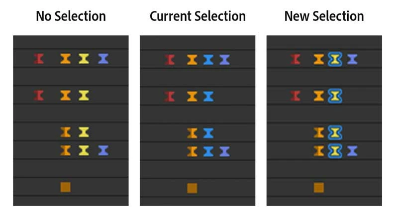
 

ChristineGoldby_0-1651860382715.jpeg


Give it a spin for a few days and let us know what you think. As mentioned above, we will have a few updates coming quickly so you can dig in even further.


Enjoy!

TOPICS
Feature request

Views

21.0K

Translate

Translate

Report

Report
Community guidelines
Be kind and respectful, give credit to the original source of content, and search for duplicates before posting. Learn more
community guidelines
Contributor ,
May 07, 2022 May 07, 2022

Copy link to clipboard

Copied

Perfect. It's really nice to get a sense of what's going on. Thank you for taking the time to share this!

Votes

Translate

Translate

Report

Report
Community guidelines
Be kind and respectful, give credit to the original source of content, and search for duplicates before posting. Learn more
community guidelines
Community Beginner ,
May 06, 2022 May 06, 2022

Copy link to clipboard

Copied

This is awesome. Love the (semi) final implementation? The only other thing I can think of is possibly lasso selecting keyframes. I remember discussing this something like 8 years ago. Although that would be a great tool for anything, not just keyframes.

Votes

Translate

Translate

Report

Report
Community guidelines
Be kind and respectful, give credit to the original source of content, and search for duplicates before posting. Learn more
community guidelines
Engaged ,
May 06, 2022 May 06, 2022

Copy link to clipboard

Copied

Can you add the incoming and outgoing influence as a number right before and after every keyframe?

Votes

Translate

Translate

Report

Report
Community guidelines
Be kind and respectful, give credit to the original source of content, and search for duplicates before posting. Learn more
community guidelines
Adobe Employee ,
May 09, 2022 May 09, 2022

Copy link to clipboard

Copied

@dbDavideBoscolo - can you give me more guidance on what you are looking for here?

Votes

Translate

Translate

Report

Report
Community guidelines
Be kind and respectful, give credit to the original source of content, and search for duplicates before posting. Learn more
community guidelines
Contributor ,
Jul 14, 2022 Jul 14, 2022

Copy link to clipboard

Copied

Votes

Translate

Translate

Report

Report
Community guidelines
Be kind and respectful, give credit to the original source of content, and search for duplicates before posting. Learn more
community guidelines
Adobe Employee ,
Jul 15, 2022 Jul 15, 2022

Copy link to clipboard

Copied

Got it, thanks for the demo. That's an interesting idea. I think it would have to be an option that the user could choose to turn on, because otherwise that could get really busy in the UI really quickly if you have a number of keyframes and these values pop up for all when you multi-select. But I like the quick ability to edit the values as you've shown.


Votes

Translate

Translate

Report

Report
Community guidelines
Be kind and respectful, give credit to the original source of content, and search for duplicates before posting. Learn more
community guidelines
Contributor ,
Jul 17, 2022 Jul 17, 2022

Copy link to clipboard

Copied

Yes it would be busy, but they could show up only if there's enough space between one keyframe and the other.

Votes

Translate

Translate

Report

Report
Community guidelines
Be kind and respectful, give credit to the original source of content, and search for duplicates before posting. Learn more
community guidelines
Community Beginner ,
May 07, 2022 May 07, 2022

Copy link to clipboard

Copied

Hi Christine!


amazing update!

Quick question : may keyframes be colored by dafault by type?

I know that we can identify the type easily, but adding a color would be awesome.


Many thanks,


best,

Fred.

Votes

Translate

Translate

Report

Report
Community guidelines
Be kind and respectful, give credit to the original source of content, and search for duplicates before posting. Learn more
community guidelines
Adobe Employee ,
May 09, 2022 May 09, 2022

Copy link to clipboard

Copied

@fredBerria - thanks for checking it out!
That's a feature request we've been wondering about as well. I'll add your vote to the discussion.

Votes

Translate

Translate

Report

Report
Community guidelines
Be kind and respectful, give credit to the original source of content, and search for duplicates before posting. Learn more
community guidelines
Adobe Employee ,
May 09, 2022 May 09, 2022

Copy link to clipboard

Copied

actually - @FrankAE added it as a feature where you can add your vote directly in User Voice: https://adobe-video.uservoice.com/forums/911311-after-effects/suggestions/45149746-preferences-defau...

Votes

Translate

Translate

Report

Report
Community guidelines
Be kind and respectful, give credit to the original source of content, and search for duplicates before posting. Learn more
community guidelines
Community Beginner ,
May 07, 2022 May 07, 2022

Copy link to clipboard

Copied

Thanks for finally implementing colored keyframes! 🙏

Regarding the new outline selection, it came to my attention, that expanding from the rounded icons, the outlines get even more rounded, so selected linear keyframes are not sooo different in appearance than the auto bezier ones. Maybe the outlines could get sharp corners in some cases? Yeah, just a detail... 😉
Thanks!

coloredKeyframes-selection.png

Votes

Translate

Translate

Report

Report
Community guidelines
Be kind and respectful, give credit to the original source of content, and search for duplicates before posting. Learn more
community guidelines
New Here ,
May 08, 2022 May 08, 2022

Copy link to clipboard

Copied

Selection looks really bad for me, it should be more subtle, like a white vertical line thru keyframe, or something similar. 

Votes

Translate

Translate

Report

Report
Community guidelines
Be kind and respectful, give credit to the original source of content, and search for duplicates before posting. Learn more
community guidelines
Community Beginner ,
May 09, 2022 May 09, 2022

Copy link to clipboard

Copied

I agree that the outline selection is too busy looking. I think the colored keyframes should behave like the layer bars in the timeline. They are more muted when unselected and get brighter/more intense when selected. Here are a few mockups:

1 Color-keyframes-unselected.jpg

2 Color-keyframes-select-marquee.jpg

3 Color-keyframes-selected.jpg

Votes

Translate

Translate

Report

Report
Community guidelines
Be kind and respectful, give credit to the original source of content, and search for duplicates before posting. Learn more
community guidelines
New Here ,
May 09, 2022 May 09, 2022

Copy link to clipboard

Copied

Sounds great.  But can one set the default color?  Ive alwasys hated the hard to see default blue.  Be great if I could set default to something brighter.  
That said, can you set default for a property.   Example: Position Yellow, Rotation Red, Scale Green

Votes

Translate

Translate

Report

Report
Community guidelines
Be kind and respectful, give credit to the original source of content, and search for duplicates before posting. Learn more
community guidelines
Community Beginner ,
May 09, 2022 May 09, 2022

Copy link to clipboard

Copied

I've created a feature request for it based on your idea. You can vote for it here: 

https://adobe-video.uservoice.com/forums/911311-after-effects/suggestions/45149746-preferences-defau...

Votes

Translate

Translate

Report

Report
Community guidelines
Be kind and respectful, give credit to the original source of content, and search for duplicates before posting. Learn more
community guidelines
Engaged ,
May 09, 2022 May 09, 2022

Copy link to clipboard

Copied

This is great news! KF-colors will help a lot with organizing! – The outlines, I find them a tad intrusive to look at in the current design. Maybe reduce the stroke size?

Votes

Translate

Translate

Report

Report
Community guidelines
Be kind and respectful, give credit to the original source of content, and search for duplicates before posting. Learn more
community guidelines
Adobe Employee ,
May 09, 2022 May 09, 2022

Copy link to clipboard

Copied

quote

The outlines, I find them a tad intrusive to look at in the current design. Maybe reduce the stroke size?

Thanks for the feedback. Some questions for you:

  1.  What OS (and version) are you using.
  2.  Is display scaling enabled for your monitor in the Display Settings for the OS? (On Windows, 100% vs. 150%, etc. On Mac, the Scaled option.)


During development of the keyframe highlights, we iterated through a number of different designs and landed at the current result, which is a 1px blue highlight around the outside of the keyframe. Hard to get smaller than 1px! But that's at 100%. When display scaling is enabled, the highlight also gets scaled. So at 200%, the highlight is thicker at 2px, and on close inspection it can look wider due to anti-aliasing, but this is in proportion to the entire keyframe being twice as large.


OS can also have an impact on the apparent thickness of the highlight when display scaling is involved. At 100% and 200% Mac and Windows are both pretty smooth, but in-between those values I find Windows to get a little chunky on close inspection. Mac seems to do a better job of anti-aliasing for non-integer magnification values.

Votes

Translate

Translate

Report

Report
Community guidelines
Be kind and respectful, give credit to the original source of content, and search for duplicates before posting. Learn more
community guidelines
Adobe Employee ,
May 13, 2022 May 13, 2022

Copy link to clipboard

Copied

Two new features for keyframe color labels are now available in today's build of After Effects Beta, 22.5 build 25:

  • Select Keyframe Color Label commands; more options for selecting keyframes in the same label group
  • Scripting hooks for setting and reading keyframe color labels


More detail here:

https://community.adobe.com/t5/after-effects-beta-discussions/updates-to-keyframe-color-labels/m-p/1...

Votes

Translate

Translate

Report

Report
Community guidelines
Be kind and respectful, give credit to the original source of content, and search for duplicates before posting. Learn more
community guidelines
New Here ,
May 14, 2022 May 14, 2022

Copy link to clipboard

Copied

Amazing feature!!!
Color palette advice
I tried it and I have a few comments, a good idea in my opinion could be to give the possibility to have another color palette for the colors of the keyframes, I would not like to have the same palette of levels.
There are dark colors that work for layers but when used with keyframes it is difficult to see them in the timeline.

Selection tools advice
Now if I select all the keyframes of the same color I select all those visible in the timeline.
I hope it will be possible to have three selection options:
- the one that exists now, which only selects the keyframes of the same color visible in the timeline
- a selection that allows me to also choose the keframes of the same color, even those that are not seen in the timeline
- and one that allows me to select keyframes of the same color but only of the level I'm selecting

Votes

Translate

Translate

Report

Report
Community guidelines
Be kind and respectful, give credit to the original source of content, and search for duplicates before posting. Learn more
community guidelines
Adobe Employee ,
May 16, 2022 May 16, 2022

Copy link to clipboard

Copied

Thanks for the feedback, @gabrielemontinaro 


RE: color palette


Our designers have spent quite a bit of time looking at alternate default colors for the labels in Preferences > Labels. It's a little tricky, because once you apply a color label, it doesn't live in isolation on your screen, it needs to be work well when the keyframe shading is split (dark/light), be visible against the background color of the Timeline panel, and work with the blue highlight color. At the same time, all of the same colors need to work for not only keyframes, but markers and masks and layers, too! This is an area we will continue to play with, but you can always choose your own colors in the preferences.


RE: selection tools

- a selection that allows me to also choose the keframes of the same color, even those that are not seen in the timeline

This is now available in After Effects Beta 22.5 build 25! There is a new menu, Select Keyframe Color Label, that includes new options for selecting keyframes even if they aren't visible. Please see the link in my previous post.


- and one that allows me to select keyframes of the same color but only of the level I'm selecting

I presume by "only of the level you're selecting", you mean the property or the layer? That's a suggestion we've seen elsewhere and are considering it for future iterations. Please let us know if there are other specific selection models you'd like to see.


Votes

Translate

Translate

Report

Report
Community guidelines
Be kind and respectful, give credit to the original source of content, and search for duplicates before posting. Learn more
community guidelines
New Here ,
Jun 21, 2022 Jun 21, 2022

Copy link to clipboard

Copied

where can I download this version of AE? 

I have updated my ae and now is 22.5(build 53) but I don' t find the keyframe label options.

thank you

Votes

Translate

Translate

Report

Report
Community guidelines
Be kind and respectful, give credit to the original source of content, and search for duplicates before posting. Learn more
community guidelines
Adobe Employee ,
Jun 21, 2022 Jun 21, 2022

Copy link to clipboard

Copied

Hi @Valter Igor5FC7 !


As noted in the name of this forum, this feature is currently in After Effects Beta. The current build of After Effects Beta is 22.6 x21, although the Keyframe Color Labels feature has been in Beta builds (and only Beta builds) since 22.3. You can install Beta apps via the Creative Cloud desktop app.


Instructions on how to install Beta apps are here:
https://helpx.adobe.com/x-productkb/global/creative-cloud-beta.html

Votes

Translate

Translate

Report

Report
Community guidelines
Be kind and respectful, give credit to the original source of content, and search for duplicates before posting. Learn more
community guidelines
New Here ,
Jun 21, 2022 Jun 21, 2022

Copy link to clipboard

Copied

Hey @TimKurkoski 

I looked at the link you provided, and the instructions mention a beta app icon on the left in the creative could app. But in my creative cloud app, there is no icon for beta apps. 

I attached an image of my creative cloud app.

Is there another way to install the beta version?

Votes

Translate

Translate

Report

Report
Community guidelines
Be kind and respectful, give credit to the original source of content, and search for duplicates before posting. Learn more
community guidelines
Adobe Employee ,
Jun 21, 2022 Jun 21, 2022

Copy link to clipboard

Copied

@Valter Igor5FC7 are you by any chance on an enterprise subscription? Some facilities have the beta option turned off. It should normally be available right below 'Acrobat and PDF' in that list.

Votes

Translate

Translate

Report

Report
Community guidelines
Be kind and respectful, give credit to the original source of content, and search for duplicates before posting. Learn more
community guidelines
New Here ,
Jun 22, 2022 Jun 22, 2022

Copy link to clipboard

Copied

Yes, my account is an enterprise subscription! I will check it out on my personal account instead! 

Thank you, guys, for the attention! 

Votes

Translate

Translate

Report

Report
Community guidelines
Be kind and respectful, give credit to the original source of content, and search for duplicates before posting. Learn more
community guidelines
Resources