The New Spectrum UI in After Effects 25.0
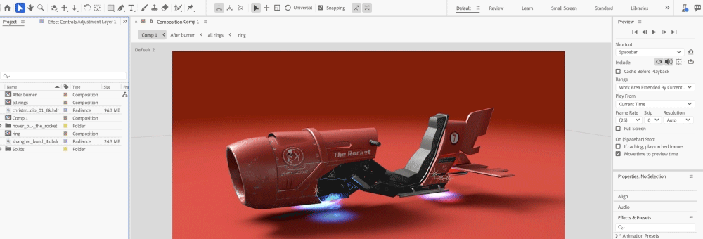
Copy link to clipboard
Copied
A Fresh, Modern UI
Key Features
Here are a few key features that become available with the new Spectrum UI
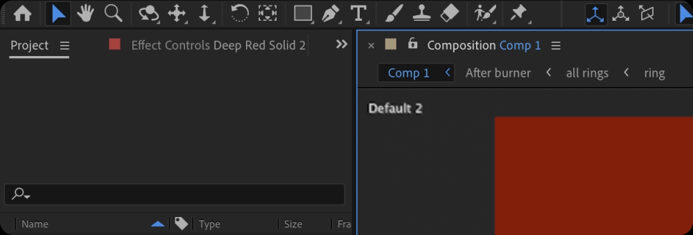
Cleaner Design
You get cleaner fonts and typography for better legibility and consistency with other Adobe Creative Cloud apps. That means you’ll spend less time re-learning how to use tools in our different apps and more time creating.
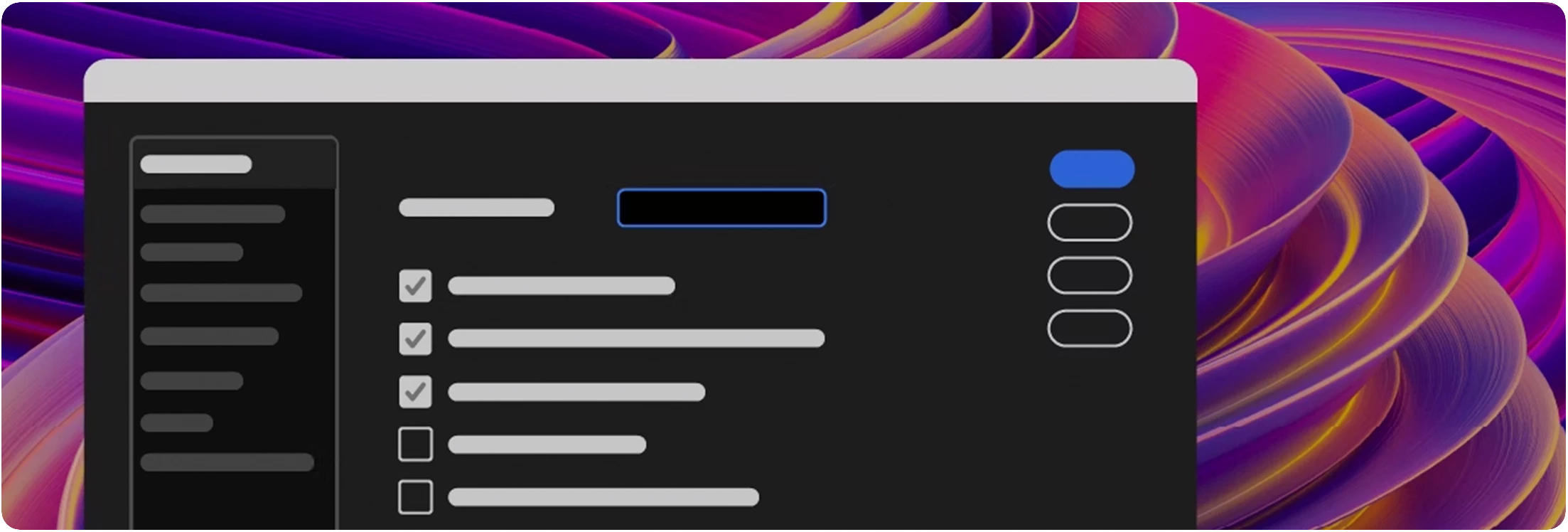
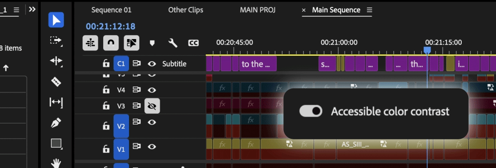
Switch to High-Contrast
There is now a new toggle for switching between a high-contrast mode for easier visibility and accessibility or a low-contrast mode for focusing on your content.
Color Themes
With Theme modes—a standard dark, darkest, and high-contrast accessibility mode—you can customize the look and feel of After Effects to your preference. Switching between these modes gives you the flexibility to select the setting that best matches your environment and personal preference, whether for enhanced readability or improved visibility based on current lighting conditions.
Here's how you can install the latest version
Open the Creative Cloud desktop application and click the Updates tab on the top left. Find After Effects in the list and click Update.
I don't see the update in my Creative Cloud desktop application. What should I do?
Click Help > Check for Updates from the Creative Cloud desktop application to refresh it.
If you are experiencing any issues, please create a new thread explaining your problem so we can help.
Copy link to clipboard
Copied
How can I access color themes and accent colors via scripting?
Copy link to clipboard
Copied
Hello @JeamCJ
Are you looking for scripting access to ask which theme is active in the UI or what exactly are you looking for?
Thanks for your time.
All the best,
Jessica McMillan
AE Engineering
Copy link to clipboard
Copied
Hello @JeamCJ,
In case it is the scripting side, this will be added to the help docs, but scripting access was added.
On the application
getAppTheme - returns a string of the current theme
getUseReducedContrast - returns a bool indicating whether this is on or off
getAllowedAppThemes - returns an array of our theme names
Recommendation would be to getAllowedAppThemes, and check if your plugin has a handle for them all, then getAppTheme + getUseReducedContrast to then use one of those methods you have to update your ui.
All the best,
Jessica
AE Engineering
AE Engineering
Copy link to clipboard
Copied
In previous versions of AE, it was possible to access and customize the UI highlight colors by setting the Enable_Colorizing_Theme tag to true in the console window. Unfortunately, with the recent 2025 update, this no longer works. While not a critical feature, it was certainly a nice one to have. Perhaps it is possible to make this an "official" option in the Appearance menu one day.
Copy link to clipboard
Copied
Hi, thanks for answering.
When will this be officially published in the help docs?
Copy link to clipboard
Copied
Hello @JeamCJ,
Mentioned in the most recent What's New: After Effects feature summary (December 2024 release)
We also have plans to update the ae scripting site with these accessors. Will look to do that this week.
All the best,
Jessica
AE Engineering
AE Engineering
Copy link to clipboard
Copied
Can you make the font bigger? I might go blind.
Copy link to clipboard
Copied
are you talking about the community or the app?
Copy link to clipboard
Copied
@nishu_kush Could Adobe publish a dedicated Help section and/or tutorials on how to prepare 3D objects (GLB's and OBJ's) for After Effects, listing to what features are actually supported? Those formats have something different than Adobe Standard Material (ASM).
Same for the regular flat 3D layers (e.g. PNGs/PSDs), which have just a few material properties, can't use texture maps to simulate PBR pipeline and have no apparent relation to ASM pipeline. Still waiting for AcceptLights switch for 3D layers in Advanced3D, which was "on the table" some ten releases ago.
Besides that, could this fundamental time sampling bug be fixed asap?
Thank you.
Copy link to clipboard
Copied
Will the accent color change be returned to the new Spectrum UI interface, as on older versions, using the Enable_Colorizing_Theme tag in the console? It's unusual to return to a blue accent after your yellow one 😞
Copy link to clipboard
Copied
I came here to see someone else's comment, but I guess they deleted it?
in any case, I have to agree, and I guess I'll reiterate what they said.
The adobe devs have lost the plot.
the UI is a dark grey for a reason- it eases eyestrain on long days and makes colors clearer, and breaking from what the other guy said, making it darker increases contrast past a certain point and increases eyestrain, too. It was in a perfect spot of medium contrast, dark, but not overly contrasted UI.
sure, white and black is good for accessibility, but there are reasons it was the way it was, and the devs don't seem to understand that what we have is the result of decades of tiny changes that everyone agreed on, not some grand idea to differentiate version 25 because nothing else has changed.
and that's my take on it. he mentioned the protestant reformation and the 95 complaints, and that's basically how I feel, and I imagine most people who use After Effects feel for an extended time feel, too.
we want it to be faster, not slower
we want more export types, but we've actually lost many over the years.
we don't need to eat 100GB of RAM just for a 2 second preview
After effects can't even play a RAM preview at 24FPS, so what's even the point of it?
why don't we have 32 bit effects?
why do so few effects use GPU? this is a graohics software, get with the program!
there are so many reasonable requests that Adobe just seems totally incapable of, and at this point, I can't consider it an accident. they're trying to end After Effects, and I honestly would support that. it's time to stop.
Copy link to clipboard
Copied
Omg I hate the 'hover' over the Video/HideVideo or Lock slots.
It's so confusing! I turn of the visibility of a layer, the eye was white, but because your mouse is still over the box it will show a greyed out eye.. But it seems like it's not turned off.. very confusing :((
As you see below, the last 'eye' is disabled but still it seems activated.
Remove this function please.
Copy link to clipboard
Copied
Hello @Multipasser,
Thanks for the feedback. We will take it back to our design team.
We have had many instances in the past where users had a hard time seeing that they were over the toggle box they wanted to click on. The hover behavior of all the boxes in the timeline is to help with that issue. Your response indicates that this isn't helpful for the visibility and locking columns for yourself. Do you also dislike it for all other columns or just these in particular? Would it be better if the active and hover shades were further apart? Maybe it could be adjusted so it could still assist in seeing which check you are over but not be mistaken for active state when hovered.
Thanks again for providing feedback on the update.
All the best,
Jessica
AE Engineering
AE Engineering
Copy link to clipboard
Copied
I'm not understanding how some users have hard time to see a toggle box?
Guess you must be almost legit blind to miss the box. You could add contrast to the box but now you are just seeing the 'icons' that confuses more.
Copy link to clipboard
Copied
I also really dislike the hover states for the toggle buttons, especially when you click a toggle the state then it turns to the hover state confusing you if you actually clicked it.
If the hover states should be kept, they should not immediately turn to the hover state when clicked, but turn to its full on or fully off state as long as you havnt moved the cursor away from the button, only if you move away and back over the button you should use the hover states of the button.
This way the "bug" when you click drag to toggle a bunch of layer states in one go, and the first clicked toggle button keeps its hover state untill you have dragged and let go. This makes it seem like you forgot to drag over the first one, and looks like a bug... although just minor visual UI update bug 🙂
Copy link to clipboard
Copied
this new UI update is awesome..please do not change that color theme
Copy link to clipboard
Copied
The layers look like they have already selected. It is so eye-killing. Can't we change that?
The highlight effect on layers.
It should look like an offset tab. =/
Copy link to clipboard
Copied
I couldn't agree more on the interface change.
You don't want colors in your design to seem brighter than they are by having the interface too dark, nor do you want colors to seem duller by too bright an interface. Since the 25 update, balancing colors is very hard to do.
Why is a neutral grey option so hard to implement? Until the 25 update, at least there was a slider which almost got me a 50% grey when all the way up.
Same goes for the Premiere Pro update. Come one Adobe, you should know better. Please fix this.
Copy link to clipboard
Copied
Frankly, Adobe should be ashamed boasting about this new "feature" which does literally nothing for their vision impaired users.
Copy link to clipboard
Copied
Hi everyone, I live with adhd and I gotta say I feel this too. One fundamental thing that was taught and shown to me when learning the basics of creative crafts is that the interfaces were made with consideration on not affecting color values/being neutral/etc.
I get the trend of recent user interfaces, yet sometimes "user friendly" does the complete opposite. It's like throwing away all the ingenious details that go into making a high speed vehicle , and replacing them with a "sleek" "cutting edge" electric truck... *eyes emoji* I hope I didn't offend anyone with that comment.
Cheers
Copy link to clipboard
Copied
Overall I think the spectrum overhaul is a step in the right direction. Peformance is improved and the UI looks a bit more consistent overall. There is however a lot of room for improvment
Especially in terms of Windows UI performance but still a ways off from a fully responsive app. Once you hit about 50 keyframes, things still stutter pretty badly behind the cursor which is jarring. Not nearly as bad as it used to be but still a lot of room for improvment. I get we are touting this as a 4X improvement but a 4X improvement over 1FPS is only 4FPS.
There are some nitpicks that were pointed out in the beta but were not addressed:
hese toggles no longer being blue is a bit harder understand when things are turned off or on:
T
Its not like blue highlights have been depreciated fully in spectrum ui, the tool bar still uses them:
Column dividers in the timeline panel are nearly impossible to see on darkest, unless you have high contrast turned on. I almost never know where to grab I just have to wait for my mouse to switch icons.
Properties panel still basically useless for shape layer functions
- cant add modifers from properties panel or access their properties
-cant add dash, taper, or wave stroke options
-very incomplete.
Still too many holes in parts of the App that need to be plugged with scripts on every install.
Day to day issues I have to work around in AE:
-no way to change default easing for easy ease [33% is a pretty bad default]
-no easing panel of any type, [always have to install Motion script]
-no way to dynamically stagger keyframes or layers without using the tedious sequence layers dialog [need script]
-figma integration lacking [rip figma aquisition, AEUX is buggy at best]
-no native or viable variable font support [Ai and Photoshop have had for years]
-graidents in illustrator can't be converted to shape layers
-shape layers not rendered on GPU afaik
-basic 3d not rendered on GPU, causes comps to be rendered single threaded many times
-have to use a script to scale comps to different frame sizes
-no color swatches or dyanmic color without a lot of expression overhead
-no grouping of layers in timeline
-no grouping of keyframes except by color
-2GB frame buffer size is getting pretty limiting when clients are now asking for 8K deliverables
-calvary has lapped AE when it comes to dynamic design
This is why many users get upset when 2012 level 3D gets added or a fresh coat of paint, (honestly Element3D is still better) or a new whizbang Ai feature gets added when there ia a huge laundry list of basic functionality missing from the animation and design experience. I don't want to have to own and maintain 30 scripts just to get AE to a functional place in 2024. I want a 2.5 engine that doesn't stutter or render like a potato. We are trying to do our job but we have to mod the app 100 times just to get going.
I love AE, but the more time I spend in it the more aware I become of its many flaws.
Copy link to clipboard
Copied
as you can see, the fonts and the icons are bluury , very much not readable for me...the 2024 style was better...
i cant work with this version i see blurred ui and my brain hurts....
Copy link to clipboard
Copied
Can't change the highlight color now. Can you bring this feature back? In previous versions, Cmd + F12 and enabling "Enable_Theme_Colorizing" lets user change highlight color in "Settings - Appearance"
Copy link to clipboard
Copied
The highlight effect on layers is completely off. Please change it.
I select the "end" parameter now. It looks the same with the layers below that but they are not selected. So weird man. Every layer looks like it was selected.
-
- 1
- 2