Inspiring
July 5, 2023
Answered

Button Consistency - New Version of Captivate

  • July 5, 2023
  • 3 replies
  • 1987 views

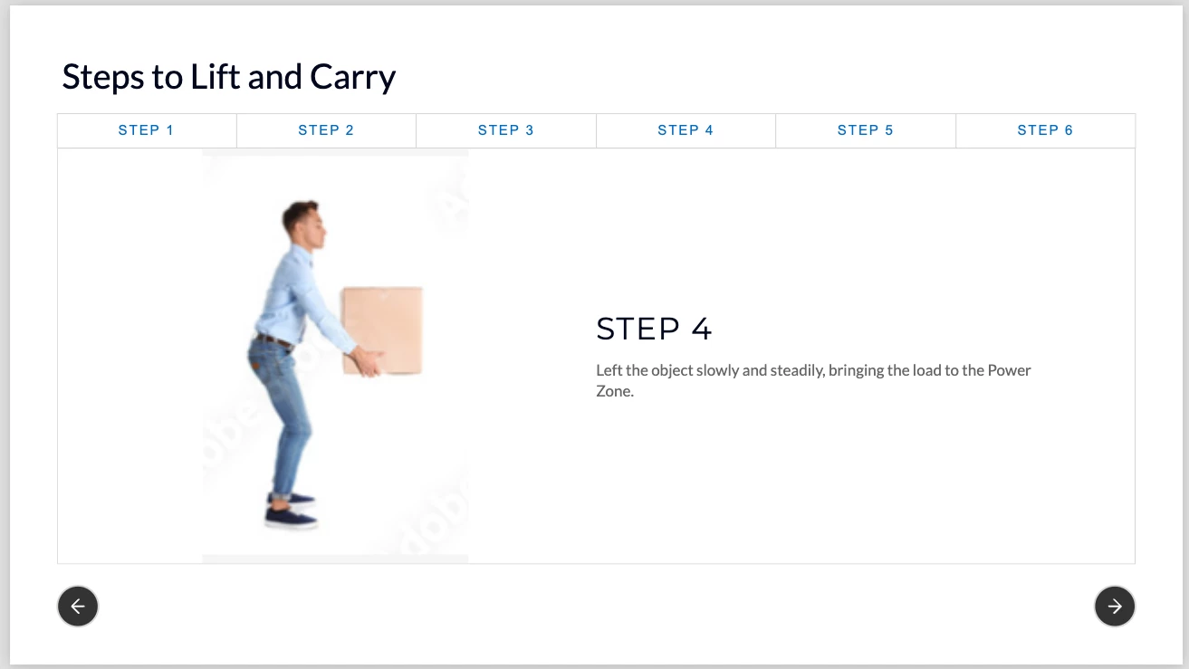
I am using the new version of Adobe Captivate and have an issue with getting a consistent look and feel with my buttons. I am trying to get a similar look and feel to the buttons in the below screenshot. The main reason I need the rest of the training to mirror this page is because the ability to force users to go through each step is tied to the buttons shown here, not the buttons in the play bar. 

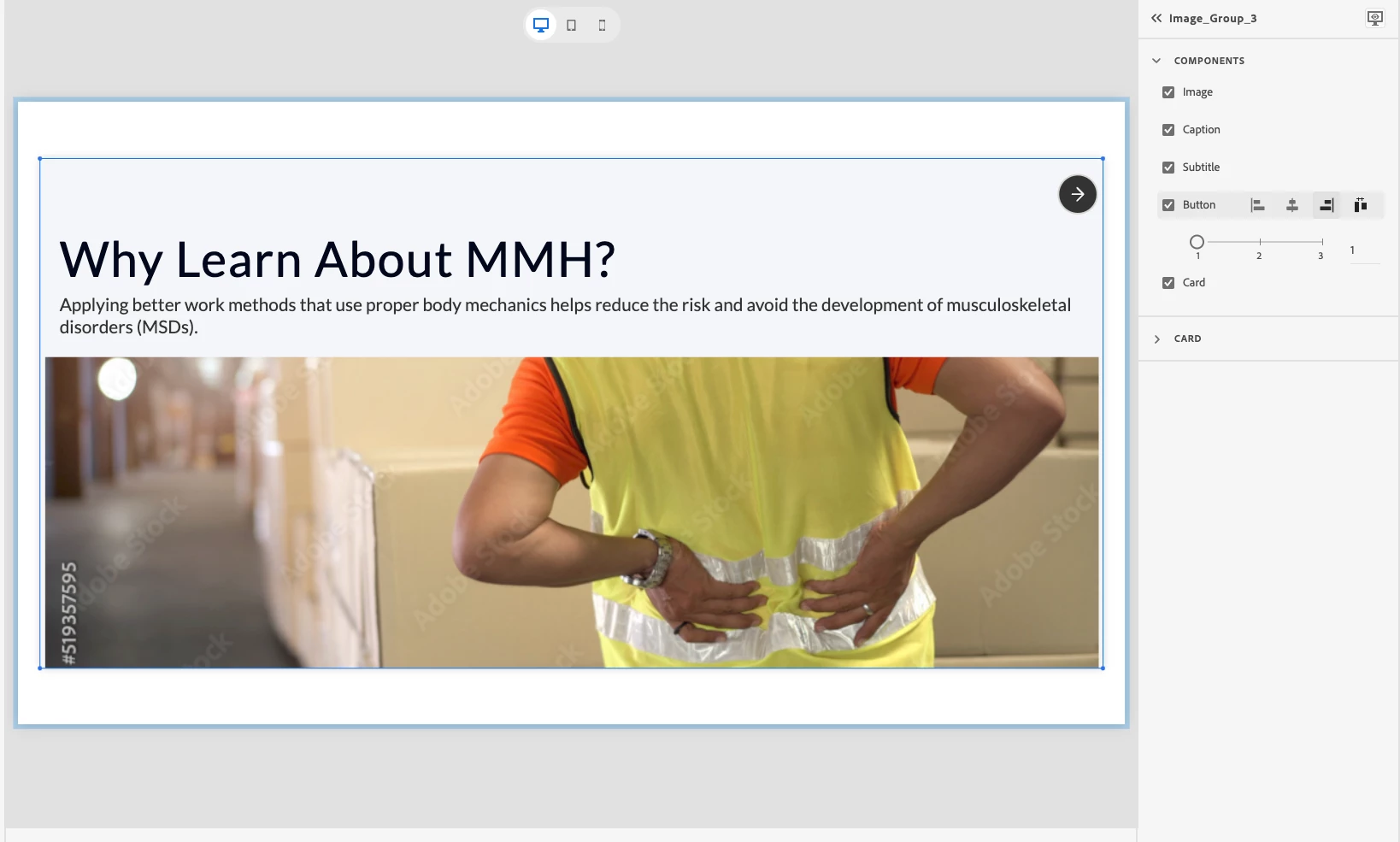
However, when I use other slide templates—like the one below—the button is at the top of the screen, and I can't change the position. If the button locations are always changing, that's a problem for usability. Consistency is important from a design perspective and to make it user-friendly.

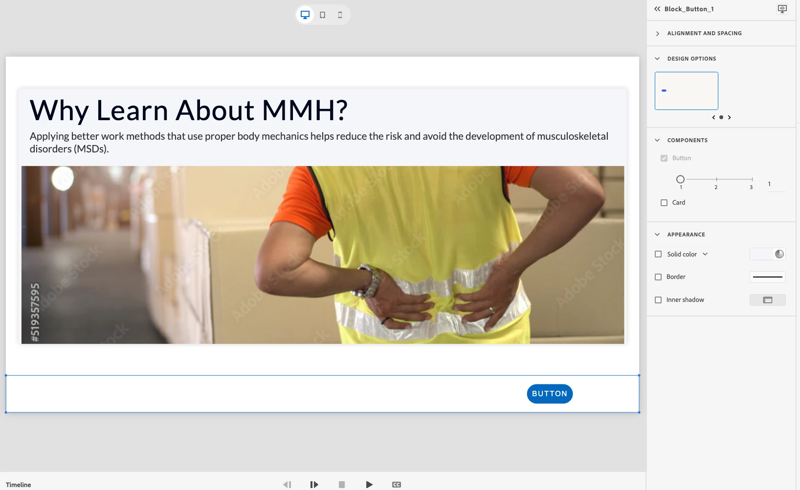
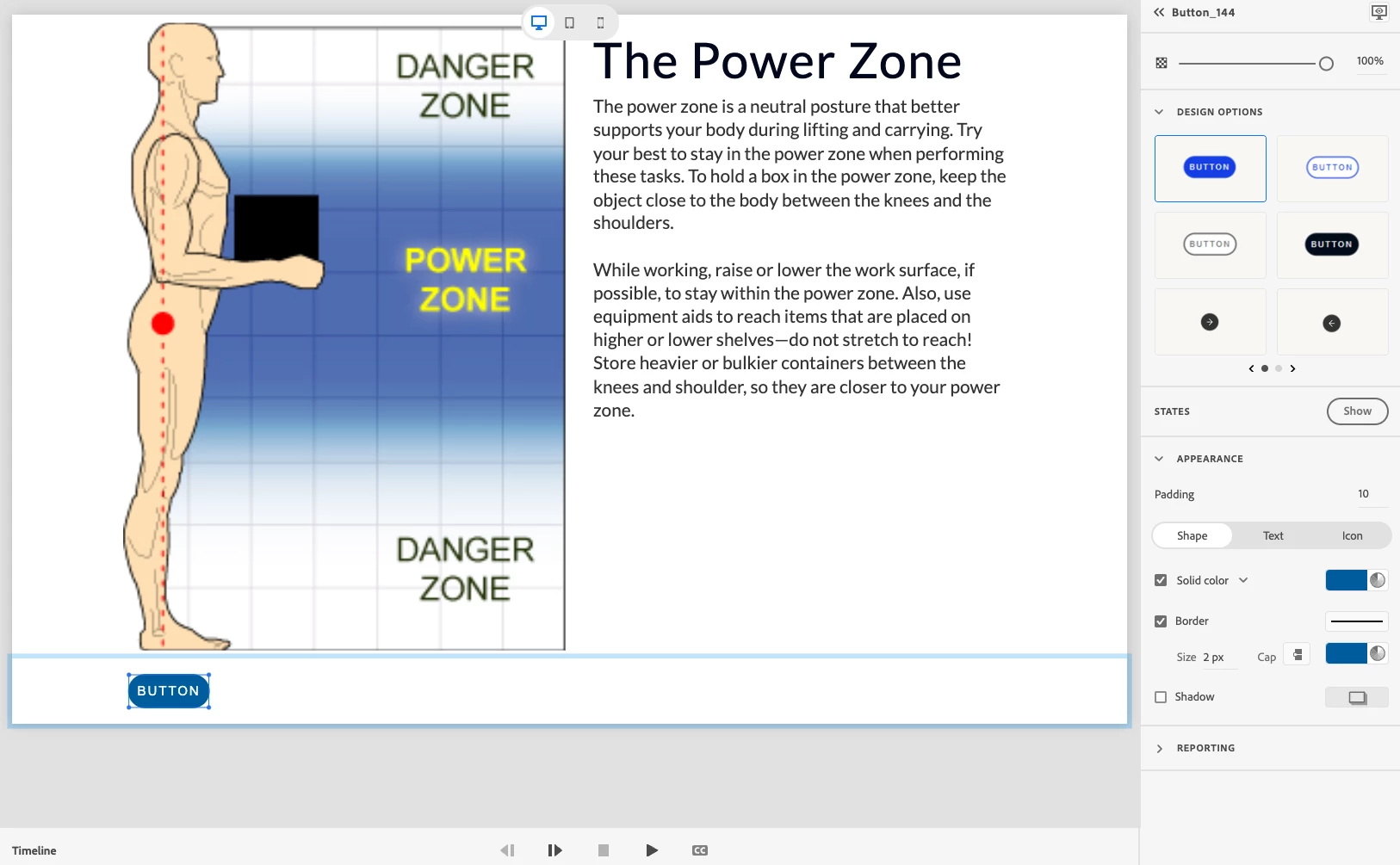
Then I thought I'd try to insert an interactive button block below the main block, but there are two issues with this approach. 1) The most important being there is only one design style for the button!! The buttons with circles and arrows are not an option on this page (see below). 2) If the content of the page is taller in height it pushes the button below the fold (not shown on the screenshot below but it's happening on other screens). Unless the entire training has a ton of content below the fold, the user will get stuck here unsure of how to move forward. I've seen it in user testing many times. 

So, my question is - how do I get a consistent look and feel for buttons so my user knows what to expect? 

    Correct answer carly_inseer

    I figured this one out...at least issue #1. I had the block selected vs. the component. Once you select the component (the button itself), the options to customize it show up. See below screen shots. 

    My workflow looks like this: on the left-hand menu bar, click "Add interactive components" > Button > select number of buttons you need (in the case below, I chose 2) > under components on the right-hand side, mouse over the button row - this will display the alignment choices. If you want the buttons to be on opposite sides, say for forward and backward buttons, select the far-right "split" option. Note that the alignment selections are not visible to the user until you mouse over it. > click on each button individually and select how you want it to look (there are more options).

    This still doesn't solve the issue of buttons going below the fold, but I don't believe that won't be solved until they let you customize padding and margins. 

    3 replies

    carly_inseerAuthorCorrect answer
    Inspiring
    July 7, 2023

    I figured this one out...at least issue #1. I had the block selected vs. the component. Once you select the component (the button itself), the options to customize it show up. See below screen shots. 

    My workflow looks like this: on the left-hand menu bar, click "Add interactive components" > Button > select number of buttons you need (in the case below, I chose 2) > under components on the right-hand side, mouse over the button row - this will display the alignment choices. If you want the buttons to be on opposite sides, say for forward and backward buttons, select the far-right "split" option. Note that the alignment selections are not visible to the user until you mouse over it. > click on each button individually and select how you want it to look (there are more options).

    This still doesn't solve the issue of buttons going below the fold, but I don't believe that won't be solved until they let you customize padding and margins. 

    Participating Frequently
    May 3, 2024

    I dont see the "split" option. Spent an hour already and whatever I do the 2 buttons move together.

    New Participant
    September 23, 2024

    This is one of the MOST annoying ways to show options in any program ever!

    Solution: With the block selected, in the Components section (where you select how many buttons you want), just above the number of buttons is a GREYED OUT "Button" tick box. It is GREYED OUT - which you would normally think means it is not enabled..... HOVER your mouse over this and magically the very very useful options appear - WHy is this not in Alignment and Spacing??? Why is this not under the number of buttons selector??? Why on earth would anyone be attracted to hover over an inactive option!!! Utterly stupid. Did Adobe actually test any of this? Just another one to add to the litany of annoyances with this software.

    lisar47675339
    Known Participant
    July 6, 2023

    I'd like to hear about this as well. I am starting on a project and the button placement on one slide is already driving me a bit silly. I am having to tweak a lot just to get a button in the lower right corner. 

    Inspiring
    July 6, 2023

    Once I get an email reply from Adobe Help, I will share any tips I learn here!

    New Participant
    July 10, 2025

    I am just starting to learn Captivate and a little shocked it does not allow some basic principles. I thought it was going to work like PPT where you can have consistent placement of objects, master pages etc. In PPT just copying and pasting will put an object in the same spot in the next slide in PPT.   Captivate does not do this.  I noticed graphic designers were not in the list of users to select, so it explaines why Captivate is weird. It was created for developers by developers and not graphic designers.  Adobe gets a slap on the wrist for this b/c they have always built products around the creatives.  Hope they improve some of these wonky features. Not a fan of the widgets with limited adjustments.

    Community Manager
    July 6, 2023

    Hi carly_inseer,


    Please  drop us an email at captivatehelp@adobe.com and we can connect to help with your use cases.