Check the object styles for the Buttons (you don't tell which type of button you are using) in the Object Style Manager (to be found under Preferences):
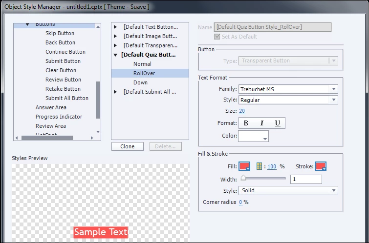
Look for the type of button you are using (the screenshot is for the Default Quiz button, you see there is also a Default Text Button style, and style for the other type of buttons, shapes all have possible states as well because they can be used as buttons). Expand the style (using the triangle) and look at the rollover state. You can change that state, and the down state as well. It is not clear from your question if you talk about the Rollover or the Down state. Those are InBuilt states for buttons. The color you see in the states depends on the theme you are using in your project. Each theme has a theme colors palette.
It is normal that a button has those states, why would you want to have the same state for the three: normal, rollover, down? I published some articles about CP9, where you'll see different types of button states, here are two links:
Playing with Captivate 9 - Captivate blog
1 action = 5 Toggle Buttons - Captivate blog


 AdChoices