New Participant
December 11, 2016
Question

Responsive chaos

  • December 11, 2016
  • 2 replies
  • 247 views

Hi

Newbie here - please be patient.

I designed my first responsive course in mobile portrait mode. However, when I click the tablet and desktop tabs the slide content is thrown off completely and do not resemble the original slide at all. The film strip also does not resemble my slide design. In addition, the previews (except for "My slide") generate the chaotic tablet and desktop modes. What do I need to do?

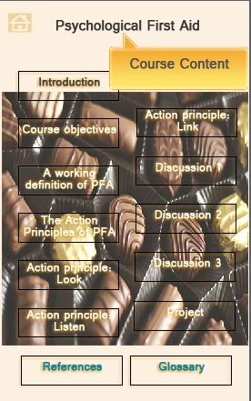
Above screenshot is mobile portrait.

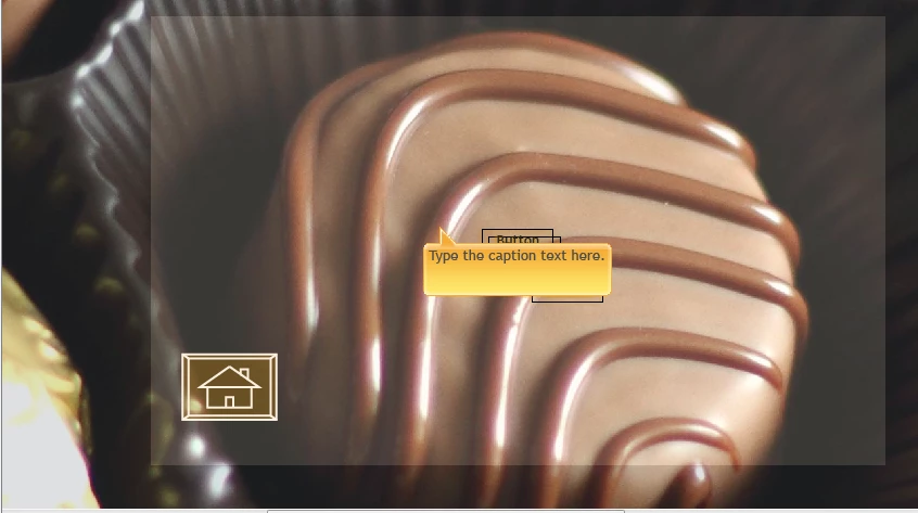
Below is desktop portrait screenshot. My buttons are put on a heap (this happens in every slide) and there are even changes to the text content.

    This topic has been closed for replies.

    2 replies

    Inspiring
    December 11, 2016

    Hi Gerhard,

    Responsive design can be tricky. You need to adjust you elements in each preferred breakpoint, you also have options around how far you want design elements from edges. Paul Wilson did created a really good YouTube video around this you can view it here..Responsive Design Secrets Revealed Adobe Captivate eLearning - Free Tutorial - YouTube

    Cheers

    Steve

    Paul Wilson CTDP
    Braniac
    December 11, 2016

    Thanks Steve.

    Paul Wilson, CTDP
    Paul Wilson CTDP
    Braniac
    December 11, 2016

    A couple of things that could be causing the experiences you are having.


    First, Adobe Captivate Responsive starts with Desktop view and cascades your settings down to the other views automatically. If you would like to design in Mobile Portrait view you will need to right click on each object as you create them and select Apply Position Properties to All Views. This will ensure that an object that you have created that is 50% of the height and width and that is 5 % from the left side of the slide and 5% from the top of the slide, maintains that location and size on all your breakpoints.


    Secondly, you have to be very careful about your position properties of certain types of objects. For example, if you have a button on your slide, it might make more sense to choose an absolute number of pixels rather than percentage or percentage relative.


    If you haven't already subscribed to my YouTube channel, I suggest you do. I have an entire playlist on responsive design that might help you out.


    https://youtube.com/paulwilsonlearning

    Paul Wilson, CTDP
    New Participant
    December 12, 2016

    Paul,

    I'm delighted to hear from you and I'm going to try your suggestions. Thanks!