
Answered
Change only part of a text font lines thicker?
Font I am using has a few areas where the lines are too thin. How can I make just those lines thicker and then make it back to a compound path? Example is jaz in mofishine script font.

Font I am using has a few areas where the lines are too thin. How can I make just those lines thicker and then make it back to a compound path? Example is jaz in mofishine script font.
In addition to Myra's reply, you can utilize a stroke profile that is tapered. I colored mine red so you can see what they are doing. Did this quick, so do not match my postions exactly.
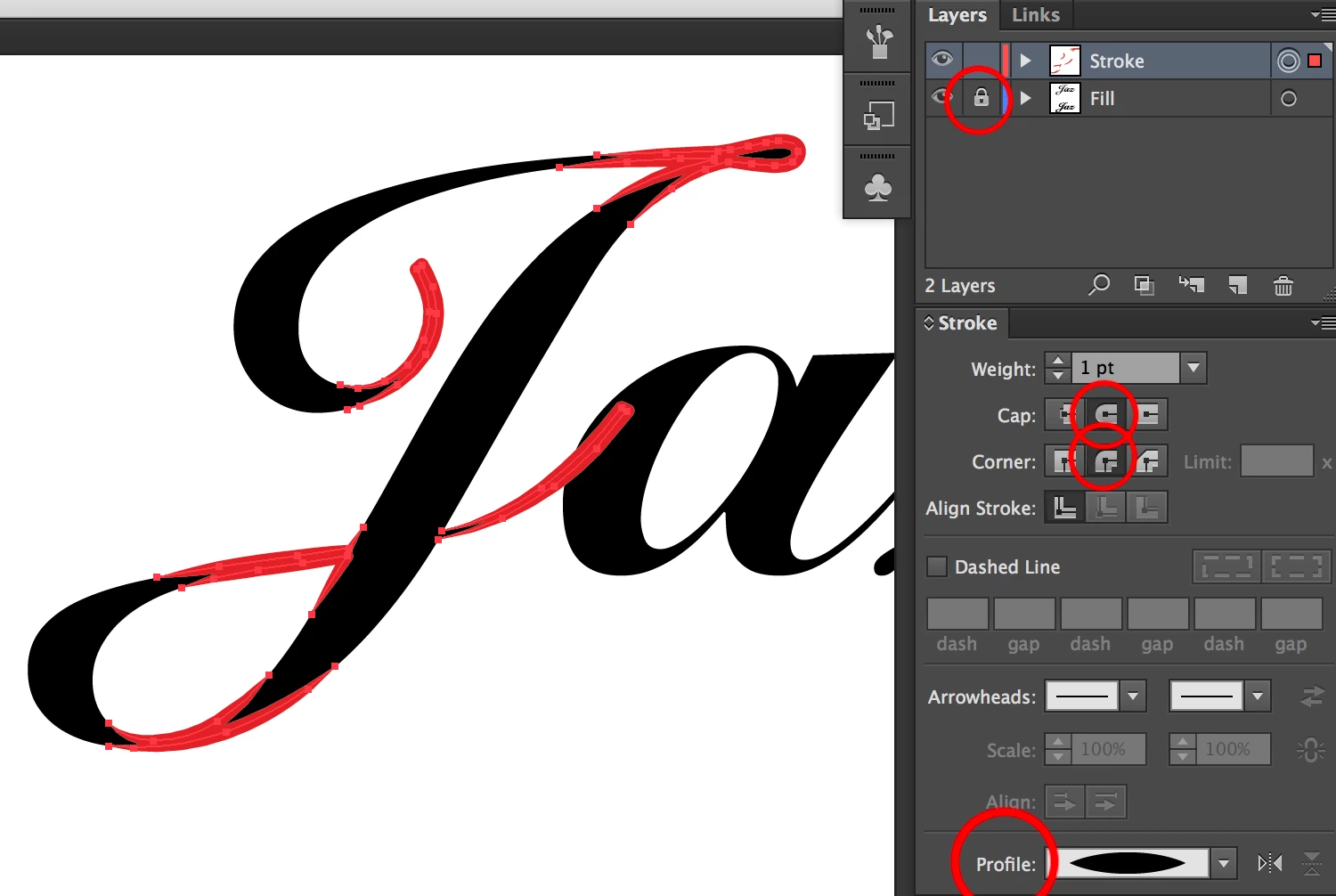
To erase parts of stroke not needed use
I lock my original layer and put what I am editing on top
When done outline the strokes and merge in pathfinder
Already have an account? Login
Enter your E-mail address. We'll send you an e-mail with instructions to reset your password.