Participating Frequently
September 16, 2010
Answered

custom chart objects-is it possible?

  • September 16, 2010
  • 3 replies
  • 4549 views

The task is to create my own chart in illustrator which would interact with spreadsheet programs similar to illustrator's existing charts.  Is it possible?  It seems like a scripting excersise, to define basic objects and layout parameters, then link one of those parameters (in this case circle diameter) to a prepared excel file with unique pixel-count measurements.  One key part is that the chart needs to be updatable as the base data is changed.

Any ideas?

This topic has been closed for replies.
Correct answer Jongware

@Jongware

(a) Yes, this was just a sub-sample of the data for one year.  In  full, the data covers expenses of a government department branch from  1981 to present, less a couple years in-between, including approximately  5,000 figures and metadata.  The chart would represent the expense for one year alone, so perhaps several dozen data points per year until 1998, and then a dramatic increase in data given a different datasource (I could condense data for consistency with the earlier data)

(b) The data itself for the sample visualization is as follows, transcribed from a spreadsheet.  Parent and subordinates noted for clarity:

Individual totals1981/2 ($000s)pxr
Fisheries Research (parent)6446.6100.0050.00
Fresh & Anadromous (subordinate)1175.442.7021.35
Groundfish (subordinate)2268.259.3229.66
Invertebrates (subordinate)821.935.7117.85
Marine Mammals (subordinate)450.126.4213.21
Pelagic Fish (subordinate)1151.942.2721.14
Fisheries Ecology (subordinate)579.129.9714.99

All 'px' values, other than those of the parent value, are generated from the equations noted earlier and again below.

All 'r' values (radius) are 1/2 of the px value.

subordinate px=sqrt(((parent px*parent px)*SubordinateAnnualExpense)/ParentAnnualExpense)

(c) I suppose, with enough work beforehand, the generated chart would come all at once and then be inserted into a template after I finish data quality.  Initially I thought a means to update would be good, but that could throw off other edits required as you suggest.

The end result would be a collection of posters, one per year. An even more entusiastic goal is a web-based interactive tool with varying levels of detail as the user clicks, and an animated year-by-year showing each given expense grow or shrink with spending (or appear/dissapear as appropriate).

I had planned to learn this scripting myself, but I was under the impression that it was as easy as other scripting, none of which I've learned yet.  Are you offering to take a stab at it? I'm not one to argue if so!


Ain't scripting fun. It was a breeze (well -- sort of) to get something up & running for InDesign ... Now translating it into the very different Javascript for Illustrator proved to be harder than I thought!

(Is there no way to vertically align a text into its frame? This is now sort-of, but it depends on the number of lines of text...)

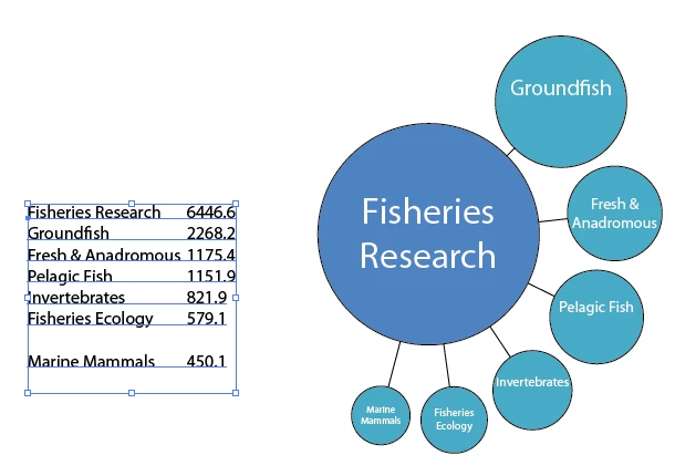
Type in (or copy, or import) your values into a new text frame. Separate the label and the value by a single tab. The values will be sorted automatically, and the largest value will appear in the center; the rest will be distributed nicely around the edge. I noticed my mathematical distribution is not exactly the same as the sample you provided ... even when allowing for a pixel here or there. I wonder why?

For better or for worse, this is what it produces -- the first sub-item will always be at a 45 degrees angle, the rest is separated from each other by an exact distance of 5 points.

and here is the script:

//DESCRIPTION:Krazy Circular Diagrams

// A Jongware Script 24-Sep-2010

// Uses a tab-separated set of String / value data

// which ought to be selected when running the script.

// Use but do not abuse, please.

if (app.documents.length == 0 || app.selection.length != 1 || !(app.selection[0].hasOwnProperty("baseline") || app.selection[0].hasOwnProperty("contents")))

{

     alert ("Please select the text frame containing data");

} else

{

     var dataArray;

     var resultGroup;

     var parent_diameter = 100;

     var parent_position_x = app.activeDocument.activeView.centerPoint[0];

     var parent_position_y = app.activeDocument.activeView.centerPoint[1];


     var black = new GrayColor(); black.gray = 100;

     var white = new GrayColor(); white.gray = 0;

     dataArray = gatherValues(app.selection[0]);

     if (dataArray.length == 0)

          alert ("Unable to get sensible values .. please check");

     else

     {

          calculateValues ();

          resultGroup = app.activeDocument.groupItems.add();

          drawCircles(resultGroup);

     }

}

function gatherValues (fromItem)

{

     var result = new Array();

     var l, line, lines, dataSource;

     if (fromItem.hasOwnProperty("baseline"))

          dataSource = fromItem.parentStory.contents;

     else

          dataSource = fromItem.contents;


     lines = dataSource.split ("\r");


     for (l=0; l<lines.length; l++)

     {

          line = lines.split ("\t");

          if (line.length == 2)

          {

               if (!isNaN(Number(line[1])))

                    result.push ([line[0], Number(line[1])]);

          }

     }

     result.sort (sortByValue);

     return result;

}

function calculateValues ()

{

     var v;

     // Calculate size per circle

     for (v=0; v<dataArray.length; v++)

     {

          dataArray.push (Math.sqrt(parent_diameter*parent_diameter*dataArray[1]/dataArray[0][1]));

     }

}

function drawCircles (addToGroup)

{

     var color_p = new RGBColor();

     var color_c = new RGBColor();

//     Parent colors, in RGB

     color_p.red=80;

     color_p.green=130;

     color_p.blue=190;

//     Child colors, in RGB

     color_c.red=74;

     color_c.green=172;

     color_c.blue=197;


     // Draw parent circle

     drawCircleAt (addToGroup, parent_position_x, parent_position_y, dataArray[0], color_p);


     // Draw the other circles.

     // First one starts at -45 degrees (0 degrees is straight to the right)


     circleAngle = 45;


     // The center of the circle is at parent_diameter/2 + (distance) + own_diameter/2

     centerDistance = parent_diameter/2 + 5 + dataArray[1][2]/2;


     for (nextCircle=1; nextCircle<dataArray.length; nextCircle++)

     {

          // and this is Math 1-0-1: finding its center position using the angle :-)

          cx = parent_position_x + Math.cos(Math.PI * circleAngle/180)*centerDistance;

          cy = parent_position_y + Math.sin(Math.PI * circleAngle/180)*centerDistance;


          drawCircleAt (addToGroup, cx, cy, dataArray[nextCircle], color_c, parent_position_x,parent_position_y,parent_diameter/2, circleAngle);


          if (nextCircle < dataArray.length - 1)

          {

          // Advance angle to make space for next circle.

          // Let's type this while thinking, shall we?


          // We have:

          // a line from parent_center to child_center A at angle alpha

          // radius of A (actually, diameter, but we don't care)

          // radius of B (as above)

          // some distance to put between A and B

          // rad_A + distance + rad_B -> position of center of B (anywhere)

          // oh, and distance from parent_center to child_center B is the same as to child_center A!

          // checking on Wikipedia, http://en.wikipedia.org/wiki/Law_of_sines

          // yields something like this ...


               angle_diff = Math.asin ( ((dataArray[nextCircle+1][2]/2 + 5 + dataArray[nextCircle][2]/2)/2) / centerDistance);     // in Radians

               angle_diff = 2*angle_diff * 180 / Math.PI;     // in Degrees

               circleAngle = circleAngle - angle_diff;

          }

     }

}

function drawCircleAt (group, xpos, ypos, textAndSize, color, lineto_x, lineto_y, parentRad, angle)

{

     var tframe, line;

//     The connexion line, if any

     if (lineto_x != undefined && lineto_y != undefined && parentRad != undefined)

     {

          angle = Math.PI * angle / 180.0;


          line = group.pathItems.add();

          line.setEntirePath ( [[lineto_x + parentRad*Math.cos(angle),lineto_y + parentRad*Math.sin(angle)], [xpos - textAndSize[2]/2*Math.cos(angle),ypos - textAndSize[2]/2*Math.sin(angle)]]);

          line.filled = false;

          line.stroked = true;

          line.strokeWidth = 0.5;

          line.strokeColor = black;

     }

//     The Circle

     circle = group.pathItems.ellipse (ypos+textAndSize[2]/2, xpos-textAndSize[2]/2, textAndSize[2], textAndSize[2]);

     circle.strokeColor = black;

     circle.strokeWidth = 0.5;

     circle.fillColor = color;

//     The Text Frame

     tframe = app.activeDocument.pathItems.rectangle(ypos+textAndSize[2]/6, xpos-textAndSize[2]/2, textAndSize[2], textAndSize[2]/2);

     tframe = group.textFrames.areaText(tframe);

     tframe.contents = textAndSize[0];

     tframe.wrapInside = false;

     tframe.wrapped = false;

     tframe.textRange.hyphenation = false;

     tframe.textRange.justification = Justification.CENTER;

     tframe.textRange.textFont = app.textFonts.getByName("MyriadPro-Regular");

     tframe.textRange.characterAttributes.size = textAndSize[2]/6;

     tframe.textRange.fillColor = white;

}

function sortByValue (a,b)

{

     a = Number(a[1]);

     b = Number(b[1]);

     return (a == b) ? 0 : (a < b ? 1 : -1);

}

3 replies

Jongware
Brainiac
September 25, 2010

Here is the next step; I honestly don't think I can push it any further, but fellow scripters are invited to build onto this!

It's also getting a bit on the large side to comfortably post in here, so I've put it as KrazyCircles.zip onto my website.

Improvements:

1. All comma's are ignored in the numbers

2. If the first data line doesn't contain a tab-and-number, the total of the following numbers is used.

3. If you have a circle selected -- together with the data text frame --, the center circle will not be drawn (at all -- not even its title). Instead, the selected circle is used as the base for the next graph. That way you can chain graphs together.

4. It has a dialog! A quick explanation:

Distance to parent: the length of the connector between the parent circle and the largest subordinate one.

"Fixed" checkbox: if unchecked, the centers of all subordinate circles are at the same distance from the parent circle. If checked, the distance is the same for all -- the one in the above box.

Inter-children distance: I reviewed my math and now it should work correctly! It's the distance between two successive subordinate circles.

Start angle: the initial angle of the first drawn circle, where 0 is right and 90 is down (I think).

"Clockwise" checkbox: the subcircles are drawn largest to smallest in clockwise fashion. If unchecked, the subcircles get drawn the other way around.

OK: obvious, methinks!

Cancel: ditto

estern80Author
Participating Frequently
September 25, 2010

To get around the comma issue, I just removed the commas-problem solved

I never thought I'd have something to work with just a day or two later, and now that I see it I am confident I would have been months to complete what you tossed together out of entertainment.  Kudos!

I'll poke around with it Monday.  This weekend is cleanup from Hurricane Igor-many down trees, still lucky to have power.

Jongware
Brainiac
September 26, 2010

I had a go at making it "interactive" using Juerg Lehni's Scriptographer (which you will need to download and install first! Only then download and install ScriptoCircleDiagram into Scriptographer's own Scripting folder).

It has a few problems, some because of my limited programming acumen (it appears sometimes settings aren't properly reset when creating two diagrams right after each other), and some because of limitations of Scriptographer (it seems you cannot make the interactive panel automatically update when you select another object, so it needs a 'read settings' button).

Nevertheless, it does two things the plain Illustrator version does not: it stores the data into the graph group itself, and you can interactively adjust existing diagrams -- select, then press the "Read settings" button, then adjust.

It shows the limits of what can be scripted: you cannot change anything in the graph, because if you move the items around using the script, the graph will be destroyed and created a-new; and you cannot ungroup a diagram, because then all data will be lost, and it'll become a 'dumb' set of objects. And you still have to build a multi-level object one level at a time.

So it's just for fun -- creating a moderately complicated diagram is possible, but you'll soon run into these limitations.

The more I try, the more I'm convinced an Illustrator-only solution is not feasible. I'm inclined to think you need a totally custom solution, written in, for example, Flash or Java. A custom solution should be able to:

1. Import (and optionally, export) tabular data in a layered tree form.

2. Enable you to change the data after it's entered into the program.

3. Draw a basic diagram from this data.

4. Allow you to alter individual circle positions, formatting, style, colors, etc. and store the changes per circle, so they can be reapplied when the graph needs regenerating.

5. Automatically stretch and shrink the connector lines when you move entire sub-diagrams out of the way ...

6. And finally ... export the graph to a format that can be read by Illustrator, for the final purely artistic touches.

Participating Frequently
September 18, 2010

what kind of chart you need?

estern80Author
Participating Frequently
September 19, 2010

Michele,

The charting technique I want to (re)create is Jess Bachman's 'Death&Taxes' vis at wallstats.com (with his permission, which I have obtained). Specifically, it's using area-relative circles to compare government data, but a different government service, different country.  I have already assembled test data and played with a few equations to give the right Px figures for use in adobe.

Jess assembled the vis using 700-odd layers in photoshop, according to an interview.  There must be a more efficient way to permit illustrator to generate a vector chart that can loosely assemble a master and subordinate series of circles with various bits of text data displayed (also from spreadsheet), and a few graphical bits to tie the circles together.

Participating Frequently
September 19, 2010

The detailed example is Jess Bachman's 'death and taxes' visualization of the US discretionary budget.

Even if there was a way to script in an auto-adjust of circles that I had pre-arranged in a chart, saving the tedium of expressly setting each size individually.

Below is a sample of some data I'm using, modeled by hand using excel.

Equation is:

r=0.5 * px

pxSubordinate=sqrt(((pxParent*pxParent)*$subordinate)/$parent

The end result of this sample data looks like:

http://image.bayimg.com/papjcaacc.jpg


for dot-lines network visualizations i've used in the past software different from illustrator, such as http://www.cytoscape.org/ or http://gephi.org/.

These programs are able to read data from excel, create a visualization using differents visual variables (like dot size, color...) and then export it in a pdf.

The two programs are both free and open source.

This solution make you able to quickly generate the visualization and then clean up in ai.

another way to solve your problem is to write a small script with scriptographer (http://scriptographer.org/).

The simpliest way is to import a series of values from excel and create a series of circles based on the values.

Muppet_Mark-QAl63s
Inspiring
September 18, 2010

You would possibly be better taking a look at data driven graphics and using Illustrators 'variables' for doing this… Graphs are one of the options that you can make dynamic…