

- Home
- Illustrator
- Discussions
- Re: Distorting text in diamond shape.
- Re: Distorting text in diamond shape.

Copy link to clipboard
Copied
Hello,
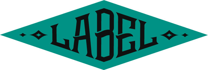
I am trying to figure out how to distort a word, so that it takes a perfect diamond shape, as shown in the attached photo. I have tried envelope distort, envelope distort with mesh, perspective, free distort, warp, you name it. Save for spending 2 hours and dragging each anchor into a perfect fashion to match the diamond, It seems to me that something like this wouldn't be as difficult to achieve in Illustrator as it is.
I've searched high and low, youtube, google, you name it!! Does anyone have any insight as to doing this with Illustrator, or possibly a different program/technique was used. As experienced as I think I am, leave it to something simple like this to completely baffle me. LOL!
Thanks in advance.
Using Illustrator 19.0.1, MAC OSX Yosemite (by choice, lol)


 1 Correct answer

Guys, go back and look at the original.
All of the attempts so far cause the horizontal strokes of the glyphs to taper. An envelope distortion algorithm does not know that the shapes are text glyphs and that the character strokes need to be angled, but maintain consistent "weight." Envelope distortions are just working on the outline paths. They know nothing about human perceptions like "stroke weight" of the glyphs. There is no shape recognition. There is nothing in an envelope distortion that k
...Explore related tutorials & articles
 13
Replies
13
13
Replies
13

Copy link to clipboard
Copied
As you have already stated: In Illustrator you have to do it manually if you are going to get exact and clean results. Most of the time it won't work well by using envelopes or effects.
There may be some plugins that can probably do it better, but isn't it relieving that some things still require handcraft?
Copy link to clipboard
Copied
Well, truthfully, I can appreciate your sentiment, but that's kind of like a building contractor being happy to use an old hammer in lieu of a nail gun. But I guess If it can't be done, it can't be done. Hah.
Copy link to clipboard
Copied
No, it's not a sentiment. It's just a statement about what can or cannot be done convincingly in Illustrator at the moment. And currently there is no instant method (or "nail gun") to do it. That's all I'm saying. You may like it or not.
Copy link to clipboard
Copied
Well, okay then Kurt. lol I was just trying to bring levity to the discussion. Why must every corner of the internet consist of people trying to outwit or drill a point into someone else's skull. Good grief. I digress. Happy Friday.

Copy link to clipboard
Copied
The plugin FilterIT will produce slightly better results than Illustrator alone. At least it won't bend the edges like rubber gum.
But since it doesn'T have any intelligence or sense of design, it will distort the elements in the center of the shape (as for example the middle bar of the E). The plugin simply doesn't know that the middle bar should be the same width as the other bars. Only fontdesign software might be able to recognize these kinds of details. But then: font design software won't do the distortions that you wish to do.
Copy link to clipboard
Copied
Thanks for your attempt to introduce your gentle levity.
And, sorrry, no thanks for your absurd assumption that I'm outwitting or drilling you.

Copy link to clipboard
Copied
Hi
I recall doing something similar effect in photoshop. I would ask in their forum.
Pierre

Copy link to clipboard
Copied
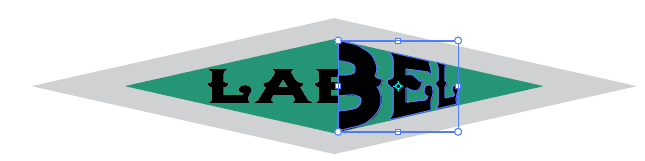
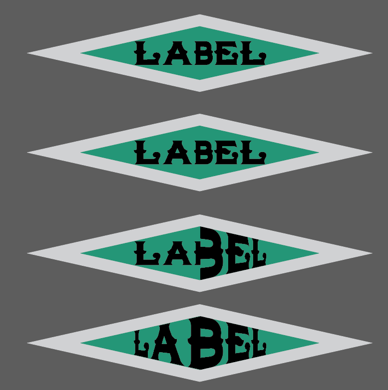
Outline your type, and split the word in half using pathfinder >> divide. The skew each half individually using the transform tool set to distort perspective.
My B looks very wide in comparison to other letters. To make the effect better am thinking to for example set the "B" to 80% horizontal scale, and the "L"s to 120% horizontal scale.
My diamond shape was created using offset path to give me my guide lines.
Copy link to clipboard
Copied
Below are the results stretching the type using 80 to 120% horizontal scaling. Going in the correct direction, but not even pre-distortion to the type.
Maybe someone has an idea of how to do polar coordinates as in photoshop that does not involve bitmapping the type first.
Copy link to clipboard
Copied
Guys, go back and look at the original.
All of the attempts so far cause the horizontal strokes of the glyphs to taper. An envelope distortion algorithm does not know that the shapes are text glyphs and that the character strokes need to be angled, but maintain consistent "weight." Envelope distortions are just working on the outline paths. They know nothing about human perceptions like "stroke weight" of the glyphs. There is no shape recognition. There is nothing in an envelope distortion that knows "These paths are text objects that need to be bent to a particular surrounding shape, but still be recognized as individual text characters of equal importance throughout the word."
There does not exist an instant-gratification command to automate every kind of thing you might imagine drawing. That's why an illustrator is necessary. The heart and soul of an illustration program is its primary path drawing tool. Such treatments as the original sample are commonplace since long before anyone every heard of drawing software, and are still drawn deliberately by hand and with human discernment.
Sorry for the lack of mirth, but I assume you want a useful answer. Otherwise:
An aspiring illustrator walked into a bar and asked, "Which button do I press to get a drawing of a...."
That should be pretty funny, but it actually happens here all the time.
JET

Copy link to clipboard
Copied
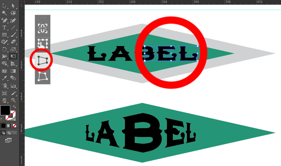
Hey man, I believe I might have the answer for you.
I once asked myself that same question, why the hell is something so simple not working. So after countless hours of tidiously moving those anchor points around, I came to a realization... Maybe I got the original shape all wrong.
I added guidelines to show exactly where we'll be creating an envelope to contain the desire typeface. For now let's ignore the diamond shapes that accompany the type. After what I'll teach you, you'll be able to add them in a jiff!

Ok so now that we know where the type starts and ends we will copy and paste in front the green diamond. Using the Eyedropper tool we will change the color of the newly added diamond shape to whatever color you want it isnt neccesarry since this will ultimately become our envelope shape.

Now here's the interesting part. Ever notice how everything we select on Illustrator is always within abounding box. It must mean that based on the algothryms illustrator is composed of, this bounding box it what helps determine it to keep things in proportion. The minute we try to envelope distort with top object on a shape that isn't based of rectangle, IT WILL DISTORT ON YOU.


so this is what we do. We will create a shape that's a slightly taller than our inner diamond and reaching almost the end. Once we are satisfied with where our rectangle is, we'll select the back shape with the inner diamond. Using the shape builder tool by, we'll hold down the option key and click on the shapes that stick out.

We should end up with that shape.
Now what you have to do is send that shape to the front, find your desired typeface and hit envelope distort with Top Object
and boom...

Hope this answer's your question.

Copy link to clipboard
Copied
We will create a shape that's a slightly taller than our inner diamond and reaching almost the end. Once we are satisfied with where our rectangle is, we'll select the back shape with the inner diamond. Using the shape builder tool by, we'll hold down the option key and click on the shapes that stick out.
Excuse but I cannot follow it, you have the original (green) diamond shape used as a background, then you have another smaller one and then draw a rectangle, slightly higher and shorter than this second diamond?
You use the Shape builder on wich pair of objects? Original and rectangle, smaller diamond and rectangle? Delete the 4 corners of the protruding rectangle?
Then, which shape is placed on top of the letters and used for top distortion?
Copy link to clipboard
Copied
Yes, there is not a command or a function that does it instantly or with ease.
You need to elongate and shorten, vertically letter shapes, the tools that can achieve that are: the Shear tool, taht can be previewed and used parametrically and the Free Distort effect, though it has no direct preview on selected paths and uses no numbers.
Text must be outlined and divided in a way part of the letterform ends distort upwards, others downwards at each half of the diamond shape behind it. Central parts must not be distorted or displaced, thus three horizontal division and one vertical (middle) division are required in most situations.


Find more inspiration, events, and resources on the new Adobe Community
Explore Now
 AdChoices