Known Participant
May 12, 2023
Answered

How can I get vibrant, almost neon colors to print?

  • May 12, 2023
  • 3 replies
  • 10416 views

I'm creating abstract art in Illustrator with a color mode of RGB and the profile Adobe RGB (1998) and am testing with giclee printing. Some of my very saturated and bright colors come out okay to well, with an almost close match. However, the hot colors, such as pinks and bright-to-dark blue and purple gradients do not.


I know that printers have a more limited color gamut, but want to know how I can get as close to the digital color gamut as possible.


Is there a way I can select alternative colors to get the same dramatic effect?

Or, are there settings in Illustrator I can use to help print that gamut range?

Or, is there a way to tweak them in Photoshop?


I haven't been able to find any current information and really need to find solutions for my art prints.


Thanks!

Correct answer chrisg11235813

Thanks, Mike. Ultimately, it sounds like I need to do a lot of test prints with my printer.


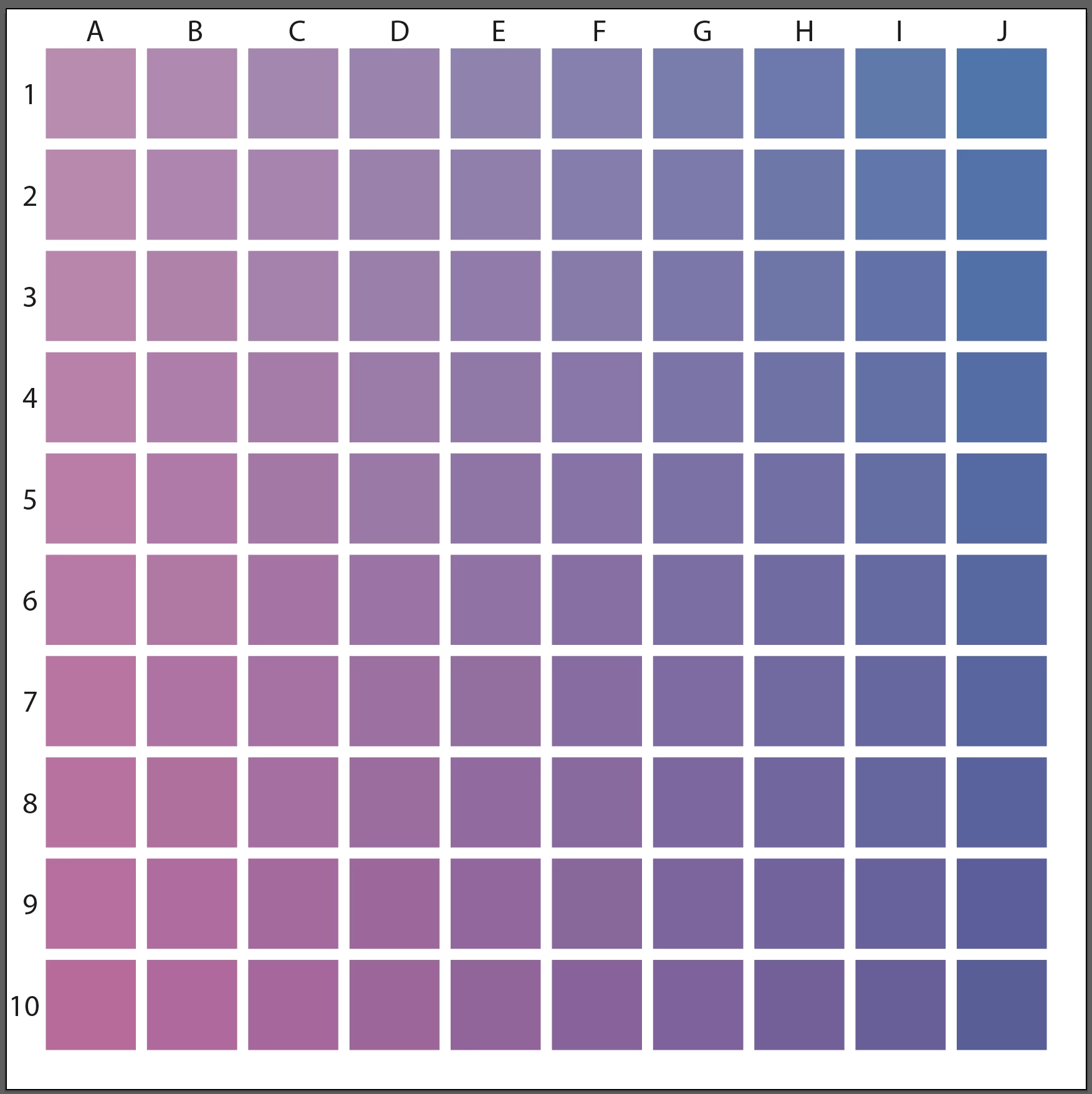
If you are doing test-prints, I would suggest doing a grid of swatches. You'll get more colours and you can keep it as a guide for the future.

Pick 2 Colours to test, in this case I have added Magenta going down and Cyan to the Right. In your case you would use RGB instead of CMYK colours.  Keep the Test Print and the actual File so you can figure out what the colour formula was in the file.  Something like this:

3 replies

Inspiring
May 20, 2023

You are correct about submitting RGB files for that print provider.  You mention Rendering Intent ( Perceptual ).  Another item to try is instead of AdobeRGB, assign or apply ProPhotoRGB as an option.  You could send your vendor one file of each RGB color space, but maintain the Perceptial Tendering Intent.  While you may never totally match fluorescent type brightness, you can get reasonably close. Your print vendor can also experiment on their end, but as far as file prep goes, you have ( and are on the path ) to finding out, through experimentation and the inherent limitations, what will ultimately become a viable workflow for your project.  Good luck!

KD11Author
Known Participant
May 21, 2023

Thanks. I read about how ProPhotoRGB can potentially help the print output. The primary printer I plan on using does request files with an Adobe RGB (1998) profile, and they are not local so I can't work with a technician directly. However, I may test that with a local printer I've also sourced.

Mike_Gondek10189183
Community Expert
Community Expert
May 22, 2023

Yes Giclee is one of the few print methods that use RGB. Best to consult your printer with his question, but compare to the spex Mockinbird Press suggests and RGB IEC61966-2.1


https://www.mockingbirdpressuk.com/artwork-requirements/#:~:text=The%20best%20colour%20profile%20to,as%20the%20regular%20CMYK%20inks.


This printer suggests 16-bit color

https://www.theartofprint.co.uk/help/

chrisg11235813
Participating Frequently
May 18, 2023

Sometimes a Printer's RIP software has a "PANTONE look-up table" built into it. In a lot of cases it recreates a much more vibrant representation of the colour than simply using the CMYK values -- BUT, if you don't already have the swatches loaded into your Adobe software, you'll have to do some digging around the interweb to find them. PANTONE dosn't want anyone freeloading of standardized colour pallets, that would defeat the purpose of standardizing.

Talk to your printer, if they are knowledagable they might have some ideas -- you might have to do a bunch of colour samples to pick the best colour.

KD11Author
Known Participant
May 18, 2023

The printer I'm mainly using does not use the Pantone color system, so, unfortunately, I can't use those colors. When I inquired about this, the printer sent me information on using their ICC Profles. I haven't worked with these before, so have a bit of a learning curve.

Community Expert
May 12, 2023

Is the type of printer you're using equipped with any extra ink colors, such as Light Cyan or Light Magenta? Printers that have additional colors can offer gamut ranges that extend a bit beyond the usual limits of CMYK. No printer can fully match the RGB gamut range. It's just not possible (especially in the greens, blues and purples). In order to get predictable colors displayed on screen you would need to use an ICC profile specific to the printer along with having your monitor properly calibrated. The type of print media being used also matters; smoother more glossy substrates will allow colors to pop more while media that has more "tooth" to it will mute colors.

KD11Author
Known Participant
May 12, 2023

Hi Bobby,

I send my files online to printer who then makes giclee prints. While there are more inks with giclee, there are still limitations, My laptop calibration is set to Adobe RGB (1198) profile, and I've used the ICC profiles for soft proofing. That said, what I'd like to know is if there are other ways I can work with colors to create a similar dynamic effect especially with bright-to-dark gradients or make adjustment in Photoshop. For example, one printer adjusted a setting to "Perceptual" and that produced a better result in the print. I see that I can set that in the TIF files in Photoshop. I'm also testing on different papers. Any manual and technical adjustments that I can make before sending to the printer is what I'd like to learn. Thanks

KD11Author
Known Participant
May 12, 2023

When working in CMYK I get the best results on items like gradient fills by manually entering specific number values for CMYK fills on each stop of a gradient. I'll go for values as "pure" as possible, maxing out certain ink colors while using as little as I can of others. Sometimes additional stops are needed in the middle areas to keep gray-ish or dirty looking values from contaminating the sweep.

Monika Gause posted this good tutorial video on YouTube a few days ago:
https://www.youtube.com/watch?v=olqwGvj7omo


Thank you, I'll check it out. However, CMYK is too limiting and RGB helps to maximize the color gamut for giclee printing. I realize CMYK is safe, but when I can expand to more colors with RGB, it's a better option for the art I make. I just need to find ways to make sure the gamut I use will print colors properly.