

- Home
- Illustrator
- Discussions
- Betreff: Is there a way to create a grid for an al...
- Betreff: Is there a way to create a grid for an al...
Is there a way to create a grid for an already designed logo?

Copy link to clipboard
Copied
I know this seems like a silly question, but I'm new to graphic design and I've designed a logo for a project without using a grid. Is there any simple way to create a grid for a logo that wasn't designed with one? Any suggestions would be much appreciated!


Explore related tutorials & articles
 15
Replies
15
15
Replies
15

Copy link to clipboard
Copied
What kind of grid?
Circular or rectangular, or hexagonal or, or, or...
Can you please show us the logo?
Copy link to clipboard
Copied
Copy link to clipboard
Copied
Looking for the place to turn on the document grid?
Or do you want to draw a real grid (and maybe convert it to guides)?
Copy link to clipboard
Copied
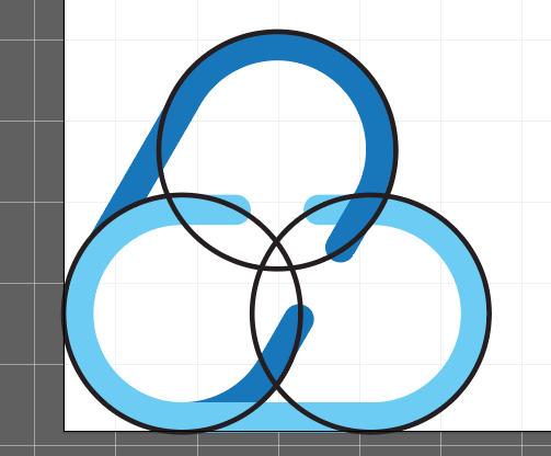
I was hoping to draw a real grid to show dimensions and consistency of the logo. I know how to draw a grid with the rectangular grid tool, but I wasn't sure if there was a way to make a grid that fits an already designed logo (which wasn't created with grid). I've already made the logo but later realized that I was supposed to make it with a grid for the project. I'm not sure if it makes sense to use circles and rectangles in this case? (I've included some photos below) Hope I'm making sense, thanks for your help!
Copy link to clipboard
Copied
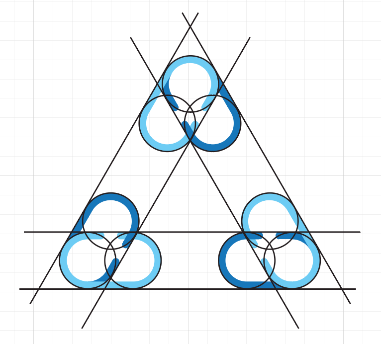
If I understand you correctly - you might mean something like this (for example):
or
https://medium.com/@radenyunos/how-to-use-geometric-shapes-to-design-logos-db7d045ae3f0
Copy link to clipboard
Copied
Yes, more so the second link/example. The only thing is that I don't know if I can do that if I already created the logo. It's more to have something in my project to explain and justify the design. Maybe this would be a better bet than just using a rectangular grid?
Copy link to clipboard
Copied

Copy link to clipboard
Copied
There's no need to "justify" the construction of your logo.
Concentrate on justifying why you think that this design fits the branding concept of the organisation. That's indeed important. But how you built it shouldn't be anyone's business. People who know how to use Illustrator know it anyway. Everyone else doesn't understand it anyway.
I know that there are prominent examples of doing this. In most cases I would assume that someone slapped a grid on the design afterwards, because the grid makes no sense whatsoever (all these circles on the Twitter bird - that's bizarre).
Copy link to clipboard
Copied
Haha,
full ack @Monika Gause
Copy link to clipboard
Copied
There are some ridiculous memes about that:
https://twitter.com/Joshua_Ariza/status/1103007477602242561/photo/1
Copy link to clipboard
Copied
Haha I totally get it, the only thing is that it's for a school project and we were supposed to use a grid. So I thought maybe I could get by with using the circles and lines
Copy link to clipboard
Copied
Obviously you can't use anything other than circles and lines, because that's how the logo has been built.
I already suspected that some school is involved in this. When designing a logo you can either satisfy your client and build something that makes sense for their situation and concept. Or satisfy your peers and build something that has a sophisticated grid built into it (bonus points if a Golden Something can be found in it as well). Only rarely you can satisfy both.

Copy link to clipboard
Copied
the only use of all these grids is to show the client and all his contractors the allowed sizes and proportions. And yes, it can help them to keep consistence. So in explication I would choose the characteristic element (e. g. circle) and use its size to highlight the sizes/distances/proportions/protection zone.
And yes, as you used lines and circles, you can show them as a "sceleton" (grid) of the logo.

Copy link to clipboard
Copied

Copy link to clipboard
Copied
Since this interesting old thread was bumped I'll add my 2¢. In some respects it does make sense to have a logo fit neatly into some sort of grid to communicate to others that the design wasn't just thrown together in some kind of slap-dash fashion. It would show deliberate thought into how the logo was constructed.
But! Be careful about making the parts of a logo design fit absolutely to a grid. It's possible to arrive at an end result that looks dull or even a bit odd. Various optical illusions can occur in designs. The parts may be perfectly sized in terms of math, yet the parts can end up not looking right. Type designers battle these problems when designing letters and other glyphs, which is why you'll find some letter strokes are thicker than others and why parts of letters will overshoot the baseline and cap height line.

Find more inspiration, events, and resources on the new Adobe Community
Explore Now
 AdChoices