New Participant
October 31, 2024
Answered

Remove undesired spaces in texts

  • October 31, 2024
  • 1 reply
  • 891 views

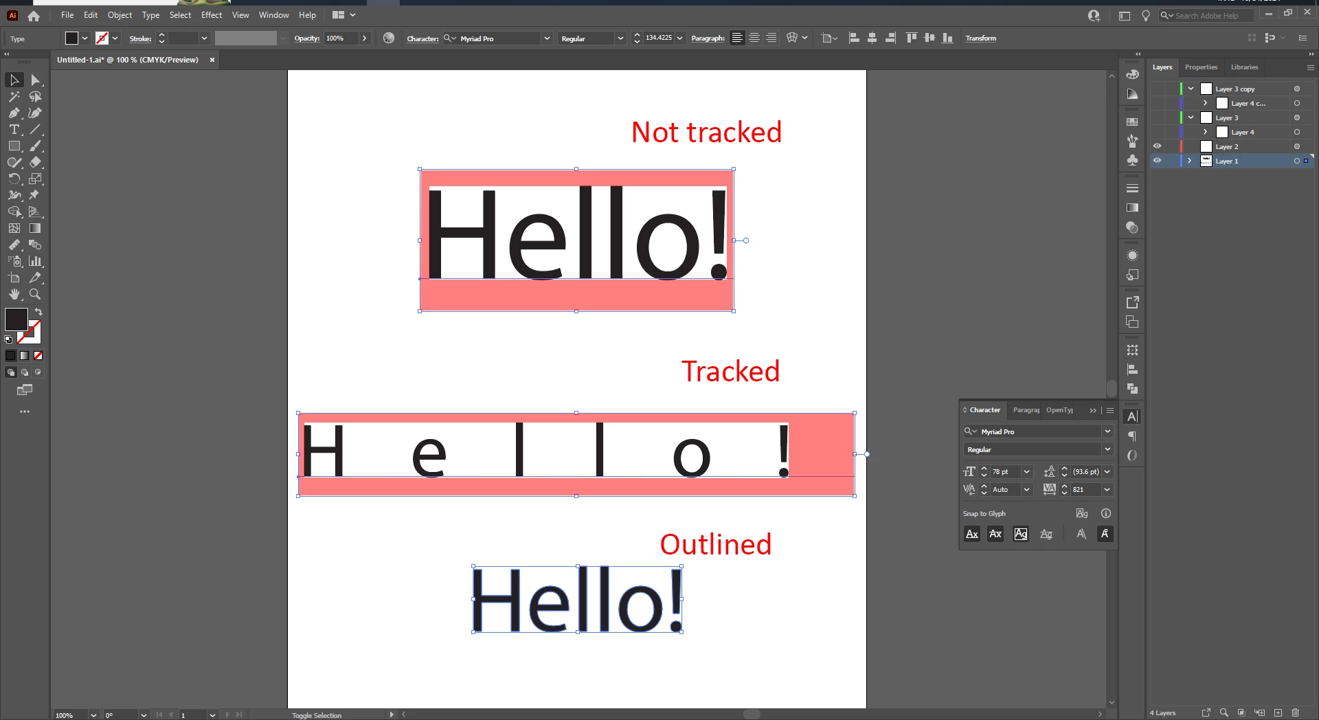
Whenever I work with text in Illustrator I always tend to face this problem: There are unwanted spaces in a selected text, which is hard to work with as it doesn't give me the accurate dimentions of the text. It gets even worse when when I use the tarcking characters option, it leaves a huge space on the right, higher the tracking number, bigger the space. It does not align properly in the center or to anything (as you can see, all the selected texts are aligned vertically and yet the tracked text leaves quite some room on the right, it's impractical).

Some might suggest to outine the text, but that turns the letters into indivual shapes/objects, it works until I need to use the character settings which is no longer possible.


Is there a way out of this? Feel free to leave any suggestions or advice.


This topic has been closed for replies.
Correct answer Monika Gause

To get the measure ments, apply the Effect > Path > Outline object.

AND

in the Preferences > General turn on "Use Preview bounds"


When using the Align panel, turn ob Align to glyphs in the panel menu.


Ming that when align something inside a box that the bottom needs to have more space than the top.

1 reply

New Participant
October 31, 2024
  • Update: So I have figured out how to solve the spacing issue on right side after tracking. But I would still like to remove the top and bottom section space of the text, if that's possible...
Monika Gause
Monika GauseCorrect answer
Community Expert
October 31, 2024

To get the measure ments, apply the Effect > Path > Outline object.

AND

in the Preferences > General turn on "Use Preview bounds"


When using the Align panel, turn ob Align to glyphs in the panel menu.


Ming that when align something inside a box that the bottom needs to have more space than the top.

New Participant
November 1, 2024

Whoa thanks! That was really helpful.

Just one more problem, the thing that you said about having more space in the bottom section, due to some lowercase letters and perhaps some capital letters as well such as the letter 'U'. The letter U or O in many font styles has bit of an extra edge at the bottom, for which when I align the overall text to somthing, it lookes a bit off as it's not aligned perfectly (not taking the letter U or O into consideration) at the centre by a few pixels/millimetres, and adjusting it manually is not practical . Is there a way to redefine the bounds (by excluding the bottom edge) or suggest a way to work around? 

I may have made it sound too complicated, feel free to ask for any details. Thanks.