- Home
- Illustrator
- Discussions
- Re: Stretch text along outer edge of circular obje...
- Re: Stretch text along outer edge of circular obje...
Copy link to clipboard
Copied
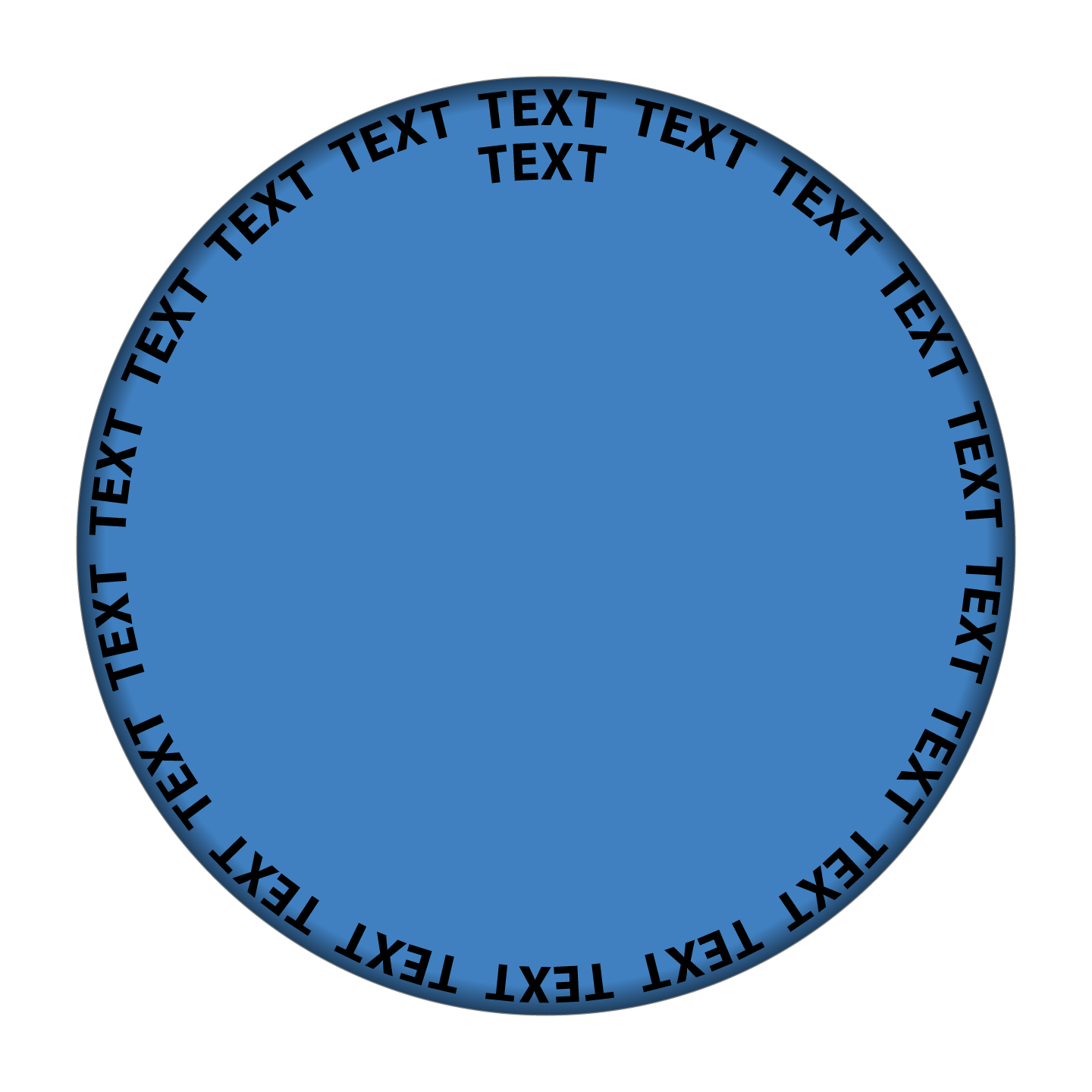
I am designing a circular object where uppercase text appears around the top edge of the object. Imagine the lid of a jar from a bird's eye view.
In order to avoid having the text appear flat, I want the top edge of all text to bend down just a little, as if beginning to wrap downward to the side of the circular shape... just a tiny bit of warping. It would be a subtle touch to help establish dimension and realism.
I can’t figure out how to do this with an expanded circular text object. Any ideas?
 3 Correct answers
I would make it into an art brush and then apply to the circle. That should do the ditortion you want.
Fvta,
From the wording accompanying the Gayla cap:
"To me, the very top-height of the uppercase letters appear to be stretched outward ever so slightly, and that is the effect I hope to accomplish. Subtle."
To me the there appears to be no stretching.
From your original description:
"I want the top edge of all text to bend down just a little, as if beginning to wrap downward to the side of the circular shape"
Rather than a stretching, I believe a (possibly exaggerated) shortening (on
...Thank you... another good tip.
I suspect you are correct that there is no actual stretching of the text, and that my mind expects to see it... so I see it. As dumb as it sounds, I have contemplated this for several days and can think of no reason how the technology of the 1940s could inadvertently stretch text on a tiny bottlecap.
But, whatever the case, following the tips mentioned above will give the shape a bit more dimension, which is something I strive for with Illustrator designs. Thanks
...Explore related tutorials & articles
Copy link to clipboard
Copied
Hmmm. Do you perhaps have an example image or a sketch of the output?
Copy link to clipboard
Copied
Hi Monika, thanks for responding. This is for a pop art series based on vintage bottlecaps.
Attached is the original soda bottlecap, and then my recreations in jpgs 1 and 2. To me, the very top-height of the uppercase letters appear to be stretched outward ever so slightly, and that is the effect I hope to accomplish. Subtle.
My version 2 uses rings of shadows and highlights to obscure the fact that the text is flat... but the end result looks more like the lid on a jar of pasta sauce.
Any thoughts would be appreciated. Thank you.
Copy link to clipboard
Copied
I would make it into an art brush and then apply to the circle. That should do the ditortion you want.
Copy link to clipboard
Copied
One approach to try in Illustrator to use the new 3D and Materials panel to extrude a circle (Ellipse tool) drawn at the size of the bottle cap, then apply a rounded bevel to the near end of the 3D cylinder, then use the Materials tab to apply your graphic to the 3D shape from the Your Graphics list (it must first be added to the Symbols panel). Then make sure the view is set to Front. Mapping the graphics to the end of that 3D cylinder bends the graphics around that rounded beveled edge.
The left image below is the image attached to the original post, the right image is the result, and the tall screen shot shows the settings I tried in the 3D and Materials panel. The shading is the result of the lighting settings in 3D and Materials, which I did not change from the default.
This is very quick and dirty, so of course you could refine how it bends around the edge by adjusting the Bevel settings relative to the graphic, and adjusting the lighting.
Copy link to clipboard
Copied
thanks. I think this will do the trick.
Copy link to clipboard
Copied
Fvta,
From the wording accompanying the Gayla cap:
"To me, the very top-height of the uppercase letters appear to be stretched outward ever so slightly, and that is the effect I hope to accomplish. Subtle."
To me the there appears to be no stretching.
From your original description:
"I want the top edge of all text to bend down just a little, as if beginning to wrap downward to the side of the circular shape"
Rather than a stretching, I believe a (possibly exaggerated) shortening (only) at the top of the letters is the best way to enhance the impression of their bendig down in addition to the (possibly exaggerated) shading at the rim, which in itself (only) gives a certain impression of bending down (or up).
And a shortening at the top of the letters is exactly what is obtained by the 3D approach shown by Conrad: most conspicuously you can see how the top bars of letters are thinner.
In a simple case like the repetition of TEXT round the cap you could just change one instance and then use an Effect to reppeat it and then add the shading, as shown in this crude sample where you can make a direct comparisom with the original TEXT without the shortened top:
 Click/RightClick to get closer, Click again to get closer still
But for the reproduction of the real cap, the 3D is the obvious way to shorten the top of the letters.
I believe that you will wish to have the appearance of seeing the cap straight on with lighting from the top (centre) at a suitable distance, in other words the same shading all the way round.
I also believe that you will prefer an enhanced impression of the bending down at the rim, of the cap including text, in order to make it noticeable.
You can work with the 3D settings to get the right (possibly enhanced) shortening and see whether you can also get the right (possibly enhanced) shading.
Or you can create an independent enhanced shading as in the crude sample above (made with a circular blend/gradient with varying transparency on top of the solid cap colour), to enhance the contribution from the shading to the impression of the bending down at the rim independently of the contribution from the text shortening, possibly corresponding to a lighting from a suitably low distance above the cap.
As with the 3D text shortening, you can work with the settings of the blend/gradient to fine tune (including the sizes of the circles they are based upon witch may be different to the sizes used for the 3D text shortening); that is easier/more convenient with a blend, I believe.
Copy link to clipboard
Copied
Thank you... another good tip.
I suspect you are correct that there is no actual stretching of the text, and that my mind expects to see it... so I see it. As dumb as it sounds, I have contemplated this for several days and can think of no reason how the technology of the 1940s could inadvertently stretch text on a tiny bottlecap.
But, whatever the case, following the tips mentioned above will give the shape a bit more dimension, which is something I strive for with Illustrator designs. Thanks again.
Copy link to clipboard
Copied
For my part you are welcome, Fvta.
Actually there is a stretching in the original radial direction caused by the stamping of the cap which stretches the top of the letters as they are pressed down into the rounding (the extent depending on how far), but that will only appear when the letter tops are seen from the side. Seen from the top it will appear quite differently, at least in some cases as a shortening owing to the same rounding. An extreme case of such stretching is the stamping of a stainless steel sink with near vertical sides.
At the same time, the downward stretching will cause a sideways/concentric contraction (along the rim) of the top of the letters because the rounded outer part of the cap will go from a larger plane sheet to(wards) cylindrical with a smaller circumference.
In any case, I believe that the (main) key to the best solution is the 3D approach shown by Conrad.
Find more inspiration, events, and resources on the new Adobe Community
Explore Now


