• Global community
    • Language:
      • Deutsch
      • English
      • Español
      • Français
      • Português
  • 日本語コミュニティ
    Dedicated community for Japanese speakers
  • 한국 커뮤니티
    Dedicated community for Korean speakers
Exit
0

Text effect

New Here ,
Sep 07, 2022 Sep 07, 2022

Copy link to clipboard

Copied

Does any one here know how to get the text effect below? My attempt is the black coloured text, and I'm trying to imitate the orange text below it. I tried "Envelope Distort" but this doesn't create the effect of wider letters at left side and more narrow letters on the right. I've also tried a whole lot of 3D effects, but this doesn't seem to work either! Any advice?

TOPICS
Tools , Type

Views

515

Translate

Translate

Report

Report
Community guidelines
Be kind and respectful, give credit to the original source of content, and search for duplicates before posting. Learn more
community guidelines

correct answers 1 Correct answer

Community Expert , Sep 09, 2022 Sep 09, 2022

i posted this in a reply to someone else, but i'll post it here as well for visibility.


I can't believe i didn't see it before, but the effect you're looking for here is perspective. That will achieve both the variable vertical scaling of the text (how it starts taller and gets shorter), while also handling the decreasing letter width AND tracking. Many of the other suggested solutions here achieve one of these things, but not all of them.


If you prefer videos for learning, here's a good tut

...

Votes

Translate

Translate
Adobe
Community Expert ,
Sep 07, 2022 Sep 07, 2022

Copy link to clipboard

Copied

This is a very precise result.

I would go for a manual approach. You can start with a font, but then create guidelines and distort the parts of the letters manually.

Votes

Translate

Translate

Report

Report
Community guidelines
Be kind and respectful, give credit to the original source of content, and search for duplicates before posting. Learn more
community guidelines
Community Expert ,
Sep 07, 2022 Sep 07, 2022

Copy link to clipboard

Copied

perhaps a 4 sided polygon matching the shape of each letter, then using that for an envelope distort. at least as a starting point. might need tweaks. 

Votes

Translate

Translate

Report

Report
Community guidelines
Be kind and respectful, give credit to the original source of content, and search for duplicates before posting. Learn more
community guidelines
Community Expert ,
Sep 07, 2022 Sep 07, 2022

Copy link to clipboard

Copied

looks good. you're close. What's missing from yours is the faux "3d effect" of the letters getting narrower as you get further right. This isn't a real "effect" like from the effects menu, necessarily. it's variable character width to accomodate the variable character height. but the changes aren't proportional. the width gets smaller faster than the height.. this helps give the impression that the left side of the word is close to you, and the right side is getting progressively farther away.

Votes

Translate

Translate

Report

Report
Community guidelines
Be kind and respectful, give credit to the original source of content, and search for duplicates before posting. Learn more
community guidelines
Community Expert ,
Sep 07, 2022 Sep 07, 2022

Copy link to clipboard

Copied

Allo,


How about this,


1) Outline Type if not already,

2) Switch to the Free Transform Tool, then hold Shift and Ctrl/Cmd and ClickDrag the lower right corner of the Bounding Box upwards?


You can (also) adjust further by scaling horizontally/vertically.

Votes

Translate

Translate

Report

Report
Community guidelines
Be kind and respectful, give credit to the original source of content, and search for duplicates before posting. Learn more
community guidelines
Community Expert ,
Sep 07, 2022 Sep 07, 2022

Copy link to clipboard

Copied

This would actually be easier in Photoshop, where you can either Distort or apply Perspective to your text, which is what you need to create the proper sizing of letters.

It can also be done in Illustrator although it's a bit more involved. Look up how to create Perspective Text in Illustrator... there are lots of how to vids out there.

Screen Shot 2022-09-07 at 1.03.32 PM.png

Votes

Translate

Translate

Report

Report
Community guidelines
Be kind and respectful, give credit to the original source of content, and search for duplicates before posting. Learn more
community guidelines
Community Expert ,
Sep 09, 2022 Sep 09, 2022

Copy link to clipboard

Copied

came here to say the same. except it can be done in illustrator as well using the perspective tool.


@Allo260017104xcf 

Set up your type at a good approximate starting size, then turn on the perspective grid and resize it until the grid roughly matches the shape/dimensions/angles of the source image text, then grab the "Perspective Selection Tool" (in the toolbar, lower part of right side middle. might have to click and hold the "Perspective Grid Tool" to open the flyout menu). Using the perspective selection tool, click and drag your tex onto the perspective grid and it will snap into perspective and you can then manipulate it and scale it from there. (though, the text is expanded when you do this.. so make sure you keep a fresh copy of the live text off to the side so that you can start over if you want. don't work destructively. =))


Here's a handy video tutorial if that's easier to follow:

https://www.youtube.com/watch?v=i1gJRhPL1yk

Votes

Translate

Translate

Report

Report
Community guidelines
Be kind and respectful, give credit to the original source of content, and search for duplicates before posting. Learn more
community guidelines
Enthusiast ,
Sep 08, 2022 Sep 08, 2022

Copy link to clipboard

Copied

Allo, Hi.


If I understand you correctly, you are requesting that each character be gradually scaled (“fat”> “thin”), in perspective and still maintain the integrity of the font.


So here is the approach I used. I random color as I work.

Set Type. The Cyan color is a Black Condensed. The Brown color is Medium Condensed.

Outline Type.  

Blend Steps. This will give you a gentle morph from Black Condensed > Medium Condensed.

Expand Blend Steps.

Ungroup. Select your characters and realign.

Group. Finally, do Free Transform to give it perspective.


K

Screen Scale, perspective.png

Votes

Translate

Translate

Report

Report
Community guidelines
Be kind and respectful, give credit to the original source of content, and search for duplicates before posting. Learn more
community guidelines
Community Expert ,
Sep 09, 2022 Sep 09, 2022

Copy link to clipboard

Copied

i posted this in a reply to someone else, but i'll post it here as well for visibility.


I can't believe i didn't see it before, but the effect you're looking for here is perspective. That will achieve both the variable vertical scaling of the text (how it starts taller and gets shorter), while also handling the decreasing letter width AND tracking. Many of the other suggested solutions here achieve one of these things, but not all of them.


If you prefer videos for learning, here's a good tutorial:

https://www.youtube.com/watch?v=i1gJRhPL1yk


If you're a nerd who prefers reading and screenshots and bulleted lists... Here's... that.


Here's the process:

  • Paste your source image into your document at the center of the artboard and lock the layer.
  • in the "View" menu, find "Perspective Grid" and click "Show Grid"
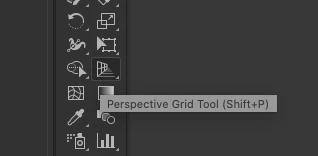
  • In your tools panel, locate the "Perspective Grid Tool". It looks like the side of a building.
    • pay attention to the right side of the tooltip for the keyboard shortcut to use if you prefer that.
    • Screen Shot 2022-09-09 at 3.04.19 PM.png
    • or you may see this instead:
    • Screen Shot 2022-09-09 at 2.30.06 PM.png
    • if so, click and hold and you'll see a flyout menu that contains the perspective related grid and selection tools
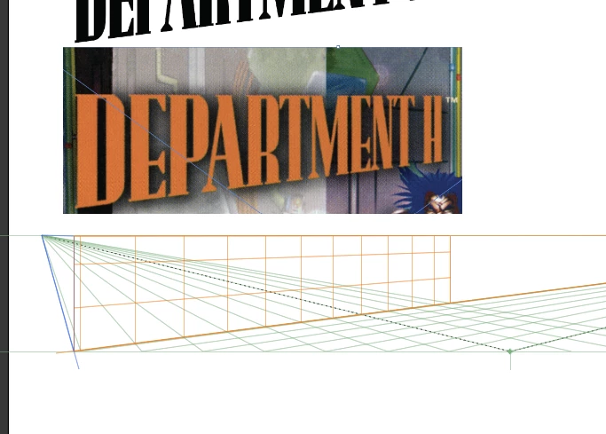
  • resize your perspective grid until it matches the dimensions of the text in your source image, like so:
  • make a new layer for your art
  • make a new text frame, input the contents, and apply the font and other character styles necessary.
  • make a duplicate of your text and keep it off to the side
    • when you attach the text to the perspective grid, you will loose editability. so you want to keep a live text version as a backup plan if you need to start over at some point.
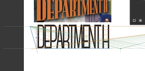
  • align your text roughly to the desired plane (orange in this example) like so:
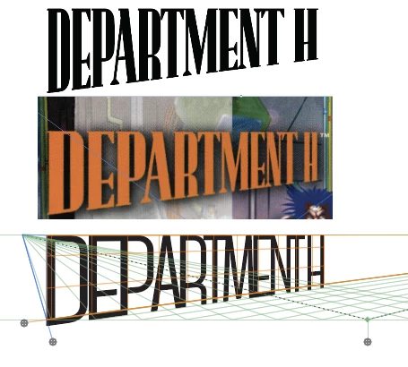
    • (don't mind the font.. couldn't be bothered to try to find the exact one you used)
    • Screen Shot 2022-09-09 at 2.29.53 PM.png
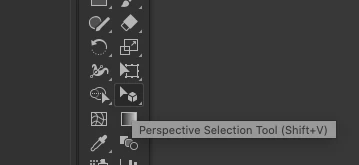
  • grab the "Perspective Selection Tool" (see above if you don't know where it is)
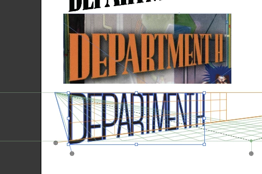
  • with the perspective selection tool, click and drag your text onto the perspective grid until you see it "snap" into perspective. Don't worry about exact size or placement. you can move and scale the text in perspective until it fits nicely into your predefined perspective grid, which is the same dimensions as your source image text.
    • Screen Shot 2022-09-09 at 2.32.18 PM.png
    • Screen Shot 2022-09-09 at 2.32.56 PM.png
  • Manipulate to your hearts delight, then "Expand" the artwork to extract it from the perspective grid so you can use it as regular old artwork again. 
  • Yours will look better than mine. i'm just a programmer.


Votes

Translate

Translate

Report

Report
Community guidelines
Be kind and respectful, give credit to the original source of content, and search for duplicates before posting. Learn more
community guidelines
New Here ,
Sep 26, 2022 Sep 26, 2022

Copy link to clipboard

Copied

Thanks everyone - yes, the perspective tool did the trick. Thanks heaps!

Votes

Translate

Translate

Report

Report
Community guidelines
Be kind and respectful, give credit to the original source of content, and search for duplicates before posting. Learn more
community guidelines
Community Expert ,
Sep 26, 2022 Sep 26, 2022

Copy link to clipboard

Copied

Never mind, I misunderstood the original post.

Votes

Translate

Translate

Report

Report
Community guidelines
Be kind and respectful, give credit to the original source of content, and search for duplicates before posting. Learn more
community guidelines
Community Expert ,
Sep 26, 2022 Sep 26, 2022

Copy link to clipboard

Copied

LATEST

I think I got pretty close using Illustrator’s very limited 3D effects. See below.

 Untitled-1.png

I duplicated the line then used the old 3D effects to add persepective. By duplicating the line I ensured the top of hte text I want to keep is horizontal. Below are the 3D settings I used. PLay around to get the effect you want.

 Screenshot 2022-09-26 at 6.11.18 PM.png


Votes

Translate

Translate

Report

Report
Community guidelines
Be kind and respectful, give credit to the original source of content, and search for duplicates before posting. Learn more
community guidelines