

- Home
- Illustrator
- Discussions
- Re: Unwanted bold fonts when converting AI to pdf
- Re: Unwanted bold fonts when converting AI to pdf
Unwanted bold fonts when converting AI to pdf

Copy link to clipboard
Copied
I've tried converting directly from illustrator and through distiller, both the same results.
Anybody?


Explore related tutorials & articles
 32
Replies
32
32
Replies
32

Copy link to clipboard
Copied
How does it look when you print?
Which font?
Is it l as in letter or I as in Illy?
Which versions?
Does it happen under any moon?
Copy link to clipboard
Copied
Thanks for responding
It looks fine when I print it on my inktjet
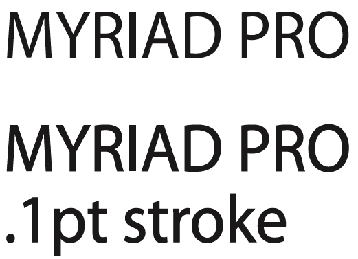
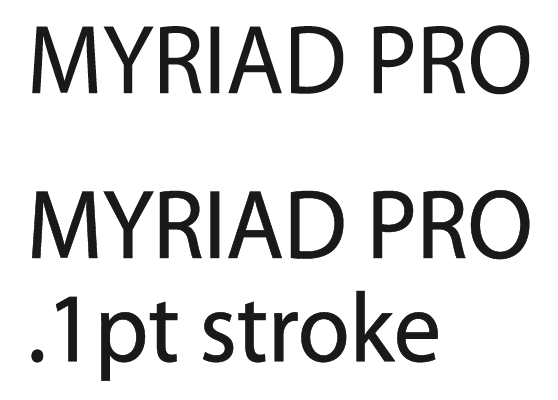
The font is myriad pro regular
The difference between the fonts dissapears on screen when I enlarge the pdf to about 800%.
you can have a look at a screenshot here http://www.11q.eu/vb.jpg
Ernst

Copy link to clipboard
Copied
Copy link to clipboard
Copied
Thanks for your remarks....does this mean that the PDF I made is suitable for printing......will the bold "l" not show up in my folder??? (probably a stupid questuion , but I'm a complete newby concerning Ai and PDF formats)
Ernst
Copy link to clipboard
Copied
Copy link to clipboard
Copied
grtz
Ersnt
Copy link to clipboard
Copied
Scott's got it absolutely right. Check your pdfs in maximum zoom and you will see that the outlined type is perfect to all intents and purposes. Embedding fonts SHOULD work these days but accidents have happened, so if you are using unusual or home-made fonts, outlining them will make your pdfs foolproof and there is no chance of them reverting to Courier (which sometimes happened in the old days). I usually outline fonts before making pdfs, at least on smalller print jobs that don't contain much text. Saves you having to worry about things going wrong at the printers. The down side is that if you have made a typo the printer won't be able to correct it, so you need to be very thorough in your proofreading.

Copy link to clipboard
Copied
This all made perfect sense to me until you said the solution was to outline the text. I also use myriad pro for the text in diagrams I prepare in Illustrator and save as .ai files. Once finalised, I select all the text (usually on a separate layer) and outline it (Type->Create Outlines), then save the resulting file as a .eps file.
In Illustrator, it looks perfect. After inserting the diagram into my document in InDesign CS3 (Object->Anchored Object->Insert, followed by File->Place) the diagrams are all pixellated, which I'm not greatly surprised by, but when I export the whole document as a PDF and check it out in Adobe Reader, the lower-case ells and upper-case i's are both thicker and taller than the rest of the text.
Printed out it looks fine, but like others, I want to make my documents available online.
Copy link to clipboard
Copied
I have found the solution, while chasing a different problem with my illustrations, and it's a problem with Adobe Reader. I'm using 9.2.0.
Click Edit -> Preferences
Select Page Display
Uncheck Enhance Thin Lines.
This solves two problems. First, the bold ells and uppercase i's revert to normal. The other problem I had was that, again in Reader, if I zoomed in on an annotated diagram (a piece of electronic equipment with the various buttons labeled - a ring containing a number and a line to the button) the lines progressively disappeared. Zoom back out and they magically reappear. This, too, is solved by unchecking Enhance Thin Lines.

Copy link to clipboard
Copied
I hope this might help you all -
File > Save as > Adobe PDF
Save Adobe PDF Dialog box Open, now choose
> Adobe PDF Preset > High Quality Print > Save PDF 
Regards,
Vipul Pawaskar

Copy link to clipboard
Copied
Thank you Robert!

Copy link to clipboard
Copied
Do you know this was an old issue and you just make my day!!! this is the REAL problem SOLUTION folks, great advice!!!!!

Copy link to clipboard
Copied
You star! Yes, I had the same issue and your advice sorted it. Thanks.

Copy link to clipboard
Copied
Unchecking that box in Acrobat worked- but I am designing this to send out in a marketing campaign, so not sure that's helpful everyone will likely have that box checked on their Acrobat versions..

Copy link to clipboard
Copied
Don't outline the fonts if they can be embedded.

Copy link to clipboard
Copied
Ernst,
Your problem has nothing to do with the PDF since that prints fine, but how Acrobat is displaying the .pdf.
Acrobat >> preferences >> page display >> Enhance Thin Lines (OFF)
Enhance lines on
Enhance lines OFF

Copy link to clipboard
Copied
Ok, I understand that the bold L will print correctly, but is there any way to stop it from happening on the preview?
We want to use the PDF online and don't want the L's stealing the show.
Thanks

Copy link to clipboard
Copied
It's a common problem with viewing pdfs. No solution ASFAIK apart from converting the type to Outline. But that then increases file size.
JJ

Copy link to clipboard
Copied
Dear JJ,
I used an adobe preflight fix up (Covert text to outlines) on the client provided pdf document (Brochure). It created all the text to outlines for sure but on the other hand when it finished the fixup, it made the 'l's in the text bolder/thicker. One of the similar problems Ernst was facing.
I tried printing it on my high resolution printed Richo C571 and to my disappointment it did show up on the print as well! How do we solve that problem? Any ideas? 
Thanks.
Copy link to clipboard
Copied
Don't convert text to outlines.
When you convert text to outlines, the hinting information is lost resulting in variable thickness.
Copy link to clipboard
Copied
Dear Ton,
Thank you for your quick reply.
The reason I convert the text to curves is simply because when I print the document that is provided, in certain places and pages the fonts appear weird, they change to symbols or something for some reason. Probably because they aren't embedded into the document by the client.
What's the solution in that case?
Looking forwards to your best advice.
Thanks.
Copy link to clipboard
Copied
Stefan, I don't think you can solve the problem of non embedded fonts on your side, the client who made the pdf has to take care of that.
If you cannot ask the client to make a proper pdf, then i am afraid that the thickening of the fonts after outlining is something you have to live with. But the higher the resolution of the printer, the less visible the thickening becomes.
Copy link to clipboard
Copied
Another way to solve the font issue: to have the same fonts installed on your computer as were used during the creation of the pdf.

Copy link to clipboard
Copied
I think this might have solved it for me, as after installing the fonts, they started to look better and no more bold Ls everywhere. Apart from installing fonts, I did copy and paste the Artboards in different files into one file for my purposes, previously they were individually exported and now together incase, this has had an affect on the outcome... Cheers
-
- 1
- 2

Find more inspiration, events, and resources on the new Adobe Community
Explore Now
 AdChoices