October 4, 2018
Answered

Negative offset path

  • October 4, 2018
  • 4 replies
  • 14662 views

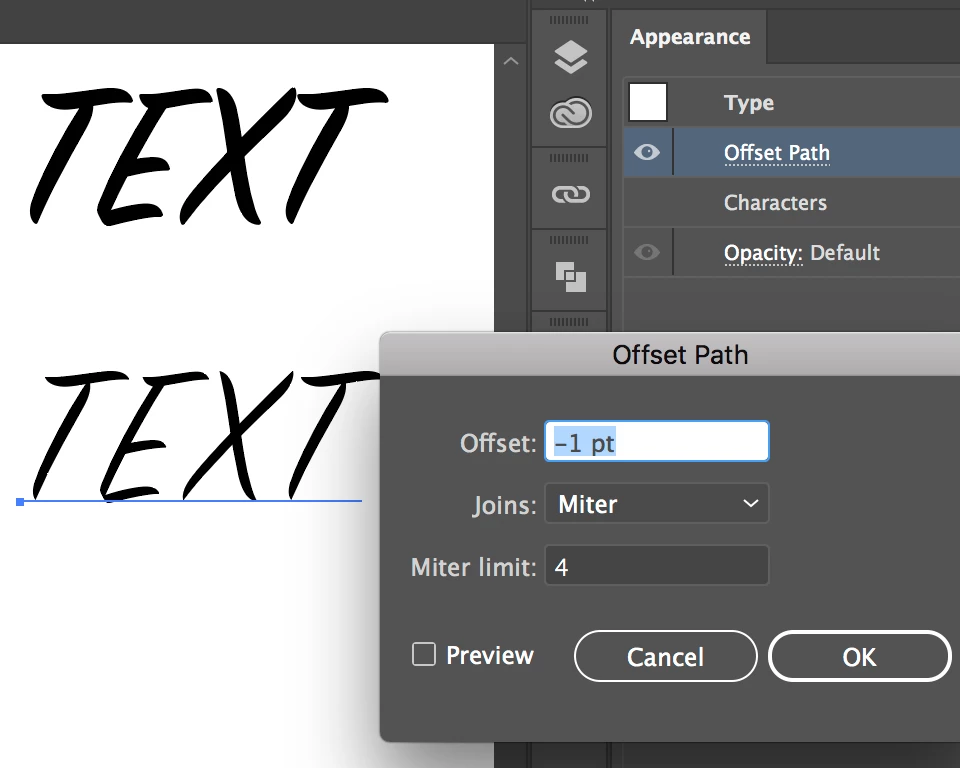
Every time I try to use a negative offset path number on a text to make it thinner, it doesn't work! what should I do to get a thinner text?

    This topic has been closed for replies.
    Correct answer Mike_Gondek10189183

    What do you exactly mean by "It Doesn't work"?

    • If greyed out, you need to apply this using effect >> path >> offset  Path, to the type or fill (check the appearance panel).

    • If you are not seeing the effect happen you may be applying too small of an amount.

    4 replies

    Mike_Gondek10189183
    Community Expert
    Mike_Gondek10189183Community ExpertCorrect answer
    Community Expert
    October 4, 2018

    What do you exactly mean by "It Doesn't work"?

    • If greyed out, you need to apply this using effect >> path >> offset  Path, to the type or fill (check the appearance panel).

    • If you are not seeing the effect happen you may be applying too small of an amount.
    meganchi
    Legend
    October 4, 2018

    If you have a solid background behind the text, you could add a stroke of the same background color to the text.

    John Mensinger
    Community Expert
    Community Expert
    October 4, 2018

    Well, it will work if the type is converted to outlines and if (all parts of) the resulting forms have enough size to accommodate whatever negative offset you apply.

    NEVERTHELESS.

    The only correct way to get thinner type is to choose a thinner font or lighter font weight, if applicable. Even in cases where negative offset path has enough room to work, there will be undesirable distortions in the result. You won't have a thinner font, you'll have what used to be a font until its integrity was violated.

    Monika Gause
    Community Expert
    Community Expert
    October 4, 2018

    Live text could be made thinner with the Offset path effect.

    John Mensinger
    Community Expert
    Community Expert
    October 4, 2018
    Live text could be made thinner with the Offset path effect.

    True, so strike what I said here:

    if the type is converted to outlines

    And I stand by the rest.

    Monika Gause
    Community Expert
    Community Expert
    October 4, 2018

    To get lighter text, it will be best to select an appropriate font.

    If that is not possible, then use Illustrator.

    You could try if entering a lower number works. When you offset by an amount that is too high then Illustrator won't offset.