Exit
  • Global community
    • Language:
      • Deutsch
      • English
      • Español
      • Français
      • Português
  • 日本語コミュニティ
  • 한국 커뮤니티
0

Adding vertical space as part of a paragraph style

Community Beginner ,
Oct 18, 2023 Oct 18, 2023

I'm laying out a book containing several stories where I've set a particular paragraph style (story title) to start on the next odd page. It's great! Except that I want the story title to be set about 2 inches down that page. If I use the "space before" function in the paragraph style setup, it sticks that space on the previous page (I guess? not really sure what's happeneing with it). Any ideas on how to include some space before the title displays, aside from manually changing the size of the text frame?

TOPICS
Print
1.0K
Translate
Report
Community guidelines
Be kind and respectful, give credit to the original source of content, and search for duplicates before posting. Learn more
community guidelines

correct answers 1 Correct answer

Community Expert , Oct 18, 2023 Oct 18, 2023

ID automatically suppresses space before paragraphs at the top of a frame. That's usually desired behavior, so that headings don't have extra space unless there is text above them.


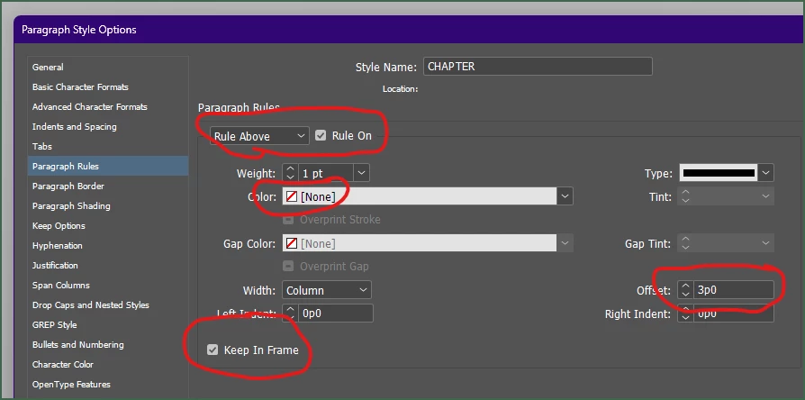
The simplest way to force this space is to use Paragraph Rule Above:

JamesGiffordNitroPress_0-1697673954084.pngexpand image

  • Set a zero-width or very thin rule above.
  • Set its color to None.
  • Set the offset to the amount of space-above you want.
  • And be sure to check "Keep in Frame" or InDesign will helpfully omit the space for you.


This is, obviously, a style setting,

...
Translate
Community Expert ,
Oct 18, 2023 Oct 18, 2023

You can create ObjectStyle with extra margin at the top and apply to the parent TextFrame - but it's just a workaround. 


Translate
Report
Community guidelines
Be kind and respectful, give credit to the original source of content, and search for duplicates before posting. Learn more
community guidelines
People's Champ ,
Oct 18, 2023 Oct 18, 2023

For the story title paragraph style, use space after and baseline shift down for the text.

The space after will create the gap you need at the top of the page. The baseline shift downwards will place the text of the story title nicely within that gap.

Full disclosure: This is a minority opinion. You will be shouted at (and so will I), for suggesting to use baseline shift as part of a paragraph style. And yes, it makes selecting the text in the story title a little tricky (but not very).

But having typeset hundreds of books in InDesign, I promise you you won't regret it in the long run!

The alternative (using an invisible rule above and applying the option to keep the rule within the frame boundaries, with the result that the text is pushed down) requires that you do not set the first baseline of the text frame to "fixed" (in the text frame options dialog). This is one compromise too far, becuase if there happens to be larger-than-usual text on the first line of the frame, the lines of text on that page will no longer fall on the baseline grid...

@Robert at ID-Tasker 's suggestion is a possibility, but of course if the text is edited or otherwise shifts around, you need to be very careful to remember to set the object style of what was the chapter opening to the regular object style, and apply the chapter opening object style to the new frame with the chapter title. Too much hassle for me!

Translate
Report
Community guidelines
Be kind and respectful, give credit to the original source of content, and search for duplicates before posting. Learn more
community guidelines
Community Expert ,
Oct 18, 2023 Oct 18, 2023

Not much hassle with a simple JS script: 

  1.  Reset ObjectStyle for all TextContainers of the ParentStory - probably a single line, something like myStory.textContainers.everyItem().appliedObjectStyle = myObjStyle;
  2.  Check 1st paragraph, if specified ParaStyle is applied - then apply ObjectStyle - here it would need to be a loop.


But I'm not JS expert. 


Translate
Report
Community guidelines
Be kind and respectful, give credit to the original source of content, and search for duplicates before posting. Learn more
community guidelines
Community Expert ,
Oct 19, 2023 Oct 19, 2023

I've used baseline shift as a style, but most often to adjust interim headings for a better visual fit when using the baseline grid. That is, instead of three full base lines between paragraphs for a heading, I will use two and shift the heading down by a couple of points. Preserves the grid spacing, allows subtle correction of heading above/below spacing without big gaps.


I think that baseline shift of more than a line-height, though, is poor practice, so moving a heading an inch or two down a page is maybe not best served by this technique.

Translate
Report
Community guidelines
Be kind and respectful, give credit to the original source of content, and search for duplicates before posting. Learn more
community guidelines
Community Expert ,
Oct 18, 2023 Oct 18, 2023

ID automatically suppresses space before paragraphs at the top of a frame. That's usually desired behavior, so that headings don't have extra space unless there is text above them.


The simplest way to force this space is to use Paragraph Rule Above:

JamesGiffordNitroPress_0-1697673954084.pngexpand image

  • Set a zero-width or very thin rule above.
  • Set its color to None.
  • Set the offset to the amount of space-above you want.
  • And be sure to check "Keep in Frame" or InDesign will helpfully omit the space for you.


This is, obviously, a style setting, so you can use it for as many headings as needed without having to manually set anything, and be able to adjust the spacing etc. globally.

Translate
Report
Community guidelines
Be kind and respectful, give credit to the original source of content, and search for duplicates before posting. Learn more
community guidelines
Community Beginner ,
Oct 18, 2023 Oct 18, 2023

Lovely solution, thank you!

Translate
Report
Community guidelines
Be kind and respectful, give credit to the original source of content, and search for duplicates before posting. Learn more
community guidelines
Community Expert ,
Oct 19, 2023 Oct 19, 2023

It would be nice if there was a style setting for paragraphs, something like that "Keep in Frame" checkbox, that would allow designers to make ID force the space at the top of frames. But there ain't. 😛


I use this method (one of two) because it exports to EPUB reliably; EPUB and Kindle readers are erratic about how they handle space-above on virtual page breaks.

Translate
Report
Community guidelines
Be kind and respectful, give credit to the original source of content, and search for duplicates before posting. Learn more
community guidelines
Community Expert ,
Oct 18, 2023 Oct 18, 2023

Like James, I use a paragraph style, and explained it on a previous post. 

https://community.adobe.com/t5/indesign-discussions/how-do-i-make-indesign-recognize-my-spacing-styl...


~Barb

Translate
Report
Community guidelines
Be kind and respectful, give credit to the original source of content, and search for duplicates before posting. Learn more
community guidelines
Community Expert ,
Oct 19, 2023 Oct 19, 2023
  1. Create a style with a paragraph ruler above.
  2. Make it so thick that the start of the paragraph is on the desired place.
  3. Change the color of the paragraph ruler to none.
Translate
Report
Community guidelines
Be kind and respectful, give credit to the original source of content, and search for duplicates before posting. Learn more
community guidelines
Community Expert ,
Oct 19, 2023 Oct 19, 2023
LATEST

This also works, but that super-thick line can cause weird layout problems in some situations. (Such as export to EPUB etc.; since there is no "none" color in export, it will show against any differently-colored background. A white line, the obvious choice, with show against any tinted or dark reader background, for example. I've seen other glitches in layout as well, since the algorithms are sometimes baffled by extra-thick lines and borders.)


A minimal line with a defined offset seems to work better, all around.. (And the thin white line on a black reader background is either unnoticeable, or harmonizes with the page display at least.)

Translate
Report
Community guidelines
Be kind and respectful, give credit to the original source of content, and search for duplicates before posting. Learn more
community guidelines