- Home
- InDesign
- Discussions
- Betreff: Baseling grid for font different between ...
- Betreff: Baseling grid for font different between ...
Baseling grid for font different between Adobe/Google font
Copy link to clipboard
Copied
Copy link to clipboard
Copied
Someone else complained about this in november - https://community.adobe.com/t5/indesign-discussions/text-boxes-need-to-be-enlarged-after-update/m-p/... - the issue there is marked as solved, but it wasn't solved actually.
but the issue started with 17.0, actually i was really hoping it would have been addresses in this recent 17.1, update, but unfortunately it wasn't fixed.
Copy link to clipboard
Copied
Please don't take this badly, but what's to fix?
One font from one type house works consistently one way. That font, named the same, created and distributed by another type foundry, consistently works another way.
Both fonts work fine. But they don't work the same way. The only "fix" needed is to use just one version of the font, from just one type source, and there will be nothing further that needs "fixing."
Jus' sayin' ...
Randy
Copy link to clipboard
Copied
Hi Friederike,
I know. What version of font repository will fail depends of the font of the repository you start out.
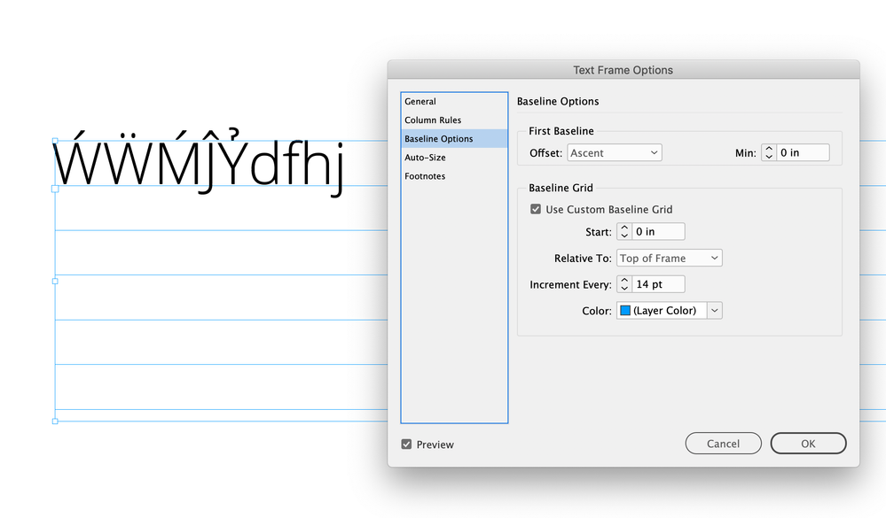
If you start out with Google Fonts' Open Sans, the version of Adobe Fonts will fail. If you start out with Adobe Fonts' Open Sans and substitute Open Sans with the Google Fonts version, the Google Fonts version will fail.
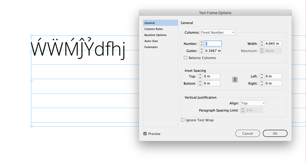
Simply a bug with the default value "Ascent" for the Start First Baseline Offset in a default text frame.
What can one do?
[1] Never substitute fonts.
[2] Use a different setting for Start First Baseline Offset in your text frames.
Never use "Ascent", instead use perhaps "Cap Height".
FWIW: I assume my post in this other thread is marked as "Solved", because I detected the cause and showed a workaround. My answer was not meant as a bug fixing attempt. I'm not part of the devoper team; just an InDesign user like you are.
Regards,
Uwe Laubender
( ACP )
Copy link to clipboard
Copied
Hi Uwe, I’m also seeing it in CC2021, but it looks more like a problem with the Google TT font than an InDesign bug:
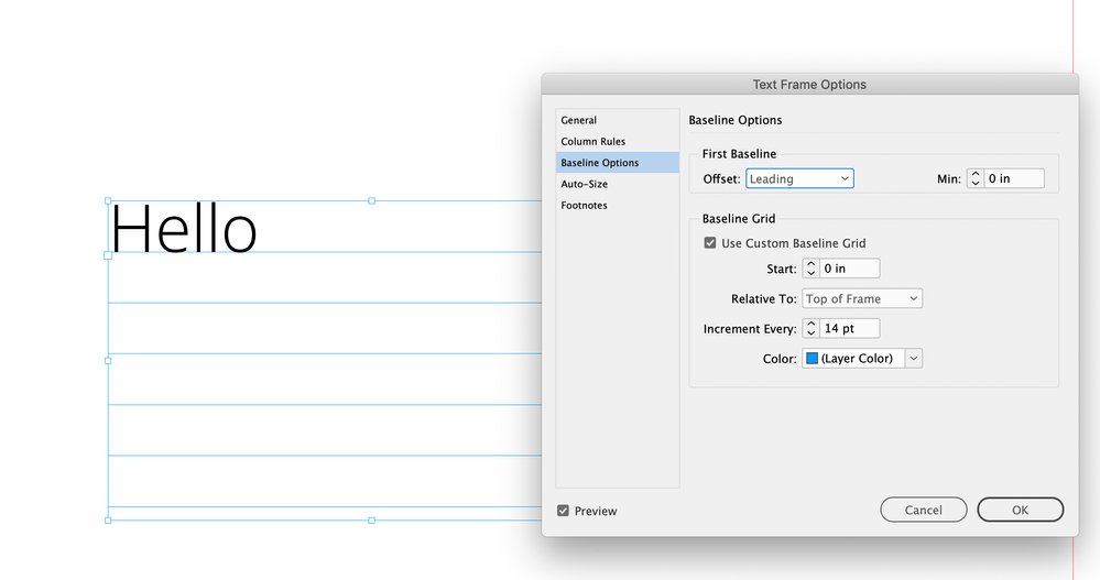
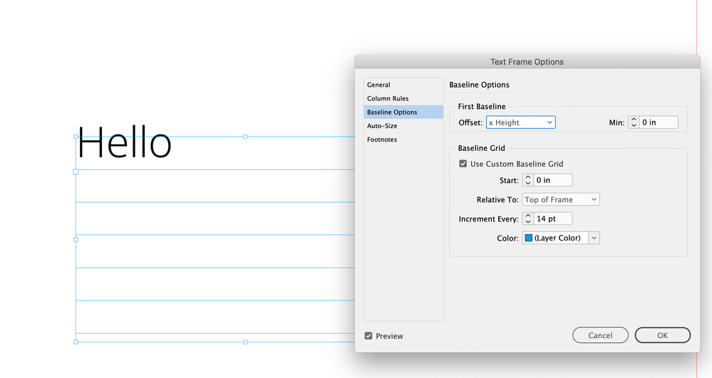
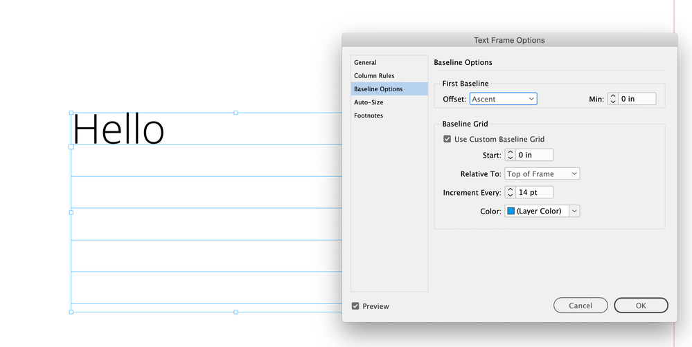
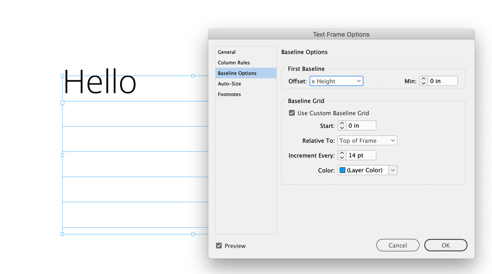
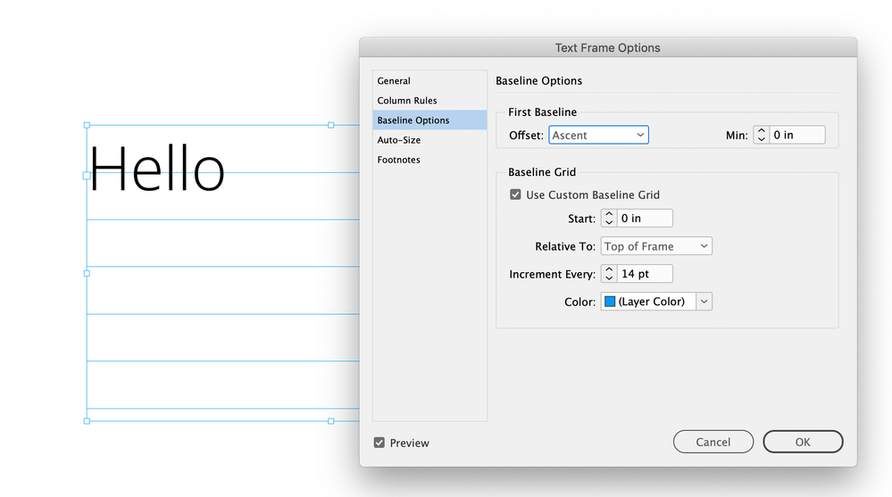
Here the Adobe OTF version behaves as expected, the text‘s Leading is set to 14, so the first baseline aligns to my 14pt baseline grid. The x-Height and Ascent Offsets also align as expected:
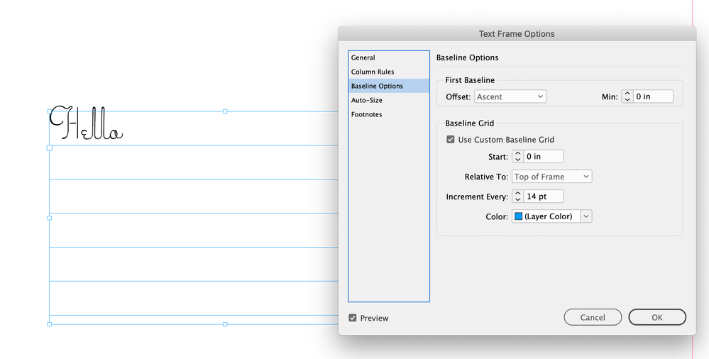
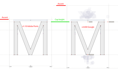
The Google TT version seems to have a different Ascent metric:
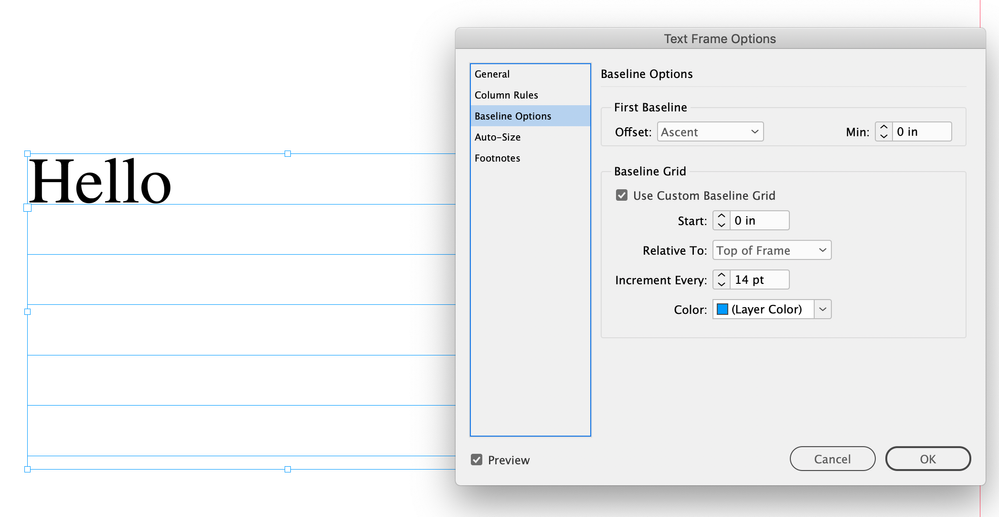
But the Ascent line is dependent on the font:
Copy link to clipboard
Copied
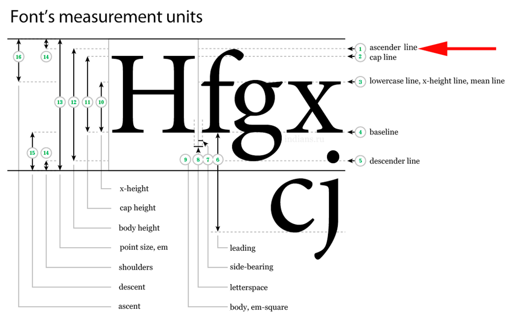
I think the ascender line is set by the type designer:
Copy link to clipboard
Copied
It looks like Adobe licensed Open Sans from Google and converted it to Open Type. The Adobe OTF version’s ascender line is at the lower case ascent, and the Google TT version has the ascender line to include diacritical marks:
Copy link to clipboard
Copied
I have cracked open each version to take a look at their internal specs. There is indeed a difference in the ascent defined within each. It's much smaller in the version available from Adobe. Although that is also Google font, it's only v1.00/1.10. The version that Google is supplying directly is currently v3.000 with a much larger ascent specified. Since, normally, the acsent defined in a font takes into account for the glyphs with accents, etc, my guess is Google tweaked the ascent between versions.
Hence Indesign is reacting appropriately according to which version you are using. As said by others, stick with one set and be done with it. Better yet, never use Ascending as the default baseline.
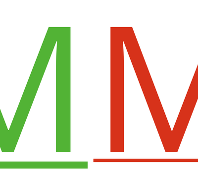
Also of note: The AF-supplied version has different underline specs (v1.10 is fatter) and diacriticals are in slightly different positions.
Copy link to clipboard
Copied
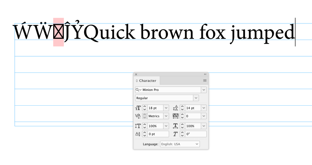
Hi Brad it looks like some type designers choose to include diacritics, while others define the ascent as the top of the lowercase characters. Seems like most Adobe designed fonts (Minion, Myriad, Adobe Garamond, Caslon, etc.) do not include the diacritics:
Copy link to clipboard
Copied
Oh, they're in there (in the Adobe-supplied version). My guess is they original designer (Ascender) didn't account for them in their first version, but that has been since corrected.
This is the second time i've seen differences in the Google fonts that were given to Adobe and the ones Google supplies directly, and it comes down to the the fact the Adobe supplied ones were older versions. Why they aren't keeping up to date is beyond my understanding of the licensing agreements between them, but, yah, this is causing issues!!
Another issue I found with Open Sans, is that the Plain "Regular" font has a different internal name between Adobe and Google, so they can accidentally be activated at the same time, which is nerver a good thing
Copy link to clipboard
Copied
Oh, they're in there (in the Adobe-supplied version).
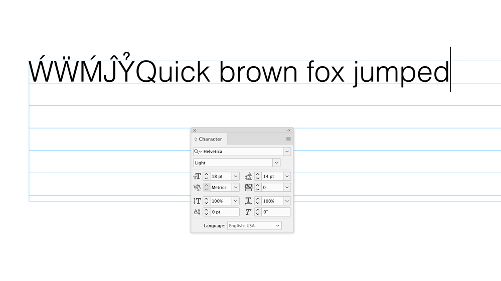
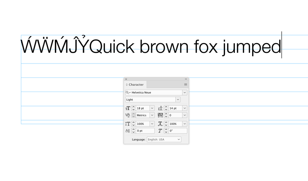
I know the glyphs with diacriticals are there, I meant that it appears to be a type design choice to set the ascent line either at the top of the diacriticals, or at the top of the lowercase character’s ascender. If you look at my Minion Pro capture the ascent line is at the top of the lowercase b ascender, not the diacritical—I’m seeing that with all of Adobe’s fonts and many others—the system Helvetica has it at the lowercase, while Helvetica Neue has it at the diacritical.
Copy link to clipboard
Copied
In any case, we're both on the same page...it was the designer's choice as to where they put the ascent. In the case of the Open San Adobe offers, it's an OLD version originally designed by Ascender Studios that Google has taken on.
It's an open source font and is going through changes all the time: https://github.com/googlefonts/opensans
There have been lots of changes to it; the ascent is just one of them.
In the end, I guess Adobe isn't as concerned aboout serving the most recent versions.
Copy link to clipboard
Copied
Hi Brad and Rob,
thank you both for looking into this issue.
I'll revisit another case with the Roboto font family we had last year.
Regards,
Uwe Laubender
( ACP )
Copy link to clipboard
Copied
Hi Uwe, it looks like Roboto is using the font’s total ascent. Here it is compared to Robert Slimbach’s Acumin Variable, which has it set at the lowercase ascender:
Copy link to clipboard
Copied
Welllllllll.. I just did the same thing with Roboto that I did for Open Sans.
This is even MORE interesting.
The Roboto set I had in my own collection was one downloaded from Google a couple of years ago.
I compared that to the version Adobe is serving as of today.
I then checked to see if Google had updated versions online. They did.
Here are the three of them in that order. The Acsent in the current Google offering has been reduced!!!
Copy link to clipboard
Copied
The ascent slightly above the cap line is what I expect—all the Adobe originals seem to have it that way.
Copy link to clipboard
Copied
Hi Brad,
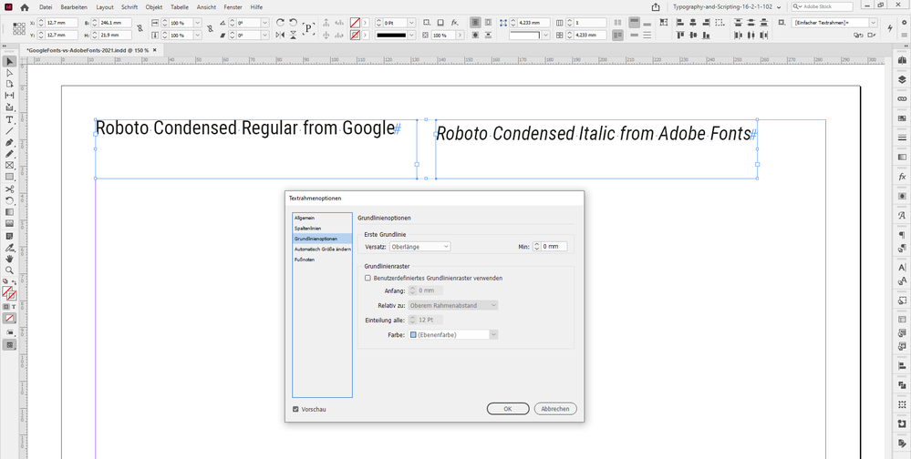
thanks for that! Maybe you remember this thread from June 2021:
Space added above and below Source Sans Pro and Roboto Adobe fonts
anneka_rose, Jun 10, 2021
where I showed the Roboto from Adobe Fonts next to the one from Google Fonts:
Now it's very clear what exactly happened!
Thanks,
Uwe Laubender
( ACP )
Find more inspiration, events, and resources on the new Adobe Community
Explore Now
