• Global community
    • Language:
      • Deutsch
      • English
      • Español
      • Français
      • Português
  • 日本語コミュニティ
    Dedicated community for Japanese speakers
  • 한국 커뮤니티
    Dedicated community for Korean speakers
Exit
0

Body word spacing inconsistent

Explorer ,
Jan 05, 2025 Jan 05, 2025

Copy link to clipboard

Copied

Hi, 

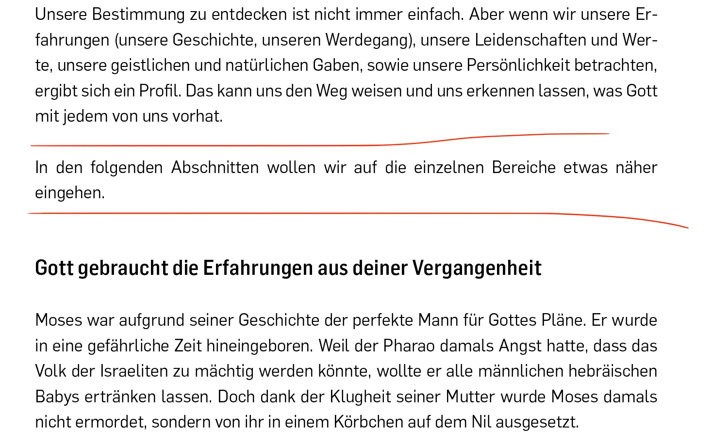
I am working on my first book layout. For the body spacing, it seems that sometimes the spacing between words is larger in certain places. I imagine this is happening because the body text is set to justify with the last line aligned left.
My question is: Is it acceptable to leave it like this? If not
, what solutions are there to fix this?
 

Screenshot 2025-01-06 at 08.31.41.png

Thank you very much! 

TOPICS
How to , Print

Views

133

Translate

Translate

Report

Report
Community guidelines
Be kind and respectful, give credit to the original source of content, and search for duplicates before posting. Learn more
community guidelines
Community Expert ,
Jan 05, 2025 Jan 05, 2025

Copy link to clipboard

Copied

Are you referring to the horizontal space between words, or the vertical space between lines, indicated by the red lines in your screen shot?

The former are controlled by the justification settings (and your choicwe of alignement is a factor), the latter could be caused by several different things.

Look for empty paragraphs, a space before or space after setting applied to the the paragraphs on either side of the gap (coul;d be part of the paragraph style or a local override), or an Align to Grid setting on the paragraph after the gap (my suspicion for waht is causing this). Again, this could be part of the style or a local override.

Bawseline grid alignement is a useful methos for keeping lines of text aligned across columns or pages, but it only works when the base line grid is set to the correct spacing, generally the same as the leading of the body text.

Votes

Translate

Translate

Report

Report
Community guidelines
Be kind and respectful, give credit to the original source of content, and search for duplicates before posting. Learn more
community guidelines
Explorer ,
Jan 06, 2025 Jan 06, 2025

Copy link to clipboard

Copied

@Peter Spier 
I am referring to the spacing between words like this:

Screenshot 2025-01-06 at 09.02.20.png

Votes

Translate

Translate

Report

Report
Community guidelines
Be kind and respectful, give credit to the original source of content, and search for duplicates before posting. Learn more
community guidelines
Community Expert ,
Jan 06, 2025 Jan 06, 2025

Copy link to clipboard

Copied

Those spaces are controlled by the values set under Justification in the paragraph style assigned and will shrink and grow to fill the line in fully justiufed text, as you are using, with inDesign occasionally having to violate the limits when some other condition in the text occurs, such as trying to fully justify a line with too few words. You can turn on a warning highlight for this in the preferences under the Composition setting.

As to whter this varialbility is acceptable, it is a necessity when using fully justified text.  If you are not happy withthe amount of variability in general, you should try changing the minimum and/or maximum allowances in the Justifcation settings, but be aware that doing so will cause all of ther text in your document to reflow.

You could also do this for single paragraph in isolted places, or use the (to my knowledge undocumented) keyboard shorcuts Ctrl + Alt + Backspace (Cmd + Opt + Backspace on Mac)  and Ctrl + Alt + \ (Cmd + Opt + \)to tighten, or loosen, respectively,  word spaces in selected text. I used to use those all the time to eliminate runts and orphans in newspaper columns, or to adjust the number of total lines to fill an allotted space, and occasioanlly in books, particularly in text next to an image whre text wrap has been applied to get a more pleasing flow, but they must be used judiciously.

Votes

Translate

Translate

Report

Report
Community guidelines
Be kind and respectful, give credit to the original source of content, and search for duplicates before posting. Learn more
community guidelines
Explorer ,
Jan 06, 2025 Jan 06, 2025

Copy link to clipboard

Copied

Thank you! Is this somehting that would be done in the end or as soon as possible?

Votes

Translate

Translate

Report

Report
Community guidelines
Be kind and respectful, give credit to the original source of content, and search for duplicates before posting. Learn more
community guidelines
Community Expert ,
Jan 06, 2025 Jan 06, 2025

Copy link to clipboard

Copied

Is it acceptable to leave it like this?


That's up to your customer. I would hyphenate eingehen but there are people who object to breaking such a paragraph. Another option would be to play with word and letter spacing (in the Justification window), maybe that will take eingeben back a line, but that probably means that the paragraph will be too tight.


Votes

Translate

Translate

Report

Report
Community guidelines
Be kind and respectful, give credit to the original source of content, and search for duplicates before posting. Learn more
community guidelines
Community Expert ,
Jan 06, 2025 Jan 06, 2025

Copy link to clipboard

Copied

  1. With the justify setting InDesign is forced to make the space between the words larger. Specially if the last word is not allowed to hyphenate.
  2. You can change the justify settings in the paragraph settings (fine tuning) to allow a spacing between glyphs (what I recommend for those short paragraphs).
  3. Another influence is the language. Did you set up your paragraph correcly with German 2006?


For which publisher do you set up? I do a lot for Logos Editions, E21, and many other Christian Evangelical Publishers in Germany and Austria.

Votes

Translate

Translate

Report

Report
Community guidelines
Be kind and respectful, give credit to the original source of content, and search for duplicates before posting. Learn more
community guidelines
Explorer ,
Jan 06, 2025 Jan 06, 2025

Copy link to clipboard

Copied

Thank you! What are some common justification settings? Are there any good standards, or does it vary based on projects? I'm not very experienced in this area, so I don't want to mess up the text. The language is set to Swiss German 2006 (it's for a Swiss-based company).

Votes

Translate

Translate

Report

Report
Community guidelines
Be kind and respectful, give credit to the original source of content, and search for duplicates before posting. Learn more
community guidelines
Explorer ,
Jan 06, 2025 Jan 06, 2025

Copy link to clipboard

Copied

@Willi AdelbergerAlso, when fine-tuning the text, is this something that should be done as soon as it's noticed or at the end?

Votes

Translate

Translate

Report

Report
Community guidelines
Be kind and respectful, give credit to the original source of content, and search for duplicates before posting. Learn more
community guidelines
Community Expert ,
Jan 06, 2025 Jan 06, 2025

Copy link to clipboard

Copied

I do it as soon as possible. I ahve short named paragraph style names, like p, h1, h2, etc. And if I create a dependend alteration for specific purposes, I make a child of this style like p.short-paragraph. If I make changes in the mother style, their children will inherit these changes.

Votes

Translate

Translate

Report

Report
Community guidelines
Be kind and respectful, give credit to the original source of content, and search for duplicates before posting. Learn more
community guidelines
Explorer ,
Jan 06, 2025 Jan 06, 2025

Copy link to clipboard

Copied

LATEST

@Willi Adelberger 
What about in an instance like this? Would I also apply the p.short-paragraph? In this case, it isn’t very noticeable anyway, so should I just leave it as is?
Also, is it adviced to make these fine tuning to the mother style? 

Screenshot 2025-01-06 at 12.04.36.png

Votes

Translate

Translate

Report

Report
Community guidelines
Be kind and respectful, give credit to the original source of content, and search for duplicates before posting. Learn more
community guidelines
Community Expert ,
Jan 06, 2025 Jan 06, 2025

Copy link to clipboard

Copied

If I am working on a long document with full justification I usully make at least one Tight variant and at least one Loose variant of my body copy styles. This is primarily to allow me to add or remove a line as needed for length or appearance.


Full justification works by taking the space that would appear at the end of the line (if using left justified text) and distributing it evenly across the line. This can be dome by adding all the extra space between each word, by adding all the extra space between each character, or by streching the characters using horizontal scaling, or some combination of the three.


Remember there are three attributes you can play with. It looks like you are unhappy with lots of word spacing, so try making the maximum word spacing lower and adding more character spacing. You can also add horizontal scaling. 1% up or down will not be noticeable and it adds one more way to adjust spacing.


In the top image I used InDesign’s default spacing, which only allows for changes to word spacing. In the bottom image I reduced the range for word spacing and added a bit for character spacing and horizontal justification. As it turns out each line breaks in the same place, but the way the space is distributed is different.

Screenshot 2025-01-06 at 2.41.27 AM.png

Votes

Translate

Translate

Report

Report
Community guidelines
Be kind and respectful, give credit to the original source of content, and search for duplicates before posting. Learn more
community guidelines